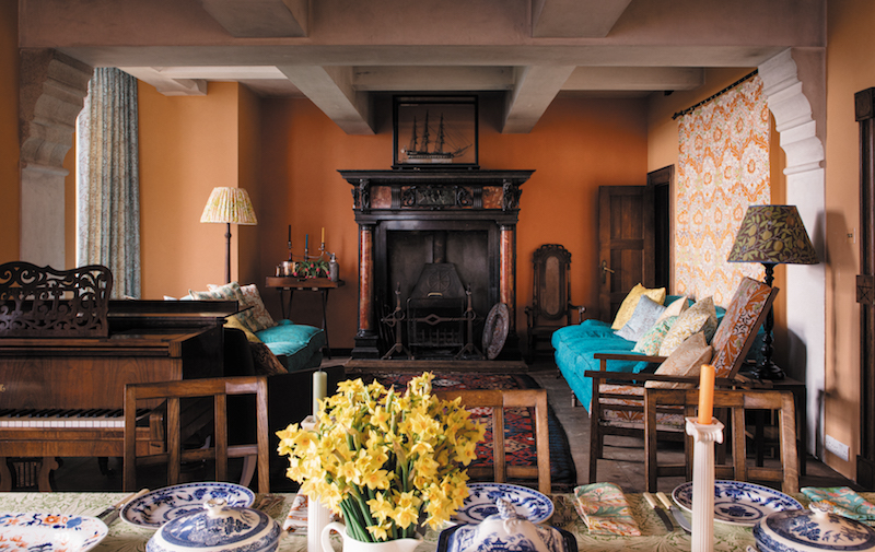

There are two ways to revive a famous design archive. The first is to handle it like a museum artifact: carefully, quietly, and with enough reverence to make everyone whisper. The second is to invite Ben Pentreath into the archive, hand him the color cards, and let tangerine, primrose, apple green, and sea blue loosen their collars. Morris & Co’s Cornubia collection happily takes the second route.
Introduced in 2022 as Pentreath’s secondand at the time latestcollaboration with Morris & Co, Cornubia revisits celebrated wallpapers and fabrics while returning overlooked patterns to production. The collection comprises 18 wallpapers and 18 fabrics, all shaped by the colors, landscape, and memories associated with Cornwall. It is cheerful without becoming sugary, nostalgic without turning a room into a Victorian reenactment, and bold enough to remind beige that it is not the only grown-up in the house.
What Is the Cornubia Collection?
Cornubia is a collection of recolored and revived Morris & Co patterns developed by British architect and interior designer Ben Pentreath. Its name is derived from the Latin word for Cornwall, a fitting reference for a palette inspired by green fields, garden flowers, clear coastal water, summer sunlight, and the occasional flash of color that makes the English countryside look as though someone quietly increased the saturation.
The concept sounds simple: take historic patterns and give them new colors. In practice, recoloring a famous design is closer to recasting a familiar character. Change too little and there is no reason for another production. Change too much and the original personality disappears. Pentreath’s solution was to preserve the botanical structure, repeating rhythm, and craftsmanship of the designs while shifting their emotional temperature.
Instead of reproducing Victorian color combinations exactly, Cornubia introduces lemon yellow, tangerine, soft pink, bright green, and sea-inspired blue. These colors bring more sunlight into the patterns without stripping away their historical character. The result is not William Morris made trendy for a season. It is Morris & Co viewed through a brighter window.
From Queen Square to the Cornish Coast
Pentreath’s first collection for Morris & Co, Queen Square, debuted in 2020. Named for the Bloomsbury location where William Morris lived and worked, Queen Square favored rich, jewel-like, autumnal colors. Its rooms suggested polished wood, deep upholstery, lamplight, old books, and the sort of armchair that strongly discourages productivity.
Cornubia was conceived as a brighter sibling. Where Queen Square feels enclosed and autumnal, Cornubia opens the windows. Its colors refer to spring and summer, especially the landscape of Cornwall, where Pentreath has ancestral connections. He has also associated the collection with memories of his childhood during the 1970s, when strong greens, yellows, oranges, and blues appeared confidently throughout domestic interiors.
That personal connection helps explain why the palette feels remembered rather than manufactured. Cornubia does not look like a trend forecast assembled around a conference table. It feels like a collection of colors gathered from gardens, painted furniture, old textiles, seaside houses, and rooms that became more interesting as the years passed.
Why Ben Pentreath and Morris & Co Belong Together
Pentreath is known for interiors that balance architectural discipline with comfortable layering. His historic houses rarely remain trapped in one period. Antique furniture may share a room with modern art, strong paint colors, simple checks, patterned textiles, handmade objects, and pieces acquired because someone loved them rather than because they completed a historically approved furniture set.
This approach makes him a natural interpreter of Morris & Co. He treats historic design as a living language, not a costume. He had also used Morris patterns in his projects for years before the collaboration began, so his interest was not invented for a product launch. The affection is visible in the way he refuses to sand away the patterns’ complexity.
Rather than attempting to make Morris designs “minimal,” Pentreath makes them usable in a broader range of interiors. Cornubia respects the density of the originals, then changes the light around them. That same light-touch philosophy can be seen in his architectural work, where historic buildings are refreshed without erasing the evidence of previous lives.
Classic Morris Patterns, Newly Awake
Willow Bough: Familiar, Fluid, and Difficult to Tire Of
William Morris designed Willow Bough in 1887, arranging curling willow leaves and stems into a repeat that appears both ordered and natural. It became one of Morris & Co’s most enduring patterns because the eye can follow its movement without finding an obvious beginning or end.
Cornubia’s colorways emphasize that flowing quality. Willow Bough can behave like a calm background in a bedroom, a lively botanical surface in a hallway, or a softer frame around a window. The pattern contains enough detail to reward close inspection, but its continuous movement prevents it from feeling like a collection of isolated floral motifs pasted onto a wall.
Marigold: Small Scale, Serious Decorating Talent
Marigold dates to 1875 and is one of the relatively few Morris patterns developed for both wallpaper and fabric. Its compact repeat gives it unusual flexibility. Larger botanicals can dominate a small space, but Marigold behaves more like visual texture. From across the room, it produces color and movement; up close, the leaves and flowers become clearer.
That makes Marigold an excellent supporting pattern. It can sit beside stripes, checks, plain linen, painted paneling, or a larger Morris print without beginning a decorative argument. Every pattern-rich room needs at least one design willing to play rhythm guitar.
Trellis: The Beginning Still Looks Fresh
Designed in 1862, Trellis was William Morris’s first wallpaper pattern. Its roses and birds were inspired by the garden trellis at Red House, the home Morris commissioned in Bexleyheath. The design’s underlying grid gives the flowers a strong architectural framework, which is one reason it remains surprisingly easy to place in contemporary interiors.
In a bedroom, Trellis can suggest sleeping inside a garden structure. In an entryway, it establishes character before a visitor has removed a coat. Paired with clean-lined furniture, it also demonstrates that a nineteenth-century wallpaper does not require a nineteenth-century room.
Blackthorn and Compton: Honoring John Henry Dearle
The Morris & Co legacy extends beyond William Morris himself. John Henry Dearle managed important areas of the firm’s production and eventually succeeded Morris as artistic director. Designs associated with Dearle, including Blackthorn and Compton, became major components of the company’s visual identity.
Blackthorn is dense with flowers, fruit, leaves, and stems. In Cornubia, lighter grounds and clearer color relationships allow that abundance to feel crisp rather than heavy. Compton has a more sweeping, immersive quality suited to dining rooms, libraries, bedrooms, and other spaces where the goal is atmosphere rather than polite neutrality.
Recognizing Dearle’s contribution is more than a historical footnote. It reveals Morris & Co as a creative workshop with an evolving group of designers, craftspeople, printers, and collaboratorsnot simply a one-man pattern factory.
Merton and Woodland Weeds: The Joy of Rediscovery
One of Cornubia’s strongest ideas is that an archive should contain surprises, not only greatest hits. The collection revives Merton, previously known as Eden, and Woodland Weeds, two large-scale designs that had been absent from regular production for decades.
Pentreath had remembered Merton from a sofa he encountered more than 20 years before the collection was created. That story captures the peculiar power of pattern: a textile can lodge in the memory long after the room, furniture, and conversation surrounding it have become blurry.
These revivals also broaden the public image of Morris & Co. The archive is not a short playlist consisting only of Willow Bough, Strawberry Thief, and a few familiar florals. It is a much larger ecosystem filled with patterns whose scale, structure, and personality can speak differently when introduced to another generation.
Color Is the Collection’s Real Plot Twist
Cornubia’s achievement is not simply brightness. Plenty of collections are bright; some resemble a fruit stand during a power surge. Pentreath’s palette works because its colors are cheerful but slightly softened, as though sunlight, salt air, and time have already passed over them.
Tangerine contributes warmth without becoming a novelty. Primrose and lemon bring light. Apple green connects the patterns to gardens and fields, while sea-inspired blues add depth. Soft pink prevents the blues and greens from becoming chilly. Because related colors recur across several designs, wallpaper and fabric can be combined without relying on exact matching.
This is particularly useful in layered interiors. A Willow Bough curtain does not have to reproduce every shade found in a Blackthorn wall covering. It only needs to share one or two visual notes. The room then feels coordinated but not packagedwhich is usually the difference between a welcoming home and a furniture showroom that expects everyone to behave.
Traditional Production With Contemporary Energy
Morris & Co continues to use production methods that retain the tactile character of heritage pattern. The wallpapers in Pentreath’s collaborations are surface printed, a process that applies generous layers of color and creates a slightly raised, hand-worked quality. Surface printing is commonly regarded as the modern production method closest in appearance to traditional block printing. The fabrics are screen printed, preserving clarity and richness across complex repeats.
This physical quality matters. Digitally printed perfection can make a historical pattern appear strangely flat, like a botanical illustration trapped behind glass. Surface printing produces subtle variations and allows pigments to catch the light differently. The repeat remains precise, but the finished wall has warmth, depth, and evidence of process.
That attention to making connects Cornubia to the wider Arts and Crafts philosophy. Morris believed everyday objects should unite beauty, usefulness, appropriate materials, and skilled labor. A wallpaper was not merely an image applied to a wall; it was a designed and manufactured object whose method of production contributed to its character.
How to Use Cornubia in a Modern American Home
Choose One Hero Pattern
Begin with the design that creates the strongest emotional response, then allow the rest of the room to support it. A large Merton or Compton wallpaper can serve as the hero, while plain upholstery, a stripe, and a small-scale Marigold accent take supporting roles. Pattern mixing works best when every actor is not delivering a monologue simultaneously.
Repeat Colors Instead of Matching Everything
Select two or three colors from the wallpaper and repeat them through paint, lampshades, rugs, artwork, or upholstery. A green leaf might suggest the trim color, while a minor blue detail can connect with ceramics or a rug. This produces unity without making the room look as though every item arrived in the same delivery truck.
Interior designers frequently recommend combining one dominant “hero” pattern with quieter designs that share related colors. Florals also pair naturally with stripes and checks because the straight geometry balances curling botanical forms.
Do Not Be Afraid of Small Rooms
Powder rooms, vestibules, laundry rooms, and reading nooks are ideal places for immersive wallpaper. Small rooms often benefit from a powerful identity because they have limited architectural space in which to create one. Covering all four wallsand occasionally the ceilingcan look more intentional than placing one nervous strip behind the sink.
Real-world renovations repeatedly show that William Morris patterns can give compact bathrooms, entries, and workspaces a sense of depth and personality. Large-scale designs make small rooms feel intimate, while lighter grounds help prevent the space from becoming visually closed.
Balance Botanicals With Straight Lines
Checks, stripes, tailored upholstery, simple wooden furniture, and geometric rugs provide structure beside curling leaves and flowers. This is one reason Morris patterns adapt so well to American traditional, cottage, Arts and Crafts, eclectic, and even restrained modern interiors. The botanical motif supplies movement; the linear element keeps everyone from wandering too far into the shrubbery.
Consider Light Before Committing
Pattern scale and color can change dramatically according to distance, daylight, and artificial lighting. Tape a large sample to more than one wall and view it in the morning, afternoon, and evening. A yellow that appears fresh in sunlight may become warmer under lamps, while a pale ground may look cooler beside bright white trim.
Modern wallpaper guidance continues to emphasize botanical prints, expressive color, and the importance of selecting designs that respond well to a room’s natural light. Cornubia fits those preferences without feeling disposable because its underlying patterns have already survived multiple cycles of fashion.
Why Cornubia Matters Beyond Decoration
William Morris was a designer, writer, printer, entrepreneur, preservationist, and leading figure in the British Arts and Crafts movement. His influence traveled well beyond Britain, helping shape American conversations about honest craftsmanship, artistic labor, useful beauty, and the relationship between design and industrial production.
Major American institutions continue to preserve extensive Morris material. The Metropolitan Museum of Art holds important examples of his wallpapers and textiles. Cooper Hewitt has collected numerous wallpaper patterns and later reprints made from original blocks. The Huntington maintains one of the world’s leading collections of Morris-related manuscripts, books, drawings, furniture, decorative art, and Arts and Crafts material.
Cornubia keeps that history active. It does not pretend that the nineteenth century can be recreated unchanged, and it does not apologize for ornament. Instead, it offers a practical form of conservation: understand the original design intelligence, preserve the craft, and allow color to address the present.
A Collection That Lets the Classics Breathe
Ben Pentreath’s Cornubia collection succeeds because it is neither a replica nor a rebellion. The patterns remain recognizably Morris & Co, but their coastal palette reveals different expressions. Willow Bough becomes breezier. Blackthorn appears sharper. Marigold becomes an adaptable companion. Forgotten designs return with the confidence of guests who were merely late, not lost.
For homeowners tired of anonymous rooms, Cornubia presents a persuasive alternative: decoration with memory, craftsmanship, personality, and enough color to improve the weather indoors. It retells the classics by remembering that classics were once newand that they remain alive only when someone is willing to see them differently.
Living With the Look: Practical Experiences and Lessons
The most useful way to understand a collection like Cornubia is not to stare endlessly at one perfect promotional photograph. It is to imagine the patterns surviving ordinary life: changing daylight, mismatched books, children running through the hallway, a dog brushing past the curtains, takeout containers on the table, and the occasional chair purchased because it was comfortable rather than historically correct.
From a practical decorating perspective, the first surprise is how quickly a dense Morris pattern can become a background. A sample may appear busy when held at arm’s length, especially when it contains five or six colors. Once installed across an entire wall, however, the repeat creates continuity. The eye stops counting individual flowers and begins reading the surface as atmosphere. This is why an enveloping wallpaper can sometimes feel calmer than a single feature wall surrounded by stark white paint.
A second lesson is that imperfect furniture often looks better against a sophisticated pattern. A plain dresser, flea-market table, basic upholstered bed, or inherited cabinet gains context when placed in front of Trellis, Marigold, or Willow Bough. The wallpaper contributes detail that the furniture does not have to supply.
This can be liberating for anyone who assumes heritage wallpaper requires a room full of museum-quality antiques. It does not. A combination of simple furniture and one elaborate pattern often feels fresher than a room in which every object is grand. Too many serious antiques can make the result look staged, as though a velvet rope might appear if someone sits down incorrectly.
Color selection is usually the point where confidence begins to wobble. The safest approach is to resist matching every shade. Choose one dominant color from the pattern for painted woodwork, then allow smaller colors to appear casually through books, ceramics, artwork, and textiles. A Cornubia print containing green, blue, yellow, and pink does not require four coordinating purchases before breakfast. One green trim color and a faded blue rug may be enough.
Pattern scale also changes the experience of a room. Large designs such as Merton and Woodland Weeds can make a compact space feel intimate, while smaller repeats like Marigold add movement without controlling the entire conversation. In an open-plan American home, a large print can define the dining area or entryway, creating a visual room within a larger room. Smaller patterns can travel more easily into connecting hallways, window treatments, seat cushions, or lampshades.
Natural materials help keep Cornubia’s brighter colors grounded. Oak, pine, wicker, linen, wool, aged brass, and handmade pottery absorb color without flattening it. Highly polished matching furniture may push the collection toward formality, while varied textures make it feel gathered over time. Cornubia tends to look most convincing when a room contains something worn, something handmade, and something slightly unexpected.
Another practical discovery is that the wallpaper will not look identical throughout the dayand that is part of its appeal. Morning sunlight may pull yellow from the design. Cloudy light may emphasize green and blue. Evening lamps can deepen orange and pink. A successful wallpaper does not deliver one fixed image; it performs several versions of the room, quietly changing the set while everyone gets on with life.
The overall experience is less about recreating an Arts and Crafts interior than borrowing its confidence. Use objects because they are useful or loved. Let craftsmanship remain visible. Allow nature-inspired pattern to occupy real space. Most importantly, remember that a room can take design seriously without looking as though it has forgotten how to smile.
Note: Wallpaper and fabric colors, scale, and texture may vary by screen, production batch, and room lighting. Review physical samples in the intended space before ordering final quantities.