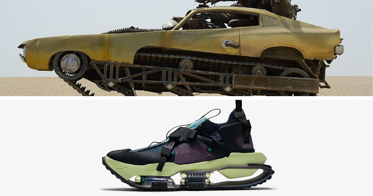

At first glance, the idea sounds like the kind of thing you’d dream up after spending too long on Instagram with a coffee in one hand and a sneaker tab open in the other. Shoes and cars? Really? But the moment a designer starts placing them side by side, the joke turns into a tiny design revelation. Suddenly, a chunky runner looks suspiciously like a retro concept car. A sleek basketball shoe gives off the same energy as a low-slung coupe. A bright red pair of Jordans starts whispering, “Ferrari,” and honestly, it is not being subtle.
That is exactly why the concept behind Designer Compares 30 Shoes And Cars To Show Design Similarities lands so well. It is playful, visual, and weirdly smart. It also taps into something design lovers, sneakerheads, and gearheads have known for years: great products tend to speak the same visual language. Whether an object rolls on asphalt or rides on your feet, the best designs often rely on the same tricks: motion, proportion, materials, tension, contrast, and attitude.
And attitude matters. A lot. Nobody falls in love with a car because the cupholders are competent. Nobody obsesses over a sneaker because the stitching is merely acceptable. People respond to products that seem alive, fast, confident, expressive, and a little dramatic. Shoes and cars are both masters of that performance. They are functional objects, sure, but they are also identity pieces. They tell the world who you are before you say a word. Which is convenient, because some people would rather let their sneakers and their car keys do the talking.
The Visual Experiment That Makes the Point Instantly
The beauty of comparing 30 shoes and cars is that it does not require a lecture. It works in one look. Put a futuristic sneaker next to an aggressively sculpted supercar and your brain notices the same cues: arched geometry, cutaway panels, exaggerated curves, layered surfaces, and a sense that everything is moving forward even while standing still.
That is the secret sauce. Designers in both worlds are not just making objects. They are making motion visible. A shoe cannot literally sprint while it is sitting on a shelf, and a parked car cannot thunder down a highway from a dealership floor. But design can create the illusion. Sharp toe boxes, tapered midsoles, sweeping sidewalls, aerodynamic vents, sculpted heels, and tension-filled lines all suggest speed. They imply force before the product even does anything.
When a designer compares thirty pairs and thirty cars, the pairings start to reveal patterns instead of coincidences. The similarities are not random. They are structural. You begin to see that both industries love visual compression, layered texture, purposeful contrast, and storytelling through details. In other words, the comparison is fun, but it is not silly. It is design criticism wearing cooler shoes.
Why Shoes and Cars Keep Speaking the Same Design Language
1. Both are built around performance theater
A great car has to perform, but it also has to look like it can perform. Same deal with sneakers. A basketball shoe needs grip, containment, cushioning, and support, but it also needs to signal explosiveness. A running shoe has to communicate lightness and propulsion before your foot even hits the ground.
This is why performance cues translate so easily between categories. Racing-inspired tread patterns show up on outsoles. Seat belt references become pull tabs. Car chassis logic turns into ideas about lockdown, stability, and support. In both cases, design turns engineering into visual drama. The product is saying, “I am built for action,” and thankfully it is saying it with better grammar than a movie trailer voice-over.
2. Silhouette is everything
Strip away logos and hype for a second, and what is left? Shape. Good designers know silhouette does the heavy lifting. The outline of a Porsche, a Ferrari, or a wedge-shaped concept car can be recognized in seconds. The same goes for iconic sneakers. You can spot an Air Jordan or an Air Max from across a room because the silhouette carries the identity.
That is one reason certain comparisons feel so satisfying. A shoe with a spoiler-like heel tab, a long sloping forefoot, or a tucked waistline can echo the profile of a sports car almost perfectly. The famous example of the Air Jordan VI drawing inspiration from Michael Jordan’s Porsche is still a classic case. Likewise, the Air Jordan 14’s Ferrari association worked because the form already carried that fast, luxurious, automotive energy. The branding only turned the volume up.
3. Materials create emotional meaning
Leather, suede, mesh, rubber, carbon-look textures, glossy coatings, matte finishes, contrast stitching, metallic paint, translucent accents: these details do not just decorate a product. They tell a story about what the object is. Is it refined? Tough? Experimental? Retro? Technical? Loud? Quietly expensive?
That overlap shows up everywhere in shoe-car comparisons. A cracked leather upper can evoke aged automotive paint. Soft suede can mirror plush interiors. Glossy molded panels can feel like bodywork. Even color blocking can function like trim packages on a car. In both design worlds, surface treatment is not a bonus. It is part of the message.
4. Branding works best when it becomes form
The smartest designs do not slap a logo on top and call it a day. They make identity feel built in. Sneaker culture has long understood this. Think of how a Swoosh, side stripe, or molded heel piece becomes part of the product’s architecture rather than a sticker pretending to have a job.
Cars do the same thing with lights, grilles, vents, badges, and trim signatures. A modern vehicle often becomes recognizable not by one logo, but by the rhythm of its lines and the pattern of its details. That is why shoe and car comparisons hit so hard when the brand identity feels structural. You are not just seeing two products that match in color. You are seeing two objects that share a design philosophy.
What the 30 Comparisons Really Reveal
If you look across a large set of shoe-and-car comparisons, several recurring themes pop out.
Forward lean
Many shoes and sports cars are visually pitched forward. That tilt suggests readiness. It feels like momentum captured mid-breath. On sneakers, it appears in a pointed forefoot, lifted heel geometry, or a narrowed waist. On cars, it shows up in rake, stance, beltline, and nose-down aggression.
Layered construction
Both categories love layers because layers communicate complexity. Overlays on a sneaker are not unlike body surfacing on a car. One panel catches light. Another adds contrast. Another protects a stress point. Another exists because, frankly, it looks cool. Functional? Yes. Fashionable? Also yes. We contain multitudes.
Visible technology
Sneakers increasingly put their tech on display, whether through exposed air units, sculpted midsoles, or unusual support cages. Cars do something similar with aero parts, vent treatments, lighting signatures, and structural cues. The product is not just engineered well; it wants you to notice that it was engineered well.
Color storytelling
This is where things get especially fun. Automotive paint colors often become sneaker colorways, and sneaker palettes often feel tailor-made for custom wraps, interiors, or accent trims. Porsche and Puma have leaned into actual vehicle hues. Nissan-inspired driving shoes translated the look of the Z into footwear. Sean Wotherspoon’s Porsche art car pushed color-blocking and unusual materials into a full automotive canvas. The message is clear: color is not decoration. It is narrative.
Specific Examples That Prove This Is More Than a Gimmick
The reason this topic keeps resurfacing is simple: the parallels are backed by real collaborations, real design decisions, and real products.
Jordan Brand gave the world one of the best-known automotive sneaker stories with the Air Jordan VI and its Porsche-adjacent inspiration, then doubled down years later with the Air Jordan 14 and its Ferrari-coded identity. Those were not lazy marketing stunts. The shapes, materials, and details made the references feel earned.
Nike has also leaned into the crossover more directly. Devin Booker’s collaboration with Chevrolet made his affection for classic Blazers part of the design story, while the Book line has been described through the language of tuned-up classic cars: classic outside, high-performance underneath. That is a perfect metaphor for modern footwear design, where old-school proportions often hide cutting-edge cushioning and containment systems.
The Luka 3 is another strong example. Its tire-inspired traction, seat-belt references, and high-performance sports car cues show how deeply automotive ideas can shape a basketball shoe without turning it into costume. Good design knows when to wink and when to shout.
New Balance has played the game too. The FuelCell 996v6 openly describes itself as inspired by racing cars, while the 9060 uses visible motion, enlarged structural cues, and a futuristic tech aesthetic that feels surprisingly close to concept-car thinking. Even when the reference is not explicitly automotive, the design language is.
Meanwhile, on the car side, Ford’s Maverick Lobo reportedly borrowed visual DNA from Nike basketball shoes for its interior details. That matters because it flips the usual direction of influence. We often assume sneakers borrow from cars, but cars are just as happy to steal a little swagger from sneakers. Fair is fair.
And then there is the culture layer. Designers and collectors have said outright that classic cars and classic sneakers attract the same kind of person: someone who notices line quality, proportion, materials, rarity, and subcultural meaning. That is not just shopping. That is visual obsession with a side of emotional attachment.
Why This Topic Performs So Well Online
From an SEO perspective, this subject has catnip-level appeal. It hits multiple search interests at once: sneaker culture, automotive design, industrial design, visual comparisons, streetwear, luxury products, and viral design content. It is niche enough to feel fresh and broad enough to attract readers from several communities.
It also works because people love pattern recognition. Human beings are wired to enjoy spotting similarities between things that “shouldn’t” match. That is why before-and-after posts do numbers, why comparison reels thrive, and why side-by-side design content travels so far. The reader gets a little reward every time they notice a connection. It is basically brain candy, but with better taste.
And because both sneakers and cars carry personal identity, readers are more likely to argue, comment, share favorites, and send the article to friends with messages like, “Tell me this does not look exactly the same.” That social behavior is gold for discoverability. The topic is visual, searchable, debatable, and highly scrollable. The internet loves all four.
What Designers Can Learn From the Shoe-and-Car Comparison Trend
The biggest lesson is that design rarely lives in a silo. Great ideas travel. A footwear designer can learn from fender lines. An automotive designer can learn from the way sneaker brands use overlays to control rhythm and emphasis. Both can learn from fashion, architecture, product design, and even film props. Good design is nosy. It peeks over the fence, takes notes, and comes back with better ideas.
The second lesson is that emotional design matters just as much as technical performance. People may justify purchases with specs, but they usually fall in love with shape, texture, memory, and story. That is true whether they are buying a collectible sneaker, a sports coupe, or a sensible daily driver they swear is “practical” while choosing it entirely because the side profile looked amazing in the dealership parking lot.
Finally, the trend proves that audiences are sharper than brands sometimes assume. Readers can tell when a comparison is forced. But they can also spot a genuine relationship between objects. When the lines, stance, detailing, and materials line up, the connection feels obvious. It turns curiosity into admiration.
The Real Reason These Similarities Feel So Satisfying
In the end, the appeal of Designer Compares 30 Shoes And Cars To Show Design Similarities comes down to one simple truth: both objects are designed to move people, literally and emotionally. One carries your body. The other carries your whole self through space. Both become extensions of personality. Both live at the intersection of utility and fantasy. And both invite designers to solve practical problems while making something people desperately want to look at again.
That is why the side-by-side comparisons are more than visual jokes. They reveal a shared design instinct: make performance visible, make identity memorable, and make the object feel faster, cooler, and more alive than it has any right to be. Once you notice that, you cannot unsee it. Every sneaker store starts to feel a little like an auto show. Every parking lot starts to look slightly more fashionable. Which, frankly, is a much more entertaining way to run errands.
Design Experiences: What You Notice Once You Start Seeing the Pattern
Here is the strange part about diving into this topic: once you start noticing the similarities between shoes and cars, your brain becomes completely unhelpful in the best possible way. You stop seeing a pair of sneakers as just sneakers. You stop seeing a coupe as just a coupe. Instead, you start reading both like moving sculptures with a mission.
Walk into a sneaker store and suddenly every shelf feels like a mini motor show. One model has the stance of a grand tourer. Another has the layered aggression of a track car. A chunky runner feels like an off-road SUV that somehow discovered fashion school. A sleek retro trainer looks like it should come with a manual transmission and a loyal fan base on obscure internet forums. It becomes impossible not to compare.
The same thing happens at car meets, dealership lots, or even in traffic. You start noticing how many vehicles are built like footwear. The padded shoulder line of one car feels like a molded collar. The cut of a headlight resembles an eyestay. A matte finish feels like nubuck. A glossy paint treatment reads like patent leather. Contrast stitching inside a cabin suddenly looks like the sort of detail that would sell out instantly on a limited sneaker drop.
And there is a deeper pleasure in that recognition. It reminds you that design is not random. Someone sweated over that curve. Someone argued about that color break. Someone moved a seam, softened an edge, sharpened a toe, widened a stance, or changed a texture because they knew it would change how the object felt. That awareness makes everyday products more interesting. It turns ordinary looking into active seeing.
There is also something charmingly human about the overlap. Sneakerheads and car enthusiasts can seem like different tribes until you listen closely. Then you realize they obsess over the same stuff: proportions, materials, release stories, heritage, rarity, and the eternal drama of whether a redesign improved the original or committed a crime against taste. Replace “midsole” with “front fascia” and half the arguments are basically identical.
Personally, the most enjoyable part of this whole conversation is how it rewards curiosity. You do not need to be an industrial designer to appreciate it. You just need to pay attention. The next time you see a shoe that looks oddly aerodynamic or a car that feels suspiciously wearable, that tiny moment of recognition is the fun. It is like catching design in the act. Suddenly, the world looks more connected, more intentional, and a little more stylish. Not bad for two objects most of us use every single day without a second thought.
Conclusion
The brilliance of comparing 30 shoes and cars is that it turns a visual gag into a design masterclass. What starts as a side-by-side curiosity quickly reveals how much these two worlds share: motion, proportion, texture, performance cues, color storytelling, and cultural meaning. The best sneakers and the best cars do more than function well. They create desire. They make utility feel exciting. They give shape to personality.
So yes, a designer comparing shoes and cars can absolutely teach us something. It teaches us that strong design principles travel across categories, that style and performance are rarely separate, and that people respond to objects that feel emotionally charged. Once those similarities click, the connection feels obvious. Shoes and cars are not distant cousins. They are practically related by silhouette.