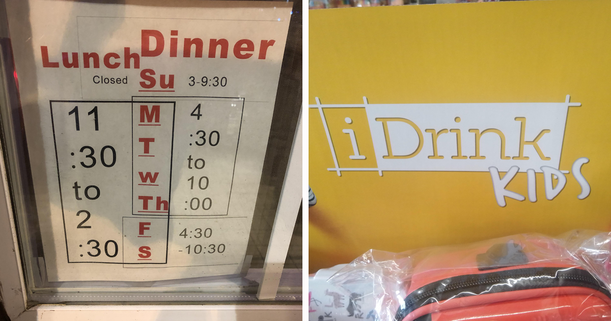

Graphic design software has never been easier to access. Unfortunately, access to a “Make It Pop” button has yet to include taste, judgment, proofreading, or the ability to recognize when a logo looks like something that should not be mentioned at a family dinner.
Great graphic design is not merely decoration. It organizes information, directs attention, establishes trust, and helps people understand what to read or do next. Established design guidance consistently emphasizes hierarchy, contrast, alignment, readable typography, balanced spacing, and purposeful communication.
Bad graphic design performs the same functions in reverse. It hides the phone number, emphasizes the legal disclaimer, turns a restaurant name into an accidental insult, and makes “50% off” look suspiciously like “5% off.” The following 88 graphic design fails are generalized examples inspired by the mistakes commonly found on signs, packaging, advertisements, websites, menus, and social media posts.
Typography Fails That Make Letters File Complaints
Typography should make words easier to read while reinforcing the tone of the message. Legibility, spacing, font pairing, and hierarchy matter because viewers must first recognize the letters before they can understand the joke, offer, warning, or instruction.
When Fonts Become the Main Character
- The ransom-note restaurant menu: Every dish uses a different font, apparently selected during a police negotiation.
- The funeral announcement in Comic Sans: Nothing says solemn remembrance like typography associated with elementary-school bake sales.
- The luxury logo in stretched Arial: Yours for only $4,999, including complimentary emotional damage.
- The script font nobody can read: Is the boutique called “Willow,” “Wallow,” or “Window”? Adventure awaits.
- The all-caps paragraph: The designer did not write information. The designer issued a 600-word threat.
- The microscopic disclaimer: The sale looks wonderful, provided you own a microscope and a legal degree.
- The giant headline with a shy message: “GRAND OPENING” dominates the page while the location hides beneath a decorative leaf.
- The accidental word merger: Insufficient spacing transforms two perfectly innocent words into one deeply unfortunate phrase.
- The lonely orphan word: A single word drops onto the next line, where it quietly questions its purpose.
- The center-aligned novel: Each line begins somewhere new, turning ordinary reading into competitive eye tracking.
- The outline-font catastrophe: Thin letters placed over a busy photograph disappear faster than accountability after approval.
Layout Fails With No Sense of Direction
A clear visual hierarchy tells viewers what matters first, second, and third. When every element has equal size, color, and emphasis, the design stops guiding attention and starts hosting a shouting contest.
Everything Is Important, So Nothing Is Important
- The poster with seventeen focal points: Your eyes enter the design, panic, and immediately search for an exit.
- The logo trapped against the edge: One more pixel and the company becomes an abstract memory.
- The invisible call to action: “Register today” is hidden beneath three testimonials and a stock photo of handshakes.
- The floating text boxes: Nothing aligns, yet everything appears strangely confident about it.
- The margin-free flyer: Every element touches an edge as though whitespace personally offended the designer.
- The accidental optical illusion: Two unrelated photographs overlap and create a new species.
- The backward reading order: The event date appears before the event name, followed by the reason anyone should care.
- The decorative border uprising: The border occupies more space than the actual message.
- The logo bigger than the product: Customers may not know what is being sold, but they will remember who confused them.
- The symmetry obsession: Important information is duplicated solely because an empty corner made someone nervous.
- The crowded business card: It contains six phone numbers, four social accounts, a mission statement, and no breathing room.
Color Fails Visible From Low Earth Orbit
Color can establish mood, indicate importance, and strengthen recognition, but it should never be the only method used to communicate essential information. Sufficient contrast is particularly important for body text, buttons, icons, signs, and other functional elements.
Fifty Shades of “Why?”
- Yellow text on white: The message is available exclusively to eagles staring directly into the sun.
- Red text on green: A festive combination that becomes a vision test for many viewers.
- The twelve-color logo: It looks less like a brand and more like a printer calibration page.
- The neon funeral-home ad: Electric lime and hot pink create a mood, although perhaps not the intended one.
- The muddy print conversion: A brilliant screen design returns from the printer looking emotionally exhausted.
- The low-contrast menu: Pale gray lettering on beige paper makes ordering lunch feel like decoding ancient scripture.
- The radioactive gradient: Blue becomes green, green becomes orange, and everyone becomes slightly concerned.
- The random accent color: One sentence is purple for reasons that remain classified.
- The red “success” message: Congratulations! Your payment worked, although the color suggests your house is on fire.
- The invisible hyperlink: It looks exactly like ordinary text until someone accidentally clicks it.
- The brand palette rebellion: Every department uses a different blue and insists theirs is the official one.
Logo and Branding Fails Nobody Can Unsee
A logo must remain recognizable at different sizes and across varied applications. Branding also depends on consistent typography, colors, imagery, and usage rulesnot simply placing the same symbol in random corners.
When the Sketch Needed One More Review
- The accidental anatomy logo: Two innocent shapes overlap and create something the client definitely did not request.
- The suspicious mascot: It was meant to wave. Its hand gesture communicates a dramatically different message.
- The copycat identity: The logo resembles a famous competitor after spending five minutes in a witness-protection program.
- The unreadable monogram: Three initials combine into a symbol that appears to summon weather.
- The tiny-detail emblem: It looks majestic on a monitor and becomes decorative oatmeal on a business card.
- The backwards logo application: The delivery vehicle transforms the brand name when seen in a mirror.
- The inappropriate icon: A dental clinic selects a symbol that looks alarmingly like a shark attack.
- The meaningless swoosh: Because no homemade logo is complete until an unexplained curve flies over it.
- The brand with four taglines: Apparently one promise was insufficient, so the logo now travels with a paragraph.
- The logo inside another logo: Brand recognition meets graphic-design nesting dolls.
- The seasonal redesign addiction: Customers receive a new identity every month and recognize none of them.
Signs and Packaging That Send the Wrong Message
Public-facing graphics must work quickly. Directional signs, warnings, labels, and packaging need readable characters, logical placement, strong contrast, and freedom from glare or distracting textures.
Helpful Information, Aggressively Hidden
- The restroom arrow pointing nowhere: Visitors are directed confidently into a decorative plant.
- The “open” sign behind a closed blind: A philosophical statement about the uncertainty of modern commerce.
- The warning label beneath the hazard: You learn not to touch the surface immediately after touching it.
- The packaging window over the instructions: The product proudly displays itself while covering how to use it.
- The misleading food photograph: The bowl contains twelve berries; the actual package contains two and a rumor.
- The sale sticker over the product name: It is inexpensive, whatever it may be.
- The exit sign disguised as decoration: Elegant during dinner, less impressive during an emergency.
- The reversed storefront letters: They looked correct from inside, which is wonderful for the employees.
- The menu price ambiguity: Is the burger $8.99 or $899? Financing options may be available.
- The unfortunate shelf alignment: Two package labels combine into a sentence no marketing team approved.
- The transparent label problem: Instructions vanish whenever the liquid behind them reaches the same color.
Photography, Illustration, and Icon Fails
Stock Photos Cannot Solve Everything
- The watermark left behind: Nothing communicates premium service like “SAMPLE IMAGE” across the founder’s forehead.
- The badly removed background: The model retains a glowing white halo and half of the previous office.
- The stretched portrait: A normal human becomes an eight-foot accordion person.
- The wrong stock-photo profession: The “surgeon” is holding a soldering iron, but confidence remains high.
- The inconsistent icon family: One icon is outlined, one is solid, and one appears borrowed from 1998.
- The giant smiling employee: Their face occupies 80% of the annual report and all of your attention.
- The photo facing away from the text: Every visual cue politely escorts readers off the page.
- The motivational mountain cliché: Nothing explains quarterly accounting software like a stranger standing on a cliff.
- The accidental crop: The subject loses an ear, an elbow, and any remaining enthusiasm.
- The mirrored product image: Buttons, labels, and readable words now belong to a parallel universe.
- The clip-art emergency: A serious medical brochure features a cartoon heart wearing sunglasses.
Print Production Fails That Cost Real Money
Print introduces technical requirements that screen-only designs can hide. Resolution, bleed, trim areas, color mode, safe margins, and final-size proofing all affect the finished result. High-resolution artwork and proper bleed help prevent fuzzy images and unwanted white edges.
The Printer Did Exactly What You Told It To Do
- The missing bleed: A mysterious white stripe appears along the edge of 20,000 brochures.
- The pixelated billboard: A tiny web image is enlarged until each pixel receives its own zip code.
- The RGB surprise: Electric blue becomes corporate pond water after printing.
- The clipped phone number: Customers can call almost all of it.
- The forgotten placeholder: “Insert inspiring quote here” becomes the campaign’s most honest statement.
- The folded-face brochure: A crease runs directly through the spokesperson’s nose.
- The spine-text reversal: The book title can be read comfortably only while standing upside down.
- The binding sacrifice: Important words disappear into the center gutter and begin a quieter life.
- The unproofed typo: Ten thousand menus proudly introduce the restaurant’s “world-famous desert.”
- The low-resolution QR code: Every phone scans it and responds with respectful silence.
- The final-size shock: Text that looked generous at 300% zoom becomes ant handwriting in print.
Website and Social Media Design Fails
Digital designs must adapt to different screen sizes, viewing environments, interaction methods, and accessibility needs. Narrow email clients, mobile layouts, enlarged text, and responsive components can expose problems that remain hidden in a desktop mockup.
Perfect on the Designer’s Laptop, Broken Everywhere Else
- The mobile headline collision: Text overlaps the product photo and invents several exciting new words.
- The invisible button: It exists, technically, in the way buried treasure exists.
- The desktop-only masterpiece: On a phone, users must scroll sideways until retirement.
- The social graphic crop: The platform removes the logo, headline, and one important eyebrow.
- The autoplay background video: The message loads after viewers have already closed the tab.
- The five competing buttons: Buy, learn, join, watch, and subscribe all demand immediate emotional commitment.
- The hover-only instruction: Touchscreen users are invited to develop a mouse.
- The trendy ultra-thin font: Beautiful on the mockup, invisible under ordinary daylight.
- The endless carousel: Important information rotates away precisely when someone begins reading it.
- The fake notification badge: Users click it repeatedly and develop trust issues.
- The template nobody customized: “Your Amazing Headline Goes Here” launches successfully to 40,000 followers.
Why These Funny Graphic Design Fails Actually Matter
Design fails are entertaining because the human brain constantly searches for patterns, meaning, order, and recognizable forms. When spacing creates an unintended word or two shapes form an awkward image, the viewer notices the accidental message before the intended one.
The business consequences are less amusing. Confusing typography can obscure prices. Weak contrast can exclude readers. Poor hierarchy can bury a call to action. Inconsistent branding can make a legitimate company appear unreliable. A production error can require thousands of pieces to be reprinted.
The common problem is rarely a lack of software. It is a lack of process. Effective graphic design begins with a clear objective, considers the intended audience, creates an obvious reading order, and tests the result in its real environment. A billboard must be judged from a distance. Packaging must be placed beside competing products. A mobile graphic must be checked on an actual phone rather than admired only inside a design application.
How to Avoid Becoming Graphic Design Fail Number 89
Start With the Message
Before choosing fonts, colors, or illustrations, decide what the audience needs to understand. One primary message is usually stronger than six equally loud messages.
Use Restraint
Limit typefaces, build a deliberate color palette, align related objects, and allow empty space to separate information. Whitespace is not wasted space. It is the room that helps useful content remain visible.
Test the Real Output
Print a physical proof, resize the design, inspect it in grayscale, test contrast, and view digital work on multiple screens. Ask people unfamiliar with the project what they notice first. Their answer may be painfully educational.
Proofread the Design, Not Just the Document
Read joined words, examine crops, rotate packaging, cover neighboring elements, and shrink the design to its smallest expected size. Many legendary graphic design mistakes are technically correct pieces assembled into a hilariously incorrect whole.
Conclusion
The funniest graphic design fails remind us that owning professional tools does not automatically produce professional communication. Designers must balance creativity with clarity, personality with readability, and bold ideas with the humble willingness to zoom out and ask, “Does this look accidentally inappropriate?”
Good design often feels effortless because someone invested considerable effort in research, hierarchy, spacing, testing, revision, and proofreading. Bad design skips those steps, adds a gradient, and emails the printer.
Bonus Experience: What It Is Really Like to Review a Design Fail
The First Look Is Usually Deceptively Calm
Anyone who has participated in a design review knows the familiar opening moment. A draft appears on the screen, and everyone becomes unusually quiet. The designer waits for feedback. The client searches for something encouraging to say. Someone leans closer to the monitor because the phone number appears to be six pixels tall.
At first, the design may seem merely busy. Then the hidden problems begin revealing themselves. A headline can be read in two different orders. An employee’s photograph is stretched just enough to seem supernatural. Two letters overlap and create a word that would never survive a brand-safety meeting. Once one person notices the accidental message, everyone notices it, and productive discussion pauses for several minutes.
Small Decisions Create the Biggest Surprises
Many design disasters do not come from one enormous mistake. They emerge from a sequence of decisions that seemed harmless in isolation. The logo moves slightly downward. The headline becomes slightly larger. The image receives a tighter crop. The client requests one more badge, one more phone number, and one more line explaining that the sale is “for a limited time only.”
Eventually, the composition reaches visual gridlock. Every element is present, but no element is communicating. This experience demonstrates why graphic design involves editing as much as creating. The ability to remove an unnecessary item may be more valuable than the ability to add another decorative effect.
Real-World Testing Changes Everything
A design can look excellent at full size on a large, calibrated monitor. The experience changes when the same design is printed on an office printer, viewed outdoors, compressed by a social platform, or opened on a phone with brightness set to 30%. Thin lettering disappears. Subtle colors merge. A carefully positioned caption covers someone’s face after the platform applies its automatic crop.
Testing the intended format is often the moment when confidence meets reality. Experienced reviewers learn to print the flyer, walk away from the poster, fold the brochure, scan the QR code, and rotate the package. They check whether the message still works when viewed quickly by a distracted person rather than patiently by the team that created it.
Feedback Is Uncomfortable but Cheaper Than Reprinting
The most useful design-review experience is learning not to defend the first draft as though it were a family member. Criticism of an unreadable font is not criticism of the designer’s soul. A request to simplify the layout is not an attack on creativity. The work must serve its audience, and audiences rarely provide extra credit for artistic intentions they cannot understand.
A strong review asks practical questions: What do you notice first? Can you read it from the expected distance? Does the imagery support the message? Could any spacing, crop, or symbol create an unintended interpretation? Is the next action obvious?
Catching an embarrassing mistake during review may sting for five minutes. Discovering it after thousands of copies have been printed creates a story coworkers will lovingly retell for the next fifteen years. That difference is why professional design requires more than software. It requires observation, testing, collaboration, technical knowledge, and at least one brutally honest person willing to say, “Please look at that logo again.”
Note: The 88 examples in this article are generalized composites illustrating common design problems. They are not allegations about any specific designer, business, or brand.