
Note: This article is written in standard American English and formatted for direct web publishing. Menu names may vary slightly depending on whether you use Microsoft 365, Office 2021, or Office 2019, but the overall workflow is very similar.
If you have ever dropped a picture into Microsoft Word, PowerPoint, or Excel and then stared at it like it personally offended your layout, welcome. You are among friends. The good news is that MS Office gives you far more control over pictures and objects than most people realize. The even better news is that you do not need to be a design wizard, a PowerPoint ninja, or that one coworker who somehow makes every chart look like it belongs in a boardroom movie montage.
Whether you want to crop a photo, move a shape, wrap text neatly around an image, or keep your file from ballooning into a digital whale, the built-in tools in Microsoft Office can handle the job. In Word, PowerPoint, and Excel, most of the magic happens after you click the image or object and open the contextual formatting tools. That is where MS Office picture editing stops feeling clunky and starts feeling surprisingly capable.
In this guide, you will learn a clean four-step method for editing pictures and objects in MS Office. We will cover how to select the right element, how to crop and style it, how to arrange objects without chaos, and how to optimize everything before you save and share. Along the way, you will also get practical examples, common mistakes to avoid, and a few sanity-saving tips that can spare you from wrestling with floating images at midnight.
Step 1: Select the Picture or Object and Open the Right Formatting Tools
The first step sounds almost too obvious, but this is where many Office users go off-road. In MS Office, the editing options for a picture, shape, icon, text box, SmartArt item, or other object usually appear only after that item is selected. In other words, if the ribbon looks boring, you probably have not clicked the thing you want to edit yet.
Know what you are editing
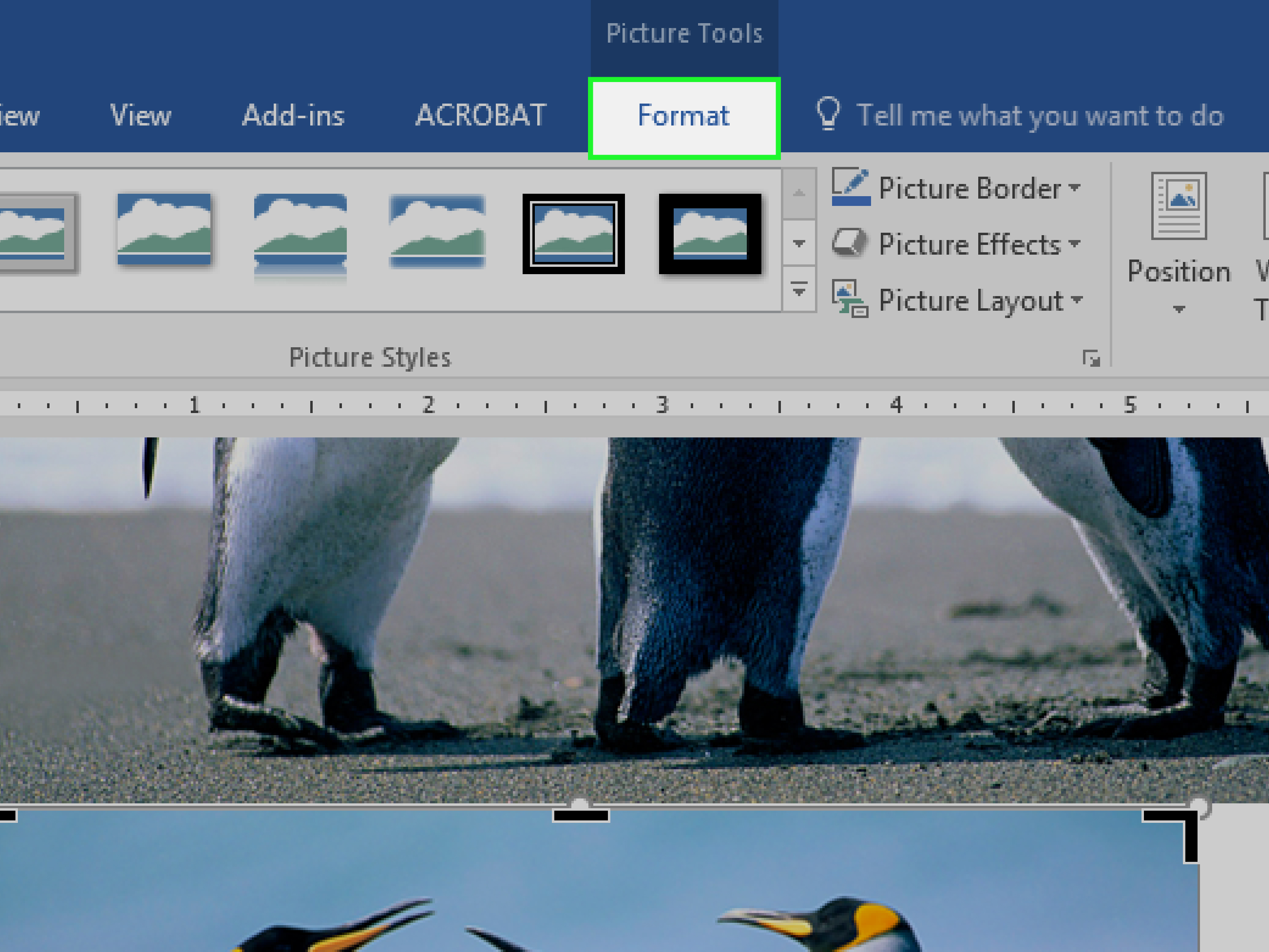
A picture is not the same as a shape, and a text box is not the same as an icon. Office treats these elements as separate object types, which means the tools you see can change depending on what you select. A photo usually opens Picture Format. A shape or text box usually opens Shape Format. That small detail matters because it tells you where the controls for crop, color, effects, alignment, grouping, and positioning are hiding.
For example, if you insert a logo into Word, clicking the logo should reveal picture tools. If you insert a callout box into PowerPoint, clicking that box should reveal shape tools instead. Same app, different object, different ribbon options. Office is helpful like that, but only after you click the right target.
Resize before you panic
Once the item is selected, you can start with the simplest edit: size. Dragging the corner handles usually helps preserve the image’s proportions, while dragging side handles can stretch or compress it. That is great when you want a banner shape, less great when your manager suddenly looks like they were photographed in a funhouse mirror.
If you need precision, use the size controls in the ribbon or the formatting pane instead of dragging with the mouse. This is especially useful in PowerPoint slides where consistency matters. If one headshot is 2.1 inches tall and the next is 2.38 inches tall, people may not know why the slide feels “off,” but they will feel it. Layouts are sneaky that way.
Open the formatting pane for more control
If the ribbon feels too limited, right-click the picture or object and open the formatting pane. This is where you often get the more detailed controls for color, corrections, size, properties, effects, and accessibility. Think of the formatting pane as the quieter, more serious cousin of the ribbon. It is less flashy, but it gets things done.
Before moving on, take one extra second to confirm whether your image is inline with text or floating in the document. In Word especially, that choice affects everything that comes next. Inline images behave like giant letters. Floating images behave like tiny rebels.
Step 2: Crop, Correct, and Style the Picture So It Actually Looks Intentional
Now that the right item is selected, it is time to edit the picture itself. This is the part most people mean when they say they want to edit pictures in MS Office. You are not just dropping in an image and hoping for the best. You are shaping it to fit the page, the slide, or the spreadsheet without making it look like a last-second afterthought.
Crop first, because clutter loves photos
One of the fastest ways to improve an image in Microsoft Office is to crop it. Cropping removes distractions and focuses attention on what matters. If your photo includes half a lamp, a random elbow, and three inches of empty wall, that is not “context.” That is visual noise.
To crop a picture, select it, go to Picture Format, and choose Crop. Then drag the crop handles inward from the sides, top, or bottom. If you want more control, use aspect ratio options to fit the image into a cleaner frame. This is handy for speaker headshots, product images, blog graphics, and presentation slides where consistency matters more than artistic mystery.
A practical example: say you are building a company bio page in Word. One employee photo is close-up, another is zoomed out, and a third includes what looks like an office ficus auditioning for a supporting role. Cropping them to the same general ratio instantly makes the page feel more polished.
Use corrections and color carefully
After cropping, look at the image quality. Office lets you make basic corrections to brightness, contrast, sharpness, and color. These tools are useful for fixing dull images, brightening something that looks gloomy, or toning down a picture that is screaming with saturation.
The trick is moderation. You want the image to look clearer, not like it just returned from a dramatic reality show makeover. A slight bump in sharpness can help a blurry photo look cleaner. A gentle brightness adjustment can rescue an underlit image. A color tweak can make a washed-out image look more presentable. But once you start stacking aggressive effects, your professional document can quickly start looking like a scrapbook from 2007.
Add styles, borders, and effects without overdoing it
Microsoft Office also lets you add borders, shadows, reflections, soft edges, bevels, and artistic effects. These can be helpful when you want an image to stand out on a slide or match a branded style. A subtle border around a product image in Word can make it look intentional. A light shadow behind a photo in PowerPoint can help it pop from the background.
But here is the golden rule: if every picture has a glow, a reflection, and a thick border, you do not have style. You have a ribbon accident. Use effects with a light touch, especially in business documents, reports, and educational materials.
If you go too far, do not worry. Office makes it fairly easy to reset picture formatting or swap in a different correction. That is one reason experimenting here is low-risk and high-reward.
Step 3: Arrange, Wrap, Rotate, and Group Objects So the Page Stops Fighting You
This is where editing objects in MS Office becomes truly useful. Pictures are only half the story. Shapes, text boxes, icons, charts, and SmartArt elements all count as objects, and learning to organize them properly can transform a messy document into something clean and easy to read.
Use text wrapping in Word instead of dragging blindly
If you work in Word, text wrapping is the difference between “I am in control” and “Why is this image teleporting across the page?” Once you select a picture, use Layout Options or Wrap Text to decide how nearby text behaves.
In Line with Text is the safest option for stability. The image behaves like text in a paragraph, which makes the layout more predictable and more accessible. Square and Tight are useful when you want text to flow around the image. Behind Text and In Front of Text can work for creative layouts, signatures, or watermarks, but they can also become troublemakers if you forget where the object went.
For example, if you are writing a newsletter in Word, a photo beside a short article usually works well with square wrapping. If you are building a formal academic document, inline placement is often cleaner and safer.
Align and distribute objects for a cleaner layout
PowerPoint and Excel users, this part is your best friend. If multiple objects look slightly crooked or uneven, do not eyeball them unless you enjoy avoidable suffering. Select the objects, then use the Align options to line them up left, right, center, top, middle, or bottom.
You can also align objects to the slide in PowerPoint, which is excellent for title graphics, icon rows, and comparison layouts. In Excel, alignment tools help when you are layering shapes, arrows, or callouts over a dashboard or report. The result is not just prettier. It is easier to scan, easier to understand, and more credible.
Office on the desktop gives you more flexibility here than some web versions, so if alignment feels limited in the browser, that is not your imagination. The desktop apps simply offer more arrangement muscle.
Rotate, flip, and group with purpose
Sometimes a layout needs one object nudged into position, rotated for emphasis, or flipped to fit the design. Office makes this easy. Select the object, go to the formatting tools, and use Rotate or Flip. This is especially useful for arrows, directional graphics, product images, and visual callouts.
Then there is grouping, one of the most underrated features in MS Office. If a picture, label, arrow, and shape belong together, group them. That way, you can move the whole cluster at once instead of nudging four different objects like you are solving a tiny design puzzle with your patience on fire.
Imagine a PowerPoint slide with a smartphone icon, a caption, and three arrows pointing to features. Group them together after arranging them. Now they behave like one object, which makes later edits dramatically easier.
Step 4: Optimize the File, Check Accessibility, and Finish Like a Pro
You have edited the picture. You have arranged the objects. The page no longer looks like a hostage situation. Great. Now finish the job properly.
Compress pictures to keep file sizes under control
Large images can make Word files sluggish, PowerPoint decks enormous, and email attachments weirdly dramatic. To fix that, use Compress Pictures. This reduces file size by lowering resolution or removing stored editing data. If you are sharing a presentation online or sending a document by email, this is a smart final step.
In practical terms, a presentation full of high-resolution photos can feel fine while you are editing it, then suddenly become impossible to upload anywhere sensible. Compressing images helps keep the file manageable without making everything look terrible. For most standard documents, screen or web-friendly resolution is plenty.
If you want to preserve the original high-quality version, save a separate copy before compressing aggressively. Future You will appreciate the backup.
Add alt text so your visuals are usable for everyone
Editing pictures in MS Office is not only about appearance. It is also about usability. If an image carries meaning, add alt text. Alt text gives people using screen readers a short description of what the picture or object communicates.
This matters in Word documents, PowerPoint slides, Outlook messages, and other Office files that may be shared widely. A chart, diagram, infographic, screenshot, or informative photo should not become invisible to part of your audience.
Keep alt text short, meaningful, and specific. Describe what matters in context. If the image is purely decorative, mark it as decorative instead. That way, assistive tools do not waste time announcing something that adds no information.
Run one final visual check
Before you save, zoom out and look at the whole page or slide. Are the images aligned? Are the shapes consistent? Is the wrapping clean? Do any effects feel heavy-handed? Does the design look balanced?
This quick review catches more problems than people expect. Something that looked fine at 150 percent zoom can suddenly reveal itself as slightly crooked, oddly spaced, or visually too loud when viewed at normal size. Give yourself sixty seconds for that final scan. It is cheap insurance.
Final Thoughts
Learning how to edit pictures and objects in MS Office is one of those skills that seems small until you realize how often you need it. Reports, class projects, proposals, resumes, presentations, newsletters, spreadsheets, marketing drafts, internal documentation, and quick team updates all benefit from better image handling.
The real secret is not memorizing every single button in Microsoft Office. It is understanding the four-part workflow. First, select the right element and open the correct formatting tools. Second, crop and style the image so it supports the content. Third, arrange objects intentionally with wrapping, alignment, rotation, and grouping. Fourth, optimize the file and make sure the result is accessible and shareable.
Once you work through those four steps a few times, editing in Word, PowerPoint, and Excel stops feeling random. It becomes predictable. And when Office becomes predictable, you get your time back, your layouts improve, and your documents stop looking like they were assembled during a caffeine emergency five minutes before a deadline.
Real-World Experiences Editing Pictures and Objects in MS Office
One reason this topic stays useful is that almost everyone who works on a computer eventually runs into it. A student is formatting a paper in Word and needs one clean image beside a paragraph. A sales manager is building a PowerPoint deck and wants product screenshots to line up neatly. A small business owner is creating a flyer with shapes, icons, and a logo. Different jobs, same headache: the pictures and objects do not automatically behave the way you want.
A common experience in Word is inserting a picture and then watching the surrounding text react like it has seen a ghost. Suddenly the paragraph spacing looks strange, the image jumps to the next page, and the caption is nowhere near the photo. That is usually the moment people discover text wrapping. Once they switch from the default behavior to a more suitable layout option, everything becomes much easier. It feels less like wrestling a document and more like guiding it.
PowerPoint brings a different kind of chaos. The usual issue is inconsistency. One image is slightly too high, another is too wide, and a third is floating a few pixels off center like it is making a personal statement. The first time someone uses alignment tools instead of manual dragging, it is almost magical. Suddenly the slide looks cleaner, more professional, and much more trustworthy. Audiences may not say, “Ah yes, excellent object distribution,” but they absolutely feel the difference.
Excel is the sleeper hit in this conversation. People often think of Excel as cells and formulas only, but it can handle pictures, shapes, and layered callouts surprisingly well. The challenge is that once images and objects enter a spreadsheet, they can pile up quickly. An arrow overlaps a chart title. A text box drifts over a number. A shape hides part of a legend. Learning to bring objects forward, send them backward, align them, and group them can save a dashboard from turning into visual spaghetti.
Another very real experience is over-editing. Office makes it easy to add borders, reflections, color changes, artistic effects, and shape treatments, so users sometimes go on a small design adventure and return with something wildly dramatic. Most people do this once. Then they discover that a simpler image with better crop, clean spacing, and one subtle effect usually looks stronger than a heavily edited one. It is a classic case of “just because the button exists does not mean the button should be used today.”
Accessibility also tends to become real only after someone shares a file more widely. A document that looked perfectly fine on one laptop may be confusing to someone using assistive technology if images have no alt text or decorative objects are announced for no reason. Many users do not think about this at first. Then they run the Accessibility Checker, fix the visuals, and realize that good editing is not only about appearance. It is also about clarity and inclusion.
In the end, the best experience with MS Office picture editing usually comes from small habits, not giant tricks. Select carefully. Crop ruthlessly. Align intentionally. Group related items. Compress when needed. Add alt text when the image matters. Those habits make everyday Office work smoother, faster, and much less annoying. And frankly, anything that reduces document-related annoyance deserves at least mild applause.