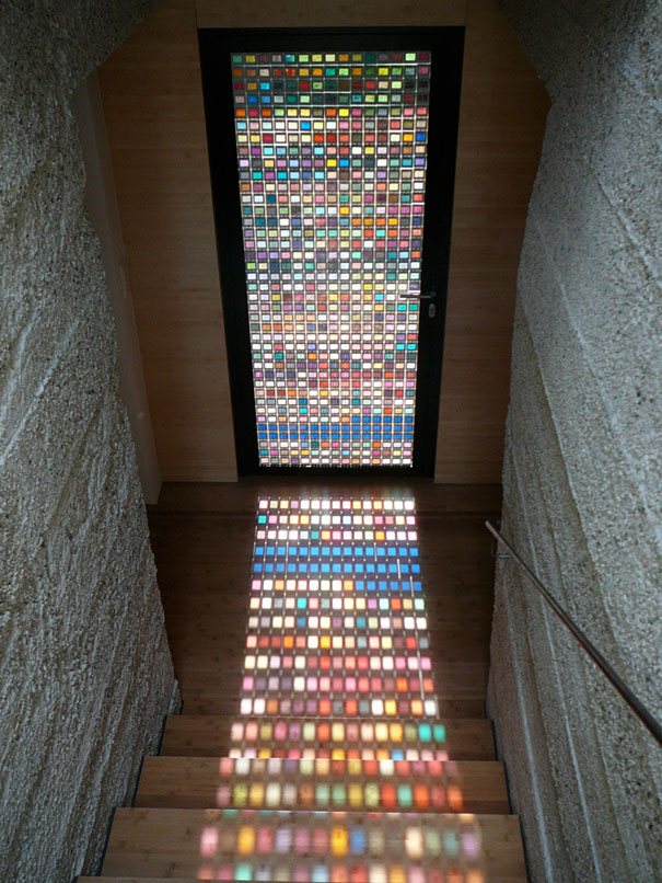

A stained glass door made of Pantone swatches sounds like the sort of idea that appears after a designer drinks one strong espresso, stares at a color deck for too long, and says, “Yes, this belongs in a doorway.” Yet the concept is not only real; it is surprisingly elegant. The best-known example is the Pantone-inspired door associated with Italian architect Armin Blasbichler’s home, Der Muslhaufen, in South Tyrol, Italy. It looks like a glowing mosaic, but instead of traditional stained glass made with colored glass pieces and lead came, it uses the visual language of Pantone swatches to turn daylight into a grid of luminous color.
This project has become a favorite among design lovers because it sits at the intersection of architecture, graphic design, color theory, DIY imagination, and pure visual delight. It is both practical and playful. It separates spaces like a door should, but it also performs like an artwork, changing with the sun, the season, and the mood of the room. In a world where many interiors are still recovering from years of beige-on-beige minimalism, a Pantone swatch door feels like someone finally opened the windows and invited the rainbow inside.
What Is a Pantone Swatch Stained Glass Door?
A Pantone swatch stained glass door is a door that uses small color blocks inspired by Pantone color chips or Pantone swatch imagery to create a stained-glass-like effect. The original design often referenced online is not traditional stained glass in the historic sense. Instead, it is a clever architectural feature made from hundreds of color squares arranged in a grid, protected by glass, and framed in wood. When sunlight passes through or across the surface, the door casts a lively pattern of color onto nearby walls, floors, and stairs.
The brilliance of the idea lies in its simplicity. Pantone swatches are designed to communicate color with precision. Stained glass is designed to transform light through color. Put the two together, and suddenly a utilitarian door becomes a living color chart. It is like walking through a designer’s notebook, except the notebook is glowing and politely asking you not to slam it.
The Story Behind the Famous Pantone Swatch Door
The most widely circulated version of the stained glass door made of Pantone swatches is credited to architect Armin Blasbichler. The door appears in Der Muslhaufen, his imaginative home in the South Tyrol region of Italy. The house itself is already unusual. Inspired by local log piles, it combines old and new materials, blending rustic references with modern architectural thinking. Within that setting, the Pantone-style door feels perfectly at home: part design experiment, part family-house detail, part “why doesn’t every hallway have one of these?” moment.
Design coverage has described the door as being made with hundreds of colorful squares, often identified as slide images or framed swatch references, placed behind or between glass and set into a wood frame. The result resembles stained glass, but it also carries the unmistakable grammar of graphic design: tidy rows, square modules, readable color notes, and a satisfying sense of order. It is not random color chaos. It is organized joy.
Why Pantone Makes the Idea So Appealing
Pantone is famous because it gives designers, printers, brands, manufacturers, and product teams a shared language for color. Instead of saying “make it kind of tomato red but not too ketchup,” a designer can specify a Pantone color code and communicate a more exact target. That standardization matters in printing, packaging, fashion, interiors, product design, and branding. Color may feel emotional, but in professional design, it also has to be repeatable.
That is why Pantone swatches carry such strong visual authority. They are not just pretty rectangles. They suggest accuracy, taste, process, and creative decision-making. When used in a door, those familiar swatches become more than samples. They become a decorative system. The viewer recognizes the format immediately, even if they cannot name every shade. It feels like stepping into the backstage area of design, where the colors are still lined up and waiting for their big performance.
Is It Real Stained Glass?
Technically, nonot if we define stained glass in the traditional way. Classic stained glass uses pieces of colored glass, often joined with lead came or copper foil. Historically, color in glass could be created with metallic oxides or other mineral-based ingredients during production, then cut and assembled into windows, panels, lamps, or decorative features.
The Pantone swatch door creates a stained-glass effect rather than using traditional stained-glass construction. That distinction matters for accuracy, but it does not make the project less impressive. In fact, the “fake-but-fabulous” quality is part of its charm. It borrows the emotional impact of stained glasscolor, light, atmosphereand combines it with the language of modern print and graphic design. It is not pretending to be a cathedral window. It is more like a graphic designer’s love letter to a cathedral window, mailed with very neat typography.
Why the Door Works So Well Visually
1. The Grid Creates Calm
Color can become overwhelming quickly, especially when many shades are placed together. The grid keeps everything under control. Each square has its own space, so the viewer can enjoy dozens or hundreds of colors without feeling attacked by a rainbow confetti cannon. The structure gives the eye a path to follow.
2. The Light Adds Movement
A painted door looks the same unless the room lighting changes dramatically. A Pantone swatch glass door shifts throughout the day. Morning light may make yellows and pale greens feel soft and fresh. Afternoon sun may intensify oranges, reds, and magentas. Evening light may turn the whole surface into a quieter, moodier composition. The door is never completely static.
3. The Pantone Labels Add Personality
Many Pantone-inspired designs preserve the swatch-label idea, which adds a subtle layer of humor and intelligence. A color block is beautiful on its own, but a labeled color block tells you it has a name, a place, and a purpose. It turns the door into a catalog of tiny decisions. For design nerds, this is basically interior design catnip.
Design Lessons From a Stained Glass Door Made of Pantone Swatches
This door is more than a clever object. It offers useful lessons for anyone interested in home decor, architecture, and creative reuse.
Color Needs a System
The project works because the colors are contained within a clear structure. If the same shades were splashed randomly across a door, the result might feel messy. In a grid, they feel intentional. This is a valuable principle for interiors: bold color becomes easier to live with when it has boundaries. A colorful bookshelf, tiled backsplash, gallery wall, or textile panel can all benefit from the same logic.
Small Materials Can Make Big Statements
Pantone swatches are small. Slides are small. Color chips are small. Yet when repeated, they create architectural impact. This is the magic of modular design. Repetition turns humble pieces into a feature wall, a light screen, or a focal point. You do not always need one large dramatic object. Sometimes you need 585 tiny ones behaving nicely in rows.
Functional Objects Can Be Art
A door does not have to be visually silent. It can divide rooms, control light, preserve privacy, and still make people stop mid-sentence. The Pantone swatch door reminds us that the most ordinary parts of a homedoors, stair risers, cabinet fronts, windows, partitionscan become the most memorable.
How to Create a Pantone-Inspired Stained Glass Door at Home
A true architectural version should be planned carefully, especially if glass, weight, hinges, and safety are involved. However, the concept can inspire several home-friendly versions, from temporary window panels to semi-permanent decorative doors.
Option 1: Use Transparent Color Film
For renters or beginners, transparent adhesive window film is the easiest route. Cut the film into equal squares and arrange them in a grid on a glass door or interior window. You can create a Pantone-inspired look without using actual Pantone materials. This approach is affordable, removable, and much less intimidating than handling custom laminated glass.
Option 2: Create Printed Swatch Inserts
If you have a divided-light door, you can print color swatch designs on translucent paper or film and place them behind each glass pane. Use a consistent template with a color block and a label area. For a personal touch, name the colors after things in your life: “Grandma’s Lemon Pie,” “Lost Sock Blue,” or “Tax Season Gray.” The last one may not be cheerful, but it will be honest.
Option 3: Make a Hanging Light Panel
Instead of altering a door, build a lightweight hanging panel with acrylic sheets and transparent color squares. Hang it in front of a sunny window. This gives you the colored-light effect without modifying architecture. It is also easier to move when you redesign the room or realize you have accidentally created a shrine to hot pink.
Option 4: Commission a Custom Glass Feature
For a polished, long-lasting result, work with a glass professional, stained glass artist, or architectural fabricator. A custom piece can use laminated safety glass, printed interlayers, or actual colored glass depending on the desired look and budget. This is the best route for doors that will be used frequently, especially in homes with children, pets, or enthusiastic adults who open doors like they are making an entrance in a soap opera.
Safety and Practical Considerations
A glass door must be safe before it is beautiful. For real doors, especially full-size interior or exterior doors, use appropriate safety glazing such as tempered or laminated glass according to local building requirements. Laminated glass is often valued because it can hold together when broken, while tempered glass is designed to break into smaller, less dangerous pieces than ordinary glass. The right choice depends on the location, door type, and code requirements.
Durability also matters. Paper swatches can fade in direct sunlight, especially if they are not protected by UV-resistant glazing or film. Adhesives can bubble. Printed colors can shift. Moisture can damage paper layers. If the door is near a bathroom, kitchen, or exterior entry, materials should be chosen with humidity and temperature changes in mind. A Pantone-inspired door should look joyful, not like it survived a dishwasher cycle.
Where This Door Style Works Best
A stained glass door made of Pantone swatches is ideal for spaces that can handle a visual focal point. It works especially well in studios, creative offices, craft rooms, children’s playrooms, modern homes, stair landings, sunrooms, and interior hallways with natural light. It can also be a smart solution for spaces that need partial privacy without blocking brightness.
In a minimalist home, it can become the single colorful feature that prevents the room from feeling too sterile. In an eclectic home, it can join the party without looking out of place. In a creative workspace, it can reinforce a brand identity centered on color, design, or visual storytelling. For a graphic designer, illustrator, photographer, printer, or interior stylist, it is practically a personality test in door form.
Color Psychology: Why It Feels So Good
Color affects how we experience a space. Warm shades such as red, orange, and yellow can feel energetic, social, and stimulating. Cool shades such as blue, green, and violet often feel calmer or more spacious. Neutrals can create balance and breathing room. A Pantone swatch door offers all of these effects at once, but because the colors are broken into small squares, no single shade dominates completely.
This balance is one reason the door feels exciting rather than exhausting. It gives the brain variety, but the grid gives the brain order. That combination is powerful. It satisfies both the part of us that wants surprise and the part that wants everything lined up properly. In short, it is a party hosted by a very organized person.
Modern Stained Glass and the Return of Character
Stained glass has been enjoying renewed attention in modern interiors. Designers and homeowners are rediscovering its ability to add character, privacy, color, and atmosphere without relying on more furniture or wall decor. Unlike a framed print, stained glass changes with light. Unlike curtains, it can preserve brightness while adding pattern. Unlike paint, it can project color into the room itself.
The Pantone swatch door belongs to this larger movement, even though it uses a graphic-design twist. It shows that stained glass does not have to look medieval, church-like, or old-fashioned. It can be modular, witty, contemporary, and deeply personal. It can celebrate the beauty of color systems while still making a home feel warmer and more human.
Specific Design Examples and Variations
Imagine a home office door arranged in gradients: blues at the top, greens in the middle, warm oranges and reds near the bottom. The effect would feel calm from a distance but rich up close. For a children’s room, the colors could be brighter, with playful custom labels such as “Rocket Red,” “Puddle Blue,” and “Macaroni Yellow.” For a sophisticated dining room, the palette could lean jewel-toned with emerald, sapphire, garnet, amber, and smoky plum.
A boutique could use brand colors mixed with seasonal palettes. A print shop could create a door using CMYK-inspired tones. A design school could invite students to contribute one square each, turning the installation into a collaborative color archive. Even a small apartment could borrow the idea through a transom window, cabinet insert, or room divider. The concept scales beautifully because it is based on units.
Common Mistakes to Avoid
Using Too Many Dark Colors
Dark colors can be dramatic, but too many may block light and muddy the stained-glass effect. Mix deep shades with lighter tones so the panel can glow.
Skipping the Layout Plan
Do not start sticking squares randomly unless you enjoy regret as a hobby. Lay out the entire design first. Take photos. Step back. Rearrange. Then commit.
Ignoring the Room Around It
The door should interact with the surrounding space. If the room already has bold wallpaper, patterned rugs, and neon furniture, the Pantone door may need a calmer palette. If the room is neutral, the door can be more adventurous.
Choosing Cheap Materials for a Permanent Door
A temporary craft project can use budget materials. A real door should not. Invest in proper glass, stable printing, UV protection, and professional installation when safety or longevity is involved.
Experience Notes: Living With the Idea of a Pantone Swatch Door
The most interesting thing about a stained glass door made of Pantone swatches is how quickly it changes the emotional rhythm of a space. A plain door is usually something we pass through without noticing. A Pantone-inspired door asks for a pause. You notice the morning light. You notice how a yellow square lands on the floor like a tiny spotlight. You notice that the blue corner feels quieter in the afternoon. Suddenly, a hallway is not just a hallway; it is a small daily exhibition.
From a homeowner’s perspective, the experience is less about showing off and more about discovering small moments. Guests may comment on it immediately, because colorful light has a way of making adults behave like children in a candy store. But the owner gets the better reward: seeing how the door behaves on ordinary days. Cloudy weather softens it. Direct sun sharpens it. Evening light turns it into a darker mosaic. The same object keeps offering new versions of itself.
There is also something satisfying about turning a design tool into a domestic object. Pantone swatches usually live in studios, print shops, and brand meetings. They are used for decisions, approvals, and sometimes tiny arguments over whether a red is too blue or a blue is too sad. In a door, those swatches are freed from the pressure of perfection. They no longer have to match a logo or satisfy a client. They simply get to be beautiful.
For DIY enthusiasts, the project can be both thrilling and humbling. Cutting hundreds of equal squares sounds easy until square number 47 starts looking like a parallelogram with commitment issues. The layout process requires patience. Colors that look wonderful in a stack may clash when placed side by side. Some shades disappear when backlit. Others become surprisingly intense. The best approach is to test small sections near the actual light source before building the full design.
Maintenance is another real-life factor. A glass surface with many visual details can hide fingerprints better than clear glass, which is a nice bonus for households with kids. However, dust and smudges still show when sunlight hits the door at an angle. If the design uses film or printed inserts, edges should be checked occasionally for peeling or fading. A permanent installation deserves higher-quality materials, because sunlight is beautiful but also a relentless little editor.
The door also teaches a broader design lesson: joy does not have to be loud to be powerful. A Pantone swatch door is colorful, yes, but it is also orderly, architectural, and useful. It proves that playful design can still be mature. It can make a home feel creative without turning it into a theme park. It can be whimsical without shouting, “Look at me, I own three glue guns and no fear.”
In the end, living with a Pantone-inspired stained glass door would feel like living with a changing color calendar. It marks time through light. It turns routine movement into a visual experience. It gives the room a signature. And perhaps most importantly, it reminds us that good design does not always require rare materials or complicated forms. Sometimes it begins with a simple question: what if a door could behave like a color chart and a window at the same time?
Conclusion
A stained glass door made of Pantone swatches is a brilliant example of how design can transform the ordinary. It takes a familiar object, the humble door, and gives it the drama of stained glass, the precision of graphic design, and the delight of sunlight passing through color. Whether interpreted as an architectural artwork, a DIY inspiration, or a modern stained-glass alternative, the concept continues to fascinate because it feels both clever and emotionally generous.
The lesson is simple: color belongs in the places we use every day. Not only on gallery walls. Not only in fabric samples. Not only inside a designer’s fan deck. A Pantone swatch door proves that color can live in the threshold between rooms, catching the light, changing the mood, and making even a quick walk down the hallway feel a little more magical.