
Note: This article is for educational purposes only and should not be treated as personal financial advice.
Introduction: A Cleaner Financial Dashboard for a Messy Financial Life
In 2021, Personal Capital rolled out a refreshed dashboard experience designed for one very modern problem: people have money scattered everywhere. A checking account here, a 401(k) over there, a brokerage account hiding in the corner, three credit cards acting like tiny chaos machines, and maybe a mortgage that politely reminds you it will be around longer than some houseplants.
The big promise of the Personal Capital dashboard was simple: bring the full financial picture into one place. Instead of logging into five banks, two investment platforms, and one retirement account that still looks like it was designed during the dial-up era, users could open one dashboard and quickly see net worth, cash flow, investment balances, retirement progress, market movement, and spending behavior.
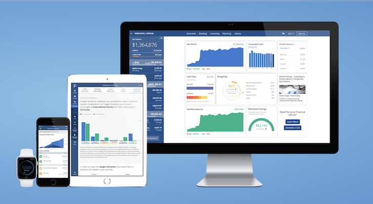
The new dashboard features for 2021 were not just cosmetic. Yes, the layout became cleaner and easier to scan, but the deeper value was in how the dashboard surfaced key financial signals faster. Personal Capital made widgets more prominent, improved the sidebar, added clearer date ranges, emphasized net worth movement, and made it easier to jump from a summary card into a detailed planning tool.
For users who like spreadsheets, the dashboard felt like a friendly assistant. For users who hate spreadsheets, it felt like a small financial miracle wearing a clean interface.
What Was Personal Capital in 2021?
Personal Capital was a digital wealth management and personal finance platform known for combining free money-tracking tools with optional paid advisory services. By 2021, it had already become popular among investors, high-income professionals, retirees, and anyone who wanted to understand more than just “how much did I spend on takeout this month?”
Unlike basic budgeting apps, Personal Capital leaned heavily into net worth tracking, portfolio analysis, retirement planning, fee visibility, and investment allocation. That made it especially useful for people whose financial lives included brokerage accounts, IRAs, 401(k)s, real estate, loans, and cash accounts.
In 2020, Empower acquired Personal Capital, giving the platform more backing from a major retirement services provider. In 2021, the dashboard improvements reflected that larger direction: more integrated planning, cleaner navigation, and faster access to financial tools that could help users make smarter long-term decisions.
Personal Capital New Dashboard Features for 2021
The 2021 update focused on usability. Personal Capital did not reinvent personal finance, because assets minus liabilities still equals net worth, no matter how fancy the font is. Instead, the platform reorganized the experience so users could get answers faster.
1. Wider Sidebar for Easier Account Viewing
One of the most noticeable dashboard changes was the updated left sidebar. Personal Capital made the account bar wider, which helped users view linked accounts more comfortably. This mattered because the sidebar was the command center for checking balances across bank accounts, investment accounts, credit cards, mortgages, and loans.
For users with multiple accounts, a narrow sidebar could feel like trying to read a grocery receipt through a keyhole. The wider layout made the experience smoother, especially when scanning account names and balances quickly.
The dashboard margins were also reduced so information could fit better inside smaller browser windows. That was a practical improvement for users working from laptops, tablets, or split-screen setups. In other words, the new design understood that not everyone manages money from a giant monitor in a minimalist home office with a fiddle-leaf fig tree.
2. Auto-Hide Sidebar for Smaller Screens
Another helpful update was the auto-hide sidebar. If the browser window became too small, the sidebar could hide automatically. Users could hover over it to expand it or use a pin icon to keep it visible during the current session.
This small design choice improved the dashboard experience because it gave users more control over screen space. Financial dashboards can easily become cluttered. By allowing the sidebar to disappear when needed, Personal Capital made the main content area feel less crowded and more focused.
3. 90-Day Graphs Behind Account Totals
The 2021 dashboard added 90-day graphs behind account totals in the sidebar sections. This gave users a quick visual sense of account movement over time.
Instead of seeing only a static number, users could see whether an account had been rising, falling, or wobbling around like a shopping cart with one bad wheel. This was especially useful for investment accounts, where short-term volatility can make balances feel dramatic. A small trend line helped provide context.
For example, if a brokerage account was down for the day but still up over 90 days, the graph could reduce panic. If cash balances were steadily shrinking, the trend line could gently whisper, “Maybe check those subscriptions.”
4. Faster Add-Account Buttons
Personal Capital also added plus icons at the top and bottom of the sidebar to make it easier to add accounts. This may sound minor, but account aggregation only works well when users connect everything.
A dashboard that excludes one major credit card or retirement account is like a weather report that forgets clouds. By making account linking more accessible, Personal Capital encouraged users to build a more complete financial picture.
New Dashboard Widgets: The Real Star of the Update
The biggest improvement in the Personal Capital dashboard for 2021 was the use of individual widgets. These widgets made the homepage more useful by turning it into a financial control panel rather than a static summary page.
Each widget acted like a shortcut to a deeper tool. Users could click a section header and jump directly to the corresponding feature. This design reduced friction and made the dashboard easier to use for quick check-ins.
Net Worth Widget
The net worth widget was one of the most important dashboard features. Net worth is calculated by subtracting liabilities from assets. In plain English: what you own minus what you owe.
The updated dashboard made net worth more prominent. The chart orientation changed, the font size increased, and Personal Capital added an asset and liability bar underneath. This made the widget easier to understand at a glance.
For long-term financial planning, net worth is often more meaningful than income alone. A person can earn a high salary and still be financially fragile if debt and spending are out of control. On the other hand, someone with moderate income and steady saving may quietly build impressive wealth over time. The net worth widget made that bigger picture visible.
Cash Flow Widget
The cash flow widget compared income with spending and highlighted what users saved over the past month. This is where the dashboard moved from “How rich do I look on paper?” to “Where did the money actually go?”
Cash flow is the heartbeat of personal finance. Positive cash flow means money is left over after expenses. Negative cash flow means spending is outrunning income, which is usually not a long-term strategy unless your financial plan involves winning a game show.
By showing inflows and outflows visually, the dashboard helped users identify patterns. A high-spending month became easier to investigate. A strong saving month became easier to celebrate. And recurring expenses became harder to ignore.
Budgeting Widget
The budgeting widget categorized spending by type and gave users both a high-level overview and access to individual transactions. Users could also set a monthly budget target.
This feature was especially useful for people who wanted a lightweight budgeting system without building a complicated spreadsheet. It did not force users into a rigid envelope budgeting method. Instead, it provided a clear picture of spending behavior.
For example, a user might discover that restaurant spending doubled in one month. The dashboard would not judge. It would simply show the numbers, perhaps while silently wondering how many tacos were involved.
Portfolio Balance Widget
The portfolio balance widget summarized investment accounts and displayed a total balance. For investors with multiple accounts, this was a major convenience.
Many people have a workplace 401(k), a Roth IRA, a taxable brokerage account, and maybe an old retirement account from a job they left years ago. Without aggregation, understanding total portfolio value can require several logins and a calculator. The Personal Capital dashboard simplified that process.
The portfolio balance widget also supported better decision-making. Investors could quickly see whether their investment assets were growing, shrinking, or concentrated in one account type.
Investable Cash Widget
The investable cash widget was a newer feature that totaled available cash across bank and investment accounts. The purpose was to show how much money might be available to invest.
This was useful because cash can hide in plain sight. A user might have money sitting in checking, savings, or brokerage cash positions without realizing how much idle cash they had accumulated. The widget gave that number a spotlight.
Of course, not every dollar of cash should be invested. Emergency funds, upcoming bills, and short-term goals matter. But seeing investable cash helped users ask better questions: Is this cash intentional? Is it waiting for an opportunity? Or did it just wander off and take a nap?
Market Movers Widget
The market movers widget helped users track how their portfolio performed relative to broader markets. Personal Capital used a feature known as the You Index, which aggregated portfolio performance into a single number.
This was a smart idea because market headlines can be misleading. The S&P 500 might be up, but a user’s portfolio could be down if they held a different mix of stocks, bonds, international funds, or sector-specific investments. The market movers widget personalized market context.
Instead of asking, “What did the market do today?” users could ask, “What did my money do today?” That is a much more useful question.
Market and Blog Commentary Widget
The updated dashboard also included market and blog commentary. Users could receive weekly market recaps, outlooks, and educational content.
This turned the dashboard into more than a tracking tool. It became a place to learn, reflect, and connect current events to personal financial decisions. For long-term investors, that kind of context can help reduce emotional decision-making during volatile periods.
Retirement Savings Widget
The retirement savings widget pulled information from the Retirement Planner tool and summarized progress toward retirement goals. This was one of the most valuable widgets for users focused on financial independence or traditional retirement.
Retirement planning can feel abstract because it involves future income, inflation, investment returns, Social Security, spending assumptions, health care costs, and life expectancy. That is a lot to think about before coffee.
The widget gave users a quick snapshot instead of forcing them to run a full retirement analysis every time they logged in. It helped keep long-term goals visible during everyday financial check-ins.
Customizable Date Ranges
Another important dashboard improvement was the move from rolling date ranges to individual date ranges that users could customize. This change applied across tools such as Budgeting and Net Worth.
Custom date ranges matter because financial questions are rarely one-size-fits-all. A user might want to compare this month to last month, review spending since a job change, measure net worth growth since the start of the year, or analyze expenses during a specific vacation period.
The ability to hover over graphs and see net worth on a specific day also added precision. Personal Capital also showed one-day changes near the total, helping users understand short-term movement without digging through multiple screens.
Why the 2021 Dashboard Update Mattered
The 2021 Personal Capital dashboard update mattered because it made financial tracking faster, more visual, and more actionable. The best financial software does not merely display numbers. It helps users understand what those numbers mean.
By improving widgets, navigation, graphs, and date ranges, Personal Capital reduced the gap between information and action. Users could notice a cash flow problem, click into the cash flow tool, review transactions, adjust a budget target, and return to the dashboard with a clearer plan.
The same applied to investing. A user could check portfolio balance, compare market movement, review allocation, and evaluate retirement progress. The dashboard encouraged a habit of regular financial awareness.
Who Benefited Most From the New Personal Capital Dashboard?
Long-Term Investors
Investors benefited because the dashboard made portfolio balances, market movement, asset allocation, and retirement progress easier to monitor. Personal Capital was especially strong for people with multiple investment accounts.
High-Net-Worth Households
Households with complex finances benefited from account aggregation. When assets include retirement accounts, taxable investments, cash, property, and liabilities, a unified dashboard can save time and reduce confusion.
Budget-Conscious Users
Although Personal Capital was not purely a budgeting app, the cash flow and budgeting widgets helped users understand spending patterns. It worked well for people who wanted budget visibility without micromanaging every dollar.
Retirement Planners
Users focused on retirement benefited from the retirement savings widget and Retirement Planner integration. Seeing retirement progress directly on the dashboard helped keep long-term goals from disappearing behind short-term expenses.
Pros and Cons of the 2021 Dashboard Experience
Pros
The dashboard was clean, visual, and easy to scan. It brought net worth, spending, investments, and retirement planning into one place. The new widgets made key tools easier to access. Customizable date ranges improved analysis. The sidebar updates made account tracking more practical.
Cons
The platform still depended on accurate account syncing. If a bank connection broke, the dashboard could become incomplete. Budgeting features were useful but not as detailed as dedicated budgeting apps. Users also needed to be comfortable linking sensitive financial accounts to a third-party platform.
Personal Capital Dashboard vs. Traditional Spreadsheets
Spreadsheets are powerful, flexible, and beloved by people who enjoy formulas the way others enjoy chocolate cake. But they require maintenance. Users must update balances, categorize transactions, and build charts manually.
The Personal Capital dashboard automated much of that work. By syncing accounts and updating data, it gave users a more current picture with less manual effort. For many households, that convenience was the difference between tracking finances consistently and ignoring them until tax season arrived wearing steel-toed boots.
However, spreadsheets still offered more customization. The ideal setup for some users was combining both: Personal Capital for automated tracking and a spreadsheet for custom planning, projections, or personal notes.
Practical Examples of How Users Could Use the Dashboard
Example 1: Spotting Lifestyle Creep
A user receives a raise but notices that cash flow has not improved. By checking the cash flow and budgeting widgets, they discover higher spending on restaurants, subscriptions, and shopping. The dashboard helps them catch lifestyle creep before it becomes normal.
Example 2: Preparing to Invest Idle Cash
A household sees a large investable cash balance. After confirming their emergency fund is healthy and short-term expenses are covered, they decide to dollar-cost average part of the excess into a diversified portfolio.
Example 3: Reviewing Retirement Progress
A couple checks the retirement savings widget and sees they are slightly behind their target. They increase monthly contributions and use the Retirement Planner to test different retirement ages and savings rates.
Example 4: Understanding Market Volatility
During a volatile week, a user checks the market movers widget and sees how their actual portfolio performed compared with broad indexes. Instead of reacting to headlines, they review their allocation and stay focused on the long term.
of Experience: What It Feels Like to Use a Dashboard Like This
Using a financial dashboard like Personal Capital in 2021 felt like turning on the lights in a room you had been cleaning with a flashlight. Before using an aggregated dashboard, many people handled money in fragments. They checked a checking account on Monday, a credit card on Wednesday, investments after the market closed, and retirement accounts whenever a quarterly statement arrived. The problem was not lack of information. The problem was that the information lived in separate rooms and refused to talk to each other.
The first real benefit of the new dashboard experience was emotional clarity. Seeing net worth in one place can be motivating, humbling, or occasionally rude. But it is useful. A single number can reveal whether financial decisions are moving in the right direction. Even when the number is not where someone wants it to be, clarity beats guessing. Guessing is how people end up saying, “I think we are doing fine,” while their credit card balance is quietly building a vacation home.
The second benefit was habit formation. A dashboard with clean widgets encourages quick check-ins. Users do not need to spend an hour reviewing every transaction. They can open the dashboard, scan net worth, cash flow, portfolio balance, and retirement savings, then decide whether anything needs attention. This creates a weekly money ritual that feels manageable instead of exhausting.
The third benefit was pattern recognition. A one-time expensive month may not be a crisis. A three-month trend of shrinking cash flow deserves attention. The sidebar graphs and widget summaries made patterns easier to notice. This matters because personal finance is rarely ruined by one coffee, one dinner, or one impulse purchase. It is usually shaped by repeated habits that become invisible. A good dashboard makes the invisible visible.
The investment features also created a better sense of control. Many investors know their account balances but do not know their overall allocation, fee exposure, or how their portfolio behaves compared with the market. The dashboard helped connect those dots. For long-term investors, that kind of visibility can prevent overreaction. If the market drops, users can look at their own numbers instead of letting dramatic headlines drive decisions.
There was also a practical time-saving benefit. Manually updating a net worth spreadsheet can be satisfying, but it can also become a chore. Personal Capital reduced that friction. The dashboard could not make financial decisions for users, but it could gather the data faster. That left more time for actual thinking: Should I save more? Should I pay down debt? Is my cash sitting idle? Am I still on track for retirement?
The experience was not perfect. Account syncing could be annoying, and users still needed to review categories for accuracy. No dashboard can replace judgment. But the 2021 Personal Capital dashboard made the financial review process easier, cleaner, and more likely to happen. And in personal finance, consistency is often the secret sauce. Not glamorous. Not viral. Just powerful.
Conclusion: A Smarter Dashboard for Better Financial Awareness
The Personal Capital new dashboard features for 2021 made the platform more useful for everyday financial management and long-term wealth tracking. The wider sidebar, auto-hide behavior, 90-day graphs, faster account linking, improved widgets, and customizable date ranges all served the same goal: helping users understand their money faster.
The dashboard was especially valuable because it connected budgeting, investing, cash flow, net worth, and retirement planning. That combination made it stronger than a basic spending tracker and more approachable than a full financial planning software suite.
For users who wanted a clearer view of their financial life, the 2021 dashboard update was a meaningful step forward. It did not magically make people richer. Sadly, no widget has yet discovered how to turn unused gym memberships into index funds. But it did make financial awareness easier, and awareness is where better decisions begin.
SEO Tags