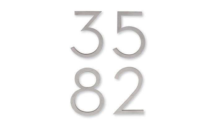

House numbers are the tiny front-door detail that quietly does a heroic amount of work. They help guests find you, delivery drivers stop circling like confused satellites, and emergency responders identify your home quickly when every second matters. They also influence curb appeal more than most people expect. A fresh set of address numbers can make an older entry look intentional, a plain porch feel polished, and a modern facade look like it finally remembered to put on shoes.
The best house numbers are not just pretty digits. They are legible from the street, proportioned to your home, made from weather-resistant materials, and mounted where people can actually see them. That sounds obvious, yet many homes still hide their numbers behind shrubs, porch shadows, holiday wreaths, or fonts so curly they look like they were written by a Victorian ghost with a fountain pen.
This guide rounds up 10 easy pieces of advice for choosing house numbers that look good, work hard, and do not require a design degree or a weekend-long argument with a drill. From floating metal numbers to classic brass plaques, from mailbox updates to illuminated address signs, these ideas are practical, stylish, and friendly to real American homes.
Why House Numbers Matter More Than You Think
House numbers are part safety feature, part design accessory, and part hospitality signal. Building and fire codes in many U.S. communities generally require address identification to be visible from the street, with characters that contrast against the background. A common benchmark is a minimum character height of about four inches with a clear stroke width, though local requirements can vary. That means your charming two-inch ceramic number may look adorable on Instagram but fail the “can a firefighter see it from the road at night?” test.
Visibility is the first rule. Style comes right after it. A good address display should feel connected to the home’s architecture. A midcentury ranch can carry slim sans-serif aluminum numbers beautifully. A craftsman bungalow may look better with bronze, blackened metal, or enamel. A farmhouse entry can handle oversized matte black numbers without looking like it is trying too hard. The goal is simple: make the numbers feel like they belong there, not like they escaped from a different house and got lost.
How to Choose the Best House Numbers
Start With Size and Sight Line
For most homes, four-inch numbers are the practical minimum. Five-, six-, or seven-inch numbers are often better, especially if your house sits back from the street. If the road is far away, the driveway is long, or the entry is partially hidden, bigger numbers are not “too bold.” They are useful. Think of them as curb appeal with manners.
Prioritize Contrast
Black numbers on white siding, brass on a dark door, stainless steel on charcoal, or white numbers on brick-backed plaque can all work. What does not work is gray on gray, bronze on brown, or anything mounted in a shadowy corner where it disappears after sunset. Your house number should not require a treasure map.
Pick Weather-Ready Materials
Popular outdoor materials include aluminum, stainless steel, brass, cast metal, powder-coated steel, ceramic tile, acrylic, and composite plaques. Aluminum is lightweight and rust-resistant. Stainless steel looks crisp and handles weather well. Brass brings warmth and can age into a handsome patina. Powder-coated finishes offer color and durability. Wood looks charming but needs more maintenance unless protected properly.
Install Where People Look First
The most common locations are beside the front door, above the door, on a porch column, near the garage, on a fence post, on a mailbox, or on a freestanding yard sign. If your front door is not visible from the street, add a second address display closer to the road. One set for beauty and one set for visibility is not overkill; it is good manners for pizza, packages, and paramedics.
10 Easy Pieces: House Numbers That Work for Real Homes
1. Modern Floating Metal Numbers
Floating house numbers are a favorite for contemporary homes because they create a subtle shadow line behind each digit. The numbers mount with standoff hardware so they appear slightly raised from the wall. The effect is clean, architectural, and surprisingly dramatic for something that costs less than many throw pillows.
Look for aluminum, stainless steel, or powder-coated metal in a height of five inches or larger. Matte black floating numbers look sharp on light siding, stucco, stone, and painted brick. Brushed aluminum works well on dark or warm-toned exteriors. The key is spacing. Use a paper template, painter’s tape, or a straight edge before drilling. “Eyeballing it” is how a house ends up looking permanently surprised.
2. Classic Brass House Numbers
Brass house numbers are timeless because they add warmth without shouting. They suit traditional homes, brownstones, colonials, cottages, and even modern exteriors that need a little softness. Aged brass, unlacquered brass, antique brass, and polished brass all tell slightly different stories. Polished brass says, “I enjoy symmetry and clean door hardware.” Aged brass says, “I read design magazines but pretend I do not.”
Brass can patina over time, which many homeowners love. If you prefer a bright finish, choose lacquered brass or plan on occasional cleaning. Pair brass numbers with matching door hardware, a brass mailbox, or warm exterior lighting for a cohesive entry.
3. Oversized Matte Black Numbers
Oversized black address numbers are one of the easiest curb appeal upgrades for American homes. They are readable, affordable, and visually confident. On white siding, pale brick, stone, fiber cement, or light stucco, black numbers create instant contrast. They also photograph well, which is useful if you ever sell the home or simply want your front entry to stop looking like the “before” picture.
Choose a simple font with enough stroke width to remain legible from the street. Avoid ultra-thin styles unless the numbers are very large and mounted in a well-lit area. Matte black works with modern farmhouse, craftsman, transitional, contemporary, and minimalist exteriors.
4. Address Plaques for Instant Structure
An address plaque is a smart choice when your exterior surface is busy. Brick, stone, shingles, and textured stucco can make individual numbers harder to read. A plaque gives the digits a consistent background, improving contrast and making installation easier.
Plaques come in rectangular, oval, arched, round, and custom shapes. Metal plaques with raised numbers feel classic. Powder-coated aluminum plaques feel modern and low-maintenance. Ceramic plaques bring color and personality. For best results, choose a plaque large enough to keep the digits readable, not one that crams your full address into a decorative postage stamp.
5. Mailbox Numbers That Actually Help
If your mailbox is at the curb, it should clearly display the address number. This is especially important for homes where the front door is set far back, blocked by landscaping, or located on a shared driveway. Numbers on both sides of the mailbox can help drivers approaching from either direction.
Mailbox numbers can be adhesive vinyl, metal digits, reflective stickers, or part of a custom mailbox design. Reflective options are especially useful on darker roads. Make sure the numbers contrast with the mailbox finish. Black numbers on a black mailbox are not design restraint; they are hide-and-seek.
6. Illuminated House Numbers
Illuminated house numbers are practical and stylish, especially for homes with poor street lighting. Options include LED-backlit plaques, solar address signs, low-voltage illuminated numbers, and numbers mounted under porch lights or landscape lighting.
Backlit numbers give a modern glow and can make an entry feel more upscale. Solar signs are easier to install because they do not require wiring, though performance depends on sun exposure. For wired fixtures, consider hiring an electrician if you are not comfortable with outdoor electrical work. The best lighting is gentle and clear, not so bright that your address looks like it is auditioning for an airport runway.
7. Tile House Numbers for Color and Character
Ceramic or porcelain tile house numbers are ideal for Spanish-style homes, cottages, bungalows, Mediterranean exteriors, and anyone who wants more charm than a plain metal digit can provide. Tiles can be hand-painted, glazed, patterned, or arranged in a small border.
The trick is to keep readability in mind. Decorative tile can get busy quickly. Choose numbers that stand out from the tile background and avoid overly intricate patterns if the sign must be read from the street. Tile works beautifully near a front gate, garden wall, porch column, or stucco entry.
8. Vertical House Numbers
Vertical house numbers are a smart solution for narrow spaces beside doors, garage trim, porch posts, and modern entry walls. They create a strong graphic line and can make a small entry feel taller. This layout is especially popular on midcentury and contemporary homes.
When installing vertically, keep the spacing consistent and the numbers aligned. Make sure the sequence is easy to read from top to bottom. Some people love vertical numbers; others need a second to process them. If your home is hard to find, pair vertical entry numbers with a horizontal mailbox display near the road.
9. Custom Cut Numbers and Connected Address Signs
Custom address signs allow homeowners to choose exact fonts, sizes, materials, and finishes. Some designs connect all digits into a single panel, which simplifies alignment and creates a polished architectural look. Custom pieces are useful for unusual addresses, long house numbers, duplexes, guest houses, and homes where standard hardware store numbers feel too generic.
Aluminum and acrylic are common for custom cut designs because they can be shaped cleanly. Brass and steel are also popular for higher-end exterior details. Before ordering, measure the space carefully and print a full-size mockup if possible. A number set that looks perfect online can feel comically large or sadly tiny once it meets your actual wall.
10. DIY House Number Planters
A house number planter combines address display with greenery, making it a friendly choice for porches, fences, and small front yards. The numbers are mounted on a board, box, or plaque with a planter attached below or beside them. Add succulents, trailing vines, seasonal flowers, or low-maintenance faux greenery if your thumb is more “decorative” than “botanical.”
Use exterior-rated wood, sealed cedar, metal, or composite materials. Keep the numbers large and high-contrast. Plants should frame the address, not swallow it. If your trailing ivy starts covering the digits, it has stopped being charming and started working for the witness protection program.
Best House Number Styles by Home Type
For Modern Homes
Choose floating aluminum, stainless steel, black powder-coated numbers, or a backlit plaque. Stick with simple fonts, generous spacing, and high contrast. Modern homes benefit from restraint, so avoid overly decorative shapes unless the architecture is already playful.
For Farmhouse and Transitional Homes
Matte black, oil-rubbed bronze, aged brass, or simple enamel numbers work well. Mount them near the front door, on a porch post, or above a mailbox. Oversized numbers look especially good on white siding and board-and-batten exteriors.
For Craftsman Bungalows
Bronze, blackened metal, hammered finishes, ceramic tiles, and wood-backed plaques suit craftsman homes. Look for substantial numbers with a handmade feel. Avoid ultra-sleek chrome unless you want the numbers to feel disconnected from the architecture.
For Historic Homes
Traditional brass, cast iron, enamel plaques, or serif-style numbers can respect the home’s age while improving function. If the house is in a historic district, check local guidelines before changing exterior details. A beautiful address sign is not worth a strongly worded letter from the preservation committee.
For Coastal Homes
Salt air can be tough on exterior hardware, so choose corrosion-resistant materials like powder-coated aluminum, stainless steel, marine-friendly finishes, or high-quality composite plaques. White, navy, black, brushed metal, and weathered bronze are all strong choices for coastal curb appeal.
Installation Tips for a Clean, Professional Look
Before installing house numbers, stand at the street and look at the home the way a guest, driver, or emergency responder would. Notice shadows, porch lights, trees, columns, and parked cars. The best location is not always the prettiest close-up location; it is the place where the address can be read quickly.
Use a level, measuring tape, pencil, and template. Many house number sets include mounting guides, which are worth using. If mounting into brick, stone, or concrete, use the correct masonry bit and anchors. If mounting into siding, avoid crushing or warping the material. For floating numbers, check that all standoffs sit evenly so the digits do not tilt like they are slowly giving up.
Spacing matters. Numbers that are too close look cramped; numbers that are too far apart become harder to read as a group. A simple rule is to leave enough breathing room for each digit while keeping the address visually unified. After taping a mockup in place, walk back to the street and check it before drilling.
Common House Number Mistakes to Avoid
The first mistake is choosing style over readability. A gorgeous font is not helpful if nobody can tell whether your house is 318, 816, or “squiggle fancy loop.” The second mistake is mounting numbers too low, too high, or behind landscaping. Trim branches, move decor, and avoid placing the address where seasonal wreaths or flags will cover it.
The third mistake is ignoring nighttime visibility. Your numbers may look clear at noon but vanish after sunset. Add a porch light, landscape light, reflective background, or illuminated plaque. Finally, do not forget the mailbox. If your house number is visible only after someone walks up the driveway, delivery drivers may still struggle to find you.
Budget-Friendly Ways to Upgrade House Numbers
You do not need a major renovation to improve your address display. Replace faded adhesive numbers on the mailbox. Spray-paint old metal numbers with an exterior-rated finish. Mount affordable hardware store numbers on a painted wood backer. Add a small spotlight. Clean the area around the address. Sometimes curb appeal is not about buying the fanciest option; it is about removing the cobwebs, dead leaves, and mystery screw holes from 1998.
For renters, look for removable or non-damaging options where allowed. A freestanding address planter, mailbox refresh, or adhesive plaque can improve visibility without permanent changes. Always check lease rules before drilling into exterior walls.
Experience Notes: What Real Homes Teach About House Numbers
After looking at many front entries, one thing becomes obvious: homeowners often underestimate distance. A number that looks huge in your hand may look perfectly normal from the street. This is why five- and six-inch numbers tend to be safer choices than tiny decorative digits. The street view is the honest view. The porch view is where bad decisions go to flatter themselves.
Another experience-based lesson is that contrast beats trend every time. Matte black numbers are popular because they work on many light surfaces, but they are not magic. Put black numbers on dark stained wood and they disappear. Brass looks elegant, but on yellowish stone it may blend too much. Stainless steel is sleek, but on pale gray siding it can become shy. Always test the finish against the actual background before committing.
Lighting also changes everything. A home can have excellent house numbers during the day and terrible ones at night. Porch lights often shine downward or outward, missing the number completely. If the address is important for nighttime visibility, place it directly in the light path or choose an illuminated option. Solar signs can help, but only if they receive enough sun. A solar plaque tucked under a deep porch roof may perform like a houseplant in a closet.
Installation patience pays off. The most common DIY problem is crooked alignment. House numbers are small, but crooked numbers are strangely loud. They bother the eye every time you walk up to the door. Templates, painter’s tape, and a level are not optional fussiness; they are the difference between “custom entry detail” and “weekend project completed during emotional turbulence.”
Material choice depends on climate. In wet regions, rust resistance matters. In coastal areas, salt air can age finishes quickly. In hot sunny climates, dark finishes may fade over time if the coating is poor. In snowy regions, roadside address signs should be mounted high enough to remain visible above snowbanks. Local weather is not background information; it is the boss.
Finally, house numbers work best when they coordinate with other exterior details. They do not need to match every hinge, handle, mailbox, light fixture, and planter. In fact, overly matched exteriors can feel stiff. But the finishes should have a conversation. Black numbers can relate to black window trim. Brass numbers can echo warm lighting. Bronze numbers can connect with door hardware. A good entry feels collected, not random.
The best upgrade is the one that solves a real problem while making the home look more finished. If delivery drivers miss your house, prioritize size and street placement. If the entry looks bland, choose a stronger finish or a graphic layout. If your exterior is busy, use a plaque. If your home looks dated, swap tiny old numbers for clean, larger digits. This is one of those rare home projects where function and beauty actually agree with each other, which is nice because the kitchen backsplash and the budget are still not speaking.
Conclusion
House numbers may be small, but they carry serious design weight. They guide visitors, help deliveries arrive correctly, support emergency visibility, and give the front of your home a more intentional look. The best address numbers are large enough to read, bold enough to contrast, durable enough for your climate, and stylish enough to complement your architecture.
Whether you choose floating metal numbers, classic brass, a ceramic tile plaque, an illuminated sign, or a DIY planter, focus on the same basics: visibility, proportion, placement, and material quality. Get those right, and your house numbers will do exactly what great exterior details should do: look effortless, work every day, and quietly make the whole home feel better.
Note: Always check local building, fire, HOA, or historic-district requirements before installing new house numbers, especially if your home is set far back from the road or located on a private drive.