
Note: This article is based on real brand histories, public redesigns, company announcements, and marketing coverage. No source links are included in the body so the content can be published cleanly.
Why Brand Mascots Keep Getting Makeovers
Brand mascots are like celebrities who never age, except every few decades a design team quietly gives them better posture, smoother lines, brighter colors, and sometimes, for reasons only a focus group can explain, sneakers. From cereal boxes to mobile apps, these familiar faces are not just cute decorations. They are powerful branding tools that help companies stay memorable in a world where consumers scroll faster than a caffeinated squirrel.
The best mascot redesigns do not erase history. They polish it. A strong update keeps the character recognizable while making it work better on packaging, social media, TV ads, mobile screens, merchandise, and digital campaigns. That is why popular brand mascots often move toward simpler shapes, cleaner colors, more expressive faces, and personalities that can survive TikTok, memes, and the occasional internet meltdown.
Below are 22 popular brand mascots and their updated looks, from snack icons and cereal legends to insurance animals, tech characters, fast-food faces, and one very persistent green owl who would really like you to finish your Spanish lesson.
22 Popular Brand Mascots And Their Updated Looks
1. Ronald McDonald: From Clown Suit to Modern Brand Elder
Ronald McDonald remains one of the most recognizable fast-food mascots in the world, but his look has been toned down over time. The classic red wig, striped shirt, yellow suit, and gigantic shoes are still part of his identity, but later versions softened the outfit with updated jackets, cargo-style pants, and cleaner styling. McDonald’s has also used Ronald more selectively as consumer tastes shifted away from loud clown mascots. Today, Ronald feels less like the star of every commercial and more like a heritage character who appears when nostalgia needs a red-haired spokesperson.
2. The Burger King: From Creepy King to Retro Brand Energy
The Burger King mascot had one of the strangest second acts in advertising. The plastic-faced “King” from the 2000s became famous partly because he looked like he might appear at the foot of your bed holding a Whopper. In recent years, Burger King has moved away from that eerie mascot-heavy approach and leaned into a warm, retro-inspired visual identity. The 2021 rebrand brought back a flatter, vintage-style logo, richer food colors, and a less synthetic feel. The updated “look” is less about one royal character and more about making the whole brand feel delicious, playful, and human again.
3. Mr. Peanut: A Dapper Legume With a Fresh Polish
Mr. Peanut is proof that a top hat, monocle, and cane can make even a peanut look like he owns a townhouse. The Planters mascot has gone through several updates, including the headline-grabbing Baby Nut campaign and later a refined design that honored his long history. His newer look keeps the essential gentlemanly details but simplifies the character for modern packaging and digital use. The result is still unmistakably Mr. Peanut, just less dusty antique shop and more charming snack-world aristocrat.
4. M&M’s Spokescandies: New Shoes, Same Candy Chaos
The M&M’s characters received a widely discussed makeover in 2022, with updated shoes, refreshed personalities, and a stronger emphasis on individuality. The Green M&M traded her famous boots for sneakers, Brown’s heels became more understated, and the group was positioned as more inclusive and expressive. The update caused a surprisingly loud debate for characters who are, technically, chocolate with limbs. Still, the spokescandies returned as key brand icons, proving that even tiny footwear changes can become giant marketing news.
5. Toucan Sam: The Froot Loops Bird Who Survived the Internet
Toucan Sam’s redesign is a cautionary tale in mascot modernization. In 2020, Froot Loops introduced a more simplified, neon-colored version of the famous bird, complete with a different beak and a more cartoonish face. Fans reacted strongly, and not in the “please put this on a T-shirt” way. The brand later adjusted the design, bringing Toucan Sam closer to his classic appearance while keeping a brighter, cleaner style. The lesson: update the bird, but do not make breakfast feel like it came from a fever dream.
6. Tony the Tiger: From Friendly Cat to Muscular Motivator
Tony the Tiger started as a softer, more animal-like cereal mascot and gradually evolved into the confident, athletic character seen today. His current look emphasizes strength, energy, and movement, making him a natural fit for sports partnerships and digital appearances. Tony’s design has become more muscular, more human-like, and more polished over the decades. He still has the red scarf and booming “They’re gr-r-reat!” energy, but now he looks like he could casually coach a youth soccer team and deadlift the cereal aisle.
7. Pillsbury Doughboy: Softer, Cleaner, Still Pokeable
The Pillsbury Doughboy, also known as Poppin’ Fresh, has remained remarkably consistent: white dough body, chef’s hat, blue neckerchief, and that famous giggle. Recent brand refreshes have polished the character for modern packaging and advertising while keeping his gentle, homemade charm. His updated look is cleaner and more flexible, allowing him to work across social content, product launches, and nostalgia-driven campaigns. He is still tiny, cheerful, and medically unbothered by being poked in the stomach by strangers.
8. Mr. P from Pringles: The Mustache Gets a Glow-Up
Mr. P, the Pringles mascot, received his first major makeover in about two decades. The refreshed version simplified his face, removed the hair, sharpened the bow tie, and gave his mustache a cleaner, bolder shape. His new look feels more like an emoji or digital icon, which makes sense for a character living on cans, ads, apps, and social posts. The redesign kept the mustache, because removing it would have been less of a rebrand and more of a national emergency.
9. Colonel Sanders: Heritage With a Sharper Outline
KFC’s Colonel Sanders is not a cartoon animal or cereal goblin. He was a real person turned brand legend. Over the years, the Colonel’s visual identity has been simplified, redrawn, and adapted for packaging, signage, uniforms, and commercials. Recent updates have emphasized bolder outlines, cleaner facial details, and a refreshed bucket-focused brand world. The modern Colonel keeps the glasses, goatee, and southern hospitality energy, but his current styling is built to feel crisp across restaurants, delivery apps, and global campaigns.
10. Chuck E. Cheese: From Wisecracking Rat to Rockstar Mouse
Chuck E. Cheese has had one of the most dramatic mascot glow-ups. The character began as a wisecracking rat with a slightly edgier personality, then evolved into a friendlier mouse. In 2012, he was redesigned again as a guitar-playing rockstar character, complete with a more energetic pose and modern kid-friendly style. The brand also moved away from animatronic house bands in many locations, putting more emphasis on live mascot appearances and updated entertainment spaces. Chuck E. Cheese basically went from smoky lounge comic to family-friendly pop-punk frontman.
11. Wendy’s Girl: Classic Pigtails, Sharper Personality
The Wendy’s mascot is based on founder Dave Thomas’s daughter, and her red pigtails have become one of the most recognizable features in fast food branding. The 2013 logo refresh gave Wendy a cleaner, freer look, with pigtails breaking out of the old frame and softer lettering around her. In social media, the Wendy’s character has become even sharper, often acting as the visual anchor for a famously witty brand voice. Her look remains wholesome, but her Twitter personality could probably roast a frozen burger into steam.
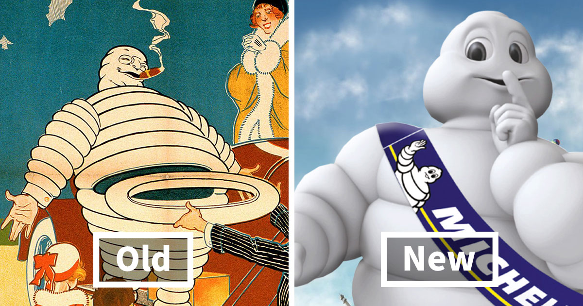
12. The Michelin Man: From Cigar-Smoking Gentleman to Friendly Mobility Icon
The Michelin Man, also known as Bibendum, is one of the oldest active brand mascots. Early versions showed him as a rotund, upper-class figure with details like a cigar and glasses. Over time, those elements disappeared, and his body became slimmer, more energetic, and more approachable. The modern Michelin Man is still made of white tire-like rings, but he looks younger, healthier, and more mobile. It is one of the best examples of a mascot aging backward without causing an internet conspiracy.
13. The GEICO Gecko: A Digital Lizard for a New Era
The GEICO Gecko began as a clever solution to a pronunciation problem and became one of the most durable insurance mascots in the United States. His look has become more refined through CGI, with expressive eyes, smoother movement, and a polished personality that works across television and digital campaigns. Recent AI-driven experiments point toward an even more interactive future for the gecko. The key is consistency: he still feels helpful, dryly funny, and small enough to fit on a dashboard, which is apparently a strong insurance strategy.
14. The Aflac Duck: Still Quacking, Now More Flexible
The Aflac Duck debuted in 2000 and quickly became famous for loudly saying the brand name in a way no human sales meeting could improve. His core appearance has stayed consistent: white duck, orange bill, orange feet, and big attitude. The update has been more about how he appears. The duck now lives across TV, social campaigns, digital content, sports partnerships, and even comfort-focused initiatives connected to children’s health. His look remains simple because the brand learned an important truth: when your mascot is a duck yelling your name, do not overcomplicate the duck.
15. Kool-Aid Man: From Pitcher Costume to CGI Party Crasher
The Kool-Aid Man is one of advertising’s loudest entrances. His original appeal came from bursting through walls and shouting “Oh yeah!” like a hydrated wrecking ball. Later updates moved him into CGI, giving him smoother motion, more personality, and a modern digital presence. The updated Kool-Aid Man can appear in apps, social campaigns, animated ads, and playful internet content. He is still a giant pitcher of red drink, but now he has the production quality of a character who knows what a content calendar is.
16. Android’s Bugdroid: From Flat Robot to 3D Companion
Android’s green robot mascot, often called Bugdroid, received a major visual refresh with a 3D look. The update made the character more dimensional, playful, and adaptable to different colors, textures, and environments. Android also refreshed its wordmark, making the identity feel closer to Google’s broader visual language. The new Bugdroid is less like a tiny flat icon and more like a flexible digital companion that can show up in product launches, animations, and real-world installations.
17. Duo the Duolingo Owl: Cute, Chaotic, and Extremely Online
Duo, the Duolingo owl, is one of the best examples of a modern mascot designed for digital behavior, not just visual recognition. The green owl’s basic look is simple: round body, big eyes, orange feet, and maximum emotional range. But Duolingo keeps updating how Duo appears, from melting app icons to dramatic social media stunts and expressive campaign visuals. Duo is not just a mascot. He is a tiny green reminder that you skipped your lesson and now must live with the consequences.
18. Starbucks Siren: From Detailed Mermaid to Iconic Symbol
The Starbucks Siren has been simplified several times, with the biggest modern shift coming when the brand removed the surrounding words from the logo and let the green Siren stand alone. The updated look is cleaner, more symmetrical, and easier to recognize globally. It also signals confidence: Starbucks no longer needs the word “coffee” around the symbol for people to understand what it represents. The Siren went from detailed maritime mystery to minimalist global icon, which is quite a career path for a twin-tailed mermaid.
19. Mailchimp’s Freddie: A Winking Mascot in a Bolder Brand World
Mailchimp’s mascot, Freddie, the winking chimp, has long been part of the company’s playful identity. In its broader rebrand, Mailchimp moved toward a more distinctive visual system with hand-drawn illustration, unusual shapes, a warm yellow palette, and a more confident wordmark. Freddie remained a recognizable character, but he now fits into a stranger, more artistic, and more memorable brand universe. The result feels less like standard software branding and more like a creative studio that happens to help you send newsletters.
20. Honey Nut Cheerios’ BuzzBee: The Mascot Who Disappeared for a Cause
BuzzBee, the Honey Nut Cheerios mascot, is usually shown as a cheerful bee carrying honey-powered breakfast energy. But one of the most notable updates was his temporary disappearance from packaging in campaigns designed to raise awareness about declining bee populations. Instead of the full mascot, consumers saw an outline or absence that made the missing bee the message. It was a clever visual move: removing a beloved mascot made people notice both the box and the environmental issue behind it.
21. Miss Chiquita: From Banana Character to Human Icon
Miss Chiquita began as an anthropomorphic banana with a fruit hat, a dress, and a personality straight out of mid-century advertising. In 1987, she was redesigned as a human woman while keeping the famous fruit hat. Later updates polished the character further, making her more elegant and adaptable for labels, campaigns, and brand storytelling. The transformation from banana to human is one of the boldest mascot updates in food branding. Most mascots get cleaner lines; Miss Chiquita got an entire species change.
22. The Quaker Oats Man: A Subtle Digital Makeover
The Quaker Oats Man, often nicknamed Larry, has been associated with the brand since the 19th century. His updates have been subtle because the brand depends heavily on trust, heritage, and familiarity. In a modern refresh, the character was made slightly slimmer and younger-looking, with cleaner hair and a lighter face, while keeping his calm expression and wholesome identity. It was less “dramatic reveal” and more “Larry discovered good lighting and portion control.”
What These Mascot Redesigns Teach About Branding
The most successful mascot redesigns follow a simple rule: change enough to feel current, but not so much that the audience feels betrayed. Mr. Peanut kept his monocle. Tony kept his scarf. Mr. P kept his mustache. Wendy kept her pigtails. The Michelin Man kept his tire-body silhouette. These details are not random accessories; they are memory hooks. Remove the wrong one and the mascot becomes a stranger wearing a brand’s jacket.
Another trend is simplification. Modern mascots need to work on tiny mobile screens, fast-moving videos, product thumbnails, delivery apps, stickers, profile pictures, and packaging. Complicated shading and old-fashioned realism often get replaced by flatter colors, bolder lines, and more flexible facial expressions. That does not mean every mascot becomes bland. In fact, the best updates make characters more expressive, not less.
There is also a clear shift from static mascots to active personalities. Duo the owl, the GEICO Gecko, Wendy’s social avatar, and the M&M’s spokescandies are not just logos with legs. They are characters with voices, moods, and digital behavior. In modern branding, a mascot is often expected to reply, joke, react, dance, apologize, tease, or dramatically fake its own death for engagement. Advertising has become very normal and not strange at all.
Experience-Based Reflections: Why Updated Mascots Feel So Powerful
Anyone who has worked with content, branding, SEO, or digital publishing quickly notices that mascots create an instant shortcut in the reader’s mind. A plain brand name can feel abstract, but a character gives the audience something to picture. When a headline mentions “the Pringles guy,” “the green Duolingo owl,” or “the M&M’s characters,” people immediately know the visual. That recognition makes content easier to click, easier to remember, and easier to share.
From a publishing perspective, mascot articles also perform well because they combine nostalgia with visual curiosity. Readers want to compare the old and new versions. They want to decide whether the redesign was brilliant, unnecessary, hilarious, or a crime against breakfast. This creates natural engagement because design changes feel personal. People may not care about a company’s quarterly brand strategy, but they absolutely care if a cereal bird suddenly looks like he joined a futuristic cartoon band.
The most interesting experience related to mascot redesigns is watching how emotional audiences become over tiny changes. A new shoe on an M&M, a missing bee on a cereal box, or a simplified mustache on Mr. P can spark huge discussions. That is not because consumers are irrational. It is because mascots often live in childhood memory. They are tied to Saturday mornings, lunchboxes, road trips, family dinners, first phones, and old commercials playing in the background. Updating them touches more than design; it touches memory.
For writers and marketers, the lesson is clear: treat mascot redesigns as stories, not just visual updates. The strongest content explains what changed, why it changed, what stayed the same, and how people reacted. That structure gives readers both information and emotion. A good mascot article should feel like a mini time machine with a little design analysis and a few jokes sprinkled in, because honestly, if you cannot have fun writing about a monocled peanut, what are we even doing here?
Brands should also remember that mascots work best when they are given room to behave. A mascot trapped on packaging is useful, but a mascot with a voice can become a cultural asset. Duo can guilt-trip users into language lessons. Wendy can roast competitors. The GEICO Gecko can carry a calm, humorous tone through years of insurance ads. Even old-school mascots like the Michelin Man and Quaker Oats Man can feel relevant when they are refreshed thoughtfully and used consistently.
At the same time, there is danger in chasing trends too aggressively. A mascot should not be redesigned just because gradients, 3D icons, or “relatable chaos” are popular this year. The best updates come from the brand’s core identity. Michelin is about mobility and trust, so Bibendum became more active and friendly. Android is about digital flexibility, so Bugdroid became more dimensional and adaptable. Burger King wanted to feel real and appetizing again, so the brand leaned into warm retro design. Good redesigns do not simply ask, “What looks modern?” They ask, “What makes this character more useful without breaking what people love?”
That is why popular brand mascots continue to matter. They are not relics from the age of TV commercials. They are portable personalities. They travel from cereal boxes to TikTok, from drive-thru signs to mobile apps, from Super Bowl ads to meme culture. When updated carefully, a mascot can make an old brand feel fresh without forcing it to pretend it was born yesterday.
Conclusion
Popular brand mascots survive because they do something logos alone often cannot: they make brands feel alive. A mascot can smile, wink, run, dance, panic, shout, disappear, reappear, or wear sneakers and accidentally start a national debate. Updated looks help these characters stay flexible in a world where branding happens everywhere at once.
The best mascot redesigns respect memory while improving usability. They simplify shapes, sharpen personality, and prepare familiar characters for new media without deleting their charm. Whether it is Mr. Peanut’s polished elegance, Pringles’ modern Mr. P, Android’s 3D Bugdroid, or Duo’s chaotic owl energy, these updates show that mascots are not fading away. They are evolving, one glow-up at a time.