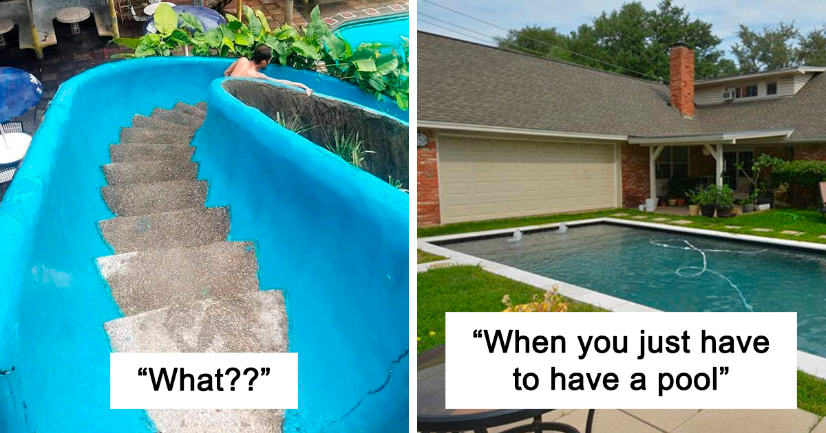

There are two kinds of home-design mistakes. The first kind is mildly annoying, like realizing your new pendant light hangs exactly where a tall cousin will bonk their forehead at Thanksgiving. The second kind gets immortalized online by people cackling in a Facebook group called You Should Have Hired An Architect. That is the big leagues of bad planning: stairs to nowhere, windows that stare lovingly into brick walls, bathrooms with all the privacy of a bus stop, and layouts that seem designed by a raccoon holding a tape measure.
The funny part, of course, is that these disasters are rarely random. They usually happen when someone treats design like a last-minute puzzle instead of a full system. Architects do not just make homes look expensive in magazine photos. They solve circulation problems, spot safety issues, understand codes, think in three dimensions, coordinate trades, plan for light, storage, ventilation, and long-term use, and save people from making very expensive “oops” decisions with walls, plumbing, and structure.
So instead of just laughing at the internet’s greatest hits of home-design chaos, let’s translate the comedy into something useful. Here are 35 reasons those Facebook-group photos keep proving the same point: sometimes the most expensive thing in a renovation is trying to save money on design.
Why These Design Fails Keep Happening
A lot of ugly or impractical homes are not the result of bad taste alone. They come from weak planning. A room can be pretty and still fail if you cannot move through it, use it comfortably, clean it easily, or live in it without muttering under your breath. Good architecture balances form, function, safety, efficiency, and context. That balance is exactly what disappears when a project is patched together room by room without someone seeing the whole picture.
35 Reasons You Probably Should Have Hired an Architect
Planning and Layout Problems
- Your floor plan flows like a maze designed by a prankster. A home should guide people naturally from one area to another. If guests need GPS to find the powder room, the layout has failed.
- You created a “grand entrance” that opens directly into chaos. Good design considers arrival, privacy, and first impressions. Nobody wants the front door to reveal the litter box, the stove, and Uncle Gary napping in one heroic glance.
- Your furniture only fits if nobody breathes. Architects and design pros think about scale early. Oversized islands, undersized living rooms, and cramped dining zones are classic signs that square footage was counted but not truly planned.
- You forgot traffic flow. A beautiful room becomes irritating fast when every path is blocked by chairs, corners, or poorly placed cabinets. Homes are for living, not obstacle-course qualifiers.
- The open concept is a little too open. There is a fine line between airy and “why can I see the toilet from the sofa?” Architects know how to open space without destroying privacy, acoustics, or common sense.
- You treated every room like a separate planet. A house should feel connected in style, proportion, and logic. Random additions and mismatched fixes can make it feel like three different homes got into a trench coat.
- You made rooms the wrong shape for real life. A weirdly narrow bedroom or an extra-wide hallway may look harmless on paper but can be awkward forever. Good design is not just about area; it is about usable proportions.
- You forgot how doors work. Doors that slam into vanities, block appliances, or smack each other in battle are not charming quirks. They are preventable geometry problems.
- You added square footage but not function. Bigger is not automatically better. Architects often help homeowners get more out of space by designing smarter rather than just larger.
- You planned room by room instead of house by house. This is how people end up with a stunning kitchen attached to a terrible everything-else. Real design starts with the whole home, not a shopping spree of isolated upgrades.
Safety, Code, and “Please Don’t Fall Down There” Issues
- Your stairs look like a liability waiver in wood form. Steep rises, poor lighting, strange landings, and uneven proportions are funny online and awful in real life.
- You moved walls without understanding structure. That “let’s just open it up” impulse gets less fun when someone discovers a load-bearing issue halfway through demolition.
- You ignored accessibility. Good design considers people at different ages, sizes, and ability levels. Tight clearances, awkward transitions, and bad door swings make spaces harder to use than they need to be.
- You designed a bathroom with zero grace. Bathrooms are small, technical rooms. Bad placement of fixtures, doors, lighting, and ventilation can make them feel cramped, damp, and endlessly frustrating.
- You created hidden hazards with poor lighting. Hallways, stairs, entries, and work areas all need thoughtful illumination. “Moody” should never mean “accident-ready.”
- You forgot that codes exist for a reason. Codes are not there to kill the vibe. They exist to protect health, safety, and welfare, which becomes a lot more comforting when you are talking about structure, egress, and electrical work.
- Your railing, guard, or landing is basically decorative. If an element is there for safety, it has to actually perform. Pinterest energy is not a substitute for sound detailing.
- You boxed in essential systems. Mechanical equipment, electrical access, and plumbing cleanouts should not require archaeological excavation to reach.
- You assumed the contractor would “figure it out.” Contractors build; architects design and coordinate intent. The best projects happen when nobody is forced to guess what the plan was supposed to mean.
- You made future maintenance everyone else’s problem. Clever-looking details that are impossible to repair, clean, or replace tend to age about as gracefully as a banana in a hot car.
Light, Comfort, and Daily Usability
- Your windows were placed with all the strategic care of confetti. Window location affects light, privacy, glare, heat gain, views, and furniture placement. It is not just “stick glass somewhere and hope.”
- You forgot orientation matters. The direction a room faces changes how it feels all day. Morning glare in a bedroom and baking afternoon heat in a living room are not exactly luxury touches.
- You designed for photos, not for sound. Some spaces echo like train stations because nobody thought about materials, ceiling heights, or how open areas carry noise.
- You skipped ventilation. Kitchens and bathrooms need moisture and odor control, not just optimism. Without proper ventilation, you are basically inviting mold to move in rent-free.
- You made storage an afterthought. Homes always need more places for coats, cleaning supplies, pantry items, shoes, chargers, bags, tools, and the mysterious cords everyone keeps “just in case.”
- You designed a kitchen for looking, not cooking. A pretty kitchen that has poor prep zones, bottlenecks, awkward island clearances, or no landing space near appliances will annoy you three times a day.
- You moved plumbing just because it sounded fun. Relocating kitchens and bathrooms can explode costs quickly. Sometimes the smartest design move is improving the layout without relocating every pipe in North America.
- You forgot that people own stuff. Minimalist homes are lovely until the broom has nowhere to live and the vacuum is camping in the hallway like it pays rent.
- You ignored how people actually gather. Great spaces support conversation, movement, cooking, relaxing, and working. Awkward seating clusters and dead corners are usually signs of weak planning.
- You designed one season of comfort. Homes should work in summer and winter, in bright afternoons and dark mornings, with heating, cooling, daylight, and shade all working together.
Aesthetics, Value, and Long-Term Regret
- Your exterior looks like three houses negotiating a merger. Additions should feel intentional. When rooflines, windows, and proportions fight each other, curb appeal takes the hit.
- You chased trends instead of designing for longevity. Trendy choices can be fun, but architecture works best when it has a backbone. Otherwise your renovation can feel dated before the grout dries.
- You cheaped out on drawings and paid for it in change orders. The cost of better planning on paper is usually far smaller than the cost of fixing confusion on-site.
- You forgot resale value is part of the conversation. Buyers notice awkward layouts, missing storage, poor light, and strange additions even if they cannot explain why the house feels “off.”
- You mistook an architect for an unnecessary luxury. In many projects, an architect is not the fancy extra. They are the person most likely to keep the entire thing from becoming a cautionary tale with 18,000 laughing reactions.
What Architects Actually Bring to the Table
Hiring an architect is not just hiring someone to sketch a prettier version of your wish list. It is hiring a trained problem-solver who can connect budget, site conditions, structure, codes, comfort, and aesthetics into one coherent plan. That matters whether you are building a custom home, reworking a kitchen, adding a second story, or trying to make an older house function for modern life.
Architects also help you make better decisions earlier, when change is cheap. It is far easier to move a wall on paper than after framing, wiring, and plumbing are already in place. They can coordinate consultants, communicate design intent to contractors, help compare bids, catch issues before they multiply, and keep the project tied to your actual priorities instead of random impulses that appeared after midnight on social media.
How to Tell When a Project Really Needs an Architect
You should seriously consider one if your project involves structural changes, major layout shifts, additions, a tricky lot, a historic home, complex permitting, accessibility goals, or a house that has never quite worked right. You should also consider one if you are about to spend a lot of money and want the result to feel calm, intentional, and valuable instead of merely expensive.
That does not mean every tiny update requires a full architectural team. But once your renovation starts touching flow, structure, code, long-term value, or multiple systems at once, professional design becomes less of a splurge and more of a shield.
The Experience of Living in a “You Should Have Hired an Architect” House
What makes these Facebook-group examples so memorable is not just that they look odd in a photo. It is that you can instantly imagine the daily misery attached to them. The staircase with bad proportions is not only ugly; it is the thing you dread walking down with a laundry basket. The bizarre bathroom layout is not only awkward; it becomes the room where every morning starts slightly irritated. The kitchen with a giant island jammed into the center of everything is not just a visual mistake; it becomes a household traffic jam where one person unloads groceries, another opens the dishwasher, and a third gets trapped holding a bag of salad like a commuter on a delayed train.
People often underestimate how much low-grade frustration a badly designed home creates. It shows up in tiny moments. There is nowhere to put keys when you come in. The bedroom gets blasted with sun at 6 a.m. year-round. The hallway is too dark. The mudroom has no place for muddy shoes. The bathroom mirror lighting is somehow perfect for looking haunted. A door cannot open fully because someone forgot the radiator. None of these things seem dramatic on their own, but together they turn a house into a slow drip of annoyance.
By contrast, a well-designed home tends to feel easy in ways that are almost invisible. You move through it without thinking. The light lands where it should. Storage appears where you need it. Privacy exists where it matters. Rooms support the way you cook, work, gather, rest, and age. You may not walk around praising the hallway width or the placement of a window every day, but your nervous system notices. Good architecture reduces friction.
That is why so many renovation horror stories sound the same after the fact. People say they wish they had slowed down. They wish they had planned the whole house before touching one room. They wish they had thought about future needs, not just current cravings. They wish someone had challenged the bad idea before it became a very expensive fixture. Most of all, they wish they had hired the person whose job is to ask better questions early enough to matter.
And that, really, is the lesson behind the laughs. The funniest design fails are often just photographs of preventable regret. Behind every weird window, dangerous stair, door-to-nowhere, and open-plan overshare is the same moral wearing a hard hat: professional design is not about making a home fancier for bragging rights. It is about making a home work. When it works, life gets smoother. When it does not, the internet gets content.
Conclusion
The Facebook group may provide endless entertainment, but the takeaway is surprisingly practical. A home is a three-dimensional, highly technical, deeply personal place. When design is done well, it improves how you live every single day. When it is done poorly, even expensive renovations can feel clumsy, uncomfortable, and oddly tragic. So yes, laugh at the cursed staircases and the mystery windows. Then take the hint: if your project is complex, permanent, or pricey, bringing in an architect early might be the smartest line item in the whole budget.
SEO Tags