
Some color combinations age like a perfectly worn leather chair. Others age like a motivational wall decal in a gray-and-yellow chevron bathroom. Interior design in 2025 has made one thing clear: people still love color, but they want it to feel layered, personal, warm, and livablenot like a showroom that panicked and ordered every trendy accent pillow from 2013.
The biggest shift is not that color is “out.” Quite the opposite. Designers are leaning into richer browns, muddy plums, earthy greens, warm whites, ruby reds, clay tones, butter yellows, and softly nostalgic shades. What is fading is the overly sharp, predictable, or theme-party approach to pairing colors. The new mood is more collected than coordinated, more soulful than staged, and much less interested in screaming, “I found this palette on a wedding invitation board.”
Below are five color combinations we are leaving in 2025, according to the direction designers, paint brands, and home trend editors have been pointing toward. The good news? You do not need to repaint your entire home at midnight while whispering apologies to your accent wall. Most of these palettes can be updated with smarter undertones, better textures, and a little design diplomacy.
Why 2025 Color Trends Are Moving Away From Harsh Pairings
For years, many homes were built around contrast: black with white, gray with yellow, navy with coral, teal with white, or burgundy with gold. These combinations were easy to recognize and easy to copy. That was part of the problem. Once a color pairing becomes too common, it starts to feel less like a design decision and more like a timestamp.
In 2025, designers are favoring palettes that feel warmer, more emotional, and more flexible. Instead of cold minimalism, the trend is toward comfortable sophistication. Think chocolate brown instead of flat black, cinnamon plum instead of generic purple, warm white instead of stark white, olive instead of neon green, and terracotta instead of bright orange. The goal is not to create a room that shouts. The goal is to create a room that knows how to hold a conversation.
1. Gray and Yellow: The Former “Happy Modern” Duo
Gray and yellow had a long, energetic run. For a while, this combination appeared everywhere: nurseries, apartments, throw pillows, bedding sets, office makeovers, and those inspirational gallery walls that somehow included both a bicycle print and the word “dream.” The idea was understandable. Gray brought calm, yellow brought cheer, and together they seemed balanced.
But in 2025, gray and yellow often feels too tied to the early 2010s. Cool gray walls can read flat and chilly, while bright yellow accents can feel pasted on rather than integrated. The result is a room that looks like it is trying to be sunny but forgot to open the curtains.
What to use instead
Replace cool gray with warm greige, mushroom, taupe, clay, or soft stone. Then swap sharp yellow for butter yellow, ochre, muted gold, or straw. The updated version keeps the brightness but removes the visual whiplash.
For example, a living room with gray walls and lemon-yellow pillows can be refreshed with a warm taupe wall color, a caramel leather chair, antique brass lighting, and softer golden textiles. The room still feels cheerful, but now it has depth. It looks less like a catalog set and more like someone interesting actually lives there.
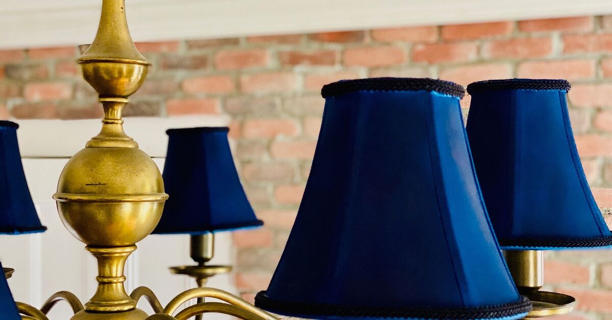
2. Navy and Coral: The Preppy Pair That Needs a Vacation
Navy and coral is not a bad combination in theory. It has contrast, confidence, and a coastal personality. Unfortunately, it has also been used so often in beach houses, dorm rooms, wedding palettes, and preppy living rooms that it can feel a little too expected. It is the color equivalent of showing up to brunch in boat shoes and announcing you love hydrangeas.
The issue is not navy itself. Navy remains a classic. Coral can also be lovely when softened or warmed. The problem is the high-contrast version: crisp navy plus bright coral plus lots of white. That formula can quickly feel more decorative than designed.
What to use instead
Try midnight blue with rust, deep indigo with clay, slate blue with dusty peach, or navy with warm camel. These alternatives feel more grounded and less theme-driven. They still give you contrast, but the contrast feels mature rather than nautical-by-default.
In a bedroom, for instance, instead of navy walls with coral lamps and white bedding, try deep blue walls, linen bedding in warm ivory, a rust velvet pillow, walnut nightstands, and aged brass hardware. The palette still nods to the coast if you want it to, but it no longer looks like a souvenir shop got promoted to creative director.
3. Black and White With Harsh Red Accents
Black, white, and red can be iconic in fashion, graphic design, and classic cinema. In interiors, however, the high-contrast version can become intense very quickly. A black-and-white room with bright red accents may look dramatic in a photo, but in daily life it can feel severe, flat, or overly themed.
This combination was especially popular in ultra-modern spaces: glossy white cabinets, black countertops, red bar stools, black-framed art, and maybe one very serious vase. The effect was bold, yes, but also a little exhausting. A home should not make you feel like you are waiting to be judged by a panel of design robots.
What to use instead
Soften the contrast. Replace pure black with espresso, charcoal, bronze, or deep olive. Replace stark white with warm white, cream, plaster, or pale oatmeal. Replace primary red with oxblood, ruby, merlot, or terracotta red.
A kitchen with black hardware, white cabinets, and red accessories can become more timeless with warm white cabinetry, dark bronze pulls, a brick-red runner, and natural wood stools. You still get drama, but now the room has warmth and texture. The red becomes a sophisticated note, not a fire alarm.
4. Teal and Bright White: The Once-Fresh Combo That Now Feels Too Sharp
Teal and white used to feel crisp, clean, and modern. It worked especially well in bathrooms, coastal spaces, and small apartments where people wanted a pop of color without committing to a full rainbow lifestyle. But bright teal against bright white can now feel a bit too synthetic, especially when paired with glossy finishes and chrome.
The 2025 approach to blue-green shades is more nuanced. Designers are gravitating toward softened, muddier, or nature-inspired colors: blue-green with gray undertones, smoky turquoise, eucalyptus, deep peacock, mossy teal, or muted aqua. White is also getting warmer. The goal is less “spa brochure” and more “beautiful old house with excellent towels.”
What to use instead
Try smoky teal with cream, peacock blue with walnut, sea-glass green with warm white, or muted turquoise with sand and woven textures. These combinations preserve the freshness of teal but give it a more natural foundation.
For a bathroom, instead of bright teal walls and stark white tile, consider a muted blue-green vanity, warm white walls, honed stone, unlacquered brass, and natural fiber baskets. The result feels calm, not clinical. It still says “clean,” but it no longer says “toothpaste commercial.”
5. Burgundy, Gold, and Ivory: The Formal Trio That Feels Too Heavy
Burgundy, gold, and ivory can be luxurious, but it can also lean very quickly into banquet hall territory. The combination brings to mind heavy drapes, shiny finishes, ornate frames, and rooms where everyone instinctively lowers their voice. In the right historic space, it can work beautifully. In many modern homes, though, it feels too formal and too locked into a specific era.
Interestingly, deep reds and rich browns are very much alive in 2025. The difference is how they are being used. Designers are choosing earthy ruby, cinnamon, oxblood, plum-brown, and wine tones in fresher, less ornamental ways. The new version is moody and tactile rather than stiff and ceremonial.
What to use instead
Swap shiny gold for aged brass, antique bronze, or soft champagne. Replace ivory with warm plaster, mushroom, or creamy stone. Use burgundy in smaller, richer doses, or choose a browner red that feels more natural.
For example, a dining room with burgundy walls, ivory trim, and polished gold accents can be updated with a muted wine wall color, warm taupe trim, bronze sconces, a natural oak table, and linen curtains. The room keeps its elegance, but it stops looking like it is waiting for a wedding DJ to announce the first dance.
How to Update an Outdated Color Combination Without Starting Over
If your home includes one of these color combinations, do not panic. Designers rarely mean that a color is permanently “bad.” What usually changes is the context. A dated palette can often be rescued by adjusting undertones, adding texture, and reducing contrast.
Warm up the base color
Many outdated combinations rely on cool bases: icy gray, stark white, blue-white, or flat black. A warmer base immediately makes a room feel more current. Warm white, soft beige, mushroom, clay, and taupe are especially useful because they work with many existing furnishings.
Choose complex colors over obvious colors
Instead of primary red, choose oxblood. Instead of bright orange, choose terracotta. Instead of lemon yellow, choose butter or ochre. Instead of basic teal, choose smoky blue-green. Complex colors have undertones that make them easier to layer.
Add natural materials
Wood, linen, stone, rattan, wool, leather, clay, and aged metal can make almost any palette feel more sophisticated. If your room feels too sharp, the problem may not be the colors alone. It may be the lack of texture.
Reduce the “matching set” effect
Rooms feel dated when every accent matches too perfectly. If your sofa pillows, artwork, rug, and curtains all repeat the same two colors, break the pattern. Add a third or fourth related shade. Bring in neutrals. Let the palette breathe.
Designer-Inspired Color Combinations That Feel Fresher Now
Instead of following rigid formulas, 2025 interiors are embracing palettes that feel collected and layered. Here are a few combinations that feel more current:
- Chocolate brown, warm white, and muted blue: Cozy, classic, and quietly polished.
- Olive green, clay, and cream: Natural, calm, and perfect for relaxed living spaces.
- Plum-brown, mushroom, and aged brass: Elegant without feeling overly formal.
- Dusty peach, walnut, and smoky blue: Soft, fresh, and more grown-up than coral and navy.
- Butter yellow, taupe, and deep green: Cheerful but grounded.
- Ruby red, warm beige, and dark bronze: Dramatic in a way that still feels livable.
Personal Experience: What These Color Shifts Look Like in Real Homes
One of the most useful lessons from real decorating experience is that color rarely fails alone. It usually fails because of lighting, finish, proportion, or repetition. A gray and yellow room, for example, might look dated not because yellow is forbidden, but because the gray is too cold, the yellow is too sharp, and every accessory is trying to repeat the same accent color like it is studying for a test.
In a real living room, I have seen a cool gray sofa, yellow pillows, a white rug, and silver lamps look instantly warmer with only a few changes. The yellow pillows were replaced with ochre and patterned textile covers. A walnut coffee table came in. The silver lamps were swapped for aged brass. Nothing dramatic happened, but suddenly the room felt intentional. The gray sofa no longer looked lonely. It had warmer friends.
The same is true for navy and coral. In many homes, people still love their navy pieces because navy is practical and elegant. The update comes from changing the coral. A bright coral throw can be replaced with rust, cinnamon, or dusty rose. White walls can be softened with warm ivory. Add woven shades or a vintage rug, and the room stops feeling like a beach rental and starts feeling like a home with a point of view.
Black-and-white rooms are another common example. Many homeowners chose this palette because it felt safe and modern. The problem appears when every surface is high contrast: white walls, black frames, black hardware, white counters, black lights, white tile. The room may be technically coordinated, but it can feel emotionally undercooked. Bringing in wood, warm metals, creamy whites, and deeper browns often solves the issue without removing the whole design concept.
Teal and white bathrooms are also easy to refresh. Instead of ripping out tile, the trick is to change the supporting cast. Bright white towels can become warm white or oatmeal. Chrome can become brass or brushed nickel. A flat teal wall can be balanced with artwork, natural baskets, a wood stool, or a patterned shower curtain that includes softer greens and blues. Suddenly teal feels less like a leftover trend and more like part of a layered palette.
Burgundy, gold, and ivory requires the most restraint. The color combination can still feel beautiful, especially in dining rooms, libraries, and powder rooms, but it needs texture and understatement. Shiny gold is usually the first thing to calm down. Aged brass, dark bronze, or antique finishes feel more current. Burgundy also looks fresher when paired with earthy neutrals, brown-black wood, plaster tones, or muted pink rather than glossy ivory and bright metallics.
The broader experience is this: people do not usually want trend-chasing homes. They want homes that feel current without becoming disposable. That is why the best color updates are subtle. A warmer white, a muddier accent color, a less shiny metal, a better rug, or a more natural fabric can shift the whole mood. Good design is often less about throwing everything out and more about teaching the room better manners.
So, if your home currently includes one of these five color combinations, treat it as a starting point, not a design crime scene. Keep what still feels good. Adjust what feels too loud, cold, flat, or themed. The most stylish rooms in 2025 are not perfect. They are personal, layered, warm, and slightly unexpectedthe decorating equivalent of someone who knows exactly who they are but does not need to announce it with a neon sign.
Conclusion
The color combinations we are leaving in 2025 are not disappearing because designers suddenly became allergic to gray, yellow, navy, coral, teal, white, burgundy, gold, black, or red. They are fading because the old ways of pairing them feel too obvious, too cold, too sharp, or too themed for the way people want to live now.
The new direction is warmer, richer, softer, and more layered. Instead of decorating with two-color formulas, designers are building palettes with undertones, texture, natural materials, and emotional depth. That is good news for anyone who wants a home that feels stylish without looking like it was assembled by an algorithm wearing a tiny hard hat.
Leave the harsh combinations behind, but keep the confidence. Color is not going anywhere. It is simply growing up, putting on better shoes, and learning how to make the whole room feel welcome.