
Software is supposed to make life easier. It should book the ticket, save the file, process the payment, send the message, and politely stay out of the way. But every now and then, an app wakes up, chooses chaos, and delivers an error so bizarre that the only reasonable response is to take a screenshot before the whole thing disappears.
That is why collections of hilarious software fails are so addictive. They capture the exact moment when modern technology trips over its own shoelaces. A button says “Cancel” and “Confirm” at the same time. A checkout page charges $0.00 plus a mysterious $79 shipping fee. A smart fridge displays a system update while the milk slowly questions its life choices. Somewhere, a developer is whispering, “It worked on my machine,” which is the official national anthem of debugging.
This article looks at the funniest types of software glitches people encounter in the wild, why they happen, and what they reveal about user experience, testing, security, and the very human side of code. These fails are funny, yes, but they are also tiny case studies in how digital products break when assumptions meet reality.
Why Software Fails Are So Funny
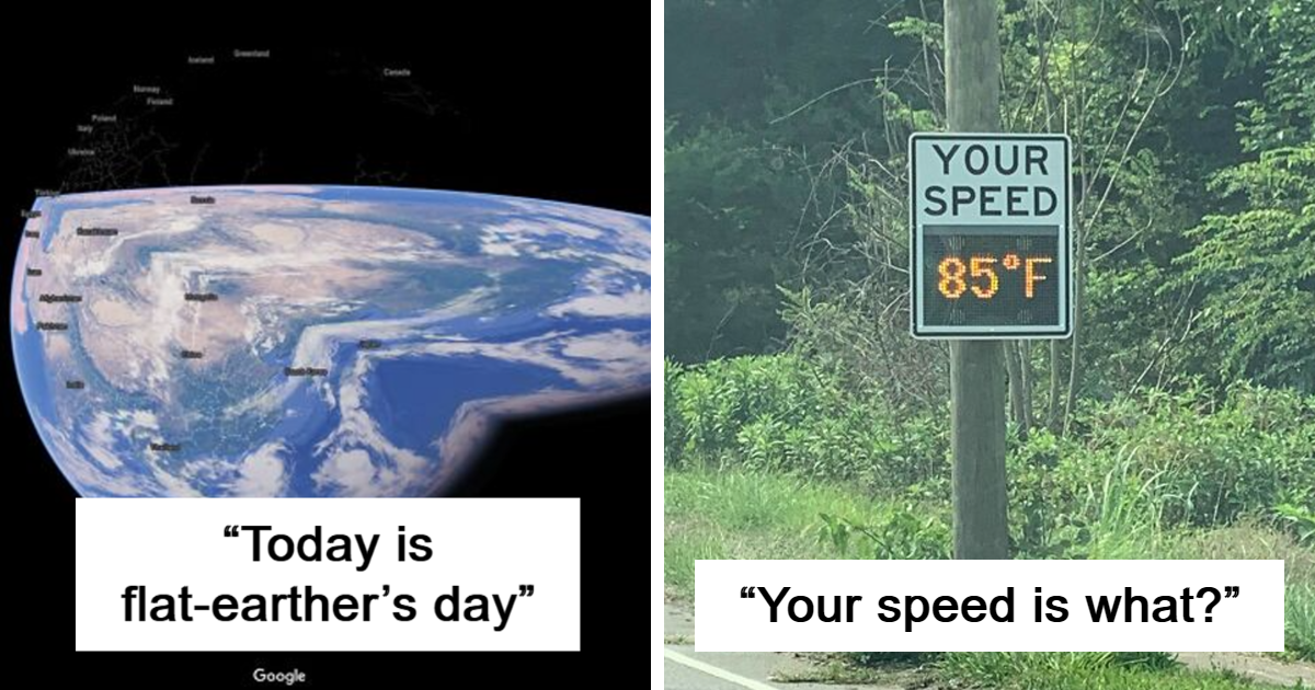
The best software fails are funny because they violate expectations. We expect computers to be logical, precise, and immune to bad moods. Then the parking meter displays “Payment successful: failed,” and suddenly the machine sounds like it needs a vacation.
Humor often comes from contrast. A serious business app uses a playful error message at the worst possible time. A government website asks for a birth date in the future. A streaming platform recommends a horror movie under “relaxing bedtime stories.” These moments feel like digital slapstick: no banana peel required, just a poorly handled edge case.
The 50 Funniest Types of Software Fails People Share Online
While every screenshot has its own special flavor of nonsense, most viral software failures fall into recognizable categories. Here are 50 classic examples of the worst software fails people love to capture.
1. The “Error: Success” Message
Nothing says confidence like a system announcing that the operation succeeded unsuccessfully. These messages usually come from mixed status codes, bad copy, or a backend response that nobody translated into human language.
2. Buttons That Fight Each Other
A popup asks, “Are you sure?” and gives users two options: “Yes” and “Yes.” This is not a choice; it is a hostage situation with rounded corners.
3. The Infinite Loading Spinner
The spinning wheel promises progress but delivers meditation. After five minutes, users are no longer waiting for the app; they are contemplating existence.
4. Text That Escapes Its Box
Mobile screens are small, translations are long, and suddenly a button reads “Subscri…” while floating over a price tag. Layout testing across devices matters.
5. Password Rules Written by a Dragon
“Password must contain one uppercase letter, one symbol, one number, one ancient rune, and your childhood nickname, but no repeated characters.” Security is important, but confusing rules encourage bad habits.
6. Form Validation That Hates Real People
Some systems reject hyphenated names, short surnames, international phone numbers, or perfectly valid email addresses. The software is not broken; it simply believes the world ends at its test data.
7. Calendar Bugs From Another Dimension
Dates are hard. Time zones are harder. Daylight saving time is where optimism goes to get humbled. That is how meetings end up scheduled for “Tuesday, February 31.”
8. Autocorrect Betrayals
Autocorrect is helpful until it turns a normal work message into an accidental comedy sketch. The worst part is that it always waits until after you press send.
9. Translation Disasters
Machine translation can turn a polite instruction into something that sounds like a haunted appliance manual. Localization needs context, not just dictionary swapping.
10. Popups That Block the Thing They Explain
A tooltip appears to help users, then covers the button they need to click. It is like a tour guide standing directly in front of the museum exhibit.
11. Error Messages With No Solution
“Something went wrong.” Thank you, software. That narrows it down to the entire universe.
12. The Update That Arrives at the Worst Time
Nothing creates suspense like a public display, cash register, or airport screen announcing an operating system update in the middle of business hours.
13. Dark Mode Gone Rogue
Dark mode looks sleek until black text appears on a black background. At that point, users are not reading; they are participating in a digital treasure hunt.
14. CAPTCHA That Humans Cannot Solve
“Select all squares containing a bicycle.” The bicycle is technically in one pixel of six different squares. Congratulations, humanity has failed the robot test.
15. Chatbots That Loop Forever
A user asks for a human agent. The bot replies, “I can help with that. Please describe your issue.” The user describes the issue. The bot replies, “I can help with that.” This is customer support as a washing machine cycle.
16. Notifications With Terrible Timing
Fitness apps congratulating someone for “no activity today” at 11:59 p.m. have the energy of a tiny digital bully wearing running shoes.
17. Price Glitches
A product costs $19.99, the discount is $20.00, and the total becomes $999.99. Somewhere, a rounding function just bought a yacht.
18. Checkout Pages That Forget the Cart
The user carefully selects items, enters shipping, confirms payment, and then the cart empties itself like nothing ever happened. E-commerce heartbreak is real.
19. Autoplay With Maximum Volume
Few software fails are more socially dangerous than a website blasting audio in a quiet room. The browser tab knows what it did.
20. Public Screens Showing Private Errors
Digital billboards, restaurant menus, and train station displays occasionally reveal desktop errors, file paths, or system dialogs. It feels like catching a robot in pajamas.
21. Broken Search Results
You search for “blue backpack” and the site recommends refrigerators. Maybe the algorithm knows something about your travel plans that you do not.
22. Recommendation Engines Having a Meltdown
After watching one cooking video, the platform decides your entire personality is soup. Recommendation systems can be useful, but they are not subtle.
23. Duplicate Emails From the Void
A company sends the same message 17 times. By email number nine, the customer is no longer informed; they are being serenaded by automation.
24. File Uploads That Accept Nothing
The page says “Upload PDF only.” You upload a PDF. It rejects the PDF. The PDF is now questioning its identity.
25. Mobile Apps That Ignore Screen Rotation
Some apps rotate when you do not want them to and refuse to rotate when you do. The phone has become a very expensive puzzle box.
26. Progress Bars That Lie
The bar reaches 99% in ten seconds, then stays there long enough to grow a beard. Progress bars should set expectations, not create emotional damage.
27. The “Are You Still Watching?” Insult
Streaming services ask this question like they caught you stealing cookies. Yes, we are still watching. No, we are not proud.
28. Weather Apps Predicting Every Season at Once
“Sunny, snowing, 94 degrees, chance of hail.” That is not a forecast; that is a weather buffet.
29. Maps Sending People on Scenic Nonsense Tours
Navigation software can be brilliant until it suggests a shortcut through a private driveway, a lake, or a road that last existed during the Bronze Age.
30. Smart Home Devices Acting Dramatic
A smart bulb disconnects, reconnects, updates firmware, and then refuses to turn off. The future is convenient, except when your lamp has a personality.
31. Printers Being Printers
Printer software deserves its own museum wing. “Cannot print because printer is printing” remains one of technology’s purest poems.
32. App Store Screenshots That Reveal Test Data
Developers sometimes publish screenshots containing placeholder names, fake balances, or “Lorem ipsum.” It is harmless, but it screams, “We shipped at 2 a.m.”
33. Unhelpful Security Alerts
A warning says, “Suspicious activity detected,” but offers no details, no next step, and no reassurance. That is not security communication; that is a panic button with branding.
34. Broken Accessibility Labels
Screen readers sometimes announce buttons as “button button button.” Accessibility bugs are not just funny screenshots; they can prevent people from using the product at all.
35. AI Features Confidently Getting It Wrong
AI tools can summarize, suggest, and generate, but they can also invent facts with the confidence of a game show host. Human review still matters.
36. Email Personalization Fails
“Hello, FirstName!” is the classic marketing automation fail. It is friendly, technically, in the same way a cardboard cutout is friendly.
37. Login Pages That Lock Out the Owner
Two-factor authentication improves safety, unless the only recovery method is the device you lost. Good security needs realistic recovery paths.
38. Unclear Delete Confirmations
“Do you want to delete this?” Delete what? A draft? A folder? Your entire account? Vague confirmations are tiny horror movies.
39. Emoji Rendering Chaos
An emoji that looks cheerful on one platform may look deeply concerned on another. Cross-platform design is more than pixels; it is emotional diplomacy.
40. Social Media Cropping Fails
Auto-cropping can turn a normal photo into a composition focused entirely on someone’s elbow. The algorithm has artistic opinions.
41. System Clocks From the Past
When a kiosk displays the wrong year, users immediately lose confidence. If the machine thinks it is 2009, should we trust it with payment?
42. Empty States With Attitude
“You have no friends yet!” may be accurate for a new account, but the wording lands like a tiny digital slap.
43. Overly Cute Error Copy
Humor can soften frustration, but “Oopsie whoopsie!” is not ideal when someone’s tax form fails to submit.
44. Broken Sorting
Sort by price: low to high. Result: $9, $19, $1,299, $12, banana. Sorting bugs are a reminder that data types matter.
45. The Wrong Image in the Wrong Place
A serious article paired with a wildly unrelated thumbnail can create accidental comedy. Content management systems need guardrails.
46. Subscription Cancellation Mazes
Some apps make signing up effortless and canceling feel like escaping a castle. Dark patterns may increase short-term retention, but they destroy trust.
47. Browser Compatibility Weirdness
A site looks perfect in one browser and turns into abstract art in another. Testing in only one environment is how layouts become modern sculpture.
48. Mobile Keyboard Covering the Submit Button
The form is complete. The user is ready. The keyboard covers the button. Nobody wins.
49. Logs Displayed to Users
End users do not need stack traces, memory addresses, or database errors. Showing raw technical output is like a chef serving the grocery receipt.
50. The Software Fail That Fixes Itself Too Late
The user reports the bug, support asks for a screenshot, and the app immediately behaves perfectly. This is the software equivalent of a car making no noise at the mechanic.
What These Glitches Reveal About Software Quality
Funny screenshots are often symptoms of serious process gaps. A confusing error message may reveal weak UX writing. A broken form may reveal poor international testing. A public kiosk showing a desktop alert may reveal missing monitoring. A checkout glitch may reveal a fragile integration between inventory, pricing, payment, and shipping systems.
Modern software is not one single thing. It is a stack of services, APIs, databases, third-party tools, design systems, authentication flows, analytics tags, content management systems, and deployment pipelines. When one layer changes unexpectedly, another layer may respond like a toddler denied a cookie.
Why Error Messages Matter More Than People Think
An error message is not just a label. It is a moment of customer service. Good error messages explain what happened, why it matters, and what the user can do next. Bad ones make people feel blamed, confused, or trapped.
For example, “Invalid input” is technically true but emotionally useless. “Enter your phone number with country code, like +1 555 123 4567” is much better. It gives users a path forward. The difference is not decoration; it is usability.
The Serious Side of Funny Software Fails
Some failures are harmless and hilarious. Others can cost money, expose private data, or interrupt critical services. Security organizations regularly warn that weak defaults, misconfigurations, poor access control, and unclear ownership can create real risk. A goofy bug in a shopping cart is one thing. A permissions bug that shows one customer another customer’s data is not funny at all.
This is why software teams rely on testing, monitoring, code review, secure design, incident response, and postmortems. The goal is not to create perfect software; perfect software lives in the same imaginary neighborhood as unicorns with fiber internet. The goal is to catch the worst problems early, recover quickly, and learn from the failures that escape.
How Developers Can Prevent the Next Viral Fail
Test Real-World Edge Cases
Use names with apostrophes, long addresses, international phone numbers, slow connections, low battery, small screens, large fonts, and translated text. Real users are wonderfully inconvenient.
Write Human Error Messages
Tell users what happened and what to do next. Avoid mystery phrases like “unexpected exception.” Every exception is unexpected to someone who just wanted to order socks.
Design for Accessibility
Keyboard navigation, screen reader labels, color contrast, focus states, and readable text sizes are not bonus features. They are part of basic product quality.
Monitor Production Carefully
Users will always discover bugs that testing missed. Error tracking, logs, crash reports, and performance monitoring help teams see problems before social media turns them into memes.
Use Blameless Postmortems
When incidents happen, teams should ask what conditions allowed the failure, not which person to blame. A healthy postmortem turns embarrassment into engineering improvement.
Extra Experiences: What It Feels Like to Live With Software Fails
Anyone who has used technology long enough has a personal software fail story. Maybe it was the hotel check-in kiosk that froze after scanning your ID, leaving you standing in a lobby while the screen proudly displayed a spinning wheel. Maybe it was the school portal that accepted your assignment, showed a success message, and then marked it missing anyway. Maybe it was the banking app that demanded an update before letting you log in, then the update demanded a login before it would install. That is not a user flow; that is a digital escape room.
The funniest software fails often happen in ordinary moments. You are not trying to hack a server or run a complex simulation. You are trying to reset a password, buy a bus ticket, print a return label, or change a profile picture. The task is simple. The software, however, has other plans. It asks you to verify your email by clicking a link it never sends. It says your password is too weak, then says your stronger password is too similar to the old one, then says the old one is incorrect, then locks you out for “too many attempts.” At that point, the app has become the villain in a very boring superhero movie.
Public software fails are especially memorable because they happen in front of everyone. A restaurant ordering screen crashes. A gas pump displays a Windows dialog. A mall directory forgets how touchscreens work. These scenes are funny because the technology looks so official right up until it collapses into complete awkwardness. The polished interface disappears, and behind it we see the messy backstage: file paths, update prompts, driver warnings, and error codes that were never meant for human eyes.
There is also a strange comfort in these glitches. They remind us that software is made by people. People miss deadlines, misunderstand requirements, forget edge cases, and occasionally name test users “Bob Testington.” A viral software fail is not just a failure of code; it is a tiny fossil of a decision made under pressure. Someone shipped the feature. Someone hoped the layout would hold. Someone thought the error would never happen. Then reality arrived with a screenshot button.
For users, the best response is patience mixed with healthy skepticism. Take screenshots, report clear steps, avoid entering sensitive information into suspicious broken pages, and do not assume an app is correct just because it looks confident. For businesses, the lesson is even clearer: every glitch is communication. A bug tells users how much care went into the product. A graceful failure says, “We expected problems and prepared for them.” A chaotic failure says, “Good luck, brave traveler.”
That is why hilarious software fail pictures remain popular. They let us laugh at the digital world without pretending it is simple. Behind every absurd popup and broken button is a useful reminder: software should be tested against reality, not just requirements. Because reality has weird names, bad Wi-Fi, old phones, long addresses, impatient thumbs, and absolutely no mercy for a submit button hidden behind a keyboard.
Conclusion
The worst software fails are funny because they expose the gap between how technology is supposed to work and how it actually behaves on a rainy Tuesday with weak Wi-Fi. A strange screenshot can make us laugh, but it can also teach developers, designers, product managers, and business owners something valuable.
Good software is not only about clever code. It is about clear communication, thoughtful design, realistic testing, accessible interfaces, secure defaults, fast recovery, and respect for the person on the other side of the screen. When those pieces are missing, the internet gets another hilarious software fail to enjoy. When they are present, users may never notice, which is exactly the point.