
A great T-shirt is more than a comfortable rectangle with sleeves. It can be a portable joke, a miniature art exhibition, a conversation starter, or a surprisingly effective way to identify the other person at a party who also understands an obscure reference to medieval vegetables.
The most creative T-shirt designs do not necessarily use the most colors, the largest graphics, or the loudest slogans. They usually begin with one strong idea. The artist then uses typography, illustration, placement, fabric color, and printing technique to deliver that idea before the viewer has time to look away.
Some designs are beautifully minimal. Others turn the entire garment into a canvas. A few create optical illusions, interact with the wearer’s body, or reveal a second joke when the shirt is folded, stretched, or viewed from behind. The following 82 concepts explore just how inventive graphic tees can become when imagination is allowed to leave the office early and wander around unsupervised.
Why Creative T-Shirt Designs Capture Attention
People encounter hundreds of visual messages every day, so a shirt has only a brief opportunity to communicate. The strongest designs establish an immediate hierarchy: one central image, one memorable phrase, or one unusual relationship between the artwork and the garment.
Contrast is equally important. Light artwork on a dark shirt, dark artwork on a pale shirt, and carefully selected accent colors make a design readable from a reasonable distance. Typography also needs enough weight to survive printing. A delicate letter that looks elegant on a monitor may become an unidentified noodle after ink meets cotton.
Placement can create another layer of meaning. A tiny illustration near the pocket feels discreet and personal, while a large back print creates drama. Sleeve graphics can continue a story, and wraparound artwork can transform the wearer’s movement into part of the design.
Minimalist Designs With Maximum Personality
1. The Single-Line Animal
A cat, whale, fox, or elephant drawn with one continuous line creates an elegant image without unnecessary detail. The uninterrupted stroke also gives the design a handmade, spontaneous personality.
2. The Pocket-Sized Explorer
A tiny astronaut appears to climb out of a printed chest pocket. The concept works because the garment’s construction becomes part of the illustration rather than merely supporting it.
3. The Almost-Empty Battery
A small battery icon with one remaining bar communicates exhaustion more quickly than an entire motivational speech. It is especially effective on Mondays and during meetings that should have been emails.
4. The One-Word Statement
A single word such as “Breathe,” “Create,” or “Unbothered” can dominate the shirt when paired with distinctive lettering and generous negative space.
5. The Tiny Mountain Range
A simple row of peaks printed near the heart gives outdoor enthusiasts a subtle alternative to enormous wilderness photographs and slogans about conquering everything in sight.
6. The Minimal Solar System
Small planetary circles arranged across the chest create a clean scientific design. A single colored planet can represent Earth, Mars, or whichever world currently seems more peaceful.
7. The Morse Code Message
Dots and dashes conceal a private phrase in plain sight. The design rewards curious viewers while allowing the wearer to display a message without shouting it across the grocery store.
8. The Half-Finished Sketch
An illustration that intentionally fades into construction lines celebrates the artistic process. It makes the shirt feel like a page rescued from a designer’s sketchbook.
9. The Negative-Space Bird
A bird formed by the empty area between two leaves demonstrates how absence can become an active visual element. It is clever without demanding applause for being clever.
10. The Micro Landscape
A complete forest, cabin, moon, and river fit inside a narrow horizontal strip. The compact composition invites viewers to move closer and discover the details.
Funny T-Shirt Designs With Smarter Punchlines
11. The Wi-Fi Mood Indicator
Four signal bars are labeled “Friendly,” “Talkative,” “Social,” and “Please Go Away.” Only the final bar is illuminated, providing useful instructions before conversation begins.
12. The Introvert Loading Screen
A progress bar labeled “Preparing to Socialize” remains permanently stuck at 12 percent. The joke is immediate, relatable, and mercifully requires no follow-up discussion.
13. The Schrödinger’s Laundry Shirt
A laundry basket appears beneath the words “Both Clean and Not Clean Until Smelled.” Science purists may object, but people with bedroom chairs full of clothing will understand.
14. The Error Message
A computer-style notification reads, “Motivation Not Found.” Clean interface graphics make the shirt look official, which somehow makes the personal failure feel more professional.
15. The Extroverted Coffee Cup
A cartoon coffee mug announces, “I Have Bean Waiting for You.” It is a terrible pun executed with enough confidence to become strangely charming.
16. The Procrastination Championship
A fake athletic emblem celebrates the “National Procrastination Finals,” followed by “Date to Be Determined.” Vintage sports styling gives the joke an unnecessarily prestigious appearance.
17. The Social Battery Diagram
A technical diagram shows the social battery draining rapidly when exposed to networking events, unexpected phone calls, or neighbors who say, “One quick question.”
18. The Honest Fitness Shirt
Instead of “Beast Mode,” the design says “Moderately Active Mode.” The lettering can imitate aggressive gym merchandise while delivering a much more achievable promise.
19. The Weather Forecast
A simple forecast predicts “100% Chance of Snacks.” Tiny illustrations of cookies, chips, and tacos replace traditional weather symbols.
20. The Grammar Emergency
A typographic design reads, “I’m Silently Correcting Your Apostrophes.” It is educational, mildly threatening, and perfect for editors attending family reunions.
Optical Illusions and Interactive Graphics
21. The Invisible Zipper
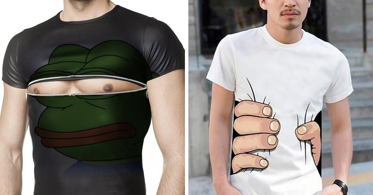
A printed zipper appears to open the shirt and reveal a mechanical interior, superhero suit, galaxy, or tropical beach beneath the fabric.
22. The Wraparound Dragon
The dragon’s head begins on the front, its body crosses the side, and its tail finishes on the back. The wearer must rotate to reveal the full creature.
23. The Pocket Monster
A small illustrated creature grips the edge of a real or printed pocket. Its expression can range from adorable curiosity to the look of someone who has seen your search history.
24. The Human Aquarium
Fish, bubbles, seaweed, and a tiny submarine appear inside a printed window across the torso, transforming the wearer into a walking aquarium.
25. The Rib-Cage Garden
Flowers emerge through a simplified anatomical rib cage. The contrast between bones and blossoms produces a poetic image of resilience and renewal.
26. The Lenticular-Style Transformation
Two interwoven images reveal different subjects depending on the viewing angle. From one side, viewers see a calm face; from the other, a wild animal appears.
27. The Fold-Activated Joke
The shirt displays one message while worn and a different phrase when folded. This gives the design a second life on shelves, in drawers, and during suspiciously elaborate laundry demonstrations.
28. The Shadow Character
A small figure on the chest casts an oversized printed shadow shaped like a superhero, monster, or mythical creature.
29. The Wearer-Controlled Puppet
Artwork positioned around the arms creates a character that moves when the wearer raises or lowers their hands. A bird can flap, a robot can dance, or a crab can become alarmingly enthusiastic.
30. The Torn-Fabric Illusion
Hyperrealistic printing makes the shirt appear ripped open, revealing circuitry, tree bark, scales, or a star-filled universe underneath.
Nature-Inspired T-Shirt Art
31. The Forest Fingerprint
The curved lines of a fingerprint gradually transform into trees. The composition connects personal identity with the natural environment.
32. The Whale and Moon
A whale swims through a night sky while stars drift around its body. The surreal combination feels peaceful, mysterious, and suitable for anyone who has ever wanted the ocean to ignore gravity.
33. The Botanical Anatomy Chart
Flowers and leaves are arranged like a scientific specimen illustration, complete with elegant labels and delicate linework.
34. The Seasonal Tree
One tree is divided into four sections representing spring, summer, fall, and winter. The image communicates change without relying on a motivational paragraph.
35. The Topographic Adventure Map
Contour lines form mountains, lakes, or the silhouette of an animal. A small compass symbol completes the outdoor aesthetic.
36. The Mushroom Neighborhood
Tiny doors, windows, and balconies turn a group of mushrooms into a whimsical village. Small residents can be added for viewers who enjoy discovering hidden stories.
37. The Ocean in a Bottle
A glass bottle contains waves, a lighthouse, clouds, and perhaps a very confused sailboat. The familiar object creates a natural frame for a miniature landscape.
38. The Floral Skull
Leaves and blossoms form the shape of a skull without using hard outlines. The result balances beauty and mortality in a wearable composition.
39. The Pollinator Parade
Bees, butterflies, beetles, and native flowers create an energetic pattern that celebrates the tiny workers responsible for keeping ecosystems busy.
40. The Raincloud Pocket
A cloud floats above the chest pocket while embroidered or printed raindrops fall inside it. The pocket appears to collect the weather.
Typography That Becomes the Illustration
41. The Animal-Shaped Quote
Words curve and compress until they form the silhouette of a wolf, bird, or bear. The message and image become inseparable.
42. The Melting Letters
Bold type drips downward like paint, ice cream, or overheated software. The effect works best with a short phrase and a controlled color palette.
43. The Retro Travel Badge
A fictional destination receives its own vintage tourism logo, complete with mountains, sunset stripes, and a suspiciously optimistic slogan.
44. The Circular Conversation
A sentence runs continuously around a circle and ends where it begins. The format is ideal for messages about routines, cycles, coffee, or meetings with no identifiable conclusion.
45. The Oversized Initial
A single enormous letter becomes a container for smaller illustrations, textures, or personal symbols. It feels both typographic and pictorial.
46. The Hidden Second Phrase
Negative space inside large letters reveals a contrasting message. The viewer reads one idea first and discovers the second after looking more carefully.
47. The Handwritten Correction
A formal printed statement is crossed out and replaced by a handwritten alternative. For example, “Follow the Plan” becomes “Make a Better Plan.”
48. The Sound-Wave Message
A real spoken phrase is converted into a waveform. The sentence can remain secret or appear in tiny lettering beneath the graphic.
49. The Alphabet Personality Test
Most letters appear in gray while a selected few form a hidden word in color. The design becomes a small puzzle for anyone standing close enough to solve it.
50. The Impossible Font
Letters are constructed from staircases, tunnels, and impossible geometric shapes. The type remains readable even while behaving as though physics has taken the afternoon off.
Pop Culture Concepts Without Copying Existing Characters
51. The Generic Space Opera
Original astronauts, planets, and dramatic laser beams capture the energy of classic science-fiction posters without borrowing protected characters or logos.
52. The Unmade Movie Poster
Create a poster for a fictional film, including an absurd title, invented cast names, and a dramatic tagline such as “This Summer, Tuesday Fights Back.”
53. The Imaginary Video Game
Pixel art advertises a game that never existed. Fake screenshots, power meters, and impossible objectives make the shirt feel like a lost arcade treasure.
54. The Alternate-History Band Tee
Design tour merchandise for a fictional band from another century. Imagine medieval synth-pop, Victorian punk, or a prehistoric group that plays exclusively on rocks.
55. The Public-Domain Remix
Classic artwork or historical imagery can be transformed through unexpected color, collage, or modern visual commentary after its legal status has been carefully verified.
56. The Genre Mashup
Combine two original genres, such as a cowboy riding through outer space or a detective investigating supernatural houseplants.
57. The Spoiler-Free Diagram
A fictional story is summarized using arrows, symbols, and vague captions. It looks informative while revealing absolutely nothing useful.
58. The Background Character Appreciation Shirt
Celebrate an invented minor character who supposedly appeared for three seconds, delivered one sandwich, and quietly saved the entire plot.
59. The Fake Streaming Interface
A familiar-looking but original media interface displays the wearer’s current episode: “Season 40, Episode 7: Trying My Best.”
60. The Crossover That Should Not Exist
Blend unrelated original worlds, such as elegant ballet robots and competitive gardening pirates. Creative tension often begins where common sense ends.
Artistic and Experimental T-Shirt Designs
61. The Watercolor Explosion
A controlled burst of translucent color surrounds a crisp black illustration. The contrast between precision and softness creates visual energy.
62. The Glitch Portrait
An original face breaks into offset color channels, scan lines, and digital fragments. The distortion suggests motion, memory, or unreliable technology.
63. The Collage of Everyday Objects
Receipts, keys, plants, ticket stubs, and coffee cups become a carefully balanced visual diary of ordinary life.
64. The Embroidered Constellation
Small stitched stars connected by fine lines create a tactile night sky. Embroidery gives the design dimension without requiring a large print area.
65. The Appliqué Landscape
Different fabric pieces form hills, clouds, trees, and buildings. Texture replaces some of the detail normally supplied by ink.
66. The Blueprint Object
A bicycle, camera, sneaker, or coffee maker is presented as a technical blueprint with measurements, labels, and imaginary engineering notes.
67. The Ink-Blot Creature
A symmetrical ink blot becomes an animal, mask, or alien form. Viewers may see different subjects, which makes the shirt an informal personality test.
68. The Screen-Print Misregistration Effect
Deliberately offset color layers imitate vintage printing imperfections. When controlled carefully, the error becomes the style.
69. The Transparent Anatomy
An illustrated object reveals its internal parts: a camera containing tiny artists, a guitar filled with sound waves, or a toaster powered by miniature dragons.
70. The Wearable Comic Strip
Three or four panels tell a complete visual joke across the front or around the torso. The final panel can appear on the back for an unexpected ending.
Personalized, Community, and Cause-Based Designs
71. The Coordinate Memory Shirt
Geographic coordinates mark a meaningful location, while a small symbol hints at what happened there. It feels personal without explaining the entire story to strangers.
72. The Family Recipe Diagram
A handwritten recipe is surrounded by small ingredient illustrations, stains, and notes. It turns culinary history into wearable family memorabilia.
73. The Neighborhood Map
A simplified street map highlights a favorite café, park, venue, or meeting place. Local designs often create stronger emotional connections than generic city souvenirs.
74. The Team Role Collection
Each group member receives a different title, such as “Planner,” “Snack Manager,” “Emergency Optimist,” or “Person Who Actually Read the Instructions.”
75. The Charity Progress Graphic
A visual meter represents a fundraising or community goal. The design can be updated annually, turning each edition into a record of collective achievement.
76. The Multilingual Welcome Shirt
A central message is repeated in several languages using a balanced typographic layout. Careful proofreading is essential unless accidental international confusion is part of the concept.
77. The Accessibility Icon Pattern
Original symbols representing inclusion, communication, mobility, and sensory awareness form a cohesive pattern rather than appearing as an afterthought.
78. The Pet Portrait With Personality
Instead of a generic animal photo, an illustrated pet appears with its habits, favorite snack, and completely unearned professional title.
79. The Event Timeline
A wedding, reunion, festival, or project launch is represented as a miniature timeline with memorable milestones and humorous detours.
80. The Hand-Drawn Signature Collection
Signatures, doodles, or short notes from a team or class become an all-over composition. The imperfections make the finished piece feel genuinely communal.
81. The Repair-Friendly Design
Decorative patches, visible stitching, and modular graphics are intentionally incorporated so future repairs add character instead of ruining the original artwork.
82. The Evolving T-Shirt
The design leaves designated spaces for new dates, badges, stamps, or embroidered symbols. The shirt changes as the wearer completes trips, events, or personal goals.
How to Turn a Clever Idea Into a Wearable Design
Begin With One Sentence
Before opening design software, describe the concept in one sentence. For example: “A tiny astronaut climbs out of the chest pocket.” If the concept requires several paragraphs, a family tree, and a legal deposition to explain, it may need simplification.
Design for the Shirt, Not Just the Screen
A graphic can look excellent when enlarged on a monitor and disappointing when printed at chest size. Test the artwork on a realistic mockup and inspect it from a distance. Small text, thin lines, muddy shadows, and low contrast are common sources of regret.
Match the Artwork to the Printing Method
Bold graphics with limited colors are natural candidates for screen printing. Highly detailed illustrations and multicolor artwork may suit direct-to-garment or transfer processes. Embroidery works beautifully for compact symbols but generally requires simplified forms and substantial line weight.
Use Placement as Part of the Story
Do not automatically drop every design into the center of the chest. Consider the pocket, hem, sleeve, upper back, shoulder, or wraparound area. A surprising location can transform a familiar illustration into an original experience.
Respect Original Work
Popular characters, brand marks, photographs, song lyrics, slogans, and illustrations should not be copied simply because they can be found online. Create original assets, obtain appropriate permission, or work with material whose permitted use has been verified.
What Experience Teaches You About Creative T-Shirt Design
The first practical lesson is that the idea people praise on a screen is not always the shirt they choose to wear. Audiences may admire an intricate illustration and then purchase the simpler version because it coordinates with more clothes, communicates faster, and does not make them feel like a walking billboard.
Wearability is not the enemy of creativity. It is a useful constraint. The best concepts often become stronger after removing extra text, secondary icons, decorative borders, and the seventh font that seemed essential at 2:00 a.m. A disciplined edit allows the central joke or image to breathe.
Testing actual print size is another valuable habit. Print the artwork on ordinary paper, cut it out, and hold it against a shirt. This low-tech experiment immediately reveals whether the graphic is too large, too low, or positioned as though the wearer’s stomach submitted a separate design request.
Garment color also changes the emotional tone. The same illustration may feel sophisticated on charcoal, cheerful on yellow, nostalgic on faded cream, or dramatic on black. Designers should test several combinations rather than treating the blank shirt as an invisible background.
Fabric matters more than beginners expect. A soft, lightweight shirt feels casual and relaxed, while a heavier garment supports a more structured streetwear look. The physical texture may also affect fine lines, distressed effects, ink coverage, and perceived color. Artwork and material should be selected together.
Another lesson is that humor ages quickly when it depends entirely on a temporary online trend. A shirt built around observation, personality, or a timeless human habit usually remains wearable longer. Coffee, procrastination, pets, awkward conversations, and misplaced confidence have demonstrated impressive cultural durability.
Small details can create disproportionate delight. A tiny sleeve icon, a hidden message near the hem, or a continuation of the illustration on the back rewards closer inspection. These discoveries make the garment feel thoughtfully designed rather than mechanically decorated.
Feedback is most useful when observers are asked specific questions. “Do you like it?” often produces polite approval. “What did you notice first?” and “What do you think the design means?” reveal whether the visual hierarchy and message are working.
A sample print should be treated as part of the design process, not merely a final inspection. Colors may shift, fine elements may disappear, and the artwork may interact unexpectedly with seams or folds. Revising after a physical sample is normal and frequently improves the finished product.
Finally, memorable T-shirt design usually comes from combining familiar ingredients in an unfamiliar way. Cats, planets, flowers, typography, and coffee cups are not new. The originality lies in the relationship between them, the visual execution, and the designer’s point of view. A creative shirt does not need to invent a new universe. Sometimes it only needs to show the existing universe from a much funnier angle.
Conclusion
The most creative T-shirt designs transform an ordinary garment into an idea people can wear. Some rely on beautiful illustration, while others use visual tricks, carefully placed typography, tactile embroidery, or a joke delivered in three words. Their common strength is clarity: each design knows what it wants the viewer to notice and removes whatever gets in the way.
Whether you are creating merchandise, developing an apparel brand, planning an event, or designing a single shirt for personal enjoyment, begin with an original concept and test it in the real world. Consider contrast, fabric, placement, print limitations, readability, and how the shirt will look after the initial novelty fades. Creativity attracts attention, but thoughtful execution earns a place in someone’s regular wardrobe.
Note: The concepts in this article are creative inspiration prompts rather than ready-made artwork. Before publishing or selling a design, verify the licenses, permissions, trademarks, and other rights associated with every graphic, font, photograph, quotation, and third-party element used.