
Note: This article is formatted for direct web publishing, uses standard American English, and removes extra citation artifacts or unnecessary markup.
Changing the foreground color in Photoshop sounds like one of those tiny tasks you can do in two seconds. And sometimes it is. Other times, it somehow turns into a five-minute detour involving the wrong panel, the wrong swatch, and a sudden existential crisis about whether that color is blue-green or green-blue. Photoshop has a special talent for making simple things feel dramatic.
The good news is that changing the foreground color is actually easy once you know where to look. Better yet, Photoshop gives you several ways to do it depending on how you like to work. You can pick a color visually, sample one from an image, enter an exact HEX value, click a saved swatch, or use shortcuts to move at lightning speed like the kind of designer who drinks coffee with purpose.
In this guide, you’ll learn six easy ways to change the foreground color in Photoshop, when each method makes the most sense, and how to avoid the common little mistakes that waste time. Along the way, we’ll also look at practical examples, helpful shortcuts, and workflow tips that make color changes feel a lot less clunky.
What Is the Foreground Color in Photoshop?
Before diving into the methods, let’s clear up one important point. In Photoshop, the foreground color is the active color used by many tools and commands. If you paint with the Brush tool, fill part of a selection, add certain strokes, or work with the Paint Bucket tool, Photoshop usually uses your foreground color first.
You can see it near the bottom of the Tools panel as the front square in the overlapping color boxes. The square behind it is the background color. By default, Photoshop uses black as the foreground color and white as the background color. That default pairing is helpful, but unless your design brief is “make everything look like a vintage newspaper,” you’ll probably change it often.
Why Knowing Multiple Ways to Change It Matters
Knowing just one method is fine for casual edits. Knowing several methods is better for real workflow. Different situations call for different approaches. If you already know a brand’s HEX code, typing it directly is fastest. If you want to match a color from a photo, the Eyedropper tool is the obvious hero. If you use the same color palette repeatedly, swatches save your sanity.
In other words, this is not just about changing a color. It is about changing it quickly, accurately, and with the fewest possible clicks. That is where Photoshop starts feeling less like a puzzle and more like a tool.
1. Click the Foreground Color Swatch in the Tools Panel
This is the classic method, the one most Photoshop users learn first, and for good reason. It is simple, direct, and works in almost every situation.
How to do it
- Look at the bottom of the Tools panel.
- Click the front color square, which is the foreground color swatch.
- The Color Picker opens.
- Choose a hue using the vertical color slider.
- Click inside the larger color field to adjust brightness and saturation.
- Click OK.
This method is ideal when you want a quick visual choice. It also works well when you are experimenting and do not care about exact values yet. Maybe you want a warmer red, a cooler green, or a yellow that says “sunshine” instead of “traffic warning sign.” The Color Picker makes that easy.
Photoshop also lets you enter numeric values right inside the Color Picker, which means this one method can be both casual and precise. That flexibility is why many designers keep coming back to it.
2. Use the Color Panel for Faster, Continuous Adjustments
If the Color Picker feels like opening a full refrigerator just to grab one grape, the Color panel may be more your speed. It lets you adjust the foreground color more fluidly without hopping in and out of a dialog box every few seconds.
How to do it
- Go to Window > Color if the panel is not visible.
- Make sure the foreground color is active.
- Drag the sliders to adjust the color.
- Use the color ramp or enter values if your workspace allows it.
This is especially handy when you want to make small changes while looking at the canvas. For example, if you are painting shadows and need a slightly cooler tone, or if you are adjusting accent colors in a composite, the Color panel is faster than opening the full Color Picker again and again.
Think of it as the “live tweaking” method. It is not flashy, but it is efficient. Photoshop veterans love efficient.
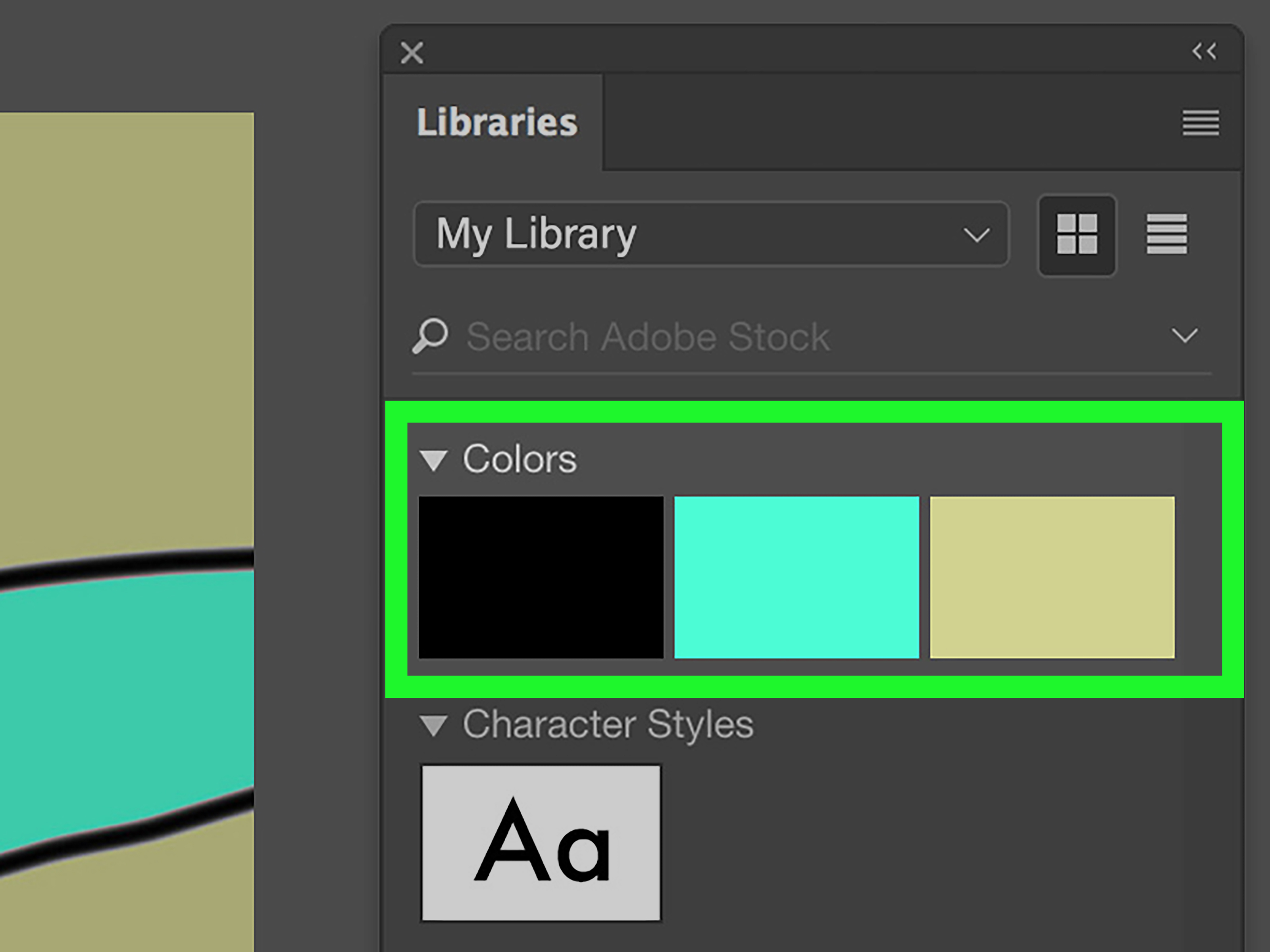
3. Choose a Saved Color from the Swatches Panel
If you use the same colors repeatedly, the Swatches panel is your best friend. Instead of eyeballing the same navy blue for the fifteenth time and hoping it matches, you can simply click the saved swatch and move on with your life.
How to do it
- Open Window > Swatches.
- Click any swatch to make it your foreground color.
- If needed, add your current color as a new swatch for future use.
This method shines when working with brand colors, product mockups, social media templates, and any project where consistency matters. If a client wants the exact same teal across ten graphics, swatches prevent guesswork and keep everything tidy.
It also makes collaboration smoother. Saved swatches help reduce the classic design conversation that goes, “It looks close enough,” followed by “It absolutely is not.”
4. Sample a Color Directly from an Image with the Eyedropper Tool
Sometimes the perfect color is already sitting right there in your image. In that case, don’t reinvent the wheel. Sample it.
How to do it
- Select the Eyedropper tool or press I.
- Click anywhere on the image to sample that color.
- The sampled color becomes your foreground color.
This is one of the fastest ways to match tones in a photo, pull a color from a logo, or create a palette from an existing design. Let’s say you are retouching a product image and want to paint highlights that match a nearby reflection. Or maybe you need text to match a flower in the photo without spending three minutes hunting for the same pink. The Eyedropper tool handles that beautifully.
Photoshop also gives you sample size options, which matters more than people realize. A single-pixel sample can be too literal, especially in noisy images. Averaging a small area often produces a more reliable color. That is a tiny adjustment with a surprisingly big payoff.
5. Enter an Exact HEX, RGB, or CMYK Value
Sometimes “close enough” is not good enough. If you are working with brand standards, print specs, or web design systems, you often need the exact color. No guessing. No eyeballing. No spiritual interpretation of orange.
How to do it
- Click the foreground color swatch to open the Color Picker.
- Enter the exact HEX, RGB, HSB, or CMYK values.
- Click OK.
This method is perfect for web projects where you already have a HEX code, like #1E73BE, or for print work where CMYK values matter. It is also excellent when translating colors between Adobe apps, style guides, or client documents.
If your workflow includes websites, product ads, banners, email graphics, or packaging concepts, numeric entry saves time and improves accuracy. It is the least glamorous method on this list, but it may be the most reliable one.
6. Use Keyboard Shortcuts to Swap, Reset, and Work Faster
Okay, this one is not about picking a brand-new random color out of thin air. It is about changing the foreground color fast using colors you already have or defaults you need constantly. In real workflows, that speed matters.
Essential shortcuts
- Press X to swap the foreground and background colors.
- Press D to reset them to the default black foreground and white background.
- Press Alt + Backspace on Windows or Option + Delete on Mac to fill with the foreground color.
These shortcuts are small but mighty. If you paint on masks, for example, you will use black and white constantly. Resetting to defaults with D and swapping with X becomes second nature. It is one of those habits that separates slow editing from smooth editing.
Even better, once you choose a foreground color with one of the earlier methods, these shortcuts help you apply or switch it instantly. That makes them part of a smart color workflow, not just a bonus trivia fact for Photoshop nerds.
How to Use the New Foreground Color Right Away
Changing the foreground color is only half the story. The other half is actually using it. Here are a few common ways the new color shows up in your work:
- Brush tool: Paint directly with the active foreground color.
- Paint Bucket tool: Fill areas of similar color.
- Edit > Fill: Fill a selection or layer area with the foreground color.
- Shapes and strokes: Apply the selected color to visual elements.
- Masks: Use black, white, or gray foreground values to control visibility.
A practical example: imagine you are creating a YouTube thumbnail. You sample a bright blue from a logo with the Eyedropper tool, make it your foreground color, and then use the Brush tool to paint a matching highlight behind the headline. That is fast, consistent, and visually cohesive. Photoshop loves a neat workflow almost as much as it loves having seventeen ways to do one thing.
Common Mistakes When Changing Foreground Color
Confusing foreground and background color
This is the big one. If you click the back square instead of the front one, you will change the background color instead. Then you start painting, nothing matches, and suddenly trust issues develop.
Sampling the wrong pixel
With the Eyedropper tool, noisy images or tiny details can produce unexpected results. Adjust the sample size if needed.
Forgetting the active panel
In the Color panel, make sure the foreground color is the active target before changing values.
Using a rough visual match when exact values matter
If a client gives you a HEX code, use it. Guessing is how brand consistency quietly goes on vacation.
Which Method Should You Use?
Here is the simplest way to choose:
- Use the Tools panel swatch for general color picking.
- Use the Color panel for quick live adjustments.
- Use Swatches for repeated or saved colors.
- Use the Eyedropper to match colors from an image.
- Use HEX/RGB/CMYK entry for exact values.
- Use shortcuts when speed matters and you already know your active colors.
There is no single best method for every situation. The best method is the one that gets you to the right color with the fewest clicks and the least amount of muttering at your screen.
Experience-Based Tips From Real Photoshop Workflows
Anyone who spends real time in Photoshop eventually notices that changing the foreground color is rarely just a tiny isolated action. It tends to be part of a larger rhythm. You sample a color, paint a correction, swap to black, touch up a mask, jump back to your sampled color, then tweak it slightly because what looked perfect in the picker suddenly looks weird on the canvas. That is normal. In fact, that is basically the Photoshop experience in one sentence.
One of the most common lessons people learn is that the fastest method is not always the best method. Clicking the foreground swatch and choosing a color manually is quick, but if the project needs consistency across multiple files, swatches are smarter. The Eyedropper tool is great for sampling a beautiful color from a photo, but the sampled result may look different when used on another layer, especially if the lighting or blend mode changes. That is why experienced users often sample first, then fine-tune in the Color panel or Color Picker.
Another real-world issue is color perception. A color can look perfect in the Color Picker and still feel wrong once it is placed next to text, skin tones, shadows, or bright highlights. This happens all the time in thumbnails, ad graphics, and product composites. The fix is simple but important: test the color in context. Paint with it. Fill with it. Put it next to the elements it will actually live with. A foreground color is not successful because it looks nice alone. It is successful because it works in the design.
Masking work creates another pattern. People often change foreground colors constantly while painting masks because black, white, and gray each do different jobs. This is where the D and X shortcuts become absolute lifesavers. Users who work on masks, composites, or retouching jobs every day often rely on those shortcuts so much that clicking the color boxes manually starts to feel painfully slow.
There is also a practical lesson in precision. For branding, packaging, website mockups, and marketing assets, typing the exact HEX or RGB value is usually the safest choice. Guessing the color by eye may work for casual personal projects, but in client work, “almost the same” can turn into revision number six. Exact input avoids that headache before it starts.
Finally, one of the best workflow habits is saving colors you know you will reuse. Building swatches for recurring projects can make Photoshop feel dramatically faster and more organized. It cuts down on repeated picking, repeated sampling, and repeated second-guessing. In other words, it saves time, reduces mistakes, and helps you look like the calm, efficient Photoshop wizard you were clearly meant to be.
Final Thoughts
Changing the foreground color in Photoshop is easy once you know your options. The trick is not just learning one method, but learning the right method for the moment. Sometimes you need visual freedom. Sometimes you need exact numbers. Sometimes you need speed. And sometimes you just need Photoshop to stop pretending that two overlapping little boxes are somehow intuitive for everyone.
Start with the Tools panel if you are new. Add the Color panel when you want faster adjustments. Use swatches for consistency, the Eyedropper for matching, numeric values for precision, and shortcuts for speed. Once these become habits, your workflow gets smoother, faster, and a lot less annoying.
And that is really the goal: fewer clicks, better color choices, and less time arguing with a panel that was quietly right in front of you the whole time.
SEO Tags