
Note: This article is written as a practical, renter-aware design feature. Product names and specific brands are intentionally omitted so the ideas can be adapted to different budgets, layouts, and personal styles.
Some apartments arrive with plenty of square footage and absolutely no personality. You know the type: beige walls, gray floors, one sad ceiling light, and cabinets that appear to have been chosen by a committee determined to offend no one. It is not ugly, exactly. It is just the visual equivalent of unbuttered toast.
That was the starting point for this apartment transformation: a clean but completely soulless space that felt more like a temporary waiting room than a home. The goal was not simply to add a few throw pillows and call it character. The mission was bigger, bolder, and a little more dramatic: turn a bland apartment into a layered, joyful, maximalist home where color, pattern, art, books, texture, and personal history could all coexist without starting a turf war.
The result is proof that a “more is more” apartment can still feel organized, polished, and surprisingly restful. Maximalism is not about filling every available square inch with random stuff. It is about creating a home that looks collected, lived-in, and unmistakably yours.
The Before: Clean, Neutral, and Completely Forgettable
Before the makeover, the apartment had all the usual ingredients of a modern rental: white walls, builder-grade lighting, pale laminate floors, minimal window treatments, and rooms that seemed to echo after a single sneeze. The furniture was practical but generic. The walls were mostly bare. The living room had a sofa, a coffee table, and the emotional energy of an airport lounge.
Nothing was technically wrong with it. That was the problem.
A soulless apartment often lacks three things: visual depth, emotional connection, and contrast. It may have furniture, but no story. It may have storage, but no display. It may have a “neutral palette,” but not one object that makes a guest ask, “Where did you get that?”
The apartment did not need to become a museum, a carnival, or a velvet-covered fever dream. It needed a point of view.
What “More Is More” Really Means in Apartment Design
Maximalist interior design is often misunderstood as clutter with better public relations. In reality, successful maximalism is highly intentional. It uses bold color, layered textures, mixed patterns, art, collected objects, and expressive furniture to create a home that feels personal rather than generic.
The key word is curated. A room can include floral fabric, striped pillows, vintage brass, books, ceramics, graphic art, and a leopard-print ottoman without becoming visual chaos. The difference is whether those pieces share a thread: a color palette, a mood, a memory, a material, or a story.
Think of a maximalist apartment as a great dinner party. There may be many interesting people in the room, but someone still has to make sure nobody is yelling over everyone else.
The Golden Rule: More Meaning, Not More Randomness
Before buying anything new, the design plan began with a simple question: What should this apartment say about the people who live here?
The answers became the foundation of the transformation:
- Travel memories deserved to be visible, not trapped in drawers.
- Favorite books should become part of the décor.
- Color should feel warm and expressive, not accidental.
- Vintage finds should mix with modern furniture.
- Every room needed one unforgettable moment.
That list kept the apartment from becoming a clearance aisle with a lease agreement.
The After: A Colorful Apartment With a Point of View
The finished apartment feels richer, warmer, and far more alive. Instead of treating the rooms as blank containers, the makeover treated them like a series of small stages. Each area has its own personality, but the overall home still feels connected.
The transformation relied on a few major moves: color drenching, patterned textiles, layered lighting, art-filled walls, smarter storage, and a mix of old and new pieces. None of the choices had to be expensive. They simply had to be intentional.
Step One: Give the Apartment a Color Story
The fastest way to make a bland apartment feel designed is to create a strong color story. Instead of randomly adding bright accessories, this makeover used a controlled palette of deep green, rust, cobalt blue, soft pink, warm cream, and brass.
The colors were repeated from room to room in different proportions. The living room used green as the anchor, with rust and pink in pillows, artwork, and accessories. The dining corner leaned into blue and brass. The bedroom softened the palette with dusty rose, cream, burgundy, and dark wood.
This repetition matters. When bold colors appear throughout an apartment, they stop feeling like isolated accidents and begin to feel like a deliberate design language.
Try Color Drenching in One Small Area
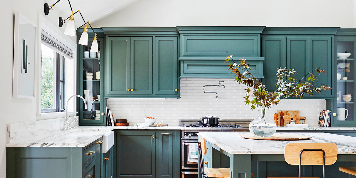
One of the biggest changes came from color drenching a small wall near the entryway. Instead of painting only one “accent wall” and hoping for magic, the wall, trim, and nearby shelf were painted in the same saturated green. The result made a boring pass-through feel like a destination.
Color drenching can work especially well in compact spaces because it creates visual continuity. A small corner becomes more immersive, not necessarily smaller. The trick is to use a color you genuinely love, not a shade you selected because it looked safe on a paint chip the size of a postage stamp.
For renters, removable wallpaper, peel-and-stick murals, large fabric panels, or painted furniture can create a similar effect without turning the security deposit into a suspense thriller.
Step Two: Mix Patterns Like You Mean It
Pattern mixing is one of the most intimidating parts of a maximalist apartment makeover. Many people worry that combining florals, stripes, checks, and animal prints will make a room look like a fabric store after a minor tornado.
The secret is scale.
Use one large-scale pattern, one medium-scale pattern, and one smaller detail pattern. For example, a large floral curtain can work beautifully with a medium stripe rug and tiny geometric pillow trim. When every print is the same size and intensity, the room starts to feel like it is arguing with itself.
A Foolproof Pattern-Mixing Formula
- Choose one dominant pattern for the largest visual surface.
- Add one secondary pattern in a different scale.
- Use a smaller accent pattern in pillows, lampshades, or art.
- Repeat at least one color across all patterns.
- Include solids and textured materials so the eye can rest.
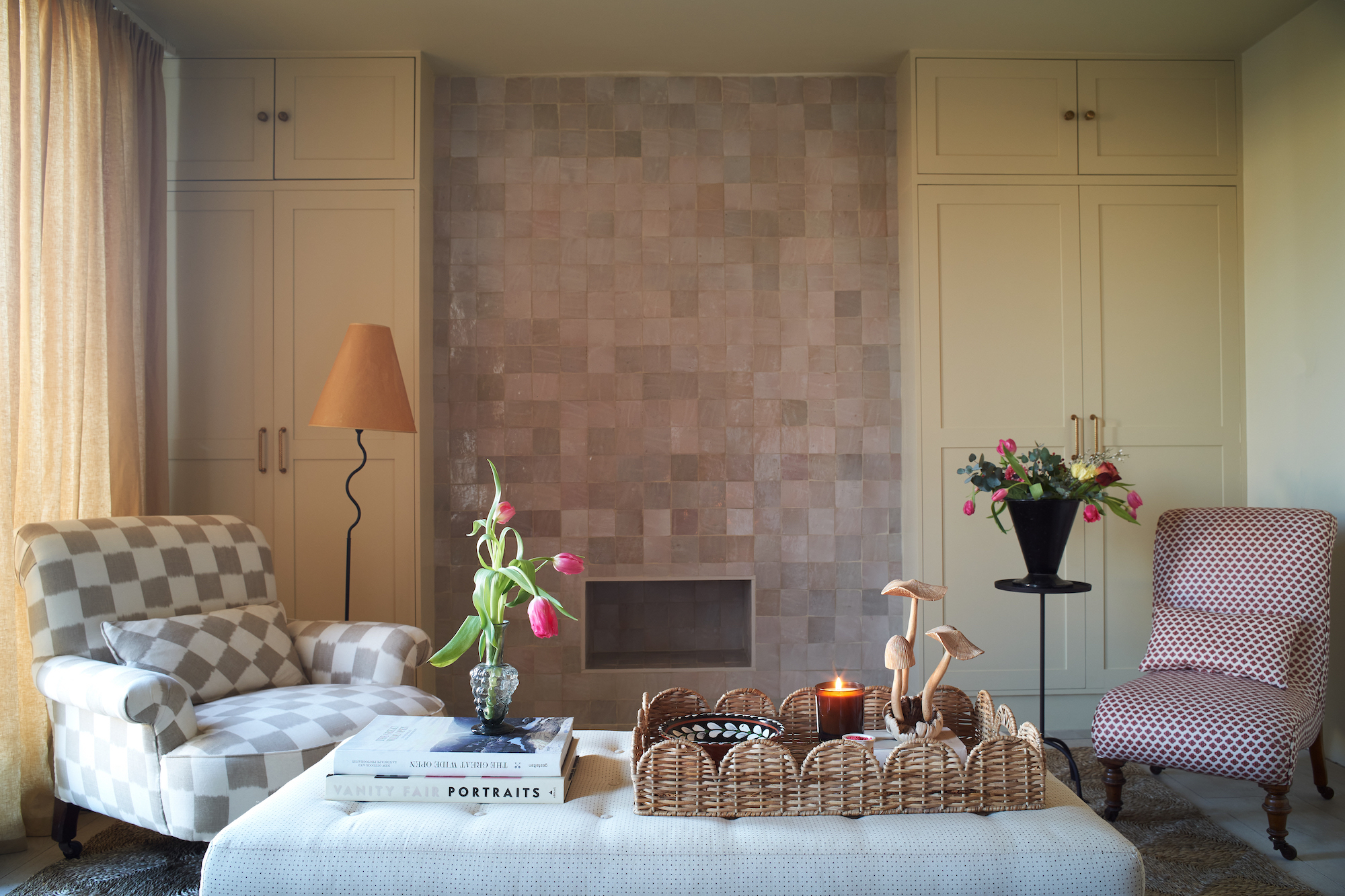
In the living room, the makeover used a patterned area rug as the main statement. A striped chair, velvet pillows, and a graphic throw added contrast. The patterns did not match perfectly, which was exactly the point. They related through color and mood, not through a desperate attempt to look like a furniture showroom set.
Step Three: Layer Textures Until the Room Feels Touchable
A soulless apartment often feels flat because every material is smooth, pale, and practical. Think laminate floors, flat-painted walls, synthetic upholstery, and shiny metal fixtures. Functional? Yes. Memorable? Not so much.
Texture changes everything.
The makeover introduced velvet, woven baskets, dark wood, brass, linen, ceramic, glass, rattan, books, framed textiles, and a little fringe. Not every item screamed for attention, but together they made the apartment feel warmer and more dimensional.
A textured room invites people to stay. It says, “Sit down, touch something, have a snack, and admire the weird little lamp I found at a flea market.”
Easy Texture Upgrades for a Rental Apartment
- Layer a flat-weave rug over a larger neutral rug.
- Swap basic pillow covers for velvet, linen, embroidery, or tassels.
- Add woven shades, curtains, or fabric panels.
- Use ceramic lamps instead of relying only on metal fixtures.
- Display books, baskets, and handmade pottery on open shelves.
- Bring in warm wood through stools, trays, frames, or side tables.
The goal is not to buy every interesting material in the universe. The goal is to avoid creating a room where every surface feels like it was wiped down with the same disinfecting wipe.
Step Four: Turn Blank Walls Into a Personal Gallery
The original apartment had plenty of wall space and almost nothing on it. That made the rooms feel unfinished, even when the furniture was in place. Art became one of the most powerful tools in the makeover because it added personality without taking up precious floor space.
The gallery wall combined framed prints, candid family photos, postcards, a textile fragment, a small mirror, and a vintage brass wall piece. The frames varied in size and finish, but the overall arrangement felt cohesive because the colors echoed the room’s palette.
A great gallery wall should feel like a visual autobiography. It does not need to contain expensive art. It needs to contain things you actually want to look at every day.
How to Build a Gallery Wall That Does Not Look Accidental
Start by laying everything out on the floor. Photograph the arrangement before committing to the wall. Mix horizontal and vertical pieces, include a few larger anchors, and leave consistent spacing between frames. A gallery wall does not need to be perfectly symmetrical, but it should look intentional from across the room.
Do not stop at framed prints. Add a small plate, textile, record cover, handwritten note, vintage mirror, or sculptural object. The best gallery walls have variety, visual rhythm, and a little surprise.
Step Five: Use Lighting as Jewelry for the Apartment
Builder-grade overhead lighting has a special talent for making everyone look tired and every room look like a dentist’s office. The makeover replaced the single-source lighting approach with layers.
There were table lamps for warmth, a floor lamp for reading, plug-in sconces for the bedroom, and small accent lighting on bookshelves. The apartment immediately felt softer and more expensive, even though the room dimensions had not changed by a single inch.
Lighting is the jewelry of a maximalist room. A sculptural lamp, pleated shade, colorful base, or antique-style sconce can be as expressive as a piece of art.
The Three-Layer Lighting Plan
- Ambient lighting: General illumination from ceiling fixtures or floor lamps.
- Task lighting: Focused light for reading, working, cooking, or getting dressed.
- Accent lighting: Lamps, sconces, picture lights, or shelf lighting that creates mood.
Even a small apartment benefits from multiple light sources. The room becomes more flexible, more flattering, and much less dependent on one lonely ceiling fixture trying to do the work of an entire lighting department.
Step Six: Make Storage Part of the Décor
Maximalism only works when everyday clutter has somewhere to go. Mail, chargers, laundry, cleaning products, receipts, cables, and mystery objects from the junk drawer do not become charming simply because they are surrounded by colorful pillows.
The makeover balanced display storage and hidden storage. Open shelves showed books, framed art, plants, ceramics, and travel souvenirs. Closed cabinets, baskets, storage ottomans, and under-bed bins handled the less photogenic parts of daily life.
This is one of the biggest lessons in apartment decorating: display what tells your story, hide what tells the story of three months of unopened mail.
Display Versus Hide: A Maximalist Storage Rule
Display objects that are beautiful, meaningful, or useful enough to earn visual real estate. Hide objects that are repetitive, messy, or only interesting to your phone charger.
For example, a collection of colorful glassware can live on open shelving. A stack of mismatched plastic food containers should remain behind a cabinet door, where it can continue its mysterious ecosystem in private.
Step Seven: Mix Vintage Finds With Modern Basics
The apartment avoided looking too trendy by mixing new functional furniture with vintage and secondhand accents. A modern sofa became more interesting next to an antique-style side table. A clean-lined dining table looked warmer with mismatched dining chairs. A flea-market mirror brought character to a hallway that had previously been about as exciting as a tax form.
Vintage pieces are valuable because they introduce age, imperfection, and story. They make a home feel collected over time instead of delivered in one large cardboard shipment.
That does not mean every item must be old. A successful “more is more” apartment often needs simple modern pieces to create balance. The sofa can be streamlined. The rug can be bold. The lighting can be sculptural. The side table can look like it has survived several decades and at least one questionable paint color trend.
Before and After: Room-by-Room Transformation Ideas
Living Room: From Generic Lounge to Conversation Starter
Before: Neutral sofa, blank walls, one overhead light, and a coffee table with no personality.
After: A bold rug anchored the room, while colorful pillows, a vintage-inspired lamp, layered artwork, stacked books, and a patterned chair created a lived-in atmosphere. A large plant softened the corners, and a tray on the coffee table gathered candles, coasters, and small decorative objects into one intentional composition.
Dining Area: From Empty Corner to Miniature Bistro
Before: A small table, basic chairs, and a pendant light that looked like it had given up.
After: A dramatic wall color, patterned curtains, mixed dining chairs, framed art, and a colorful tabletop made the space feel like a tiny neighborhood café. The design was playful without sacrificing function.
Bedroom: From Sleep Pod to Layered Retreat
Before: White bedding, a plain bed frame, empty walls, and a nightstand holding one water glass and a charger.
After: The bedroom gained a patterned headboard, layered bedding, dark curtains, art above the bed, reading lamps, a vintage-style rug, and a collection of books and small objects on the nightstand. The room felt cozy, dramatic, and much less like a hotel room where someone forgot to finish decorating.
Common “More Is More” Mistakes to Avoid
Maximalist decorating is joyful, but it is not a free pass to skip editing. A strong apartment makeover still needs breathing room, practical pathways, and clear focal points.
Trying to Make Every Object a Star
If every item is oversized, brightly colored, patterned, shiny, and loudly announcing itself, the room becomes exhausting. Choose a few hero pieces and let supporting pieces play quieter roles.
Ignoring Scale
A tiny rug in a large room will look lost, while a giant sectional in a narrow apartment can block movement. Bold décor works best when furniture still fits the room. Maximalism should feel abundant, not impossible to walk through.
Buying Décor Before Creating a Plan
Impulse buys can be fun, but too many unrelated purchases create confusion. Start with a mood, palette, or anchor piece. Then build around it gradually.
Forgetting the Practical Stuff
A beautiful apartment still needs outlets, storage, seating, surfaces, and room to open doors. Design should make life better, not make you move three pillows before you can sit down.
Final Thoughts: A Home Should Look Like Someone Lives There
The best part of this before-and-after apartment transformation is not the wallpaper, rug, art, lamps, or colorful furniture. It is the feeling that the home now belongs to someone.
A soulless apartment does not need a total renovation to become memorable. It needs color with confidence, décor with meaning, and enough visual personality to make the rooms feel alive. Whether you start with a gallery wall, a dramatic lamp, a patterned rug, or one unapologetically bold paint color, the goal is the same: make your home feel less like a temporary box and more like a place with a pulse.
“More is more” does not mean every surface has to be full. It means your apartment should not be afraid to show who you are.
Experiences From a “More Is More” Apartment Makeover
The first surprising thing about living in a maximalist apartment is how quickly the space changes your routine. A room that once felt like a place to drop a bag and scroll on your phone starts inviting you to participate in it. You notice the art in the hallway while making coffee. You pick a favorite mug because the open shelf makes every cup look like part of a tiny collection. You light a lamp at dusk because the apartment suddenly has more than one mood.
That is what happened after this makeover. The apartment did not just look better in photographs. It became easier to enjoy on an ordinary Tuesday.
The entryway was the first test. Before, it was a narrow stretch of wall with shoes on the floor and absolutely no reason to pause. After adding a saturated paint color, a slim vintage-style mirror, a small shelf, and one oversized framed print, it became a transition zone. Walking through the door felt different. The apartment greeted you instead of merely allowing entry.
In the living room, the biggest lesson was that comfort and personality are not enemies. At first, there was concern that patterned pillows, layered rugs, artwork, books, and accessories would make the space feel busy. Instead, the room felt more comfortable because it offered more to look at and more ways to settle in. A reading lamp created a corner for quiet evenings. A large tray gave the coffee table a sense of order. Books became conversation starters. The once-empty wall became a visual map of favorite places, artists, colors, and memories.
Guests reacted differently, too. In a bland apartment, people tend to say polite things about the sofa. In a layered apartment, they ask questions. They want to know where the mirror came from, whether the artwork is from a trip, why there is a tiny ceramic tiger on the shelf, and how the colors somehow work together. Those conversations are part of the value of a personal home. Décor becomes a form of storytelling.
The bedroom transformation was perhaps the most emotional. A plain bedroom can feel functional, but it rarely feels restorative. Adding dark curtains, warm lamps, patterned bedding, framed art, and textured pillows created a room that felt separate from the rest of the apartment. It became a retreat rather than simply the place where the bed happened to be.
There were practical lessons as well. More décor means more editing. The apartment looked best when collections were grouped and surfaces were reset regularly. A maximalist home needs systems: baskets for loose items, drawers for cables, trays for daily objects, and shelves that are arranged with intention rather than panic. The design works because not everything is on display.
Another unexpected experience was learning to trust personal taste. At first, it was tempting to ask whether a color was “too much,” whether a pattern was “too bold,” or whether an old piece looked “too weird.” Eventually, the better question became: Does this make the apartment feel more like home?
That question is liberating. It shifts decorating away from trying to impress strangers and toward creating a space that supports your real life. Maybe that means a wall full of family photos. Maybe it means mismatched chairs, a record collection, travel souvenirs, colorful curtains, or a lamp shaped like a mushroom. A home does not need to appeal to everyone. It only needs to feel right to the people who live there.
In the end, the “more is more” treatment worked because it was not really about having more possessions. It was about having more warmth, more memory, more color, more comfort, and more evidence that life is happening inside the walls.
SEO Metadata