
Your bedroom is basically your daily “recharge dock,” so the colors you wrap it in matter more than your throw pillows
(and yes, your throw pillows matter toojust less dramatically). The best bedroom color schemes aren’t just pretty on a
paint chip; they’re the ones that look good in your light, flatter your furniture, and make you want to stay in bed for
the right reasons.
Below are 30 bedroom color scheme ideasranging from calm neutrals to moody jewel toneseach with practical styling
notes so you can steal the look without accidentally turning your room into a weird museum exhibit called “Regret, 2026.”
How to Choose a Bedroom Color Scheme That Actually Feels Good
Start with the mood, not the paint aisle
Ask yourself what you want the room to do for you: soothe you, energize you, feel cozy, feel airy, feel hotel-luxe, or
feel like a Pinterest board that pays rent. Calming palettes tend to live in the soft blue/green/neutral neighborhood.
Cozy palettes often lean warm (creams, clay tones, soft browns). Dramatic palettes usually go deep (navy, charcoal, forest
green, aubergine).
Let the light pick the undertone
North-facing rooms can make cool colors feel extra cool; south-facing rooms can warm everything up. If your bedroom light
is golden, a “neutral” beige can turn into “surprise banana bread.” Always test large swatches and look at them morning,
afternoon, and night.
Use the 60–30–10 rule (but don’t be a robot about it)
A simple formula helps: 60% dominant color (walls/large rug), 30% secondary (bedding/drapes), 10% accent (pillows/art/metal).
Break the rule when you want, but it’s a great training wheels moment.
Pick finishes with real life in mind
Matte and eggshell hide wall flaws and feel softgreat for bedrooms. Satin is easier to wipe but can highlight bumps.
Semi-gloss belongs on trim and doors (unless you’re going for “my bedroom is a shiny apple,” which is… a choice).
30 Bedroom Color Schemes (With Styling Notes)
-
1) Warm White + Natural Oak + Matte Black
Why it works: Clean, bright, and timelesslike a crisp hotel sheet you didn’t have to wash.
Try it with: warm white walls, oak furniture, black sconces or curtain rods, and textured linen bedding.
Add a soft taupe rug to keep it from feeling stark. -
2) Cream + Blush + Brushed Brass
Why it works: Gentle warmth without turning sugary.
Try it with: creamy walls, blush bedding or an upholstered headboard, and brass accents (mirror, lamps).
Balance with natural texturesjute, cane, or light woodto keep it grown-up. -
3) Greige + Crisp White + Linen Beige
Why it works: The “quiet luxury” of color schemessubtle, polished, and easy to style.
Try it with: greige walls, bright white trim, beige curtains, and a layered bed in whites and oatmeal tones.
Add a single darker accent (charcoal frame or black nightstand) for definition. -
4) Putty Taupe + Soft Charcoal + Walnut
Why it works: Warm-neutral sophistication with a little edge.
Try it with: putty-colored walls, charcoal bedding or a rug, and walnut furniture. Add creamy lampshades and
a few ceramic pieces in warm white so the palette stays inviting. -
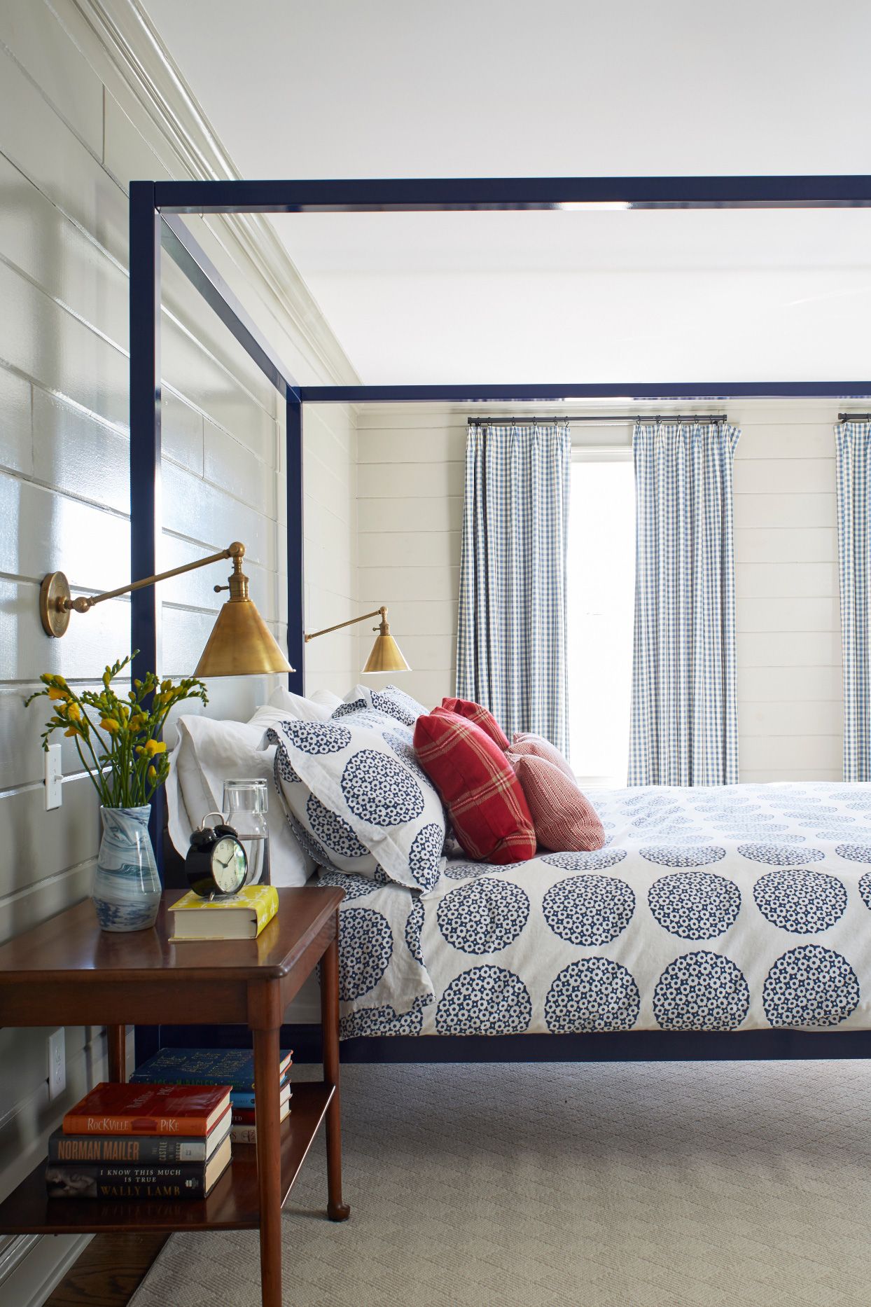
5) Pale Gray + Navy + Bright White
Why it works: Classic, calm, and tailored.
Try it with: pale gray walls, navy accents (headboard, throw, or an accent wall), and white bedding for pop.
Brass or polished nickel finishes both look sharp here. -
6) Powder Blue + Cloud White + Rattan
Why it works: Airy and beachy without screaming “souvenir seashell collection.”
Try it with: powder blue walls, cloud-white bedding, rattan lighting or a bench, and sandy-toned textiles.
Add a touch of navy for contrast if it feels too sweet. -
7) Sky-Blue Ceiling + Warm White Walls + Light Wood
Why it works: A subtle twist that feels expansiveespecially in smaller bedrooms.
Try it with: warm white walls, a soft sky-blue ceiling (or ceiling + crown molding), and light wood furniture.
Keep patterns minimal so the ceiling moment stays soothing, not circus-like. -
8) Sea-Glass Blue-Green + Sandy Beige + Soft White
Why it works: Nature-inspired and flexiblecool enough to calm, warm enough to cozy.
Try it with: blue-green walls, beige linen curtains, white bedding, and driftwood-toned decor. Add glass or
ceramic accents in watery tones for a layered look. -
9) Deep Navy + Ivory + Antique Gold
Why it works: Moody, elegant, and surprisingly restful when done right.
Try it with: navy walls or a navy accent behind the bed, ivory bedding, and antique gold lighting. Add texture
(velvet, bouclé, chunky knit) so the dark color feels plush, not flat. -
10) Teal + Warm Wood + Cream
Why it works: Teal brings personality; warm wood keeps it grounded.
Try it with: a rich teal feature wall, cream bedding, and mid-tone wood furniture. Sprinkle in black or brass
hardware for contrast. If teal feels loud, pick a muted “dusty” version. -
11) Sage Green + Off-White + Natural Fiber
Why it works: Calm, organic, and incredibly forgiving with mixed decor styles.
Try it with: sage walls, off-white bedding, woven baskets, and soft wood tones. Add subtle pattern (thin stripe
or tiny floral) to keep it from feeling too flat. -
12) Eucalyptus Green + Terracotta + Oatmeal
Why it works: Earthy and modernlike a boutique spa that also serves snacks.
Try it with: eucalyptus walls, terracotta pillows or art, and oatmeal bedding. Finish with aged brass or bronze
for a warm, cohesive glow. -
13) Forest Green + Camel + Brass
Why it works: Deep and cozy, with camel acting like a warm “candlelight” neutral.
Try it with: forest green walls, camel bedding or a rug, brass sconces, and a few creamy accents. This is also
a great palette for leather details (bench, chair, straps). -
14) Olive + Cream + Black Accents
Why it works: Olive is earthy; black adds structure; cream keeps it soft.
Try it with: olive walls, cream bedding, black frames, and a patterned rug that includes all three colors.
Add wood to prevent the black from feeling too sharp. -
15) Lavender-Gray + Creamy White + Light Oak
Why it works: A subtle “color” that reads sophisticated, not nursery.
Try it with: lavender-gray walls, creamy white bedding, and light oak furniture. Add soft metallics (champagne
or brushed nickel). It’s especially flattering with warm, ambient lighting. -
16) Soft Lilac + Off-White + Pale Pink
Why it works: Romantic but gentle, like a good playlist at a reasonable volume.
Try it with: soft lilac walls, off-white bedding, and pale pink accents in pillows or art. Use plenty of texture
(linen, knit, boucle) so the palette feels layered, not sugary. -
17) Dusty Peony Pink + Grass Green + Crisp White
Why it works: A fresh, garden-inspired combo that feels modern when the tones are muted.
Try it with: dusty pink walls, a lively green throw or upholstered chair, and lots of white bedding and trim.
Add natural wood so it feels grounded and not overly “theme-y.” -
18) Blush Beige + Chocolate Brown + Warm White
Why it works: Cozy warmth with a modern edgelike hot cocoa, but styled.
Try it with: blush-beige walls, chocolate accents (headboard, drapery, or rug), and warm white bedding. Add
brass or wood tones; avoid stark white that can feel too sharp here. -
19) Terracotta + Warm White + Cognac Leather
Why it works: Terracotta adds glow; white keeps it breathable.
Try it with: terracotta accent wall or painted niche, warm white bedding, and cognac leather details (bench,
chair, straps). Add a woven pendant to amplify the sunset warmth. -
20) Muted Rust + Oatmeal + Dark Bronze
Why it works: Rich and cocooninggreat for bedrooms that need a “hug.”
Try it with: rust-toned walls, oatmeal bedding, and dark bronze hardware. Introduce pattern in small doses
(a geometric pillow, a stitched quilt) to keep it interesting. -
21) Warm Brown “New Neutral” + Cream + Soft Black
Why it works: Brown reads timeless and comforting when it’s not too orange or too muddy.
Try it with: a soft brown on walls, cream textiles, and black accents for crisp lines. Add wood in a similar
temperature so it feels intentional, not mismatched. -
22) Charcoal + Soft White + Smoky Glass
Why it works: High-contrast drama that still feels restful when softened with warm lighting.
Try it with: charcoal on one or all walls, soft white bedding, and smoky glass lamps or decor. Balance with
plush texturesthink velvet, thick rugs, or a padded headboard. -
23) Blue-Gray (Almost Black) + Blush + Brass
Why it works: Moody sophistication with a soft counterpoint.
Try it with: a deep blue-gray wall color, blush textiles (not too pink), and brass accents. Keep the rest
neutral so the palette feels intentional, not chaotic. -
24) Uplifting Yellow + White + Denim Blue
Why it works: Cheerful without being loud when you pick a softened, buttery yellow.
Try it with: pale yellow walls, white bedding, and denim-blue accents (pillows, art, a rug). Warm woods and
natural fibers keep it cozy, not cartoonish. -
25) Mustard + Warm Gray + Walnut
Why it works: Mustard feels golden and comforting, especially paired with grounding neutrals.
Try it with: mustard on an accent wall or lower half, warm gray on the rest, and walnut furniture. Add cream
bedding so the scheme stays bright and breathable. -
26) Coral + Sand + Bright White
Why it works: Playful, warm, and flatteringgreat for rooms that feel cold or dim.
Try it with: coral accents (art, pillows, a quilt), sand-toned walls or rug, and crisp white bedding. Keep the
coral on the “muted” side so it reads chic, not neon. -
27) Soft Peach + Warm White + Light Wood
Why it works: Peach adds warmth and glow, especially with creamy neutrals.
Try it with: peachy walls (or peach bedding), warm white trim, and light wood furniture. Add a tiny pop of
sage or olive in greenery or art to keep it fresh. -
28) Burgundy + Beige + Aged Brass
Why it works: Cozy, intimate, and dramaticideal for larger bedrooms.
Try it with: burgundy as an accent wall or on lower paneling, beige walls or bedding, and aged brass lighting.
Bring in texture (velvet curtains, wool rug) so it feels luxe, not heavy. -
29) Plum (Aubergine) + Ivory + Walnut
Why it works: Deep plum reads romantic and sophisticated, especially with creamy neutrals.
Try it with: plum walls or a plum upholstered bed, ivory bedding, and walnut furniture. Add soft blush or
dusty rose in small doses if you want extra warmth. -
30) Tonal Neutrals: Sand + Camel + Cream
Why it works: Monochrome neutrals feel serene when you vary texture and depth.
Try it with: sand walls, camel throw blankets, cream bedding, and multiple textureslinen, wool, boucle,
woven shades. Add one dark accent (espresso frame or black sconce) for a clean outline.
Quick Styling Tricks That Make Any Color Scheme Look More Expensive
- Repeat the accent color 3 times: for example, navy in a pillow, a frame, and a lamp baseinstant cohesion.
- Match your metals: mixing is fine, but pick a “main” finish so the room doesn’t look like it’s wearing borrowed jewelry.
- Use texture like it’s a color: linen, velvet, boucle, and chunky knits add depth even in a “boring” neutral room.
- Anchor with a rug: if your palette feels floaty, a rug that includes two or three palette colors pulls it together fast.
- Don’t forget the ceiling: white keeps things airy; a tinted ceiling can feel cozy and designed (especially with soft blues or warm whites).
Wrap-Up: Your Bedroom Should Feel Like a Yes
The best bedroom paint colors aren’t the loudest or trendiestthey’re the ones that make you exhale when you walk in.
Start by picking the mood you want, test your colors in your real lighting, and build your palette with textiles and
textures so it feels layered instead of flat. Your bed deserves a good backdrop. You do too.
of Real-Life Bedroom Color Experiences
Here’s something people don’t tell you until you’ve painted a bedroom at least once: the “perfect” color in a store can
behave like a totally different creature at home. In the morning, your soft greige may look calm and creamy; by evening,
it can turn slightly greenish under warm bulbs. That’s not failurethat’s undertone reality. The best experience you can
give yourself is testing big swatches and living with them for a couple days, like you’re speed-dating paint.
Another common experience: darker colors feel intimidating on the first coat, then magical on the second. Deep navy,
charcoal, forest greenthese shades often look patchy mid-project and then suddenly click into “moody boutique hotel” once
the finish evens out. People who try a dark bedroom palette often say the room feels quieter at nightlike the walls are
gently turning the volume down. The trick is balancing darkness with soft bedding, warm lighting, and enough texture so it
feels cozy instead of cave-like.
Warm neutrals create a different kind of comfort. Creams, putty tones, soft browns, and oatmeal shades tend to make a
bedroom feel forgivingespecially if you have mixed wood furniture or decor you don’t want to replace. Many homeowners
notice they “stop noticing the walls” in the best way: the room feels settled, not busy. That calm backdrop also makes it
easier to swap in seasonal textilesrust in fall, sage in spring, navy in summerwithout repainting every time your mood
changes.
Blues and blue-greens are popular for a reason: people consistently describe them as fresh, clean, and sleep-friendly.
A pale blue can feel airygreat for small bedroomswhile a dusty teal can feel mature and cozy. The experience to watch
for is temperature: some blues skew icy. If your room already feels cool, pairing blue with warm white trim, tan textiles,
and wood tones keeps it from drifting into “dentist office at midnight.”
Softer color schemeslavender-gray, blush-beige, muted peachoften surprise people with how sophisticated they can look in
real life. The key experience is that these colors thrive on texture. A pale lilac wall can look flat if everything else
is also smooth and pale. Add linen curtains, a woven headboard, a plush rug, or a knit throw and suddenly the palette looks
intentional, layered, and relaxing. Many people also find these gentle hues make evening light feel warmer and more flattering.
Finally, there’s the experience of living with accents. A lot of folks discover they don’t actually need four painted walls
to get the vibe. One accent wall behind the bed, a painted ceiling, or even a bold color on trim can give you the personality
you want while keeping the room easy to evolve. The happiest bedrooms tend to share one thing: they feel personal, not
performative. If your palette makes you want to read one more chapteror sleep one more hourit’s doing its job.
SEO Tags