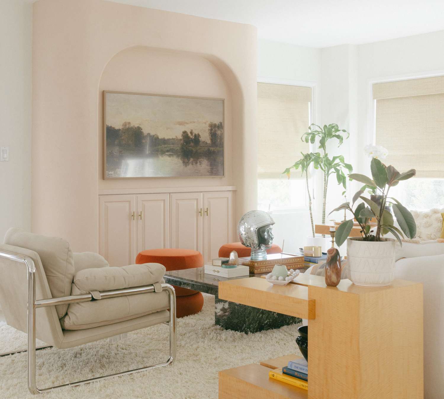

Beige had a good run. A very good run, honestly. It gave us safe living rooms, dependable hallways, and enough “warm minimalism” to last several lifetimes. But in 2026, the neutral conversation is getting a little more interestingand a lot more charming. The shade stealing attention isn’t loud, flashy, or trying too hard. It’s muted pink.
Not bubblegum pink. Not flamingo pink. Not the kind of pink that looks like it belongs in a cupcake shop with a glitter policy. The new neutral is softer, dustier, earthier, and more grown-up than that. Think shell pink, blush clay, warm mauve, rosy plaster, and barely-there dusty rose. These shades sit in that sweet spot between color and calm, which is exactly why designers and homeowners are warming up to them.
If beige is the reliable oatmeal of the decorating world, muted pink is oatmeal with cinnamon, brown sugar, and just enough personality to make you stop scrolling. It still feels easy to live with, but it brings more life, depth, and warmth to a room. In a year when interiors are leaning more personal, layered, and emotionally inviting, that shift makes perfect sense.
What Is the “Unexpected Neutral” in 2026?
The unexpected neutral taking over in 2026 is a family of pink-leaning neutrals: soft blush, shell pink, dusty rose, clay pink, and warm mauve. These shades don’t scream pink room. They whisper it politely while making everything around them look more expensive.
That is the magic. A true neutral does not have to be colorless. It has to be flexible. It has to work with wood tones, stone, metal finishes, upholstery, art, and changing light. Muted pink does all of that while adding softness that plain beige sometimes cannot. It can read warm, earthy, creamy, and even architectural depending on the undertones.
Some versions lean peachy. Some lean rosy. Some drift close to mauve. But the best ones share a common trait: they feel grounded instead of sugary. That grounded quality is what allows pink to behave like a neutral rather than a novelty.
Why Designers Are Moving Beyond Beige
1. It Makes a Room Feel Warmer Without Making It Feel Heavy
Beige can be cozy, but it can also fall a little flat when a room lacks texture or strong natural light. Muted pink fixes that problem with almost sneaky efficiency. It bounces warmth around the room and gives walls a soft glow, especially in the morning and evening. The effect is subtle, but the mood shift is real.
That warmth also helps modern rooms feel less sterile. If you have clean-lined furniture, plaster walls, pale oak floors, or simple cabinetry, a shell pink neutral can take the edge off and make the space feel less “showroom” and more “please sit down and stay awhile.”
2. It Plays Better With Natural Materials
One reason this 2026 color trend feels so believable is that it works beautifully with the materials people already love. White oak, walnut, linen, bouclé, brass, unlacquered bronze, terracotta, marble, limewash, rattan, and woven textures all look at home next to dusty pink walls or upholstery.
Beige can sometimes disappear beside those materials. Muted pink, by contrast, enhances them. It picks up the honey in wood grain, softens the coolness of stone, and adds just enough contrast to cream textiles so the room feels layered instead of washed out.
3. It Feels Personal, Not Generic
There is a reason homeowners are craving alternatives to safe neutrals in 2026. People want rooms that feel lived in, collected, and expressive. They still want calm, but they do not want bland. Muted pink lands right in that sweet middle ground.
It is more distinctive than beige, yet still easy to decorate around. It feels thoughtful without being theatrical. In other words, it has personality, but it knows how to behave in public.
Why Muted Pink Works as a Neutral
The success of this trend comes down to undertones. A soft blush with earthy, brown, peach, or gray notes behaves very differently from a candy pink. Once the saturation drops and the undertones deepen, the color stops feeling precious and starts feeling architectural.
That is why these shades look especially good in rooms with age, texture, or interesting finishes. A warm mauve wall can almost act like plaster. A shell pink can read like sun-washed stucco. A dusty rose can feel as grounded as a mushroom taupe, just with better social skills.
Another reason: it pairs with both warm and moody palettes. You can take muted pink in a soft direction with creams, sand, oat, and pale woods. Or you can take it somewhere richer with olive, camel, burgundy, espresso brown, and blackened bronze. Few neutrals can handle both moods so gracefully.
How to Use This 2026 Neutral in Real Rooms
Living Rooms
In a living room, muted pink works best when it is treated as the backdrop, not the headliner. Paint the walls in a dusty blush and then bring in cream upholstery, caramel leather, walnut tables, and woven textures. The result feels warm, relaxed, and quietly sophisticated.
If painting all four walls sounds like a leap, start smaller. Try a pink-toned sofa, accent chair, ottoman, or even drapery. Against a room full of classic neutrals, that one rosy note can make the whole space feel fresher and less predictable.
Bedrooms
This is where the trend really earns its paycheck. Bedrooms benefit from colors that flatter light and create a cocooning effect, and muted pink is almost unfairly good at both. It softens sharp corners, makes white bedding look creamier, and gives dark wood a romantic edge without pushing the room into syrupy territory.
Pair it with layered bedding in ivory, mushroom, flax, and cinnamon tones. Add a vintage rug, warm lamps, and soft curtains, and suddenly the room feels like a boutique hotel that knows exactly what it is doing.
Bathrooms
Muted pink in bathrooms is one of the smartest uses of this trend. Because these shades reflect light gently, they can make the room feel flattering, calm, and surprisingly luxurious. Pink-toned neutrals also play well with marble, brass, warm wood vanities, and classic tile.
A tone-on-tone approach works especially well here. Pair soft pink walls with a slightly deeper trim or vanity color for a layered look that feels custom rather than cute.
Kitchens and Dining Areas
In kitchens, the easiest way to use this beige alternative is through upholstery, a painted island, pantry cabinetry, or a breakfast nook banquette. Muted pink has a knack for warming up hard surfaces, which is a blessing in spaces full of stone, metal, and millwork.
Dining rooms also benefit from rosy neutrals because they feel welcoming under lamplight. If beige can sometimes look sleepy at dinner, dusty pink tends to look glowy and alive.
Best Colors to Pair With the New Neutral
Camel and Cognac
These shades bring out the earthy side of muted pink and keep it feeling grounded. Think leather chairs, caramel wood stains, and warm tan textiles.
Olive and Moss
Green and pink are old friends, but when both are muted, the effect is elegant rather than playful. Olive accents give the room a natural, garden-inspired balance.
Brown and Walnut
If you want the color to read sophisticated, pair it with deeper woods. Rich brown furniture gives dusty pink seriousness and depth.
Cream, Oat, and Ivory
For a light, airy palette, keep things tonal. These quiet shades let the pink do its work without turning the room into a color experiment.
Burgundy, Plum, and Rust
When you want more drama, pink-leaning neutrals can support richer accent colors beautifully. This route feels layered, moody, and very 2026.
How to Keep the Look Sophisticated
Choose Dusty Over Bright
The word “muted” is doing a lot of heavy lifting here. If the color is too clean, too sweet, or too bubblegum, it will not behave like a neutral. Look for versions with clay, gray, beige, peach, or brown undertones.
Use Texture Like a Professional
Texture is what keeps pink from feeling flat or overly polished. Limewash, matte paint, brushed plaster, nubby textiles, natural fiber rugs, linen drapes, and weathered wood all help the shade feel more grounded and architectural.
Layer Tones Instead of Matching Everything Exactly
A room feels richer when it includes several related shades instead of one exact color repeated like a uniform. Mix shell pink with rose-beige, mauve-taupe, and warm cream. The goal is harmony, not a pink takeover.
Mistakes to Avoid With This Trend
Do not ignore lighting. North-facing rooms can pull some pinks cooler, while bright southern light can make them warmer and peachier. Always test swatches at different times of day.
Do not pair it with icy gray unless you mean it. Cool grays can make a warm blush look muddy or dated. If you want contrast, darker greens, browns, and soft charcoals usually behave better.
Do not over-accessorize the idea. The point of using pink as a neutral is that it replaces beige. You do not need rose-shaped candles, pink tassels, and blush-everything-else. Let the walls or one major piece carry the mood.
Do not confuse delicate with weak. This shade may be soft, but it has range. It can support bold art, dark wood, patterned fabric, and sculptural lighting just fine.
Why This Trend Makes Sense for 2026
Interior design in 2026 is leaning toward comfort with character. Homes are becoming warmer, more layered, and less eager to look like untouched model units. People want softness, but not sameness. They want neutrals, but they want them to feel alive.
That is exactly where muted pink wins. It satisfies the desire for calm while offering more emotion than classic beige. It flatters people, furniture, and materials. It feels nostalgic in the best way, yet current enough to anchor a fresh palette. Most importantly, it makes a room feel intentional.
Beige is not gone forever. It has simply been nudged politely to the side so something with a little more charm can have the spotlight. Frankly, it has earned a break.
Experiences With the 2026 Neutral: What It Actually Feels Like to Live With It
One of the most interesting things about living with a muted pink neutral is that people often do not identify it as pink right away. They walk into the room, pause for a second, and usually say something like, “Wow, this feels warm,” or “This room looks so good in this light.” That reaction says everything. The color works emotionally before it works intellectually. It changes the mood first, and only later do people realize why.
That is especially true if you have spent years living with beige, greige, or off-white walls. Beige tends to behave in a very practical way. It is polite. It stays out of the way. But after a while, it can also feel a little sleepy, especially in rooms that do not get much architectural drama. A shell pink or dusty blush changes that experience. The room starts to feel softer in the morning, richer in the evening, and somehow more flattering all day long. Even ordinary momentsdrinking coffee, folding laundry, answering emails you do not want to answerfeel slightly less bleak. That is no small achievement for paint.
Another experience people notice is how beautifully this color responds to changing light. In the early morning, it can look almost creamy or rosy-beige. In afternoon sun, it feels brighter and more cheerful. At night, under warm lamps, it becomes cocooning and calm. That shifting quality makes the room feel alive. It never looks one-note, which is often the complaint people have after choosing a neutral that seemed safe in the store but dull at home.
There is also a surprising confidence that comes from using this shade. Choosing muted pink as a neutral feels slightly brave the first time, especially if you are used to standard beige walls. But once it is in the room, it usually reads more refined than risky. It does not announce itself the way a bold emerald or cobalt might. Instead, it gives the space an identity. The home feels less generic, more collected, more connected to the people living there.
It also changes how furnishings behave. Wood looks richer. Brass looks warmer. Cream upholstery feels more intentional. Even black accents seem less harsh. That means the room often feels “finished” faster, because the backdrop is doing more of the design work for you. You do not need as many accessories to create atmosphere. In fact, many people find they can edit a room down once the wall color starts carrying more of the mood.
And perhaps the best part is this: muted pink does not make a room feel trendy in the disposable sense. It feels personal. It feels like someone made a choice rather than accepted a default. In 2026, that may be the biggest luxury of allnot a louder room, not a bigger room, but a room with a little more soul.
Conclusion
If 2026 has a decorating lesson, it is this: neutral does not have to mean boring. The rise of shell pink, dusty rose, blush clay, and warm mauve proves that a background color can still have nuance, softness, and presence. This new neutral does everything beige has long donecalm a space, support other finishes, and create flexibilitybut it does it with better lighting, better warmth, and far more personality.
So yes, move over, beige. There is a new neutral in town, and it brought charm, glow, and a much better outfit.
SEO Tags