
What would an environmentally conscious royal kitchen look like? Probably less “gold-leaf palace” and more “muddy boots beside a beautifully painted cupboard.” That is the charm behind an eco color palette associated with Prince Charles: restrained British colors, practical painted cabinetry, traditional craftsmanship, and finishes selected with indoor air quality and long-term durability in mind.
The original design inspiration appeared in connection with a model kitchen created by Plain English and the organization then known as the Prince’s Foundation for Building Community. It was not a kitchen that shouted for attention. Instead, it relied on warm whites, oyster-toned neutrals, grounded charcoal, honest wood, and an unusual horizontal division between dark and light paint. The result felt elegant without becoming preciousand sustainable without dressing the refrigerator in a hemp poncho.
Where the Prince Charles Kitchen Idea Began
The story begins with a model environmentally friendly house displayed at London’s Ideal Home Show in 2012. Prince Charles collaborated with the British kitchen company Plain English, whose cupboards were known for traditional construction, unfussy details, and colors that looked as though they had been discovered in an old manor rather than selected from a neon computer screen.
Charles reportedly encouraged the company to make this kind of craftsmanship available at a more accessible price. That idea helped shape British Standard Cupboards, a simpler, online range manufactured in the same Suffolk workshop. Customers handled more of the measuring, collection, installation, and finishing themselves, reducing some of the service costs associated with a fully customized kitchen. The cupboards were supplied in a Broken White eggshell finish and could be repainted in virtually any color.
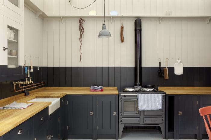
The kitchen also demonstrated a memorable “half-and-half” paint treatment. A dark color covered the lower cabinets and continued onto part of the wall above the countertop, while a much lighter color occupied the upper portion of the room. It was practical, slightly eccentric, and thoroughly Britishthe decorating equivalent of wearing gardening trousers with a tailored jacket.
What Makes a Color Palette Eco-Friendly?
An eco color palette is not simply a collection of greens and browns. Painting everything sage does not automatically cause birds to applaud outside the window. The environmental value comes from the entire design decision: what is painted, what type of coating is used, how long the finish is likely to last, whether existing cabinets can be retained, and what happens to leftover materials.
Longevity Matters More Than Trendiness
A timeless palette can reduce the urge to redecorate every time social media announces that yesterday’s warm gray has committed a serious fashion crime. Soft whites, mineral neutrals, near-black accents, natural wood, and muted botanical colors adapt well to changing hardware, textiles, lighting, and accessories.
Durability is equally important. A fragile “green” finish that chips quickly and requires frequent repainting may use more material over time than a carefully selected, hard-wearing coating. Independent paint testing has found that modern low- and zero-VOC products can deliver strong performance, even though earlier generations of lower-emission paint sometimes struggled with coverage or durability.
Reusing Cabinets Avoids Unnecessary Waste
Painting structurally sound cabinets can refresh a kitchen without sending serviceable doors, frames, shelves, and hardware to a landfill. This approach is especially effective with solid wood or well-built painted cabinetry. Repainting is not always effortlessgrease has been negotiating permanent residency on kitchen doors for yearsbut it is usually less disruptive than a complete replacement. This Old House also identifies cabinet repainting as a way to reduce material waste in an eco-friendly kitchen renovation.
The Eco Color Palette
The original Remodelista discussion referenced several colors from Fine Paints of Europe, including two numbered shades and four colors from its Mount Vernon collection: Mopboard Black, New Room White, Crushed Oyster Shell, and Palladian White. Rather than treating those names as an inflexible shopping list, it is more useful to understand the role each color plays.
1. Mopboard Black: The Grounding Color
A soft black or dark charcoal works beautifully on base cabinets, lower walls, a freestanding pantry, or a kitchen island. Unlike a glossy jet black that can resemble a grand piano with a sink attached, a softened black feels architectural and forgiving.
The darker lower section visually anchors the room. It also disguises some of the scuffs, fingerprints, and mysterious marks that appear at knee height. In a busy kitchen, practicality is a design feature, not an admission of defeat.
2. Crushed Oyster Shell: The Bridge Neutral
An oyster neutral sits between beige, gray, and chalky off-white. It connects black cabinetry with wood counters, limestone, aged brass, ceramic tile, and natural fabrics. The color should feel warm enough to prevent a north-facing kitchen from becoming gloomy, but restrained enough to remain calm beside colorful cookware.
Oyster tones are particularly useful on walls because they change gently throughout the day. Morning light may reveal a creamy undertone, while evening light can bring forward gray or mushroom notes.
3. New Room White: The Working White
A practical white is rarely the brightest white in the fan deck. For this palette, choose one with a soft mineral, putty, or parchment undertone. It should look fresh beside the darker cabinets without becoming icy.
Use it on ceilings, upper walls, shelves, glazed cupboard interiors, or trim. A softer white also works better with old plaster, handmade tile, visible wood grain, and rooms where the architecture is charmingly imperfect.
4. Palladian White: The Luminous Layer
Palladian-inspired whites often suggest pale stone, classical plaster, and gently aged architectural surfaces. In a Prince Charles-inspired kitchen, this color can create the lighter upper zone above the horizontal paint line. It reflects daylight and helps prevent the dark base color from dominating the room.
5. Herb-Garden Green: The Natural Accent
A muted green is a logical secondary color, but it should appear as an accent rather than an environmental uniform. Think rosemary, bay leaf, moss, or the silvery underside of a sage leaf. Use it inside a pantry, on a back door, across a small dresser, or in textiles and ceramics.
The connection is especially appropriate given Charles’s decades-long interest in organic gardening and environmental stewardship at Highgrove. The property’s gardens have incorporated organic practices, rainwater collection, solar technology, and other sustainability measures.
6. Terracotta or Muted Ochre: The Warming Note
Every neutral palette benefits from one color that prevents it from becoming too polite. Terracotta pots, ochre-painted furniture, copper cookware, brick flooring, or warm earthenware can provide that energy. These tones echo soil, clay, dried leaves, and traditional building materials without turning the kitchen into a theme park called Ye Olde Sustainability Village.
Why the Two-Tone Treatment Works
The dark-lower, light-upper arrangement is more than a decorative flourish. Dark paint visually settles the lower half of a room, while a pale color above it reflects light and draws the eye upward. The technique can make a ceiling seem higher, add the impression of architectural paneling, and introduce a strong color without covering every surface.
In a kitchen, the horizontal division can align with a countertop, shelf, window ledge, backsplash, or the top of a tall bank of lower cabinetry. The line does not need to divide the wall exactly in half. In fact, positioning it slightly above the counter often looks more relaxed and intentional.
For a subtle version, combine charcoal with oyster or deep olive with warm stone. For greater contrast, use near-black below and chalky white above. Keep undertones related: a warm charcoal generally behaves better with a creamy white, while a blue-black may prefer a cooler gray-white.
Choosing an Eco-Conscious Cabinet Paint
Traditional oil-based alkyd paint became popular for woodwork because it flowed smoothly, minimized brush marks, and cured into a tough film. Its disadvantages included strong solvent odor, slow drying, more complicated cleanup, and higher emissions from many traditional formulations.
Waterborne alkyd and acrylic-alkyd technologies were developed to combine some of oil paint’s leveling and durability with easier soap-and-water cleanup. Fine Paints of Europe describes ECO Brilliant as a low-odor, water-thinnable urethane-alkyd emulsion available in durable satin and brilliant finishes. Benjamin Moore’s Advance is a waterborne alkyd designed for cabinets, doors, and trim, with the flow and leveling associated with conventional alkyd paint. Sherwin-Williams also offers water-based acrylic-alkyd products intended for durable woodwork and cabinetry.
Low-VOC Does Not Mean “Open the Can and Hug It”
Volatile organic compounds, or VOCs, can evaporate into indoor air from paints and many other household products. The U.S. Environmental Protection Agency reports that concentrations of several organic pollutants are commonly higher indoors than outdoors, particularly during activities such as painting or paint stripping. The American Lung Association recommends reducing exposure and maintaining good ventilation when using products that may emit VOCs.
Look beyond a vague leaf graphic on the label. Review the technical data, confirm whether VOC information applies after tinting, and check for recognized third-party standards. Green Seal’s GS-11 standard evaluates paints and coatings for environmental, health, and performance requirements, including restrictions that extend beyond a single marketing claim.
How to Recreate the Look
Step 1: Keep What Is Worth Keeping
Inspect cabinet boxes, hinges, drawer slides, shelves, and doors. Loose hinges can be repaired. Tired hardware can be cleaned or replaced. A dated color can be repainted. Swollen particleboard that has dissolved into something resembling breakfast cereal may require replacement.
Step 2: Test the Palette in the Actual Room
Paint large sample boards and move them around the kitchen for several days. Observe them in morning daylight, artificial evening light, and cloudy weather. A charming oyster white in a brightly lit showroom can become suspiciously pink beside your countertop.
Step 3: Clean Before Sanding
Cabinet surfaces collect grease, cooking residue, wax, polish, and fingerprints. Thorough cleaning is essential because sanding a greasy surface may simply redistribute the contamination. Professional cabinet-painting guidance consistently emphasizes cleaning, deglossing or sanding when appropriate, priming, and allowing sufficient drying time.
Step 4: Label Every Door and Hinge
Number the doors, drawers, hinges, and corresponding openings. Otherwise, reassembly can become an archaeological project featuring twelve nearly identical cabinet doors and one deeply unhappy homeowner.
Step 5: Apply Thin, Controlled Coats
Follow the manufacturer’s recommended primer, applicator, temperature range, drying time, and recoat schedule. A fine synthetic brush, small microfiber roller, or properly operated sprayer can produce a smooth finish. Two or three thin coats generally look better than one heroic coat applied with the enthusiasm of icing a birthday cake.
Step 6: Respect the Cure Time
Paint may feel dry before it has reached full hardness. Reinstall doors carefully, avoid aggressive cleaning, and prevent freshly painted surfaces from pressing tightly together. Patience is cheaper than repainting a row of chipped drawer fronts.
Materials That Complete the Palette
The paint colors work best when paired with tactile, repairable materials. Natural wood countertops, stone, handmade ceramic tile, woven baskets, linen curtains, and unlacquered brass can soften the contrast between dark and light paint.
Traditional craftsmanship also fits Charles’s broader design philosophy. His environmental work has often connected natural systems with durable communities, traditional building knowledge, local skills, and objects designed for long service. He even collaborated on sculptural garden furniture intended to support regional woodworking and complement the landscape at Highgrove.
The lesson is not that every kitchen requires royal provenance. It is that sustainability and beauty are easier to combine when materials age gracefully, components can be repaired, and the design remains useful after the current trend cycle has packed its tiny suitcase and left.
Common Mistakes to Avoid
Using Too Many “Natural” Colors
Five shades of moss, three muddy browns, and a backsplash the color of compost do not necessarily create harmony. Limit the permanent palette to two or three main colors, then add seasonal variation through plants, fruit, ceramics, towels, and art.
Choosing Color Before Studying the Light
Dark base cabinets can look elegant in a bright room but heavy in a narrow kitchen with limited daylight. Use a softened charcoal instead of absolute black, increase the proportion of pale upper surfaces, and consider reflective tile or satin paint.
Buying More Paint Than Necessary
Measure carefully and keep a clearly labeled jar for touch-ups. Store usable paint according to the manufacturer’s instructions. When paint is no longer needed, reuse is preferable to disposal when possible. PaintCare operates collection and reuse programs in participating jurisdictions, helping redirect suitable leftover paint to community use or appropriate recycling.
Assuming “Eco-Friendly” Is a Complete Specification
The phrase may refer to VOC content, ingredients, packaging, manufacturing, durability, or disposaland sometimes it refers mainly to the marketing department’s enthusiasm. Compare technical information and third-party certifications rather than relying on a green label alone.
Experience Notes: Living With a Prince Charles-Inspired Palette
The following is a composite renovation experience based on common cabinet-painting projects. It is not presented as an account of work performed in a royal residence.
Imagine a modest kitchen with sound wooden cabinets, ordinary laminate counters, and a color best described as “landlord beige after a long winter.” The homeowners want a calmer room but do not want to replace functioning cabinetry. Their first idea is to paint everything dark green. After testing a sample on four doors, they discover that the green looks charming at noon and almost black after sunset. The paint does not change its mind; the room’s light does.
They revise the plan. Lower cabinets receive a softened charcoal with warm undertones. Upper walls and shelves are assigned a creamy mineral white. A narrow band of oyster paint extends above the countertop, creating the same unexpected horizontal datum that made the Prince Charles-inspired kitchen memorable.
The first practical lesson arrives during preparation. What appears to be a clean cabinet door produces a surprising amount of residue when scrubbed with a degreasing cleaner. Years of cooking have created a nearly invisible film. The glamorous portion of the renovationselecting colors while holding a cup of coffeetakes twenty minutes. Cleaning, labeling, sanding, and arranging doors on temporary supports takes considerably longer. Sustainability, it turns out, occasionally wears rubber gloves.
The second lesson concerns sheen. A large charcoal sample in a flat finish looks velvety and sophisticated, but the cabinet enamel in satin reflects more light. The final color therefore appears slightly brighter and more dimensional than the wall sample. This is not a mistake; it is a reminder to test both color and finish.
After priming, the first coat looks alarmingly uneven. The homeowners briefly consider moving to another state. The second coat levels the color, while a carefully applied final coat produces the depth they expected. They allow the doors to cure instead of reinstalling them immediately, resisting the strong temptation to declare victory and attach every handle before dinner.
Once the kitchen is reassembled, the darker lower cabinetry makes the inexpensive countertop appear more intentional. The light upper section keeps the room open, and the oyster band connects the two extremes. Existing brass knobs are cleaned rather than discarded. A secondhand wooden stool adds warmth, while terracotta pots and herbs supply color without adding another permanent painted surface.
Living with the palette reveals its practical advantages. Minor marks near the floor are less noticeable on the charcoal base cabinets. The pale upper walls reflect light during food preparation. Because the main colors are neutral, bright dishes, flowers, and textiles can change with the seasons without clashing.
The room does not resemble a palace, nor should it. Its success comes from proportion, restraint, and reuse. The homeowners preserved functional cabinets, selected a durable coating, limited the permanent color scheme, and kept leftover paint for repairs. The renovation feels richer because fewer things were treated as disposable.
Most importantly, the kitchen develops personality without becoming theatrical. It suggests an English country sensibility, but nobody expects a corgi to inspect the pantry. That balancetraditional but not nostalgic, environmental but not preachy, elegant but still able to survive a dropped saucepanis the most useful experience the Prince Charles palette offers.
Conclusion
An eco color palette for Prince Charles is less about copying a royal kitchen than adopting a durable design philosophy. Retain sound cabinetry, choose finishes with credible environmental and performance information, use dark colors where they provide visual and practical grounding, and rely on pale mineral tones to preserve light.
Mopboard black, oyster, warm white, muted green, and terracotta form a flexible family rather than a rigid formula. Combined with natural wood, repairable hardware, traditional craftsmanship, and responsible paint disposal, they can produce a kitchen that feels established from the first day.
The best sustainable rooms do not constantly announce their credentials. They simply work, age well, and avoid demanding a complete makeover every three years. That may not sound glamorous, but neither does repainting thirty cabinet doors because last season’s fashionable blue suddenly looks like a neglected swimming pool.