
Easter tables usually show up wearing pastels like they’re auditioning for a marshmallow commercial. Cute? Sure. Inevitable? Absolutely not. If you’re craving a table that feels more “dramatic dinner party” than “cotton-candy brunch,” take a cue from NYC event designer David Stark: go moody, go saturated, go jewel-tonedand do it in a way that still feels warm, welcoming, and (importantly) functional for actual humans who need places to put their elbows.
This guide walks you through building a jewel-toned Easter tablescape inspired by Stark’s approach: storytelling, high-impact color, smart layering, and a willingness to turn everyday materials (hello, egg cartons) into center-stage decor. We’ll dye eggs naturally into rich sapphire, amethyst, and garnet shades; build an egg “runner” centerpiece; and finish with polished details that make your Easter table look designer without acting like you own a rental warehouse.
Why Jewel Tones Work So Well for Easter (Yes, Really)
Jewel tones = instant depth
Jewel tones are saturated colors that look like they belong in a velvet jewelry box: emerald green, sapphire blue, amethyst purple, ruby red, deep garnet, and inky teal. Unlike pastels, these hues add instant contrastso even simple pieces (white plates, basic glassware) look intentional when grounded by a dark base layer like navy linen.
They make “natural” elements look elevated
Here’s the magic trick: jewel tones make organic textureseggshells, flowers, fruit, woodlook more luxe. A bowl of dyed eggs goes from “kids’ craft” to “still life painting” the moment the colors turn moody and complex.
The David Stark Mindset: Storytelling, Surprise, and “Rethink the Centerpiece”
Stark’s work often starts with a concept and builds outward: the room, the mood, and the details all talk to each other. He’s known for finding inspiration in unexpected places and for treating the table as a mini-environmentless “matching set” and more “collected, layered, and alive.”
Design principle: let the space be the star (and support it)
If your centerpiece is loud (and ours is: hello, jewel-toned egg runner), your place settings don’t need to shout. Clean lines, quality textures, and a restrained palette in the plates/flatware keeps things chic instead of chaotic.
Design principle: the centerpiece doesn’t have to be flowers
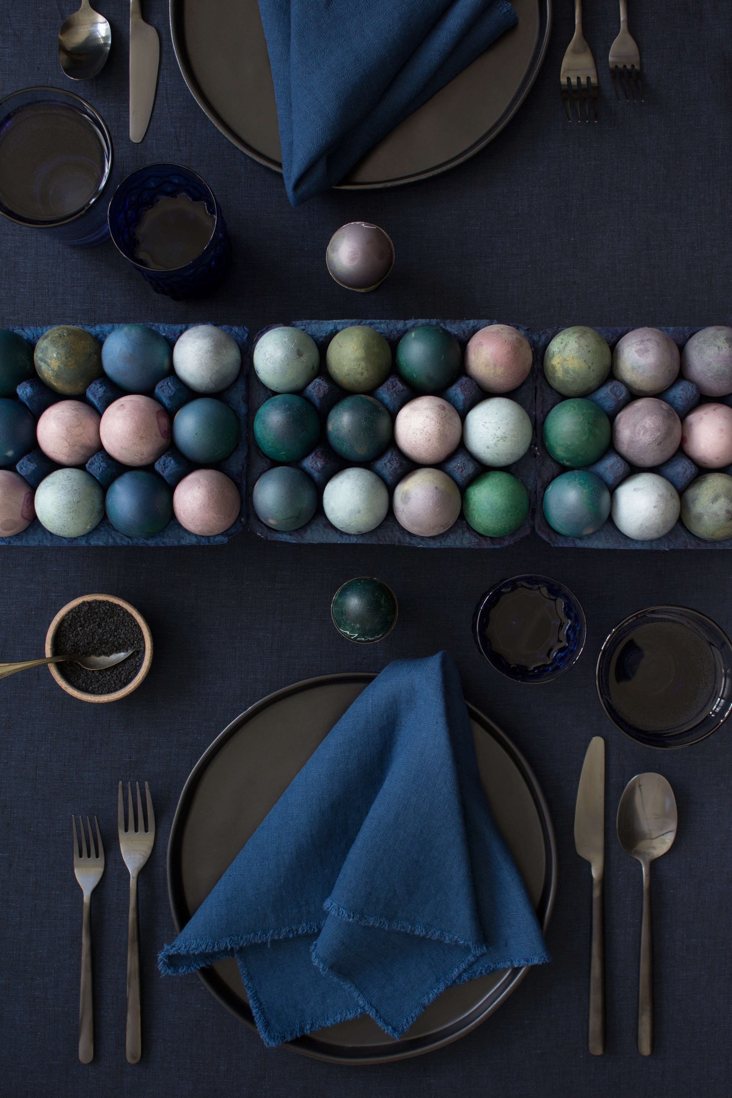
Flowers are great. But Easter gives you a second option that’s basically edible sculpture: eggs. Stark’s jewel-toned egg runner flips expectations and becomes the table’s main storyno towering floral arrangement needed.
The Look We’re Building
- Base layer: deep navy or midnight-blue linens (tablecloth or runner)
- Hero centerpiece: naturally dyed eggs displayed in painted egg cartons as a “runner” down the center
- Tableware vibe: pewter, matte silver, charcoal, or simple white (avoid busy patterns that fight the eggs)
- Accent details: unscented candles, vintage or colored glassware, minimal florals (think viburnum berries or dark greenery)
- Bonus delight: eggs doubled as place cards (yes, it’s charmingand yes, it’s also hilarious)
Materials and Shopping List (Mostly Things You Can Grab in One Errand)
For the naturally dyed eggs
- Brown and white eggs (mixing both creates more variation)
- Red cabbage
- Beets
- Grape juice
- White vinegar
- Jars or lidded bowls
- Optional but helpful: tea strainer, tongs, cooling/baking rack, paper towels
For the tablescape build
- Egg cartons (standard cartons with tops removed work great)
- Paint (navy/indigo/ink), or leftover wall paint in a deep blue tone
- Brush or sponge (or spray paint if you’re feeling fancy)
- Plates (pewter, gray stoneware, matte black, or white)
- Flatware (silver, pewter, brushed steel, or even gold accents if you want extra glam)
- Cloth napkins (navy, charcoal, deep plum, or crisp white)
- Unscented tapers/tealights + holders
- A small floral/greenery element (low arrangement only)
- White gel pen or paint pen (for egg place cards)
DIY Step-by-Step: Natural Egg Dye for Deep Jewel Tones
Natural dyeing is part recipe, part science experiment, part “wow, this cabbage is suddenly a design assistant.” Expect variation (that’s the point). Pro tip: dyeing both brown and white eggs gives you more tones from the same dye bath.
Step 1: Hard-boil the eggs
Hard-boil your eggs and cool them fully before dyeing. Handle gently; cracked shells can lead to odd blotches (sometimes pretty, sometimes… not).
Step 2: Make the beet and cabbage dyes
- Chop vegetables to yield about 1 cup of beet pieces and/or 1 cup of cabbage.
- Boil each dye ingredient in about 2 cups of water until tender.
- Drain and save the colored liquid in a jar or lidded container.
- Once cooled, stir in vinegar (it helps the color bond).
- Lower eggs into the dye: ~30 minutes for lighter stains, overnight for deeper tones.
Step 3: Make the grape juice dye
- In a jar or container, combine about 2 cups grape juice with vinegar.
- Lower eggs into the dye and vary soak time for lighter/darker results.
- For extra range, dip an egg in one dye, dry it, then dip in another for layered tones.
Step 4: Dry like a pro (aka: avoid fingerprints of doom)
Lift eggs out with a strainer or tongs and let them dry on a rack. Don’t rub; blot gently if needed. If you want a subtle sheen, a tiny dab of neutral oil on a paper towel can buff the shell once fully dry.
A quick natural dye color cheat sheet
| Dye Source | Color Family | Jewel-Tone Result | Best Tip |
|---|---|---|---|
| Red cabbage | Blue | Sapphire / teal-leaning blues | Overnight soak = deeper, moodier blue |
| Beets | Red/Pink | Garnet / wine / rose-tinged tones | White eggs show stronger reds; brown eggs go earthier |
| Grape juice | Purple | Amethyst / smoky lavender | Layer with beet dye for richer purples |
| Onion skins (yellow/red) | Orange/Brown/Greenish | Amber / sienna / moody olive | Longer soak = deeper shade |
| Turmeric | Yellow/Gold | Antique gold / mustard | Use as a second dip to push teal-green blends |
| Coffee or tea | Brown | Bronze / espresso | Great for “neutral jewel” grounding eggs |
Build the Centerpiece: The Egg Carton Runner
Paint the cartons (the easiest “designer move” you’ll ever make)
Remove the tops from standard egg cartons. Paint the bottoms in a deep blue (navy, indigo, inkwhatever makes you feel like you own a gallery). Let them dry fully. Imperfections are fine; a slightly uneven finish actually reads more artisanal than “perfect.”
Lay out the runner
Arrange the painted cartons end-to-end down the center of the table like a long “egg runway.” Fill with your dyed eggs in a mixed, varied pattern: alternate blues, purples, reds, and browns. Vary shades by mixing brown/white eggs and soak times.
Turn eggs into place cards (edible + adorable)
Use a white gel pen to write guest names directly on the eggs. Is it extra? Yes. Is it delightful? Also yes. And if anyone complains, they can sit at the kids’ table with the plastic grass.
Layer the Rest of the Table Like You Meant It
Start with dark linens
Navy linen instantly makes jewel tones look richer. If you don’t have a navy tablecloth, a deep blue runner over a neutral cloth works. Texture matters more than perfectionwrinkles in linen are basically the fabric version of “effortless.”
Keep plates simple and slightly moody
Pewter, matte gray, stoneware, or crisp white lets the eggs do the talking. If you love mixing pieces, do it subtly: one neutral base style, then small variations (a slightly different salad plate, a vintage bread plate) to get that “collected over time” feel.
Glassware: go vintage, go colored, or go both
Jewel tones love colored glassthink cobalt tumblers, smoky goblets, or anything that looks like it could hold a potion. If you only have clear glasses, no worries: the dyed eggs already brought the drama.
Lighting: glow, not fragrance warfare
Use unscented tapers or tealights for atmosphere. Avoid scented candles on the dining tablefood should be the best-smelling thing in the room (and you worked hard on that ham, so let it have its moment).
Florals: small, intentional, and never blocking faces
Keep florals minimal and low so guests can actually see each other. A simple cluster of viburnum berries, dark greenery, or a few spring stems in a short vase adds life without competing with the egg runner.
Make It Functional: Pretty Tables Still Have to Host a Meal
Don’t build a centerpiece wall
The egg runner is already a statement. Keep additional decor spaced out, stable, and low. Tall, bulky pieces can disrupt conversation and turn your table into an obstacle course.
Use “traffic flow” thinking (yes, even at home)
Borrow an event-planner trick: place drinks and serveware where they naturally pull guests deeper into the space. A small bar setup or beverage station away from the entry keeps people circulating instead of clustering in one spot like confused penguins.
Optional David-Stark-Style DIY Add-Ons (Fast, Affordable, High Impact)
Watercolor-striped place cards and placemats
Cut watercolor paper into placemat and place-card sizes. Thin paint with water and brush a confident stripe across each piece. Once dry, write names in white pen. The look is artsy, modern, and surprisingly forgiving“mistakes” read as character.
Stitched cardboard placemats (upcycled and cool)
Use clean cardboard, cut to size, and stitch around the edge with string or embroidery floss. It’s tactile, graphic, and a fun way to bring texture to a jewel-toned setting without buying anything new.
Common Mistakes to Avoid (So Your Table Looks Luxe, Not Loud)
- Scented candles on the table: they can compete with the food aromas.
- Centerpieces that block sight lines: keep it low and conversational.
- Over-matching everything: a little mix creates depth and a collected feel.
- Glitter/confetti: cute for five seconds, then it lives in your carpet forever.
- Wobbly decor: if it can topple when someone passes the potatoes, it’s not invited.
A Sample “Jewel-Toned Easter” Menu That Matches the Mood
Consider leaning into deep reds and greens on the buffet: a tomato-and-chive frittata, a fruit salad with berries and citrus, and a light greens salad (mâche is especially pretty) keep things fresh while still visually rich. Bonus points if you serve on dark platters or wood boards to echo the tablescape’s mood.
Conclusion: A Tablescape That Feels Like a Party, Not a Craft Project
The secret to a jewel-toned Easter tablescape is contrast and confidence: dark linens, saturated eggs, simple tableware, and lighting that flatters everyone at the table (including the person who definitely took a “quick taste” of the dessert three times). With natural dyeing, you’ll get organic marbling and variation that looks intentionally artisanalbecause it is. And with Stark-inspired styling, you’re not just decorating a table; you’re setting a scene for a memorable meal.
Real-World Experiences: What You’ll Notice When You Actually Try This at Home (500+ Words)
The first thing people tend to experience with a jewel-toned Easter tablescape is a tiny, unexpected wave of confidenceright around the moment the eggs come out of the dye bath and you realize they look like something you’d pay for at a fancy boutique. Natural dyes don’t behave like neon tablets. They’re moody, uneven, layered, and sometimes delightfully unpredictable. That unpredictability is exactly what makes the final look feel “designer.” If you’ve ever stared at a perfectly uniform set of bright eggs and thought, “This feels… aggressively elementary school,” jewel tones are the antidote.
Another common experience: you’ll become weirdly protective of your drying eggs. Suddenly you’re the bouncer of a tiny nightclub called “Do Not Touch That Rack.” Fingerprints show up fast on darker dyes, especially blues and purples. The fix is simplelet them dry untouched, and move them with tongsbut the emotional journey is real. On the plus side, it makes you feel like a professional stylist who’s “on set,” even if your set is the kitchen counter next to a rogue bag of tortilla chips.
People also notice how quickly the table transforms once the dark linen goes down. It’s the same room, the same chairs, the same ceiling fan doing its bestbut navy cloth changes the entire tone. That’s when the “storytelling” part clicks: jewel tones aren’t just colors; they’re atmosphere. Your Easter table starts to feel more like an intimate dinner party than a daytime holiday spread, which is a very fun plot twist for a meal that may still include jelly beans.
The egg-carton runner is where guests tend to lose it (in a good way). It’s familiareveryone recognizes an egg cartonyet it looks completely new painted deep blue and lined up like a sculptural installation. Guests often lean in to inspect the shades and ask what you used to dye them. That moment is your chance to casually say “cabbage” and watch their eyebrows climb like they’re trying to exit their faces. It’s an easy conversation starter, and it’s also practical: unlike huge floral centerpieces, it stays low and doesn’t block anyone’s view across the table.
A surprising lesson many hosts discover: you don’t need to buy “Easter plates.” When the centerpiece is strong, everyday dinnerware suddenly looks upgraded. Neutral plates become a frame, not the main event. That’s also why the “keep it simple” approach feels so satisfyingyou get a high-impact look without turning your home into a storage unit for seasonal decor. The table reads elevated because the textures and tones are intentional, not because everything has a bunny on it (though if you love bunny plates, this is a safe space).
Finally, real life will happen during your beautiful setup. Someone will reach across the table. A napkin will fall. A kid will ask if the place-card egg is “the eating egg” or “the decoration egg.” (Answer: it’s both, which is the whole point.) The best tablescapes anticipate that reality. Keep candles unscented, keep decor stable, and leave enough breathing room so guests can pass dishes comfortably. If you do that, your jewel-toned Easter table won’t just look amazingit’ll feel amazing to sit at, which is the most designer move of all.