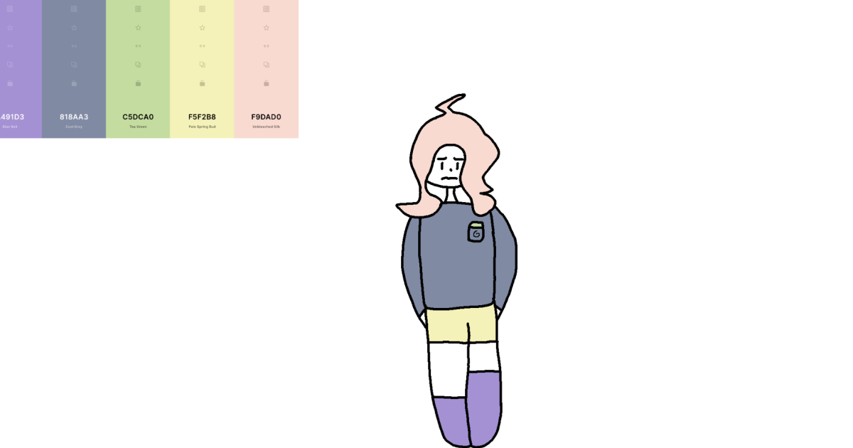

Every creative person knows the terrifying power of a blank page. It just sits there, glowing with judgment, as if it paid rent. That is why a prompt like “Hey Panda’s, Get A Color Scheme On Coolers And Draw A Picture With It” is secretly brilliant. It gives your imagination a tiny push, a handful of colors, and permission to make something weird, wonderful, moody, ridiculous, or unexpectedly frame-worthy.
First, a tiny clarification before the paintbrushes start tap-dancing: “Coolers” is often used casually when people mean Coolors, the popular online color palette generator. Whether you use Coolors, Canva, Adobe Color, a photo from your camera roll, or a handful of crayons stolen from the family junk drawer, the idea is the same: choose a color scheme, then let those colors boss your drawing around for a while. Sometimes creative limitations are not cages. They are trampolines.
This guide explores how to use a color palette generator, how color schemes work, why limited palettes make better art prompts, and how to turn a few swatches into a finished picture. It is part art lesson, part creative challenge, and part friendly reminder that your first sketch does not need to be perfect. It only needs to exist. The masterpiece can wear sweatpants at the beginning.
What Does This Drawing Challenge Actually Mean?
The prompt is simple: get a color scheme from a palette tool and create a drawing using only, or mostly, those colors. You might receive a five-color palette with dusty blue, coral, cream, charcoal, and sage. Suddenly, your brain starts making connections. A coastal fox at sunset. A retro diner in the rain. A robot drinking tea in a greenhouse. A lonely moon wearing a cardigan. Color leads the story.
That is the magic of a color scheme drawing challenge. Instead of starting with the subject, you start with atmosphere. The colors tell you whether the picture feels calm, spooky, energetic, dreamy, dramatic, vintage, cheerful, or “a raccoon opened a bakery at midnight.” The palette becomes the creative engine.
Why Color Schemes Make Drawing Easier
Many beginners think more colors equal more creativity. In reality, too many colors can turn a drawing into visual soup. A limited palette helps you make faster decisions. It gives your artwork unity, reduces the stress of choosing colors, and forces you to think about value, contrast, texture, and composition.
Color theory is not just a fancy phrase designers whisper while holding expensive coffee. It is the study of how colors relate to one another and how they affect what viewers feel. A soft blue-and-green palette might feel peaceful. Red and yellow can feel energetic. Purple and gold can feel magical or royal. Gray and neon green can feel futuristic, mysterious, or like your computer gained consciousness and wants snacks.
How To Get A Color Scheme From Coolors
Coolors is popular because it makes palette building fast and playful. You can generate random palettes, lock colors you like, adjust individual swatches, extract colors from an image, test contrast, and export the final palette. For a drawing challenge, the workflow can stay beautifully simple.
Step 1: Generate A Palette
Open your palette generator and create a random color scheme. Do not overthink the first few options. Click through until one palette makes your brain say, “Hmm, I could make something with that.” That tiny spark is enough.
Step 2: Lock Your Favorite Color
Most good palette tools allow you to lock one color while generating new companions around it. If you love a deep teal, warm peach, or dusty lavender, lock it. Then keep generating until the supporting colors feel useful.
Step 3: Assign Each Color A Job
A color palette works best when every shade has a role. Choose one dominant color for large areas, one secondary color for structure, one accent color for drama, one light color for highlights, and one dark color for shadows or outlines. This prevents every color from screaming at once like a kindergarten class after cupcakes.
The Best Types Of Color Schemes For Drawing
Not all palettes behave the same way. Some are calm. Some are bold. Some walk into the room wearing sunglasses indoors. Here are the main color schemes artists and designers use, translated into practical drawing language.
Monochromatic Color Scheme
A monochromatic palette uses variations of one color, such as navy, sky blue, powder blue, and blue-gray. This is excellent for beginners because it creates instant harmony. Try using it for portraits, landscapes, moonlit scenes, underwater drawings, or quiet emotional illustrations.
Analogous Color Scheme
Analogous colors sit near each other on the color wheel, such as blue, teal, and green. These palettes often feel natural and smooth because they echo color combinations found in nature. Use analogous colors for forests, gardens, ocean scenes, sunsets, fantasy creatures, or cozy interiors.
Complementary Color Scheme
Complementary colors sit opposite each other on the color wheel, such as blue and orange or purple and yellow. They create strong contrast and visual excitement. This is perfect for posters, character art, bold cartoons, dramatic lighting, and anything that needs to jump off the page and politely shout, “Look at me!”
Triadic Color Scheme
A triadic palette uses three colors evenly spaced around the color wheel. It can look playful, balanced, and energetic. The trick is to let one color dominate while the other two act as accents. Otherwise, the drawing may look like three colors are fighting over the remote control.
Split-Complementary Color Scheme
A split-complementary palette starts with one main color and uses the two colors beside its opposite. It offers contrast without becoming too harsh. This is a great choice for expressive portraits, fantasy scenes, comic panels, and stylized animals.
How To Turn A Palette Into A Picture Idea
Once you have your colors, do not rush straight into drawing. Spend two minutes asking what the palette reminds you of. Is it warm or cool? Bright or muted? Natural or artificial? Sweet or spooky? Modern or vintage? These questions help you find a subject that belongs to the palette.
For example, a palette of moss green, cream, clay orange, walnut brown, and storm gray might suggest a cabin in the woods. A palette of bubblegum pink, lemon yellow, electric blue, white, and black might become a roller-skating alien diner. A palette of burgundy, navy, bronze, ivory, and black could turn into a mysterious library with a cat who definitely knows tax law.
Specific Drawing Ideas Based On Color Palettes
If you are stuck, try one of these palette-to-picture combinations:
Soft Pastel Palette
Draw a floating bakery, a cloud city, a sleepy dragon nursery, a magical tea party, or a portrait with candy-colored lighting. Pastels are ideal for gentle moods, cute characters, and dreamy scenes.
Earthy Neutral Palette
Draw mushrooms, hiking boots, a desert fox, a cozy reading nook, handmade pottery, an old map, or a tiny village hidden inside a tree stump. Earth tones bring warmth, texture, and grounded storytelling.
Neon Palette
Draw a cyberpunk alley, arcade ghosts, a robot band, glowing jellyfish, futuristic sneakers, or a city where every vending machine has opinions. Neon palettes work best when paired with dark backgrounds.
Vintage Palette
Draw a 1970s kitchen, a retro motel sign, an old postcard, a classic car, a detective office, or a record store run by a suspiciously stylish pigeon. Muted oranges, browns, creams, and faded blues create instant nostalgia.
Spooky Palette
Draw a haunted greenhouse, a candlelit hallway, a pumpkin monster, a gothic cat portrait, or a moonlit cemetery with excellent landscaping. Dark purples, grays, greens, and bone whites are excellent for atmospheric art.
Use The 60-30-10 Rule For Better Balance
One simple design trick is the 60-30-10 rule. Use one color for about 60 percent of the drawing, another for 30 percent, and a final accent for 10 percent. You do not need to measure this with a ruler like a nervous architect. Just think: big color, medium color, tiny spicy color.
For example, if your palette includes navy, peach, cream, rust, and turquoise, you might use navy for the night sky, cream for the moon and highlights, peach for buildings, rust for shadows, and turquoise only for glowing windows. That tiny turquoise accent will feel special because it is not everywhere.
Do Not Forget Contrast
A beautiful palette can still fail if every color has the same brightness. Before you draw, check whether your palette includes at least one dark color and one light color. Contrast helps viewers read shapes, notice focal points, and understand the picture at a glance.
This matters even more if your drawing includes text, comic speech bubbles, signs, or digital lettering. Accessible design standards emphasize strong contrast between text and background because low contrast can make content difficult to read. In art, contrast is not only practical. It is dramatic. Shadows, highlights, silhouettes, and glowing accents all depend on it.
How To Plan Your Drawing Before Coloring
Start with a small thumbnail sketch. This is a tiny, rough version of your idea. No details. No pressure. Just shapes. Decide where the biggest forms go, where the light source is, and where the viewer should look first.
Next, label your colors. Write simple notes: “dark green for shadows,” “cream for highlights,” “orange for focal point,” “blue for background.” This keeps you from accidentally using your accent color everywhere because it looked pretty and you lost control. We have all been there. The accent color is charming, but it cannot be mayor of the whole drawing.
Traditional Media Tips: Markers, Colored Pencils, Paint, And Crayons
If you are drawing on paper, match your palette as closely as possible with the tools you own. Do not panic if the colors are not exact. The goal is interpretation, not courtroom-level evidence. A dusty rose can become pink. A dark teal can become blue-green. A warm ivory can become pale yellow. Art supplies are flexible little goblins.
Colored pencils are excellent for layering and subtle shading. Markers create bold, graphic results. Watercolor can make soft transitions, but test your colors first because watercolor loves surprises. Acrylic paint works well for strong shapes and opaque coverage. Crayons are underrated, especially for texture. Yes, crayons. Respect the wax legends.
Digital Art Tips: Layers Are Your Best Friends
For digital artists, import your palette directly into your drawing app if possible. Keep the swatches visible on the canvas. Use separate layers for sketch, background, flats, shadows, highlights, and effects. This makes it easier to adjust colors without repainting half the universe.
Try using one layer set to multiply for shadows and another set to screen or overlay for light effects. Even with a limited palette, you can create depth by adjusting opacity and value. A five-color palette can produce a surprisingly rich image when used thoughtfully.
Make The Palette Part Of The Story
The most memorable drawings do not simply use colors. They make colors meaningful. If your palette is cold and blue, maybe your character feels isolated. If your palette is warm and golden, maybe the scene is full of memory. If the accent color is bright red, perhaps it marks danger, love, magic, or the only strawberry in a world of beige oatmeal.
Ask yourself what each color represents. The dark color might symbolize mystery. The light color might represent hope. The accent color might reveal what matters most. This approach turns a simple drawing challenge into visual storytelling.
Common Mistakes To Avoid
Using Every Color Equally
Equal color distribution often makes a drawing feel chaotic. Let one or two colors lead. Use the rest as support.
Ignoring Values
If your palette looks good in color but confusing in grayscale, the values may be too similar. Squint at your drawing. If everything blends together, increase contrast.
Choosing A Subject That Fights The Palette
A soft pastel palette may not be the best choice for a gritty horror monster unless you are intentionally making the monster adorable, which is valid and frankly encouraged.
Forgetting The Background
The background is not empty space. It supports the subject. Even a simple shape, gradient, or texture can make the final picture feel complete.
A Mini Challenge: Five Palettes, Five Pictures
Want to turn this into a full creative exercise? Generate five palettes and create five small drawings. Give yourself 20 minutes for each one. The time limit keeps perfectionism from moving in and rearranging the furniture.
Palette one could become an animal. Palette two could become a building. Palette three could become food. Palette four could become a fantasy object. Palette five could become a self-portrait, but make it symbolic. Maybe you are a cactus with headphones. Maybe you are a haunted toaster. Personal truth wears many costumes.
Why This Challenge Works For Artists Of Every Level
Beginners benefit because the palette reduces decision fatigue. Intermediate artists benefit because it strengthens composition and color discipline. Advanced artists benefit because limitations create style experiments. Even professional illustrators use constraints to explore new moods, visual identities, and storytelling approaches.
Most importantly, this challenge is fun. It removes the heavy question of “What should I draw?” and replaces it with “What do these colors want to become?” That shift is powerful. It makes creativity feel less like a test and more like a conversation.
Personal Experience: What Happens When You Actually Try It
The first time I tried a palette-based drawing challenge, I expected it to be easy. Five colors, one drawing. How hard could that be? Famous last words, usually spoken right before someone discovers they have accidentally drawn a purple horse in a mustard-yellow thunderstorm.
I generated a palette with muted teal, dusty peach, cream, charcoal, and a strange brownish red. At first, I stared at it like it had just asked me to solve a tax form. The colors were attractive, but they did not immediately suggest a subject. Then I asked a better question: “Where would these colors live?” That changed everything.
The teal felt like evening. The peach felt like old light from a diner window. The cream became a moon. The charcoal became wet pavement. The reddish brown turned into a fox. Suddenly, I had a scene: a fox standing outside a closed roadside diner at night, looking through the window at one last slice of pie. Was it dramatic? Absolutely. Was the fox overreacting? Maybe. But anyone denied pie has the right to a cinematic moment.
Working with only those colors forced me to simplify. I could not rely on a rainbow of options to fix weak decisions. I had to think about shape, contrast, and placement. The cream highlight had to go where the viewer should look first. The charcoal shadows had to create structure. The dusty peach had to warm the scene without turning everything into visual pudding.
The biggest surprise was how cohesive the final drawing looked. I did not become a genius overnight. My sketch still had awkward bits. The diner sign leaned at an angle that suggested poor management. The fox’s legs were suspiciously noodle-like. But the colors made the whole thing feel intentional. The palette connected every part of the image, including the imperfect parts. Especially the imperfect parts.
After that, I started using color schemes whenever I felt creatively stuck. A green-and-gold palette became a beetle knight. A lavender-and-gray palette became a rainy city balcony. A coral-and-navy palette became a mermaid repairing a submarine. Some drawings worked better than others, but every palette gave me a starting point. That is the true value of the exercise. It gets your hand moving before your inner critic can put on a tiny judge wig.
If you try this challenge, do not choose the “perfect” palette. Choose the one that makes you curious. Curiosity is more useful than perfection. A strange palette might push you toward a stranger, better idea. A color you normally dislike might become the best part of the drawing. Creative growth often arrives disguised as inconvenience.
Also, save your palettes. Over time, you will build a personal library of moods. You may notice that you love misty greens, warm neutrals, electric blues, or dramatic dark backgrounds. That pattern becomes part of your visual voice. Your color choices begin to reveal what kind of worlds you like to build.
The best experience related to “Hey Panda’s, Get A Color Scheme On Coolers And Draw A Picture With It” is not the final picture. It is the moment when random colors become an idea. One second, you have five rectangles. The next, you have a haunted bakery, a sleepy astronaut, a neon jungle, or a fox grieving a lost dessert. That little transformation is why art stays addictive.
Conclusion
“Hey Panda’s, Get A Color Scheme On Coolers And Draw A Picture With It” may sound like a casual internet challenge, but it teaches real creative skills. It helps artists understand color harmony, contrast, mood, composition, and storytelling. It also makes drawing feel playful again, which is no small thing in a world where even refrigerators now have opinions.
Use a palette generator, pick a color scheme, assign each color a role, and let the colors guide your subject. Keep the first sketch small. Keep the rules simple. Let one color dominate, use contrast wisely, and save your brightest accent for the moment that matters most. Whether your final drawing becomes a polished illustration or a charmingly chaotic doodle, the exercise will sharpen your eye and wake up your imagination.
Note: This article is written for web publication and synthesizes real color theory, accessibility, palette-generation, design, and art-making principles. Source links are intentionally omitted from the body for cleaner publishing.