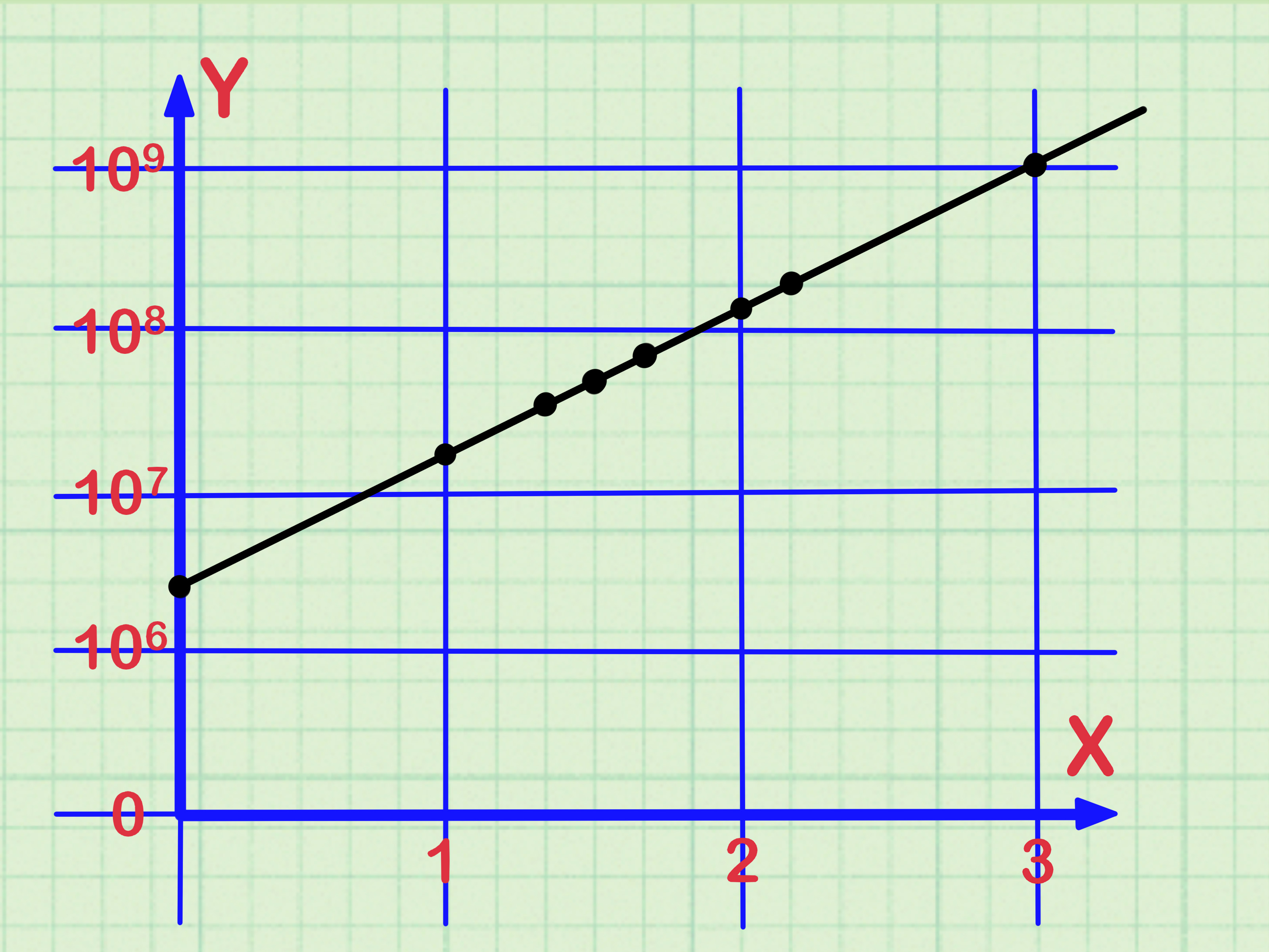

At first glance, a logarithmic scale can look like a regular graph that forgot how rulers work. The tick marks are uneven, the numbers jump from 1 to 10 to 100, and the space between 1 and 2 somehow feels luxurious while 8 to 9 is squeezed like a middle seat on a budget flight. But once you understand the trick, a log scale becomes one of the most useful tools for reading data that grows, shrinks, multiplies, or spans wildly different sizes.
A logarithmic scale, often called a log scale, is a way to display numbers by equal ratios instead of equal differences. A linear scale moves by addition: 1, 2, 3, 4, 5. A logarithmic scale moves by multiplication: 1, 10, 100, 1,000, 10,000. That difference matters because many real-world quantities do not grow politely in neat little steps. Earthquake magnitude, sound intensity, pH, investment growth, population changes, bacterial growth, viral spread, and scientific measurements often involve huge ranges. A log scale helps compress those giant ranges into a chart humans can actually read without needing a wall-sized monitor.
This guide explains how to read a logarithmic scale in 10 practical steps, using clear examples and plain American English. No math cape required.
What Is a Logarithmic Scale?
A logarithmic scale is a scale where equal distances represent equal multiplication factors. On a common base-10 logarithmic scale, each major step usually represents a tenfold increase. That means the distance from 1 to 10 is the same as the distance from 10 to 100 and from 100 to 1,000. The numbers are not increasing by the same amount; they are increasing by the same ratio.
For example, on a base-10 log scale:
- 1 to 10 means multiplying by 10.
- 10 to 100 means multiplying by 10 again.
- 100 to 1,000 means multiplying by 10 again.
That repeated multiplication is the secret sauce. A log scale is especially helpful when data includes very small and very large values on the same chart. Instead of letting one giant value crush everything else into a sad pancake near the bottom, the logarithmic scale gives both small and large values room to be seen.
How to Read a Logarithmic Scale: 10 Steps
Step 1: Check Whether the Axis Is Logarithmic
Before reading any graph, inspect the axis labels. Many charts clearly mark an axis as “log scale,” “logarithmic scale,” “log10,” or “log base 10.” Sometimes only one axis is logarithmic. Other times, both axes are.
If the numbers on an axis look like 1, 10, 100, 1,000, and 10,000, you are probably looking at a logarithmic scale. If they look like 0, 10, 20, 30, 40, you are probably looking at a linear scale. The visual clue is spacing: on a linear scale, equal distances mean equal additions. On a log scale, equal distances mean equal multiplications.
Step 2: Identify the Base of the Log Scale
The most common logarithmic scale uses base 10. That means each major interval is a power of 10. However, some charts use base 2, base e, or another base. Base 2 is common in computing because digital systems love powers of two: 2, 4, 8, 16, 32, 64. Base e, also called the natural logarithm, often appears in advanced math, statistics, and scientific modeling.
For most everyday charts, assume base 10 only if the labels confirm it or if the axis uses powers like 1, 10, 100, and 1,000. If the base is different, the reading principle stays the same: equal spacing represents equal multiplication by that base.
Step 3: Read Major Tick Marks as Powers
On a base-10 logarithmic scale, the major tick marks usually represent powers of 10:
- 100 = 1
- 101 = 10
- 102 = 100
- 103 = 1,000
- 104 = 10,000
These major tick marks are often called decades. A “decade” on a log scale does not mean ten years. It means one tenfold interval, such as 1 to 10 or 100 to 1,000. So if a chart moves from 10 to 100, it has moved one decade. If it moves from 10 to 1,000, it has moved two decades.
Step 4: Remember That Equal Distance Means Equal Ratio
This is the golden rule of reading logarithmic scales: equal distances on a log scale represent equal ratios, not equal differences.
On a linear scale, the jump from 10 to 20 is the same distance as 90 to 100 because both add 10. On a logarithmic scale, 10 to 100 is the same distance as 100 to 1,000 because both multiply by 10.
This changes how you interpret visual steepness. If a line rises steadily on a log scale, it may represent exponential growth. That means the quantity is increasing by a consistent percentage or multiplication factor over time. In plain language: a straight rising line on a semi-log chart is not boring. It is growth wearing a calm disguise.
Step 5: Understand the Uneven Minor Tick Marks
The minor tick marks between 1 and 10 are usually labeled or positioned for 2, 3, 4, 5, 6, 7, 8, and 9. But they are not evenly spaced. The gap from 1 to 2 is larger than the gap from 8 to 9 because the logarithmic distance depends on ratios.
For example, 2 is twice as large as 1, so it sits relatively far from 1. But 9 is only 1.125 times as large as 8, so 9 sits close to 8. This is why log graph paper looks squished near the top of each decade. The scale is not broken; it is doing multiplication gymnastics.
Step 6: Estimate Values Between Major Labels
To estimate a value between 10 and 100, look at the minor tick marks. On a base-10 log scale, the tick halfway between 10 and 100 is not 55. It is closer to about 31.6, because the halfway point in logarithmic space is the geometric mean of 10 and 100.
That sounds fancy, but the practical shortcut is simple: use the labeled minor ticks when available. If the axis shows 10, 20, 30, 40, and so on within the decade, read the plotted point against those tick marks. If the minor ticks are unlabeled, remember that the spacing tightens as you move upward through each decade.
Example: If a point is between 100 and 1,000 and lines up near the third minor tick, it is around 300, not 400 or 500. The visual spacing is based on multiplication, not ordinary arithmetic.
Step 7: Know the Difference Between Semi-Log and Log-Log Charts
A semi-log chart has one logarithmic axis and one linear axis. For example, the x-axis might show time in regular intervals, while the y-axis uses a logarithmic scale for population, cases, revenue, or concentration. Semi-log charts are excellent for showing exponential growth or decay.
A log-log chart has both axes on logarithmic scales. These charts are useful when both variables cover large ranges or when a relationship follows a power law. In a log-log chart, a straight line often suggests that one variable changes as a power of another. Scientists and statisticians use log-log plots for relationships involving biology, physics, economics, earthquakes, and many other fields.
The key question is: which axis is logarithmic? If only the vertical axis is log-scaled, read vertical changes as ratios. If only the horizontal axis is log-scaled, read horizontal changes as ratios. If both are log-scaled, both directions work by multiplication.
Step 8: Do Not Expect Zero on a Standard Log Scale
A standard logarithmic scale cannot include zero because there is no ordinary logarithm of zero. It also cannot include negative numbers unless the chart uses a special transformation, such as a symmetric log scale. This is one of the fastest ways to recognize a log chart: if the axis starts at 1, 0.1, or another positive number instead of zero, there may be a logarithmic reason.
This matters when interpreting charts. A bar or line that appears far above the bottom does not necessarily mean it is far from zero, because zero may not be part of the scale at all. Always check the axis minimum before making dramatic conclusions. Charts are wonderful, but they can be sneaky little storytellers.
Step 9: Translate Slopes Carefully
On a linear chart, a straight line means a constant amount of change. On a semi-log chart, a straight line often means a constant rate of percentage change. On a log-log chart, a straight line can indicate a power-law relationship.
For example, if sales rise from 100 to 200 to 400 to 800 over equal time periods, a linear chart curves upward. A logarithmic chart may show that same growth as a straight line because the value is doubling each period. The log scale reveals the consistent multiplication pattern.
This is why log scales are useful for reading exponential growth. They help you see whether growth is speeding up, slowing down, or continuing at a steady percentage rate. If the line bends upward on a log scale, growth is accelerating. If it bends downward, the growth rate is slowing. If it is straight, the multiplication rate is relatively steady.
Step 10: Practice With Real-World Log Scales
Logarithmic scales are not just classroom decorations. They appear in real life all the time.
The pH scale is logarithmic. A solution with pH 5 is ten times more acidic than a solution with pH 6. A solution with pH 4 is one hundred times more acidic than pH 6. That tiny number change is carrying a big chemical backpack.
Earthquake magnitude is also logarithmic. A one-unit increase in magnitude corresponds to a tenfold increase in measured wave amplitude and roughly 32 times more energy released. That is why a magnitude 7 earthquake is not just “a little stronger” than a magnitude 6 earthquake. It is dramatically more powerful.
Sound is measured in decibels, another logarithmic scale. A 10-decibel increase represents a tenfold increase in sound intensity and is often perceived by human ears as about twice as loud. This is why going from 80 dB to 90 dB matters much more than the numbers casually suggest.
Common Mistakes When Reading a Logarithmic Scale
Mistake 1: Treating It Like a Linear Scale
The biggest mistake is reading equal spaces as equal additions. On a log scale, equal spaces represent multiplication. If you forget that, your interpretation can go off the rails faster than a shopping cart with one bad wheel.
Mistake 2: Ignoring the Axis Label
Always check whether the chart says “log,” “log10,” “ln,” or “logarithmic.” A chart can completely change meaning depending on whether one axis or both axes use a log scale.
Mistake 3: Assuming a Straight Line Means Linear Growth
A straight line on a log scale does not mean the original data grows by equal amounts. It may mean the data grows by equal ratios. That is a major difference.
Mistake 4: Looking for Zero
Standard log scales do not include zero. If your data contains zero or negative values, the chart maker must use a workaround, a different scale, or a special transformation.
Simple Example: Reading a Logarithmic Axis
Imagine a chart showing website traffic over time. The y-axis is logarithmic and labeled 10, 100, 1,000, 10,000, and 100,000 visitors. If your traffic line moves from 100 to 1,000, it has increased tenfold. If it moves from 1,000 to 10,000, it has also increased tenfold. On the chart, those two jumps may look like the same vertical distance because they represent the same ratio.
Now suppose the line rises from 100 to 200, then 200 to 400, then 400 to 800. On a linear chart, the slope becomes steeper because the added amount grows. On a log chart, the slope may look steady because the traffic is doubling each time. That is the beauty of a logarithmic scale: it helps you see relative growth clearly.
Why Logarithmic Scales Are Useful
A logarithmic scale is useful when the data range is too large for a linear scale. If one value is 5 and another is 5,000,000, a linear chart may make the smaller value nearly invisible. A log scale compresses the range while preserving meaningful ratios.
Log scales also help reveal patterns. Exponential growth, exponential decay, and power-law relationships can become easier to interpret. Instead of staring at a curve and wondering whether it is trying to escape the page, you can use the log scale to check whether the relationship follows a predictable multiplication pattern.
For SEO analysts, scientists, engineers, investors, students, and data journalists, this is incredibly handy. A log scale can make trends readable without hiding the fact that the numbers differ by orders of magnitude.
Experience-Based Tips for Reading Logarithmic Scales
The first time many people meet a logarithmic scale, they try to read it like a normal ruler. That is understandable. Our brains are trained by tape measures, speedometers, thermometers, and grocery receipts. Add five dollars, move five units. Add ten miles per hour, move ten units. Linear thinking is comfortable. Logarithmic thinking asks you to switch from “How much more?” to “How many times more?” That small mental shift makes everything easier.
One useful habit is to say the multiplication out loud. If the axis goes from 1 to 10 to 100 to 1,000, tell yourself: “times ten, times ten, times ten.” It may feel silly, but it prevents the classic mistake of thinking the jump from 100 to 1,000 is visually comparable to the jump from 1 to 10 in ordinary addition. On a log chart, those jumps are equal because both are tenfold increases.
Another practical tip is to mark the decades before reading the data points. Find the major labels first: 1, 10, 100, 1,000. Then look inside the decade where your point falls. If a point is between 100 and 1,000, do not mentally divide the space into 100, 200, 300, 400, and so on with equal spacing. Instead, look for the minor tick marks. The lower numbers in each decade spread out more, while the higher numbers crowd together.
When comparing two points, avoid saying “the top point is twice as high on the page.” Page height is not the same as numerical difference. Ask what ratio the two values represent. A movement from 50 to 500 is a tenfold increase. A movement from 500 to 5,000 is also a tenfold increase. Even though the raw difference changes from 450 to 4,500, the log-scale movement is the same because the ratio is the same.
It also helps to connect log scales with familiar experiences. Think about sound. A small-looking decibel increase can mean a much bigger change in intensity. Think about pH. One pH unit can mean a tenfold change in acidity. Think about earthquakes. One magnitude unit can represent a huge jump in energy. These examples train your intuition: small number changes on logarithmic scales can represent large real-world changes.
Finally, slow down when reading headlines or dashboards that use log charts. A log scale is not dishonest, but it can be misunderstood. It may make explosive growth look visually calmer, or it may make small values easier to compare. The best question is not “Is this chart good or bad?” The best question is “What does the scale make easier to see, and what does it make easier to miss?” Once you ask that, you are no longer just looking at a graph. You are reading it like a data detective with a magnifying glass and, ideally, coffee.
Conclusion
Learning how to read a logarithmic scale is mostly about changing your mental gear from addition to multiplication. A linear scale asks, “How much was added?” A logarithmic scale asks, “How many times larger or smaller is it?” Once you understand that equal spacing means equal ratios, log charts become far less mysterious.
Use logarithmic scales when values span multiple orders of magnitude, when exponential growth needs clearer interpretation, or when ratios matter more than raw differences. Check the axis label, identify the base, read major tick marks as powers, use minor ticks carefully, and remember that zero usually does not belong on a standard log scale. Do that, and the next logarithmic chart you see will not look like a math prank. It will look like a powerful shortcut for understanding big, fast-changing data.