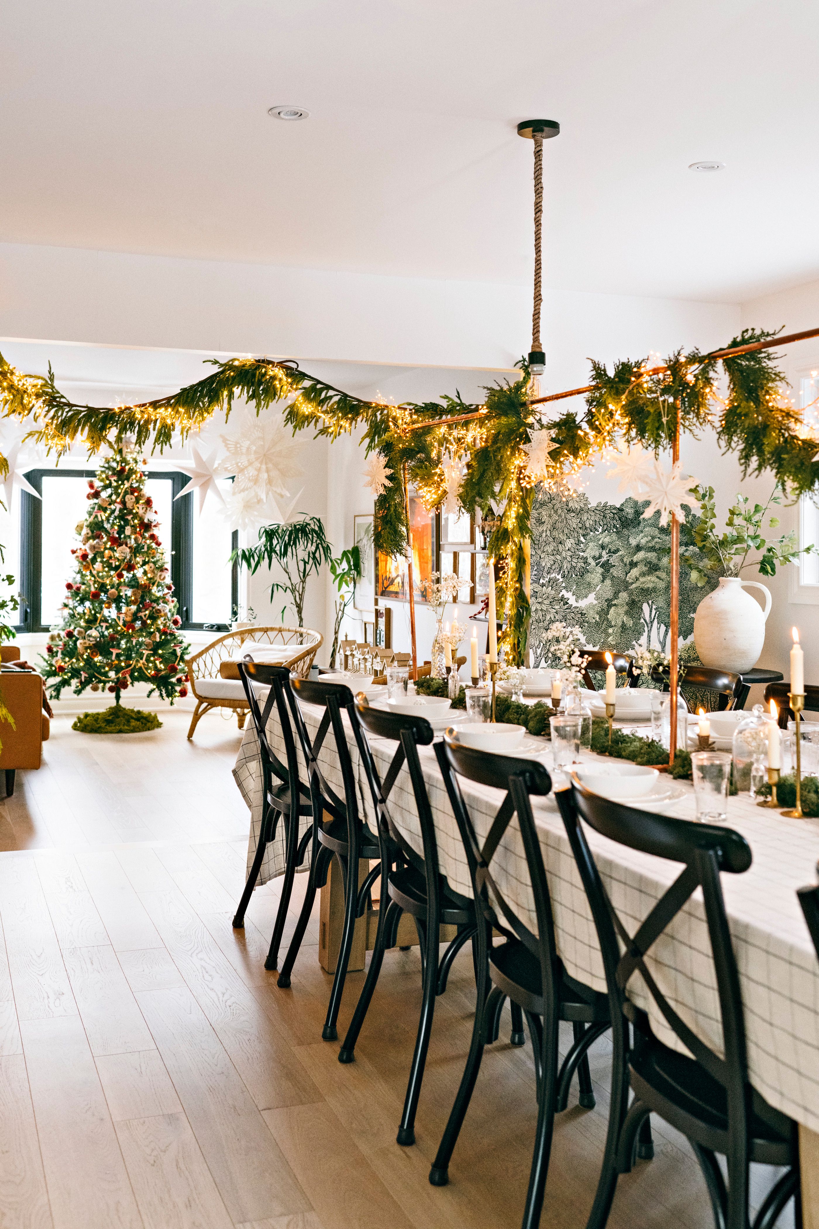
Object of Desire: Subtly Hued, Hand-Painted Furniture from Nickey Kehoe and Farrow & Ball

Some furniture politely fills a room. Other furniture walks in, orders a drink, and immediately becomes the most interesting guest at the party. The hand-painted furniture collaboration between Nickey Kehoe and Farrow & Ball belongs firmly in the second categoryalthough, true to both brands, it does so without shouting across the room.
The concept is beautifully straightforward: custom-made pieces from the Nickey Kehoe Collection can be finished by hand in nearly 300 Farrow & Ball Modern Eggshell colors. The result combines carefully considered furniture silhouettes with nuanced paint shades that react dramatically to daylight, lamplight, surrounding textiles, and the occasional glass of red wine hovering dangerously close to the dining table.
Introduced in 2024 and displayed through Nickey Kehoe’s New York outpost, the collaboration includes dining tables, benches, chairs, chests, sofas, settees, and bed frames. It is an appealing meeting of Los Angeles craftsmanship and English color expertisepart furniture collection, part oversized paint box, and part invitation to stop treating beige as the only responsible adult in the room.
A Collaboration Built on Craft, Color, and Character
Nickey Kehoe was founded by designers Todd Nickey and Amy Kehoe in Los Angeles in 2004. Their retail operation followed in 2008, bringing together vintage discoveries, globally sourced household objects, and original furniture. Over time, the studio developed a recognizable approach without relying on a rigid “signature look.” Its interiors are layered rather than matched, sophisticated without feeling precious, and frequently touched by a wink of nostalgia.
The company describes its furniture as timeless in silhouette but grounded in modern sensibilities. Pieces are handcrafted in Los Angeles through family-owned workrooms that have worked with the studio for years. That continuity matters. A painted finish can provide the color, but thoughtful proportions, joinery, curves, and construction give a piece its staying power.
Farrow & Ball brings a different kind of heritage to the partnership. The British paint maker is known for colors that often resist simple labels. A green may carry a smoky gray undertone. A red may feel earthy in the morning and nearly theatrical after sunset. The names are memorable, but the pigments and their relationship with light are what make the shades so useful to designers.
Together, the companies offer something more considered than simply ordering a chair in “red” or a table in “green.” The customer chooses a specific form, then gives that form an additional identity through color. It is customization with boundaries, which is often where the best design decisions live. Unlimited choice can be thrilling, but it can also leave a person staring at paint samples until retirement.
What Makes the Painted Furniture Feel So Distinctive?
The Silhouettes Work Before the Color Arrives
A coat of excellent paint cannot rescue a clumsy silhouette. Fortunately, the Nickey Kehoe Collection begins with forms that already have presence. The Oval Harvest Table balances farmhouse familiarity with a more refined outline. The Swiss Back Bench nods toward traditional seating without becoming a historical reenactment. The Campaign Chest offers the clean geometry and functional hardware associated with portable military furniture, but in a format suitable for a polished contemporary room.
Because the underlying pieces are restrained, color has space to perform. A sculptural chair in a strong yellow can feel spirited rather than silly. A chest in a deep dining-room red can become an architectural anchor. A green table can introduce freshness without requiring the walls, ceiling, and family dog to join the same color scheme.
The Finish Reveals Rather Than Conceals
Mass-produced painted furniture can sometimes resemble a candy shell: smooth, uniform, and strangely disconnected from the object underneath. A hand-applied finish has more life. Subtle variations around edges, joints, spindles, and carved details remind the eye that a person worked on the piece.
That evidence of the hand has become increasingly desirable in interiors. Design publications have documented a renewed interest in painted, folk-inspired, and artisan-made furniture as homeowners look for rooms with history, individuality, and visible craftsmanship. Painted furniture can provide those qualities while breaking up an interior overloaded with similar wood tones.
The Colors Are Expressive but Not Disposable
“Subtly hued” does not necessarily mean pale. Some of the partnership’s most memorable colors are rich, saturated, or delightfully odd. The subtlety comes from their undertones and their response to changing light. They do not behave like flat digital swatches copied from a screen.
This is important because a colorful piece of furniture must live among other materials. It needs to converse with oak flooring, brass hardware, linen curtains, antique rugs, ceramics, books, and whatever mysterious collection has accumulated on the mantel. A layered color generally has an easier time joining that conversation than a one-note primary shade.
Standout Furniture and Color Pairings
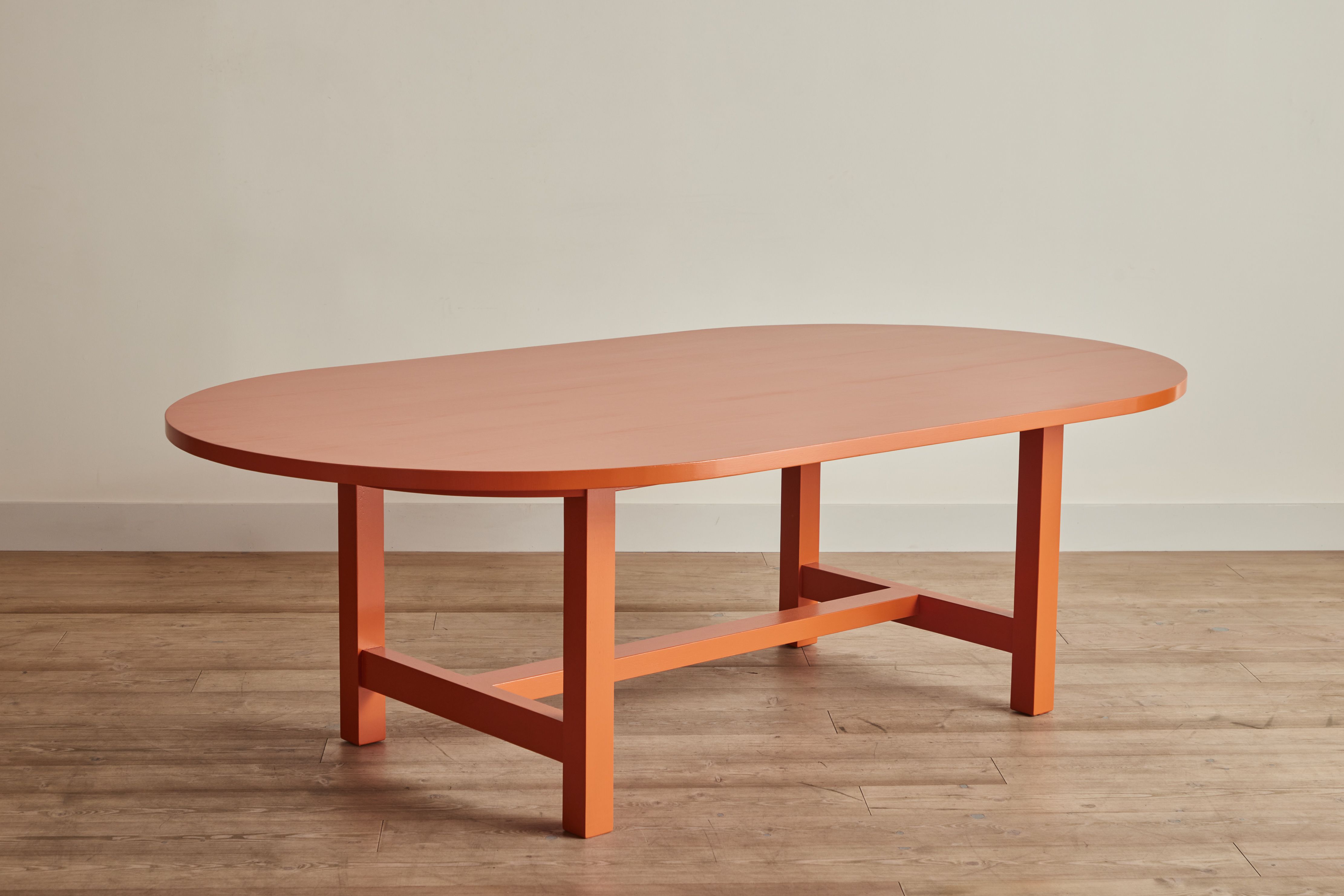
Oval Harvest Table in Charlotte’s Locks
Charlotte’s Locks is an energetic orange with enough warmth and depth to feel more sophisticated than traffic-cone orangean admittedly low bar, but a useful distinction. Applied to the Oval Harvest Table, it turns a familiar dining form into a confident centerpiece.
This pairing works especially well in rooms with chalky plaster walls, natural fibers, muted blue textiles, black accents, or dark wood flooring. The orange brings warmth, while the oval shape prevents the piece from appearing visually heavy. It is cheerful furniture for people who enjoy hosting, or at least enjoy owning a table that suggests they host.
Swiss Back Bench in Incarnadine
Incarnadine is a deep crimson associated with classical interiors and historic decorative schemes. On the Swiss Back Bench, however, it feels lively rather than formal. The color emphasizes the bench’s back profile and gives the long silhouette a graphic quality.
Placed in an entryway, it could establish the palette for an entire home. At a dining table, it could replace two or three individual chairs and introduce a welcome note of informality. Against soft pink, parchment, sage, or tobacco-colored walls, the red would appear rich and grounded. Against bright white, it would become much sharper and more contemporary.
Cove Dining Chair in India Yellow
India Yellow brings the depth of turmeric, ochre, and late-afternoon sunlight. On the Cove Dining Chair, it offers color without demanding an excessively decorated room. A set could animate a dark dining space, while a single chair could work at a writing desk or in a bedroom corner.
Yellow furniture is surprisingly cooperative. It pairs naturally with navy, plum, olive, rust, chocolate brown, and many shades of blue-green. The trick is choosing a yellow with enough earth in it. Otherwise, the dining room may start behaving like a highlighter.
Oval Farm Table in Arsenic
Despite its alarming name, Arsenic is a buoyant blue-green inspired by historically vivid pigments. Farrow & Ball has described it in terms of faded verdigris, which helps explain its unusual balance: bright enough to feel playful, yet weathered enough to sit comfortably beside vintage objects.
An Arsenic-painted farm table could be especially effective in a breakfast room, conservatory, or informal kitchen. Pair it with woven seating, terracotta flooring, creamy ceramics, and faded floral textiles for a relaxed look. Alternatively, surround it with modern metal chairs and a spare pendant to sharpen the contrast.
Campaign Chest in Eating Room Red
Eating Room Red is an earthy, historic red rather than a glossy lipstick shade. On the Campaign Chest, it highlights the piece’s compact architecture and metal details. The combination feels collected, not themed.
Used in a living room, the chest could support artwork, books, or a lamp. In a bedroom, it could serve as a substantial nightstand. Its red finish would look especially handsome with aged brass, dark green, striped fabric, woven baskets, and warm neutral walls.
Bancha, Brinjal, Studio Green, and Other Possibilities
The official collaboration also points toward Bancha chairs, Studio Green benches, Brinjal accents, and other made-to-order combinations. Bancha has an acidic olive quality associated with midcentury color palettes. Brinjal is a dense aubergine. Studio Green can appear nearly black in low light before revealing its green character in brighter conditions.
These shades demonstrate why selecting furniture color by name alone is a risky sport. Samples should be viewed in the intended room, at several times of day, near the fabrics and flooring that will remain. A paint chip under showroom lighting is merely the first date, not a lifelong commitment.
Why Farrow & Ball Modern Eggshell Suits Furniture
Furniture needs a finish that can tolerate more contact than a typical wall. Dining tables meet plates, glasses, keys, elbows, serving dishes, laptops, and occasionally a child conducting an unauthorized science experiment. Chairs and benches experience repeated handling, while chests and cabinets must withstand doors and drawers opening every day.
Modern Eggshell is Farrow & Ball’s durable mid-sheen interior finish for wood, metal, and concrete. The company recommends it for surfaces that receive regular use, including cabinetry, floors, trim, furniture, and radiators. It is water-based, low in odor and volatile organic compounds, and formulated to resist knocks, scuffs, and stains better than ordinary wall paint.
The mid-sheen level is also visually useful. A dead-flat finish can absorb light so completely that a furniture silhouette loses definition. High gloss creates drama but highlights every ripple, fingerprint, and tiny surface irregularity. Eggshell occupies the calmer middle ground, reflecting enough light to articulate curves and edges without turning a bench into a mirror.
No painted surface is indestructible, of course. “Durable” does not mean “safe place to practice knife throwing.” Coasters, trivets, felt pads, gentle cleaning products, and ordinary common sense remain excellent accessories.
How to Style Hand-Painted Furniture Without Overdoing It
Let One Piece Lead
A painted table, bench, or chest can establish the color story for a room. It does not need six matching companions. In fact, an exact furniture set may weaken the handcrafted, collected effect that makes the collaboration appealing.
Choose one dominant painted piece and repeat its color more quietly through artwork, a narrow stripe, a ceramic bowl, piping on a cushion, or a small section of a rug. The repetition should feel accidental enough to avoid looking like the room was assembled from a boxed kit.
Balance Painted Surfaces with Natural Materials
Color looks particularly convincing beside materials with visible texture. Pair painted furniture with raw or waxed wood, linen, wool, aged leather, rattan, stone, plaster, handmade tile, or unlacquered metals. These surfaces soften the crispness of the paint and help the room feel lived in.
A red bench against a plain white wall may look dramatic. The same bench near a worn runner, an oak coat rack, and a woven basket feels integrated. Neither approach is wrong, but they tell very different stories.
Use Tonal Relationships Instead of Perfect Matches
Tonal decorating allows several related shades to coexist without requiring them to match precisely. An Arsenic table might sit near dusty mint walls, dark teal pottery, and a moss-colored cushion. A Charlotte’s Locks table might be surrounded by rust, clay, coral, and muted rose.
This strategy gives a room depth and makes future additions easier. It also prevents the mild panic that occurs when a replacement lampshade is two shades away from the exact orange of the table.
Pay Attention to Light
Paint color changes according to window orientation, bulb temperature, surrounding colors, and time of day. A dark green bench might look almost black at breakfast and clearly botanical by noon. A red chest may appear brownish under warm lamps and brighter beside a cool north-facing window.
Before committing, place large samples vertically and horizontally in the room. Furniture reflects light differently from walls because its surfaces face multiple directions. A tabletop, apron, leg, and spindle may each show a slightly different version of the same color.
Allow Patina to Become Part of the Story
Painted furniture will eventually record use. Edges may soften. A frequently opened drawer may develop a subtle rub mark. A dining table may acquire tiny evidence that people have actually eaten at ita shocking breach of showroom protocol.
Reasonable wear can make a quality painted piece more appealing. It introduces patina and relaxes the room. Damage should be repaired, but perfection need not be preserved at the expense of living.
Is Custom Hand-Painted Furniture Worth the Investment?
The answer depends on what the buyer expects. This is not the most economical route to owning a table, chair, or chest. It is an investment in made-to-order construction, hand finishing, distinctive proportions, and a highly specific color choice.
For a central piece used daily, that combination can offer considerable long-term value. A strong silhouette can move between houses and adapt to different decorating schemes. The color can make an otherwise practical object emotionally memorable. Instead of becoming background furniture, it may become the piece around which the rest of the room evolves.
Before ordering, buyers should review dimensions carefully, obtain finish samples, consider delivery access, and confirm current production times. Custom furniture may have limited cancellation or return options, and a 96-inch dining table becomes considerably less romantic when it refuses to turn the corner in the stairwell.
It is also worth asking how the chosen color will work with existing permanent materials. Paint and pillows can change; stone flooring, built-in cabinetry, and a beloved antique rug may be less flexible. The best furniture color does not need to match those elements, but it should acknowledge their existence.
Living With Painted Furniture: An Experience-Based Perspective
The real pleasure of hand-painted furniture becomes apparent after the initial showroom excitement fades. At first, the color is the headline. Guests notice the green table or red bench immediately. Photographs make it look like a deliberate “design moment.” Then daily life begins, and the piece gradually stops feeling like an accent. It becomes part of the household.
A painted dining table changes throughout the day more noticeably than many stained wood tables. In cool morning light, blue-green shades can appear crisp and fresh. At dinner, under warm bulbs and candlelight, the same surface becomes deeper and softer. This variation makes the furniture feel less static. You do not simply own one green table; you own several versions of it, depending on the weather and whether somebody remembered to open the curtains.
Color also affects how people interact with a room. A warm orange or yellow table can make an eating area feel informal and sociable, even when the furniture itself is beautifully made. A dark green bench encourages a quieter, more grounded atmosphere. Deep red furniture introduces a sense of ceremony, but because the color appears on an object rather than every wall, it rarely makes the entire room feel heavy.
One practical surprise is how effectively a painted piece can organize a collection of unrelated furnishings. Many homes contain a mixture of inherited antiques, contemporary upholstery, flea-market objects, and practical purchases made during moments of desperation. A strongly colored table or chest can become the visual punctuation that makes those pieces appear intentionally assembled. Suddenly, the mismatched chairs look charming rather than accidental.
There is also an emotional adjustment. Owners of pristine painted furniture may spend the first few weeks watching every glass and belt buckle with the concentration of an airport security officer. Eventually, they learn the difference between neglect and normal use. A coaster is sensible. Refusing to place anything on the table rather defeats the table’s professional purpose.
The hand-painted finish rewards close viewing. Around joints, edges, and turned elements, light catches slight changes in texture. These are not flaws in the mass-production sense. They are reminders that the finish was applied to a three-dimensional object by a person rather than printed onto a flat surface by a machine. That human quality becomes especially valuable in rooms filled with smooth screens, factory-perfect appliances, and other objects determined never to reveal how they were made.
Maintenance tends to be simple when approached calmly. Dust with a soft cloth, wipe spills promptly, avoid abrasive cleaners, and use protective pads beneath hot, wet, or sharp objects. When moving accessories, lift rather than drag them. If a small chip eventually appears, obtain professional advice or the correct touch-up material rather than introducing a mystery paint from the garage and hoping optimism will handle the color match.
Perhaps the most satisfying experience is discovering how flexible a distinctive color can be. A crimson bench that once sat against cream walls may later work beautifully in a blue hallway. An ochre chair can move from a dining room to a bedroom. A green chest can support modern art in one home and an antique mirror in another. Color gives the furniture identity, but a well-chosen, nuanced shade does not necessarily trap it in a single scheme.
That adaptability is the quiet strength of the Nickey Kehoe and Farrow & Ball collaboration. The pieces photograph beautifully, but they are not merely decorative props. Their forms are useful, the finish is selected for real interiors, and the color grows more interesting as it encounters different light, materials, and chapters of daily life.
Final Thoughts
Nickey Kehoe and Farrow & Ball have created a persuasive case for treating furniture as an active source of color rather than a neutral platform waiting for accessories. The collaboration succeeds because neither partner depends on novelty alone. The furniture begins with enduring silhouettes and skilled Los Angeles production. The paint contributes depth, durability, and a palette broad enough to move from quiet earth tones to jubilant orange, red, yellow, and blue-green.
The best pieces feel both familiar and surprising: a farmhouse table with a flash of verdigris, a traditional bench dressed in crimson, or a campaign chest made warmer and more personal through earthy red. They bring character without requiring an entire room to follow a theme.
For anyone tired of anonymous furniture but wary of short-lived trends, hand-painted furniture offers a useful middle path. Choose a shape worth keeping, select a color worth living with, and allow the surface to gather a little history. A home should not look untouched. It should look lovedwith coasters nearby, naturally.