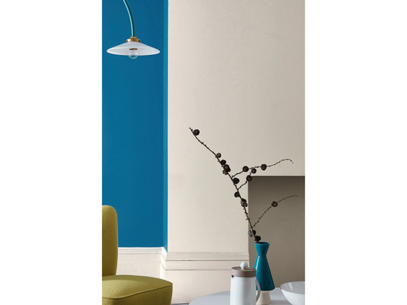

Slaked Lime – Deep sounds like something a medieval mason would ask for before repairing a castle wall. In reality, it is far more elegant: a warm, mineral-inspired neutral paint shade that sits between soft off-white, gentle beige, and quiet stone. It has the calm personality of a classic neutral, but with enough depth to keep a room from looking flat, chilly, or suspiciously like an undecorated rental.
As a color, Slaked Lime – Deep is especially useful for homeowners, designers, decorators, and anyone who has ever stared at 47 paint samples and whispered, “They are all white, but somehow none of them are right.” This shade belongs to the family of warm off-whites and grey-based neutrals, making it a thoughtful choice for walls, ceilings, trim, cabinetry, limewash-style finishes, and layered tonal schemes.
This in-depth guide explores what Slaked Lime – Deep is, how it behaves in different rooms, why mineral-based neutrals continue to trend in American interiors, and how to use it without turning your home into a beige waiting room. Spoiler: texture, lighting, contrast, and finish matter.
What Is Slaked Lime – Deep?
Slaked Lime – Deep is a deeper variation of the classic Slaked Lime off-white paint shade. The original Slaked Lime is known for its warm, soft, mineral quality, while Slaked Lime – Deep takes that gentle foundation and adds more body. Think of it as the grown-up sibling: still calm, still refined, but less likely to disappear on a wall.
The name comes from traditional slaked lime, also known as calcium hydroxide, a material historically used in limewash, plaster, masonry, agriculture, and even food processing. In design language, “slaked lime” evokes chalky walls, old-world architecture, soft plaster, and naturally aged surfaces. The paint color borrows that mood rather than acting as a bag of actual construction lime in your living room. Please do not dump masonry lime into your paint tray. Your roller will not thank you.
In color terms, Slaked Lime – Deep can be described as a warm neutral with beige, stone, and subtle grey undertones. It is not a bright gallery white, not a yellow cream, and not a cold greige. Instead, it lands in that very useful middle ground: soft enough to create calm, deep enough to add warmth, and neutral enough to support bolder furniture, textiles, artwork, and architectural details.
Why Slaked Lime – Deep Works So Well in Modern Homes
American interiors have spent years moving away from stark white and cool grey. Those colors still have their place, but many homeowners now want rooms that feel warmer, softer, and more lived-in. Slaked Lime – Deep fits that shift beautifully. It gives a space the clean quality people love about white paint, but without the sterile “dentist office at noon” effect.
The depth is the secret. A pure white can look crisp in one room and harsh in another. A beige can feel cozy, but sometimes too heavy. Slaked Lime – Deep splits the difference. It adds enough pigment to make walls feel intentional, yet it remains quiet enough to avoid stealing attention from the rest of the room.
A Neutral That Does Not Feel Lazy
Some neutrals behave like background music. Others behave like elevator music. Slaked Lime – Deep belongs to the better category: subtle, supportive, and surprisingly characterful. It provides a warm backdrop for colorful schemes, natural woods, linen upholstery, stone counters, brass hardware, black accents, and vintage pieces.
Because the shade has mineral softness, it also works well with imperfect surfaces. In older homes, where walls may have plaster texture, paneling, trim details, or quirky corners, Slaked Lime – Deep feels natural rather than forced. In new builds, it can add instant softness and prevent spaces from looking too sharp or newly boxed.
Color Profile: Undertones, Mood, and Best Pairings
Slaked Lime – Deep is best understood as a warm off-white with beige and stone undertones. Depending on the light, it may read as soft taupe, pale mushroom, warm grey-beige, or chalky cream. That flexibility is what makes it useful, but it also means sampling is essential. Paint colors are tiny drama queens under different lighting, and neutrals are the most dramatic of all.
Undertones to Expect
In bright natural light, Slaked Lime – Deep can appear lighter and cleaner, revealing its soft off-white character. In shaded rooms, it may become more grounded and beige. Under warm artificial lighting, its cozy undertones become more noticeable. Under cooler bulbs, the grey-stone side may come forward.
This is not a flaw. It is the entire charm of mineral-inspired neutrals. They shift gently through the day, giving rooms movement without requiring wallpaper, murals, or a live-in lighting technician.
Best Color Pairings
Slaked Lime – Deep works especially well with layered whites, deeper neutrals, earthy reds, muted blues, olive greens, charcoal, and black. For a calm tonal palette, pair it with lighter Slaked Lime-style whites on ceilings or trim. For a sophisticated contrast, use deep grey, black, or navy on doors, cabinetry, or furniture. For a warmer and more playful result, combine it with terracotta, ochre, muted coral, or soft red accents.
Natural materials are also strong partners. Oak, walnut, limestone, travertine, rattan, cane, wool, linen, clay ceramics, and unlacquered brass all look comfortable beside Slaked Lime – Deep. The color does not fight these textures; it lets them show off politely, like a host who knows when to refill glasses and when to stop talking.
Where to Use Slaked Lime – Deep
The beauty of Slaked Lime – Deep is its versatility. It can be used as a whole-room wall color, a cabinet shade, a trim color, or a backdrop for stronger accents. The key is matching the shade and finish to the room’s function.
Living Rooms
In a living room, Slaked Lime – Deep creates a relaxed and refined background. It pairs well with woven rugs, upholstered sofas, wood coffee tables, and layered lighting. If your living room has large windows, the color can feel airy without being stark. If the room is darker, it can add warmth instead of turning shadowy corners blue-grey.
For a polished look, use Slaked Lime – Deep on the walls with a softer white on the ceiling and trim. For a more cocooning look, continue the color onto the ceiling and use a slightly glossier finish on trim to create quiet contrast.
Bedrooms
Bedrooms love this shade. It is calm, restful, and not too sugary. Many warm whites lean creamy, which can feel overly yellow next to modern bedding. Slaked Lime – Deep offers warmth without becoming buttercream frosting. Pair it with white linen sheets, taupe throws, walnut nightstands, black reading lamps, and one dramatic piece of art for balance.
Kitchens
In kitchens, Slaked Lime – Deep works beautifully on walls, especially when cabinetry is green, navy, black, oak, mushroom, or warm white. It can also be used on cabinets if you want a soft neutral kitchen that does not look flat. For cabinetry, choose a more durable finish such as eggshell, satin, or a specialist cabinet-friendly paint, because kitchens have a way of turning walls into abstract sauce paintings.
Bathrooms
Bathrooms can benefit from Slaked Lime – Deep when the goal is spa-like warmth. It pairs well with stone tile, marble, aged brass, white porcelain, and soft towels. Because bathrooms handle moisture, a washable and moisture-resistant finish is important. Matte can look gorgeous, but satin or eggshell may be more practical in busy bathrooms.
Hallways and Entryways
Hallways are where neutrals prove their worth. Slaked Lime – Deep can make narrow corridors feel warmer and less tunnel-like. It also hides everyday wear better than bright white. Add a runner, black hooks, framed prints, and a bench in natural wood, and suddenly the hallway becomes a design moment instead of the place where shoes go to form a small civilization.
Choosing the Right Paint Finish
The color is only half the story. Paint finish affects durability, light reflection, cleanability, and how rich the color appears. Slaked Lime – Deep can look soft and chalky in a matte finish, more practical in eggshell, and slightly sharper in satin or gloss.
Matte Finish
A matte finish gives Slaked Lime – Deep its most mineral, plaster-like appearance. It is ideal for bedrooms, adult living rooms, dining rooms, ceilings, and lower-traffic spaces. Matte finishes absorb light, which helps hide small wall imperfections. The downside is that traditional matte paints may be less scrubbable unless they are specifically formulated as washable matte products.
Eggshell Finish
Eggshell is the practical middle child. It has a low sheen, but it is generally easier to clean than flat paint. It works well in living rooms, hallways, bedrooms, and sometimes kitchens or bathrooms, depending on the product. On Slaked Lime – Deep, eggshell can add a gentle glow without making the walls shiny.
Satin or Gloss Finish
Satin and gloss finishes are useful for trim, doors, cabinetry, furniture, and high-use surfaces. They reflect more light, highlight architectural detail, and improve wipeability. Used thoughtfully, a satin or gloss version of Slaked Lime – Deep can make trim feel elegant and quietly custom.
Lighting: The Make-or-Break Factor
Lighting changes every paint color, but warm neutrals are especially sensitive. Before committing to Slaked Lime – Deep, test it in the actual room. Paint a large sample board or apply two coats on a test area. Then observe it in morning light, afternoon light, evening light, and under your usual bulbs.
North-Facing Rooms
North-facing rooms often receive cooler, indirect light. Slaked Lime – Deep can help warm these spaces, but it may also lean more stone-grey. This can be beautiful if paired with warm woods, brass, cream textiles, and layered lamps.
South-Facing Rooms
South-facing rooms usually get warmer, stronger light. In this setting, Slaked Lime – Deep may appear lighter and creamier. It can prevent a sunny room from feeling too bright while still keeping the space open.
Artificial Lighting
Warm bulbs around 2700K can bring out the beige and creamy notes in Slaked Lime – Deep. Cooler bulbs around 4000K to 5000K may make it look crisper and greyer. If your paint looks perfect by day and strange by night, do not blame the wall. Blame the bulb, then change the bulb.
Design Styles That Suit Slaked Lime – Deep
Slaked Lime – Deep is not locked into one style. It can support traditional, transitional, modern organic, farmhouse, cottage, coastal, European-inspired, and minimalist interiors. The color’s personality changes based on what surrounds it.
Modern Organic
Use Slaked Lime – Deep with limewashed woods, bouclé, linen, stone, black metal, and sculptural lighting. The result feels quiet, warm, and expensive without shouting, “I bought everything in the same weekend.”
Classic Traditional
Pair it with crown molding, framed art, antique furniture, dark wood, patterned rugs, and brass hardware. It gives traditional rooms softness without looking old-fashioned.
European Cottage
Combine Slaked Lime – Deep with terracotta tile, unlacquered brass, old pine, vintage ceramics, and floral or stripe textiles. The color feels especially at home in spaces where texture matters more than perfection.
Soft Minimalism
For a minimalist interior, Slaked Lime – Deep provides warmth while keeping the palette restrained. Use it with clean-lined furniture, tonal fabrics, pale oak, and subtle contrast. Minimalism does not have to feel like a very stylish refrigerator.
Slaked Lime – Deep vs. Similar Neutral Paint Colors
Compared with crisp white, Slaked Lime – Deep is warmer, softer, and more forgiving. Compared with cream, it is less yellow. Compared with greige, it feels more mineral and chalky. Compared with beige, it is lighter and more refined. Compared with taupe, it is airier and easier to use as a whole-room shade.
This makes it a strong candidate when you want a neutral that looks designed but not decorated to within an inch of its life. It is also useful when you need to bridge several materials: white counters, wood floors, brass hardware, black windows, stone tile, and colorful artwork.
Practical Painting Tips for Slaked Lime – Deep
Start with samples. Always. Online photos are helpful, but screens lie. Even the nicest monitor cannot understand your north-facing guest room, your oak floor, your LED bulbs, or your red sofa that seemed like a great idea in 2018.
Use two coats on a sample board, move it around the room, and view it beside flooring, trim, tile, cabinets, and furniture. If the sample looks too dark, test the lighter Slaked Lime family shades. If it looks too pale, consider a deeper tonal variation or add contrast through trim and furniture.
Prepare walls carefully. Clean the surface, repair holes, sand rough patches, and use primer where needed. Warm neutrals may be forgiving, but they are not miracle workers. If a wall has stains, patchy sheen, or old dark paint, priming improves the final color and finish.
Safety and Sustainability Notes
Modern consumers increasingly care about indoor air quality, low-odor paints, VOC levels, and child-safe finishes. This matters because paint covers large surface areas inside the home. When choosing any finish in Slaked Lime – Deep, check product labels for VOC information, ventilation instructions, drying times, and surface suitability.
It is also useful to separate the paint color name from industrial slaked lime. Calcium hydroxide, the actual material known as slaked lime or hydrated lime, has important uses in masonry, water treatment, agriculture, and food processing, but it is alkaline and should be handled with proper protection. The paint shade Slaked Lime – Deep is inspired by that traditional material’s soft mineral appearance; it is not an invitation to handle raw lime casually.
Common Mistakes to Avoid
Using It Without Contrast
Slaked Lime – Deep is subtle. If everything in the room is the same middle-neutral tone, the space may feel flat. Add contrast through black picture frames, dark wood, patterned rugs, textured textiles, deeper paint accents, or colorful art.
Ignoring the Ceiling
A bright white ceiling can sometimes make warm walls look dingy by comparison. Try a softer white, a lighter Slaked Lime tone, or even the same color on the ceiling for a seamless look.
Forgetting About Finish
A matte wall and a satin trim in the same color can look intentionally layered. The same color in the same finish on every surface may feel too uniform. Finish is a quiet design tool, and quiet tools are still tools.
Real-World Experience: Living With Slaked Lime – Deep
The best way to understand Slaked Lime – Deep is to imagine using it in an actual home, not just admiring a perfect paint chip under store lighting. In real rooms, this shade behaves like a patient, well-dressed friend. It does not demand attention, but the room feels better when it is there.
In a small entryway, Slaked Lime – Deep can immediately soften the transition from outdoors to indoors. Instead of a harsh white wall that shows every fingerprint, the slightly deeper tone gives the space warmth and a little visual forgiveness. Add black hooks, a natural fiber basket, and a warm wood bench, and the color suddenly looks intentional. Even the pile of shoes looks slightly more sophisticated, although let us not give paint too much credit.
In a living room, the experience is different. During the morning, the color may look light and chalky, especially near windows. By late afternoon, it can become warmer and more enveloping. This slow shift is part of the charm. It gives the room a gentle rhythm through the day. When paired with linen curtains and wood furniture, the walls feel soft rather than blank. With colorful artwork, Slaked Lime – Deep recedes just enough to let the art stand out.
In a bedroom, the shade feels especially successful when used with natural textiles. White bedding looks cleaner against it, while beige bedding looks more layered. If the room has warm lamps, the color becomes cozy at night without turning yellow. This makes it a practical choice for people who want a bedroom that feels peaceful but not pale, warm but not heavy.
One of the most useful experiences with Slaked Lime – Deep is testing it beside trim. Against stark white trim, it may appear warmer and more beige. Against creamy white trim, it becomes softer and more tonal. Against dark trim, it looks elegant and architectural. This is why sample boards matter so much. The wall color is never alone; it is always in conversation with the floor, ceiling, windows, doors, furniture, and light.
In kitchens, Slaked Lime – Deep can be a quiet hero. It works well behind open shelving, beside stone countertops, or around painted cabinetry. If the cabinets are green, navy, black, or natural wood, this neutral makes them feel grounded. It is also forgiving in a space filled with mixed materials. Stainless steel, white dishes, warm wood cutting boards, brass hardware, and stone counters can all sit comfortably with it.
The main lesson from using a color like Slaked Lime – Deep is this: restraint is not the same as boredom. A good neutral does not have to be dramatic to be valuable. It can make a room feel calmer, more finished, and easier to live in. It can support seasonal decor, changing furniture, and evolving tastes. It can make a home feel collected instead of staged.
For homeowners who are nervous about choosing a color, Slaked Lime – Deep offers a forgiving path. It is safer than a bold wall color, warmer than plain white, and more interesting than builder beige. It is a color for people who want atmosphere without chaos. In other words, it is the paint equivalent of a good linen shirt: relaxed, classic, and somehow appropriate almost everywhere.
Conclusion
Slaked Lime – Deep is a sophisticated warm neutral with enough depth to make interiors feel soft, layered, and lived-in. Its mineral-inspired character gives it more personality than standard off-white, while its restraint makes it flexible across living rooms, bedrooms, kitchens, bathrooms, hallways, cabinetry, trim, and tonal schemes.
The key to using it well is thoughtful pairing. Test it in your room, study it under different lighting, choose the right finish, and add contrast through texture, furniture, trim, or accent colors. Used carefully, Slaked Lime – Deep can turn ordinary walls into a calm architectural backdrop. Used lazily, it may simply become “kind of beige.” The wall, dear reader, is counting on you.
Note: This article is written for web publishing in American English and synthesizes real product, design, paint-finish, indoor-air-quality, and traditional lime-use information without source-link clutter.