
Bending text in Photoshop is one of those design skills that looks fancy, feels slightly magical, and takes far less time than explaining to a client why “just make it pop” is not a technical direction. Whether you are creating a circular logo, a retro poster, a product mockup, a badge design, or a social media graphic that needs more personality than plain horizontal text, Photoshop gives you several reliable ways to curve, warp, and shape typography.
The good news: you do not need to be a Photoshop wizard with a glowing tablet pen and a mysterious folder named “final_FINAL_v9.psd.” You only need to understand which method fits your design goal. Some techniques bend text quickly with presets. Others make text follow a precise path. A third approach lets you distort text more dramatically while keeping your workflow flexible.
In this complete guide, you will learn three practical ways to bend text in Photoshop: using Warp Text, typing on a path, and converting text into a Smart Object for more advanced warping. Each method has its own strengths, limitations, and best-use cases. By the end, you will know exactly when to use each oneand how to avoid creating typography that looks like it lost a fight with a rubber band.
Why Bend Text in Photoshop?
Curved and warped text can instantly make a design feel more intentional. Straight text is clear and useful, but curved text can frame a subject, wrap around a logo, follow the edge of a product, or add motion to a static image. Designers often use bent text for badges, stickers, event posters, packaging mockups, sports graphics, album covers, restaurant menus, and promotional banners.
Photoshop is especially useful when your text needs to interact with an image. For example, you might want a slogan to curve around a coffee cup, a brand name to sit on a curved label, or a headline to follow the shape of a wave. In those situations, bending text helps the words belong to the composition instead of floating on top like a confused subtitle.
Before jumping into the methods, remember one golden rule: keep your text editable whenever possible. Editable text lets you change the wording, font, spacing, and size later. This matters because clients, managers, and your own future self will almost certainly ask for “one tiny change” after you thought the design was finished.
Method 1: Bend Text with the Warp Text Tool
The Warp Text tool is the fastest way to bend text in Photoshop. It is perfect for simple curves, arches, waves, bulges, and playful headline effects. If you need curved text quickly and do not need it to follow a custom path, start here.
When to Use the Warp Text Tool
Use Warp Text when you want a quick, symmetrical effect. It works well for curved titles, badge headings, retro-style posters, fun social graphics, and simple logo mockups. The tool includes preset styles such as Arc, Arch, Bulge, Flag, Wave, Rise, Fish, and Twist. You can adjust the bend amount and add horizontal or vertical distortion to fine-tune the result.
The biggest advantage is speed. You can create curved text in seconds while keeping the type layer editable. That means you can still change the font, wording, color, or size afterward. The downside is that preset warps can distort letterforms if pushed too far. A small arc looks polished. A 90% bend with extreme distortion can make your letters look like they are doing emergency yoga.
Step-by-Step: How to Use Warp Text
First, open your Photoshop document and select the Horizontal Type Tool from the toolbar. Click on your canvas and type your text. Choose your font, size, color, and alignment before applying the bend. This gives you a cleaner starting point.
Next, make sure the text layer is selected in the Layers panel. With the Type Tool active, look at the options bar at the top of the screen and click the Create Warped Text icon. It looks like a letter “T” sitting on a curved line. Photoshop will open the Warp Text dialog box.
Choose a style from the drop-down menu. For a classic curved headline, select Arc. For a rounded top effect, try Arch. For something more dramatic, test Wave or Flag. Keep the Horizontal option selected if you want the text to bend left to right. Use Vertical only when you want the warp direction to run up and down.
Now adjust the Bend slider. A positive value curves the text upward in many styles, while a negative value curves it downward. Start gently, around 15% to 30%, and increase only if the design needs more drama. Then use Horizontal Distortion and Vertical Distortion carefully. These sliders can be useful, but they are also where good typography sometimes goes to become a ransom note.
Click OK when the result looks right. To edit the warp later, select the same text layer, activate the Type Tool, and open the Warp Text dialog again. You can change the style, reduce the bend, remove the effect, or adjust the distortion without rebuilding the text from scratch.
Best Example for Warp Text
Imagine you are designing a summer camp badge. The words “Mountain Adventure” need to curve over an illustrated pine tree. Use the Type Tool to create the phrase, apply Warp Text with the Arc style, set the Bend around 25%, and increase tracking slightly in the Character panel so the letters have room to breathe. The result is clean, fast, and badge-friendly.
Method 2: Bend Text Along a Shape or Path
If you want text to follow a circle, oval, wave, custom curve, or object outline, use text on a path. This method does not squash or stretch the letters the same way Warp Text can. Instead, Photoshop places the text along a path, keeping the characters more natural while changing their direction.
When to Use Text on a Path
Text on a path is the best method for circular logos, seals, stickers, badges, curved labels, and text that needs to wrap around an object. It is also ideal when you want precise control. Instead of choosing from preset warp styles, you draw the exact path you want, then attach the text to it.
This method is especially useful for professional logo-style layouts. For example, if you are making a coffee shop logo, you can place the business name around the top of a circle and the tagline around the bottom. The text follows the circular path while staying crisp and readable.
Step-by-Step: Circular Text with the Ellipse Tool
Select the Ellipse Tool from the toolbar. In the options bar, set the tool mode to Path instead of Shape. This is important. A shape creates a visible shape layer; a path creates an invisible guide that your text can follow. If Photoshop starts filling a circle with color, do not panic. It is not haunted. You probably selected Shape mode instead of Path mode.
Hold Shift while dragging to create a perfect circle, or drag freely to create an oval. Once the path is drawn, select the Horizontal Type Tool. Move your cursor over the edge of the path. When the cursor changes to a text-on-path icon, click the path and start typing.
Your text will now follow the curve. Use the Path Selection Tool to reposition it. You can drag the starting and ending points to control where the text begins and stops. If the text appears inside the circle when you want it outside, or upside down when you want it readable, use the Path Selection Tool to drag the text across the path until it flips to the desired side.
Adjust font size, tracking, baseline shift, and alignment until the text feels balanced. Circular text often needs extra letter spacing because the curve compresses the visual rhythm of the characters. If the letters look crowded, increase tracking slightly. Your typography should look confident, not like commuters packed into a subway car.
Step-by-Step: Custom Curved Text with the Pen Tool
For a custom curve, select the Pen Tool or Curvature Pen Tool. In the options bar, choose Path. Click to create anchor points and shape the curve you want your text to follow. If you use the Curvature Pen Tool, Photoshop will help create smoother curves with fewer clicks, which is great for beginners.
After drawing the path, select the Horizontal Type Tool and hover over the path until the cursor changes. Click and type your text. The letters will follow the line you created. Use the Direct Selection Tool to adjust anchor points and refine the curve. Use the Path Selection Tool to move the text along the path or flip it to the other side.
This approach is excellent for text that follows a wave, a road, a ribbon, a product edge, or a hand-drawn swoosh. It gives you far more control than the Warp Text presets. The trade-off is that it takes more patience. Paths are powerful, but they can be a little dramatic until you get used to themlike tiny vector noodles with opinions.
Best Example for Text on a Path
Suppose you are designing a circular bakery logo. Draw a circular path with the Ellipse Tool. Place “Oak Street Bakery” along the top curve and “Fresh Daily” along the bottom curve. Use tracking to balance the letters and baseline shift to position the text neatly around the circle. This method creates a polished logo-style result without stretching the font.
Method 3: Bend and Distort Text with Smart Objects and Transform Warp
The third method is for more advanced bending, especially when text needs to fit a surface, follow perspective, or become part of a realistic mockup. In this workflow, you convert your text layer into a Smart Object and then use Photoshop’s transform and warp tools.
Why Use a Smart Object?
A Smart Object protects the original content inside a container. When you convert a text layer into a Smart Object, you can transform, warp, scale, and distort the container while preserving the editable text inside it. To edit the original words later, you double-click the Smart Object thumbnail in the Layers panel, update the text in the opened file, save it, and return to your main document.
This is extremely useful for mockups. For example, you can place text on a curved poster, a folded shirt, a product box, a mug, or a sign photographed at an angle. Instead of rasterizing the type and permanently damaging it, the Smart Object workflow gives you flexibility.
Step-by-Step: Warp Text as a Smart Object
Create your text with the Type Tool and style it as needed. Then right-click the text layer in the Layers panel and choose Convert to Smart Object. You can also use the menu path Layer > Smart Objects > Convert to Smart Object.
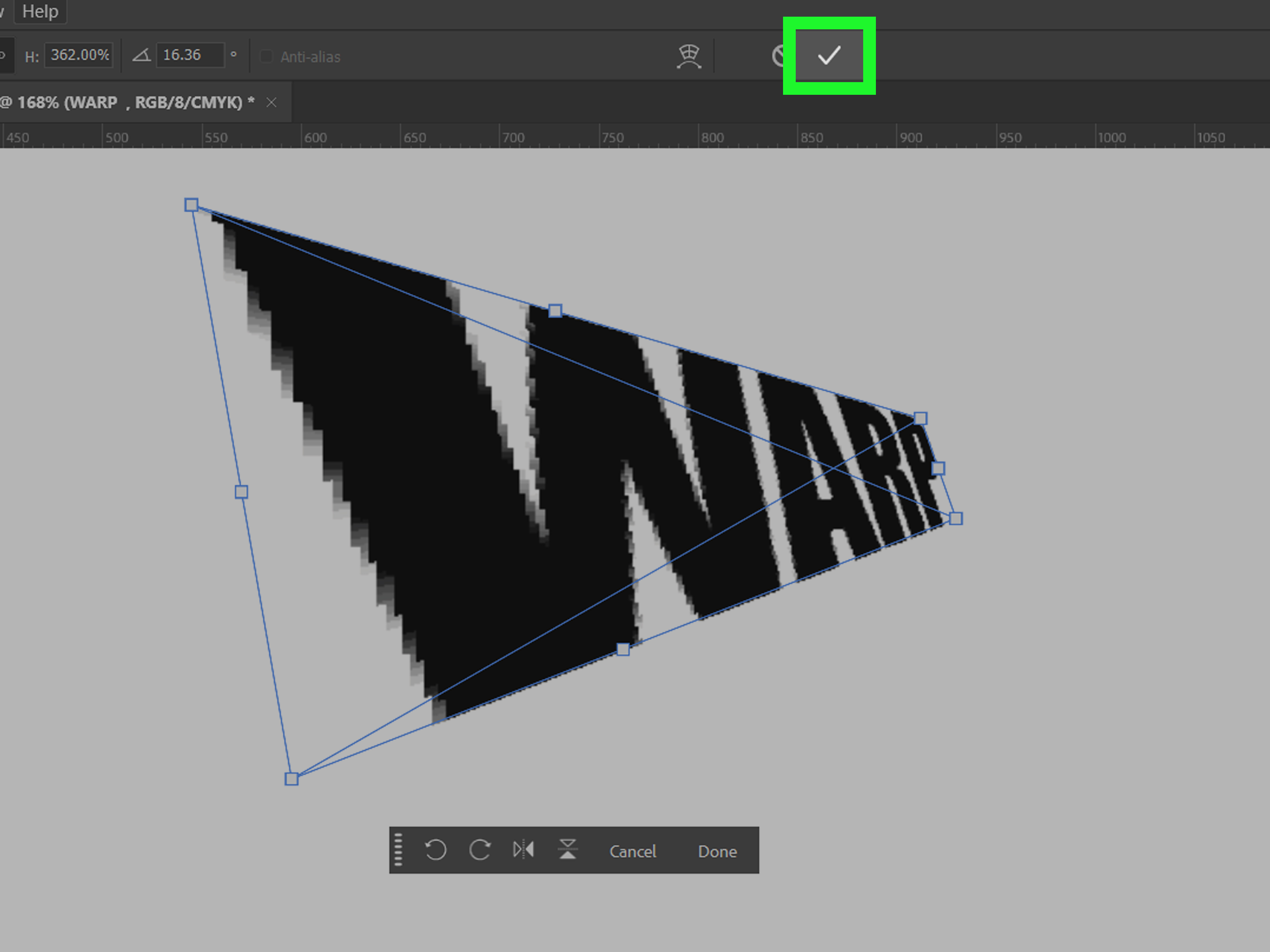
With the Smart Object selected, press Ctrl+T on Windows or Command+T on Mac to enter Free Transform. Right-click inside the transform box and choose Warp. Photoshop will display a warp grid. Drag the handles, corners, and grid areas to bend the text into the shape you want.
You can also use preset warp shapes from the options bar, including Arc, Bulge, Flag, and other forms. For more manual control, choose Custom and adjust the grid yourself. When the warp looks right, click the checkmark in the options bar to commit the transformation.
If your design needs perspective rather than a simple bend, explore Distort, Perspective, or Perspective Warp depending on the situation. These tools are helpful when text must match an angled surface, such as a billboard, box, book cover, or storefront sign. For realistic results, match the direction of the surface and keep an eye on scale, lighting, and blur. Text that is perfectly sharp on a blurry photo will announce itself as fake faster than a stock-photo handshake.
Best Example for Smart Object Warping
Imagine you are placing the words “Limited Edition” onto a photo of a curved product label. Create the text, convert it to a Smart Object, then use Transform Warp to bend the text so it follows the label’s curvature. Add a subtle blend mode, reduce opacity slightly if needed, and apply a tiny blur only if the photo itself is soft. The result looks more realistic because the text respects the surface.
Warp Text vs. Text on a Path vs. Smart Object Warp
Each method bends text, but they do it differently. Warp Text changes the shape of the text layer using preset styles. Text on a path keeps the letters more natural while making them follow a line or shape. Smart Object warping transforms the entire text object, making it ideal for mockups and perspective-based designs.
If you need speed, choose Warp Text. If you need clean circular or custom curved typography, choose text on a path. If you need the text to fit a product photo, surface, or perspective angle, choose Smart Object warping.
Common Mistakes When Bending Text in Photoshop
Using Too Much Bend
The most common mistake is overdoing the curve. A dramatic bend can be fun, but readability matters. If people need to tilt their heads like confused puppies to read your design, reduce the bend.
Forgetting Letter Spacing
Curved text often needs tracking adjustments. Increase spacing slightly for circular text and reduce spacing if the letters feel too loose on a gentle curve. Small spacing changes can make the difference between professional and “I discovered Photoshop at 2 a.m.”
Rasterizing Too Early
Rasterizing turns editable text into pixels. Sometimes it is necessary for special effects, but do it only when you are sure the wording, font, size, and layout are final. Better yet, duplicate the layer first and hide the editable original.
Ignoring the Background Image
If bent text is placed on a photo, it should match the photo’s perspective, lighting, texture, and sharpness. A curved label on a bottle should curve with the bottle. Text on a road should follow the road’s angle. Design is basically visual manners: make the text behave like it belongs there.
Pro Tips for Better Curved Text
Use bold, readable fonts when creating curved headlines. Thin fonts can become hard to read when bent tightly. Avoid extreme warping with delicate script fonts unless the design intentionally calls for a wild, expressive style.
Keep a duplicate of your original text layer before applying advanced effects. Name your layers clearly, such as “Headline Editable,” “Headline Warp,” and “Logo Circle Text.” Future you will appreciate this act of kindness.
Use guides and rulers when creating circular text or badge layouts. Centered paths create cleaner results. For circular designs, align your path to the canvas center and use consistent spacing around icons, borders, and decorative elements.
For product mockups, combine Smart Object warping with opacity, blend modes, displacement maps, and subtle texture overlays. The goal is not only to bend the text but to make it look printed, painted, engraved, or naturally attached to the surface.
500-Word Experience Section: Real-World Lessons from Bending Text in Photoshop
After working with curved and warped text in Photoshop across different design projects, one lesson becomes clear very quickly: the best method is not always the fanciest method. Beginners often jump straight into complex warping because it looks powerful, but many professional-looking results come from simple, controlled curves. A clean Arc warp or a well-spaced circular path can look far better than a heavily distorted text layer that screams, “I found every slider and used them all.”
In real projects, I usually start by asking what the text needs to do. If it only needs to add energy to a headline, Warp Text is usually enough. For example, a short phrase like “Big Summer Sale” can look lively with a gentle Arc or Rise effect. The trick is restraint. A bend between 10% and 30% often looks intentional, while anything extreme can quickly damage readability. Photoshop gives you dramatic controls, but typography rewards self-control. It is the design version of seasoning soup: add enough to make it interesting, not enough to make people cough.
For logos, badges, and stickers, I almost always prefer text on a path. This method keeps the letters more natural, which matters when the design needs to feel polished. Circular text can be tricky at first because the text may appear on the wrong side of the path or flip upside down. That is normal. The Path Selection Tool becomes your best friend here. Dragging the text across the path usually fixes the orientation. Once you understand that behavior, circular typography becomes much less mysterious.
Another practical experience: letter spacing matters more on curves than it does on straight lines. On a tight circle, letters can feel crowded even if the tracking looked fine before. I often increase tracking slightly, then adjust the font size and baseline shift until the text sits comfortably around the shape. Good curved text should feel like it was designed for the curve, not forced onto it with digital duct tape.
Smart Object warping is where Photoshop becomes especially useful for mockups. When placing text onto packaging, apparel, posters, or product photos, I always convert the text to a Smart Object before warping. This keeps the workflow flexible. If the wording changes later, I can edit the Smart Object instead of rebuilding the entire effect. That flexibility saves time, especially in commercial design where revisions are not a possibility; they are a weather system.
The biggest mistake I see in mockups is ignoring realism. Text that bends correctly but does not match the photo still looks fake. If the surface has blur, grain, shadow, or texture, the text needs some of that too. A tiny Gaussian Blur, a lower opacity, a blend mode like Multiply or Overlay, or a displacement effect can help the text sit naturally in the image. The bend is only the first step. The finishing details sell the illusion.
My final experience-based advice is simple: keep editable backups. Before rasterizing, duplicating, masking, or experimenting, save a clean version of the text layer. Photoshop is powerful, but it does not protect you from your own confidence. A duplicate layer is cheap insurance, and it can rescue you when a client changes “Grand Opening” to “Soft Opening Preview Event” at the last minute.
Conclusion
Bending text in Photoshop is easier when you choose the right tool for the job. Use Warp Text for fast arches, waves, and preset effects. Use text on a path for clean circular text, badge designs, and custom curves. Use Smart Objects with Transform Warp when your text needs to fit a realistic surface, product mockup, or perspective-based design.
The real secret is not just knowing where the tools are. It is knowing when to stop. A subtle curve can guide the eye, frame a subject, and add personality without sacrificing readability. A thoughtful path can make a logo feel balanced and professional. A carefully warped Smart Object can turn flat text into something that looks naturally printed on a real object.
So open Photoshop, grab the Type Tool, and start bending text with confidence. Just remember: curves are like jokes in a design meeting. A good one helps everyone pay attention. Too many, and suddenly the room gets uncomfortable.
Note: This article is written for current Adobe Photoshop desktop workflows and focuses on practical, editable methods for bending, curving, warping, and shaping text for web, print, branding, and mockup design.