
Note: This article is written as original web content based on real poster design principles, city map art trends, minimalist design practices, typography guidance, and urban visual identity ideas.
A city poster sounds simple enough: take a skyline, add a city name, maybe sprinkle in a few landmarks, and voilàwall art. But anyone who has ever tried to design one knows the truth. A city is noisy, layered, emotional, crowded, historic, modern, chaotic, romantic, and occasionally full of pigeons with suspicious confidence. Turning all of that into one clean poster is not just decoration. It is editing.
That is where the idea of The City Poster Simplified and Improved becomes interesting. It is not about stripping a city until it becomes bland. It is about finding the visual heartbeat of a place and presenting it with clarity, beauty, and purpose. A strong city poster should feel familiar to someone who has walked those streets, yet elegant enough to hang in a modern apartment, office, café, hotel lobby, or creative studio.
In recent years, city posters have become a favorite in home decor and personalized wall art. Minimalist city map posters, skyline prints, screen-printed travel posters, black-and-white urban illustrations, and retro-inspired destination art all share one goal: they help people remember places that shaped them. A city poster can represent where you were born, where you fell in love, where you survived your first terrible studio apartment, or where you ate the best sandwich of your life and still think about it during meetings.
What Is a City Poster?
A city poster is a visual artwork that represents a specific city through design elements such as maps, landmarks, typography, skylines, coordinates, architecture, color palettes, or cultural symbols. Some posters are detailed and illustrative. Others are minimal city map prints made from thin street lines and clean typography. Some use vintage travel poster styling, while others feel like contemporary editorial design.
The best city posters do more than show a place. They interpret it. A poster of New York might use a bold grid, tall vertical forms, and sharp contrast. A San Francisco poster may lean on hills, bridges, foggy colors, or bay-inspired spacing. A poster for Chicago might highlight strong architectural lines and lakefront geometry. A city poster for New Orleans may call for rhythm, curves, ornament, and warm color. The design changes because every city has a different visual personality.
Why Simplification Makes City Posters Better
City posters often fail when they try to include everything. The downtown skyline, every landmark, every bridge, every neighborhood, every street grid, the official flower, the airport code, the baseball team, and somehow a coffee cupsuddenly the poster looks less like art and more like a tourism brochure having a panic attack.
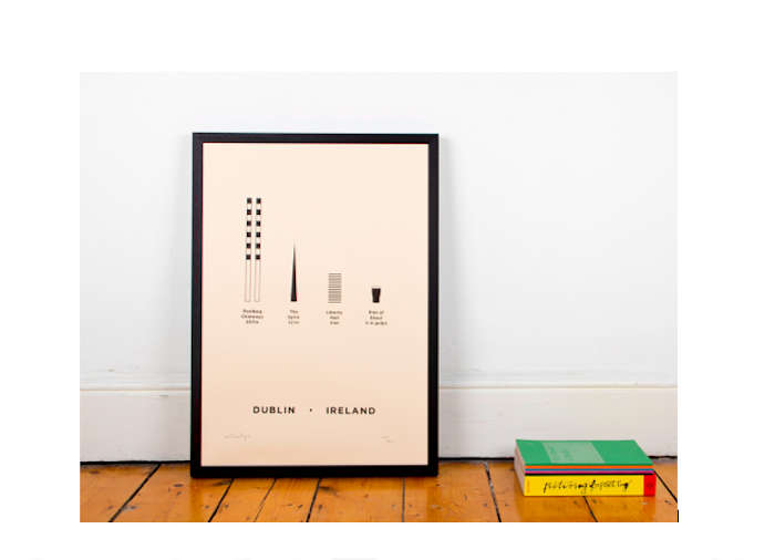
Simplification improves a city poster because it gives the viewer a clear point of focus. Good poster design depends on visual hierarchy, which means arranging information so the eye knows what to notice first, second, and third. A simplified city poster might lead with the city name, then a recognizable map shape, then subtle coordinates or a landmark detail. It guides the viewer instead of shouting from every corner.
Simple Does Not Mean Empty
A simplified poster is not automatically boring. In fact, simple design often demands more thought than decorative clutter. Every line, shape, color, and word has to earn its place. A minimal city map poster may use only black lines on a white background, yet still feel rich because the street grid creates texture. A skyline poster may rely on five or six strong shapes, yet still capture the mood of an entire downtown.
The secret is selective detail. Instead of drawing every window on every building, the designer chooses the silhouette that people recognize. Instead of mapping every street, the designer highlights the pattern that makes the city distinct. Instead of using ten colors, the designer chooses two or three that create mood and contrast.
Core Elements of an Improved City Poster
1. A Strong Visual Concept
Before choosing fonts or colors, a city poster needs a concept. Is it a minimalist street map? A vintage travel print? A skyline silhouette? A typographic poster built around the city name? A neighborhood tribute? A transit-inspired composition? Without a clear concept, the design can quickly become a buffet of unrelated ideas.
For example, a poster titled “Brooklyn” could focus on the Brooklyn Bridge, brownstone architecture, subway lines, or a simplified neighborhood map. Each direction is valid, but mixing all of them without control may weaken the result. A better approach is to choose one main idea and let supporting details serve it.
2. Clean Typography
Typography can make or break a city poster. The type should match the personality of the place while remaining easy to read. A modern sans-serif font can make a poster feel clean, urban, and architectural. A refined serif font may add heritage and elegance. Condensed uppercase lettering can create a strong travel-poster feeling. Hand-lettering can work beautifully for artsy or historic districts, but it should be used with restraint.
A practical rule is to use no more than two typefaces. One can handle the city name, while the other supports smaller details such as state, country, coordinates, year established, or a short phrase. Too many fonts create visual noise. And no, using six fonts does not make a poster “eclectic.” It makes it look like the font menu escaped.
3. Balanced Color
Color gives a city poster emotional direction. Black and white creates timeless minimalism. Warm earth tones suggest vintage travel art. Blue and gray can feel coastal, modern, or architectural. Bright primary colors may reference flags, transit systems, sports culture, or mid-century design.
An improved city poster usually works best with a limited palette. Two or three core colors are often enough. This makes the design easier to print, easier to match with interiors, and easier for the eye to process. High contrast also matters, especially when the poster includes small text or map lines. A beautiful poster loses its magic fast if the viewer has to squint like they are reading a secret message from a spy agency.
4. Recognizable Landmarks
Landmarks help people connect emotionally with a city poster. The Empire State Building, Golden Gate Bridge, Space Needle, Gateway Arch, Hollywood sign, Willis Tower, and French Quarter balconies all carry immediate associations. But landmarks should be simplified, not overworked.
One carefully illustrated landmark can be more powerful than twelve squeezed into the same composition. The goal is recognition, not inventory. A city poster should not feel like a checklist. It should feel like a memory made visible.
5. Map Details and Coordinates
Map-based city posters are popular because they turn geography into art. Street grids, rivers, coastlines, parks, and neighborhood boundaries can become beautiful abstract patterns. Coordinates add a personal and modern touch, especially for posters about hometowns, wedding locations, favorite travel destinations, or meaningful addresses.
However, map posters need careful editing. Too much geographic detail can become muddy when printed, especially at smaller sizes. The designer should simplify roads, remove unnecessary labels, and make sure line weights remain clear. The map should look intentional, not like someone accidentally printed directions to brunch.
How to Simplify a City Poster Without Losing Character
Start With the City’s Identity
Every city has a visual identity, whether official or informal. Some cities are known for architecture. Others are known for landscapes, music, food, sports, water, bridges, deserts, mountains, street art, or historic neighborhoods. A better city poster starts by asking: What makes this place instantly recognizable?
For Miami, that might be tropical color, Art Deco geometry, and ocean energy. For Seattle, it could be the Space Needle, rain-softened tones, evergreen surroundings, and waterfront mood. For Boston, historic brick, academic tradition, harbor references, and classic typography may feel appropriate. For Las Vegas, neon, desert contrast, and bold lettering can carry the concept.
Remove Duplicate Visual Messages
One common mistake in city poster design is repeating the same idea in too many ways. If the poster already has a detailed skyline, it may not need five landmark icons. If it already uses a street map, it may not need a second map shape in the background. If the city name is huge and bold, the subtitle does not need to fight for attention.
Improvement often comes from removing elements. When something does not support the main message, it becomes clutter. Designers sometimes call this “editing,” but it feels more like telling unnecessary pixels to pack their little pixel bags and leave.
Use White Space With Confidence
White space is not wasted space. It is breathing room. In a city poster, white space helps the main artwork stand out. It gives typography more authority and makes the final piece feel more premium. Many modern city posters use generous margins, centered compositions, and restrained details because this approach works well in home interiors.
A poster with good spacing looks calm and intentional. A poster without spacing looks like every design element arrived late and grabbed the nearest available seat.
Popular Styles for City Posters
Minimalist City Map Posters
Minimalist city map posters use street lines, waterways, parks, and labels to create a clean graphic representation of a city. They are especially popular for modern apartments and gallery walls because they are personal without being overly decorative. A black-and-white city map poster can match almost any interior style.
Vintage Travel Posters
Vintage-style city posters borrow from classic travel advertising, including bold shapes, simplified landscapes, warm colors, and confident typography. These posters often feel nostalgic and optimistic. They work well for cities with iconic views, beaches, mountains, historic streets, or cultural landmarks.
Skyline Posters
Skyline posters focus on the silhouette of a city. They are straightforward, recognizable, and highly decorative. A simplified skyline can look strong in monochrome, metallic ink, muted color, or layered geometric shapes.
Typographic City Posters
Typographic posters use the city name as the main visual element. The letters may be arranged vertically, stretched, overlapped, or combined with small icons. This style works especially well when the city name itself has strong rhythm, such as Chicago, Atlanta, Brooklyn, Portland, Austin, or Manhattan.
Neighborhood and Local Pride Posters
Not every city poster has to represent the whole city. Neighborhood posters can feel more personal. A poster for Silver Lake, SoHo, Capitol Hill, Wicker Park, Wynwood, or the Mission District may connect more deeply with people who know those streets. Local pride is powerful, especially when the design captures tiny details outsiders might miss.
Specific Examples of Better City Poster Design
Imagine designing a poster for New York City. A cluttered version might include the Statue of Liberty, Times Square, yellow taxis, Central Park, the subway, pizza, skyscrapers, and a pigeon wearing sunglasses. A simplified and improved version could use a bold Manhattan street grid, a small coordinate line, and clean uppercase typography. The result would feel elegant while still clearly saying “New York.”
Now consider San Francisco. Instead of loading the poster with cable cars, painted houses, the Golden Gate Bridge, fog, hills, and sourdough bread, a stronger design might use the bridge as a single red-orange line across a muted bay shape. Add restrained typography and generous spacing, and the poster becomes iconic rather than crowded.
For Chicago, the improved direction might involve architectural verticals, lake blue, and a strong grid. For New Orleans, the design might use decorative ironwork-inspired patterns, warm color, and music-influenced rhythm. For Los Angeles, a simplified poster could focus on palm silhouettes, sunset gradients, freeway curves, or Hollywood typographybut not all at once, unless the goal is visual traffic.
How City Posters Fit Modern Home Decor
City posters are popular because they combine personal meaning with flexible style. They can be sentimental without looking overly sweet. They can be modern without feeling cold. They can celebrate travel, hometown pride, college memories, family roots, or dream destinations.
In home decor, city posters work especially well in gallery walls, entryways, home offices, bedrooms, and living rooms. A pair of posters can represent two hometowns. A series of three can show favorite travel cities. A single oversized city map can become a sophisticated focal point above a sofa or desk.
The simplified approach is useful because it makes the poster easier to style. Minimalist city posters pair well with Scandinavian interiors, industrial spaces, modern farmhouse rooms, contemporary apartments, and clean office settings. Vintage city posters add warmth to eclectic, mid-century, or travel-inspired rooms. The more focused the design, the easier it is to live with.
What Makes a City Poster Feel Premium?
A premium city poster usually has four qualities: clarity, proportion, material awareness, and emotional connection. Clarity means the viewer understands the subject quickly. Proportion means the artwork, text, margins, and details feel balanced. Material awareness means the design is created with printing in mind, including line weight, color contrast, and paper texture. Emotional connection means the poster feels like more than a decorative rectangle.
Print quality also matters. Thick matte paper, archival inks, screen printing, risograph textures, or high-quality giclée printing can turn a simple design into something special. Even the best digital artwork can look disappointing if printed on flimsy paper with dull color. A city deserves better than looking like it came out of an office printer during lunch.
Common Mistakes to Avoid
Too Many Details
Detail is tempting, especially with famous cities. But too many details compete for attention. A city poster should communicate quickly, especially from across a room.
Poor Font Choices
Decorative fonts can be fun, but they must be readable. If the city name looks like it needs subtitles, choose a cleaner typeface.
Weak Contrast
Low contrast can make text and map lines disappear. Always check whether the poster remains readable at actual print size.
Generic Design
A city poster should not look like the same template with a different name slapped on it. Good design includes details that belong to that specific place.
Ignoring the Viewer’s Emotion
People buy city posters for memory, identity, and aspiration. A technically clean poster still needs feeling. Design the city as a place someone loves, not just a shape on a map.
Experience: What Designing or Choosing a City Poster Teaches You
Working with city posters teaches one surprisingly useful lesson: you cannot include everything you love. At first, that feels unfair. Cities are full of stories. There is the street where you got lost, the café where you waited out the rain, the bridge that looked better at sunset than it had any right to, and the tiny bookstore that somehow made you believe you were the main character in an indie film. But a poster has boundaries. It asks you to choose.
That act of choosing is where the magic begins. When simplifying a city poster, you start to notice what really defines a place. Sometimes it is not the most famous landmark. It might be the curve of a river, the pattern of streets, the color of old brick, or the way tall buildings cluster near the water. A city becomes easier to understand when you stop trying to capture every detail and begin looking for rhythm.
One helpful experience is to print early drafts and view them from different distances. On a screen, tiny map lines and small captions may look beautiful. On a wall, they can vanish. A poster needs to work from across the room first, then reward closer inspection. This is why strong city poster design often begins with a bold structure: a large city name, a clean map shape, a skyline silhouette, or a single landmark. Fine details should support the composition, not carry the entire design on their tiny little shoulders.
Another lesson is that personal meaning beats generic perfection. A poster of Paris does not always need the Eiffel Tower. A poster of New York does not always need the Statue of Liberty. If the poster is for someone who lived in Queens, studied in Brooklyn, worked in SoHo, or got engaged in Central Park, the design can become more powerful by focusing on that specific connection. The best city posters feel personal enough to start a conversation.
Color also changes everything. A black-and-white poster may feel elegant and architectural. A muted beige and charcoal palette may feel calm and modern. A bright retro palette may feel playful and travel-inspired. Testing color combinations is one of the most enjoyable parts of the process because the same city can suddenly feel nostalgic, luxurious, energetic, or peaceful depending on the palette. It is basically mood lighting for geography.
Choosing a city poster for a room creates another kind of experience. You begin to think about how art interacts with daily life. A loud, highly detailed poster may be exciting at first but tiring over time. A simplified poster often lasts longer because it gives the eye room to rest. It becomes part of the room rather than a guest who keeps telling the same dramatic vacation story.
Framing matters too. A simple black frame can sharpen a map poster. A natural wood frame can soften a vintage travel print. A white mat can make a small city illustration feel more important. The poster is the star, but the frame is the quiet friend making sure it looks good in photos.
Ultimately, the experience of simplifying and improving a city poster is about respect. You respect the city by finding what makes it memorable. You respect the viewer by giving them a clear, beautiful design. You respect the room by creating something that belongs there. And you respect the poster itself by not forcing it to carry every landmark, street, bridge, food item, and inside joke at once.
A great city poster does not have to explain the entire city. It only has to open the door. The viewer brings the memories.
Conclusion
The City Poster Simplified and Improved is more than a design phrase. It is a smarter way to think about place-based art. By reducing clutter, strengthening typography, choosing meaningful colors, and focusing on the most recognizable elements of a city, a poster can become both beautiful and personal. Whether it uses a minimalist map, a bold skyline, a vintage travel style, or a typographic layout, the best city poster captures the spirit of a place without trying to squeeze the entire downtown into one frame.
For designers, the lesson is clear: edit bravely. For buyers, the advice is just as simple: choose a city poster that feels connected to your story. The right poster does not merely decorate a wall. It reminds you where you have been, where you belong, or where you cannot wait to go next.