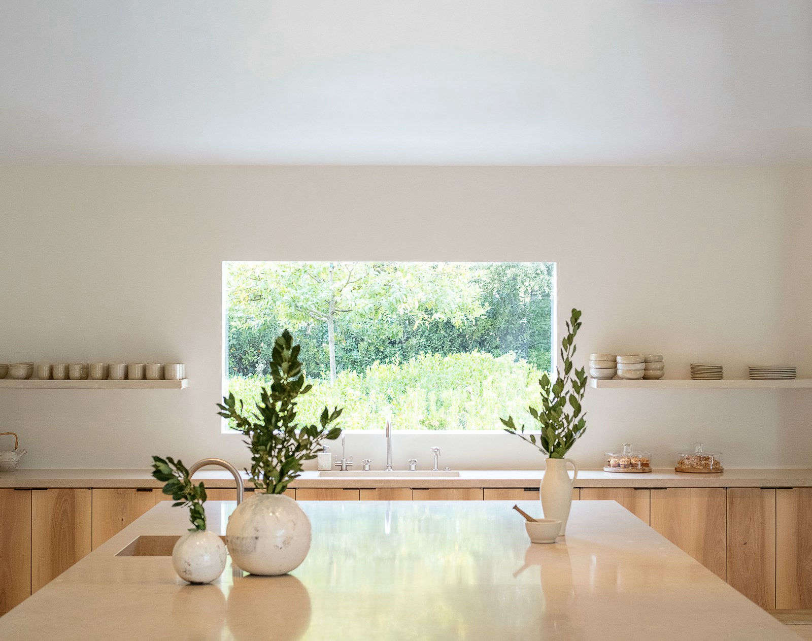

Pale interiors have suffered from a mild public-relations problem. Mention a room decorated in white, cream, or beige, and somebody will inevitably picture a sterile showroom containing one uncomfortable sofa and a bowl that nobody is allowed to touch.
That is not the version currently inspiring designers, decorators, and homeowners. Today’s pale interior design is softer, earthier, and considerably more interesting. It combines warm whites, chalky pastels, weathered woods, natural stone, handmade ceramics, aged metals, and fabrics that look better with a wrinkle or two. The result is calm without being sleepy, minimal without feeling empty, and elegant without requiring everyone to whisper.
The phrase “pale and interesting” originally appeared in Remodelista’s long-running “Current Obsessions” series. More than a decade later, the idea still works as a useful decorating brief: begin with restrained color, then build character through material, shape, light, age, and contrast.
Sources:
Why Pale Interiors Feel Relevant Again
The appeal of pale rooms is partly practical. Light colors can help compact spaces feel more open, reflect natural light, and provide a flexible background for furniture, art, and objects collected over time. They also offer visual relief in homes already crowded with screens, packaging, cables, calendars, and the mysterious household equipment that multiplies inside kitchen drawers.
Yet the current movement is not a return to icy white walls, matching white furniture, and kitchens that resemble dental clinics. Recent paint forecasts and designer recommendations favor complex pales with noticeable undertones: creamy off-white, putty, dusty blush, muted mauve, foggy green, mineral blue, soft khaki, and mushroom beige. These colors remain quiet, but they react to daylight and surrounding materials in ways that flat white cannot.
Modern pale interiors also acknowledge that a room needs emotional weight. Warm woods, old furniture, sculptural lighting, handmade surfaces, and darker accents keep the palette grounded. Pale is now the background singer, not the entire band.
Sources:
The New Pale Palette Goes Far Beyond White
Warm Whites and Soft Creams
A successful pale palette often begins with white, but choosing the right white requires more thought than grabbing the first paint chip labeled “clean.” Pure, blue-leaning whites can look crisp in sunny rooms but gray or chilly in spaces with limited daylight. Cream, ivory, bone, and parchment contain warmer undertones that soften shadows and pair naturally with wood, linen, leather, and aged brass.
Room orientation matters. North-facing rooms commonly receive cooler light, so warm neutrals can help counteract the blue cast. Southern light tends to make pale colors appear creamier, while western exposure can dramatically warm a room near sunset. Always test large painted samples on more than one wall and observe them in the morning, afternoon, and evening. A color that looks like elegant limestone at noon may become suspiciously peachy during dinner.
Sources:
Mineral Pastels
Pale does not have to mean beige. Look toward colors found in weathered landscapes: chalky blue, faded sage, dusty rose, washed terracotta, soft lavender, shell pink, and cloudy gray-green. Because these shades contain gray, brown, or earthy undertones, they behave almost like neutrals while introducing subtle personality.
A pale green bathroom can feel fresher than plain white. A muted blush bedroom creates warmth without becoming sugary. A misty blue ceiling may visually lift a living room while remaining quieter than a fully colored wall. These are colors with excellent manners: present, attractive, and unlikely to dominate every conversation.
Putty, Oatmeal, and Mushroom
The most versatile neutrals often fall between familiar color categories. Putty sits somewhere between beige and gray. Oatmeal is warmer than ivory but lighter than tan. Mushroom may carry brown, taupe, pink, or violet undertones depending on the light.
These ambiguous shades are useful because they connect different materials. A mushroom wall can bridge a gray stone floor, an oak table, and a cream sofa. Putty cabinetry can coordinate with both stainless steel and unlacquered brass. Oatmeal textiles soften black furniture without producing a harsh black-and-white scheme.
Dark Notes for Definition
Even the palest room benefits from a little punctuation. A walnut cabinet, black picture frame, bronze lamp, dark green chair, or charcoal stripe gives the eye somewhere to stop. Without those anchors, similarly pale objects can blur together until the room resembles an overexposed photograph.
Dark accents do not need to be distributed evenly. One substantial antique chest may provide more character than twelve tiny black accessories arranged with military precision. Contrast should feel intentional, not as though the room has developed spots.
Sources:
Current Obsessions for a Pale and Interesting Home
1. Chalky, Imperfect Walls
Flat paint is not the only option for pale walls. Limewash, Roman clay, mineral paint, and hand-applied plaster introduce gentle variation that changes as light travels across the surface. Their visible movement gives even a nearly white wall dimension.
These finishes are especially effective in rooms with restrained furniture because the wall itself contributes texture. They can also make newer architecture feel less clinically new. However, sample the finish first, understand its maintenance needs, and avoid attempting an entire living room five minutes after watching one cheerful tutorial.
Sources:
2. Linen That Looks Like Linen
Natural linen is one of the easiest ways to make a neutral room feel relaxed. Use it for curtains, slipcovers, tablecloths, bedding, and pillows. Its irregular weave catches light, and its tendency to crease prevents the room from appearing overly polished.
Pair linen with smoother materials such as glazed ceramic, polished metal, leather, or honed stone. A room full of rough beige fabric can begin to resemble a very tasteful sack. Contrast between coarse and smooth surfaces makes each material more noticeable.
3. Pale Wood With Richer Companions
White oak, ash, maple, and birch remain natural partners for a light interior, especially on floors and large pieces of furniture. Their visible grain adds warmth without overwhelming the palette. The more current approach, however, is to mix them with darker or older woods rather than matching every finish.
A pale oak dining table can sit comfortably beside walnut chairs. A weathered pine bench may work with a mahogany cabinet. Variation creates the impression of a home assembled gradually instead of delivered as one enormous furniture set on Tuesday afternoon.
4. Stone With Visible Personality
Travertine, limestone, marble, soapstone, and handmade tile bring quiet pattern into pale rooms. Honed and leathered finishes tend to feel softer than highly polished surfaces, while visible veining prevents counters and tables from disappearing into the background.
You do not need to clad every available surface in stone. A small travertine side table, marble lamp base, limestone bowl, or tiled backsplash can provide enough geological drama. The planet has already done the design work; your job is mainly to avoid covering it with clutter.
5. Handmade Ceramics and Cloudy Glass
Perfectly matched accessories can make pale rooms feel generic. Handmade pottery, rippled glass, alabaster, and recycled glass introduce small irregularities that reward closer inspection. Look for milky glazes, sandy clay bodies, translucent edges, and visible tool marks.
A single large vessel often has greater impact than a crowded collection of tiny decorative objects. Fill it with branches, garden clippings, or nothing at all. Empty can be a design choice, not proof that you forgot to buy flowers.
6. Sculptural Lighting
Lighting becomes especially important when a room uses limited color. Paper lanterns, plaster sconces, pleated shades, opal glass pendants, and articulated metal lamps contribute recognizable silhouettes during the day and atmosphere after dark.
Use several layers instead of relying on one bright ceiling fixture. Combine ambient lighting with task lamps and low accent lights. Warm bulbs generally flatter cream, wood, and natural textiles, while excessively cool bulbs can turn a serene room into the break area of a convenience store.
Sources:
How to Style Pale Rooms Without Making Them Bland
-
Repeat colors, not exact products.
Choose several related shades of cream, tan, gray, blush, or green rather than repeating one identical color across every surface.
-
Use at least three distinct textures.
For example, combine smooth plaster, woven linen, and grained wood. Add stone, metal, wool, cane, glass, or leather as the room develops.
-
Vary the scale of shapes.
Balance a substantial sofa with a delicate lamp, broad curtains with narrow chair legs, or a large artwork with smaller functional objects.
-
Include something old.
Vintage furniture, an inherited bowl, an aged frame, or a worn rug gives an otherwise fresh palette history and emotional character.
-
Add one controlled color surprise.
Try an olive pillow, cobalt vase, rust-colored stool, yellow artwork, or floral textile. A restrained accent often appears more vivid against pale surroundings.
-
Leave breathing room.
Not every corner requires a basket, plant, stack of books, candle, and tiny wooden chain. Negative space allows special objects to remain special.
Sources:
Room-by-Room Pale Decorating Ideas
Living Room
Start with warm off-white walls and a rug in jute, wool, or a subtle patterned weave. Choose a sofa in oatmeal, pale gray, or cream, then add contrast with a darker coffee table or vintage chair. Curtains close to the wall color can make the room feel taller while adding softness.
Instead of matching pillows, coordinate them through related tones and varied materials. A striped linen pillow, faded floral cushion, and wool bolster can coexist if they share one or two colors.
Kitchen
Cream cabinets are often more forgiving than brilliant white and pair well with marble, soapstone, wood, brass, and stainless steel. Introduce interest through fluted details, handmade tile, glass-front cabinetry, or a contrasting island.
A pale kitchen still needs evidence that people live there. Display a wooden cutting board, ceramic fruit bowl, copper pan, or framed artwork. The goal is refined functionality, not pretending nobody has ever made toast.
Sources:
Bedroom
Layer several light tones instead of buying a matching bedding bundle. Combine white sheets, an ivory quilt, a mushroom blanket, and a muted green or dusty blue pillow. Add a woven shade or softly lined curtain to filter daylight.
A dark wooden nightstand or antique bench can prevent the bed from floating in a cloud of beige. Keep lighting low and warm, and let one piece of art establish a stronger accent color.
Bathroom
Pale bathrooms benefit from tactile surfaces because the room naturally contains many hard materials. Consider handmade tile, veined stone, limewash, ribbed glass, woven baskets, and wood where moisture conditions allow.
Mixing metals can also create depth. Polished nickel, aged brass, and dark bronze can coexist when each finish appears more than once or relates clearly to another object.
The Sustainable Appeal of Decorating More Slowly
A pale-and-interesting interior does not require replacing everything you own with beige versions of the same objects. Its strongest qualitiespatina, natural materials, craftsmanship, and varietyoften support a slower approach to decorating.
Reupholster a sound chair instead of discarding it. Refinish a wooden table rather than buying a flimsy imitation. Search secondhand stores for solid furniture, pottery, frames, baskets, and lamps. Choose fewer textiles made from durable natural fibers, and allow useful objects to remain visible.
This approach usually creates a more convincing room because older pieces bring differences in tone and surface that mass-produced matching collections lack. Sustainability, in this case, is not a separate visual style. It is the pleasant consequence of buying less, choosing carefully, and keeping good things in circulation.
Sources:
Living With the Look: A Real-World Pale Interior Experience
The following is a composite experience based on common decorating challenges rather than a claim about one specific household. Imagine a living room that begins with cool white walls, a gray sofa, a pale rug, and very little else. The room is technically bright and coordinated. It is also about as emotionally engaging as an unopened refrigerator.
The first change is paint. Instead of choosing another white from a tiny paper chip, several warm off-white and putty samples are painted on different walls. One looks pleasantly creamy in the morning but turns yellow beneath the lamps. Another appears gray beside the sofa. The eventual choice has a soft stone undertone that remains balanced throughout the day.
Immediately, the sofa looks less blue and the wooden floor appears warmer. Nothing in the room has moved, yet the relationships between the existing materials have improved. This is the quiet power of undertones: they are rarely the first thing people notice, but they influence nearly everything else.
Next comes texture. Linen curtains replace thin synthetic panels. Their natural folds soften the window and filter harsh afternoon light. A chunky wool throw is added to the sofa, while a flat-woven rug is layered beneath the coffee table. The palette remains pale, but the room no longer looks flat because each surface handles light differently.
The original glass coffee table is retained rather than replaced. Its transparency prevents the modest room from feeling crowded. A scratched vintage wooden stool is placed beside it, providing the contrast and history that were missing. The stool is imperfect, slightly darker than planned, and quickly becomes the object everyone asks about.
Lighting produces the most dramatic evening change. The ceiling fixture had previously attempted to illuminate the entire room with one heroic, unflattering blast. A shaded floor lamp, small table lamp, and wall-mounted reading light create separate pools of illumination. Cream walls glow, textured fabrics cast gentle shadows, and the room finally feels inviting after sunset.
Then real life begins testing the aesthetic. The pale sofa reveals crumbs with remarkable efficiency. Linen wrinkles. The wool throw collects pet hair. A white ceramic bowl placed too close to the edge of the table survives exactly four days.
The solution is not to abandon the palette but to make it more practical. Washable slipcovers replace delicate upholstery. The rug gains a subtle pattern that disguises ordinary wear. Baskets provide quick storage. Breakable accessories move to higher shelves, while sturdy pottery occupies the coffee table. Pale design works best when it accepts that humans will sit, snack, shed, spill, and occasionally enter a room carrying something inexplicably muddy.
After several weeks, the most successful elements are not the trendiest purchases. They are the warm wall color, layered lighting, old wooden stool, breathable curtains, and a few handmade objects. Together, they create calm while still giving the room a recognizable identity.
The experience reveals an important lesson: pale interiors are not finished by selecting pale colors. They become interesting through observation. You notice how daylight moves, which chair people actually choose, where clutter gathers, and which materials improve with use. The best room evolves in response rather than remaining frozen in its first carefully styled photograph.
Conclusion: Quiet Color, Strong Character
“Pale and interesting” is less a rigid style than a method of paying closer attention. When color becomes restrained, details become louder. The grain of a table, the weave of a curtain, the curve of a lamp, and the uneven glaze of a ceramic bowl all begin to matter more.
The most successful pale interiors balance warm and cool undertones, smooth and rough surfaces, old and new furniture, and open space with useful objects. They are not empty, fragile, or afraid of color. They simply allow every element enough room to be noticed.
Begin with one nuanced wall color, one natural textile, one object with age, and one darker accent. Then live with the room before adding more. A pale home should feel collected rather than bleachedand interesting enough that nobody compares it to a waiting room.
SEO Metadata
Note: This original article synthesizes current guidance from reputable U.S. design, decorating, paint, and home-lifestyle publications without reproducing their wording.