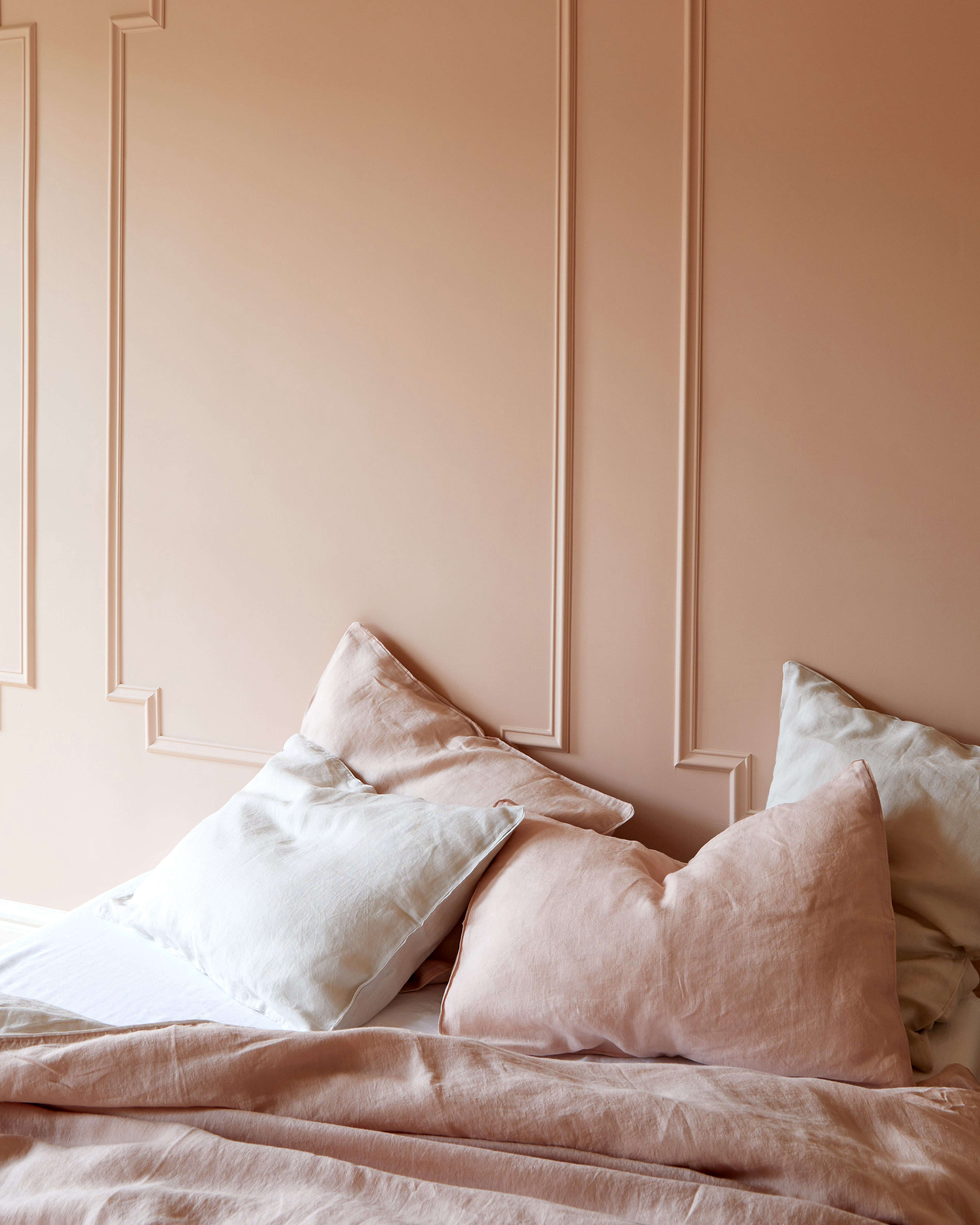

Some paint colors walk into a room and demand applause. Odessa Pink HC-59 does something smarter. It slips in quietly, straightens the pillows, softens the light, and somehow makes the whole space feel a little more expensive. This is not a bubblegum pink. It is not a sugary pink. It is not the kind of color that shouts, “Surprise, I’m a nursery!” Instead, Odessa Pink HC-59 lives in that lovely sweet spot between blush, beige, and old-house elegance.
If you have ever wanted pink walls without the drama, Odessa Pink is the kind of shade that deserves a serious look. Benjamin Moore describes it as a classic pink with a touch of beige, and that small detail changes everything. Beige is the grown-up friend who reminds pink to pay rent, drink water, and stop making impulsive decorating decisions. The result is a softer, more adaptable color that feels warm, flattering, and surprisingly easy to live with.
In practical terms, Odessa Pink HC-59 also sits in the brand’s Historic Collection, which tells you a lot about its personality. This is a color with old-soul charm. It feels equally at home in a traditional dining room, a cozy bedroom, a powder room with vintage brass, or even a modern space that needs warmth without turning tan. With a Light Reflectance Value just under 60, it has enough brightness to keep a room airy, but enough depth to avoid looking washed out.
What Kind of Color Is Odessa Pink HC-59?
Odessa Pink HC-59 is best understood as a muted, beige-kissed blush. If plain pink can sometimes feel too candy-coated, Odessa Pink takes a more tailored route. Think plaster walls in a boutique hotel, the inside of a seashell, or the rosy tone that appears on limestone when late-afternoon sun hits it just right. It belongs to the pink family, yes, but it behaves more like a tinted neutral.
That “neutral with personality” quality is exactly why soft pinks have become such dependable design tools. When pink carries earthy undertones instead of icy ones, it reads less juvenile and more architectural. Odessa Pink does not beg for attention. It creates atmosphere. It warms white trim, flatters wood, softens black accents, and adds life to gray or green furnishings without starting a color war in your living room.
Why Odessa Pink Works So Well
1. It acts like a near-neutral
One of the best things about Odessa Pink is that it can do the job of a neutral while still giving a room actual character. Beige can be lovely, but sometimes it just sits there like dry toast. Odessa Pink brings the same flexibility with a little more soul. It is subtle enough to cover four walls, yet warm enough to make a room feel intentionally designed rather than accidentally painted on a rushed Saturday.
2. It has warmth without turning peachy
Many pink paints lean too purple, too peach, or too baby-shower. Odessa Pink avoids all three traps. Its beige influence keeps it grounded, which helps it feel timeless instead of trendy. That makes it an especially good choice for homeowners who want a rosy paint color but do not want the room to feel overly sweet or theme-driven.
3. It changes beautifully with the light
This is where the color gets interesting. In morning light, Odessa Pink can look soft, fresh, and slightly creamy. By afternoon, it often shows more warmth and depth. In lamplight, it can feel cocooning and elegant. That shifting quality is part of its appeal. It is not a flat color. It is the decorating equivalent of a really good linen blazer: relaxed, polished, and somehow better the longer you live with it.
Best Rooms for Odessa Pink HC-59
Bedrooms
If you want a bedroom that feels calm but not sleepy, Odessa Pink is a strong candidate. Blue can sometimes run cold. Gray can feel detached. Bright white can start to resemble a dental office by 9 p.m. Odessa Pink brings softness and warmth, which makes it especially lovely in bedrooms with layered textiles, warm wood, antique brass, or off-white bedding.
Living rooms
Pink in a living room may sound bold on paper, but muted pinks often work like a secret design weapon. Odessa Pink can make a living room feel welcoming and polished, especially when paired with cream upholstery, walnut furniture, charcoal details, or deep green accents. It gives the room a healthy glow without hijacking the whole design.
Dining rooms
This shade has enough sophistication for a dining room, particularly if you want a space that feels warm and flattering during evening meals. Odessa Pink looks especially strong with dark woods, aged metal finishes, candlelight, and classic millwork. It can lean formal or relaxed depending on what you bring into the room.
Powder rooms and bathrooms
Smaller rooms are often the best place to take a color risk, and Odessa Pink is an excellent “risk” for people who do not actually enjoy risk. In a powder room, it feels intimate and memorable. In a bathroom, it can brighten the space while still feeling soft. If you carry the color across walls, trim, or cabinetry, the room can feel even more enveloping and visually expansive.
Hallways and entryways
Because Odessa Pink has a light, airy quality without becoming pale white, it also works beautifully in transitional spaces. Hallways, stair landings, and entryways often benefit from colors that make them feel less like traffic lanes and more like part of the home. This shade does exactly that.
How Lighting Affects Odessa Pink
No paint article is complete without a friendly reminder that lighting is basically the co-author of your paint color. Odessa Pink is warm, but it can behave differently depending on exposure.
North-facing rooms
In cooler light, Odessa Pink may look quieter and a little dustier. That is not a flaw. It often becomes more elegant in these spaces, especially when paired with creamy whites and warm woods.
South-facing rooms
In strong warm light, the rosy and beige notes can glow a bit more. The color feels fuller, sunnier, and slightly more cheerful. This is usually where Odessa Pink shows its most welcoming side.
East-facing rooms
Morning light can make the color feel soft and fresh, while the afternoon may mute it slightly. This is a nice setup for bedrooms and breakfast rooms where you want that gentle early-day lift.
West-facing rooms
Expect more drama as the day goes on. Odessa Pink can appear fairly restrained earlier, then warmer and more enveloping toward sunset. If you like rooms that get prettier in the evening, congratulations, you may have found your color.
What Colors Go With Odessa Pink HC-59?
This is where Odessa Pink earns its paycheck. Because it is not overly sugary, it pairs with a surprisingly wide range of colors and finishes.
Creamy whites and soft off-whites
If you want a clean but warm look, pair Odessa Pink with soft whites rather than stark blue-whites. This keeps the palette gentle and prevents the pink from feeling too cosmetic or overly sweet.
Sand, tan, and warm beige
These shades create a tonal, layered look that feels calm and refined. Benjamin Moore’s own coordinating suggestions point in this direction, which makes sense. Odessa Pink plays very nicely with grounded neutrals that echo its beige undertone.
Forest green and mossy green
Green is one of the best counterpoints to blush-based pinks. Rich greens anchor the softness and bring out the warm undertones in the paint. This pairing feels classic, fresh, and just structured enough to keep the palette from floating off into cupcake territory.
Chocolate brown and walnut tones
Pink and brown sound unexpected until you see them together and immediately understand that they have been plotting elegance behind your back. Odessa Pink with dark wood or chocolate accents feels polished, warm, and a little bit European.
Slate blue, navy, and muted blue-grays
If you want more contrast, cooler blues can balance Odessa Pink beautifully. The result feels tailored and sophisticated rather than precious. This is a great approach for living rooms, built-ins, or bedrooms that need a touch more edge.
Black accents
Black picture frames, iron lighting, window trim, or small furniture pieces can sharpen the softness of Odessa Pink and give it a more modern attitude. It is like adding eyeliner to a soft outfit. Suddenly the whole thing has definition.
Monochromatic pink layers
Do not be afraid to stay within the pink family. Odessa Pink can look fantastic with deeper rosy textiles, dusty mauve accents, coral notes, and burgundy touches. Layered correctly, the result feels collected and rich rather than matchy-matchy.
Official Coordinating Color Ideas
If you want a ready-made starting point, Benjamin Moore lists several coordinating colors that can help shape a palette around Odessa Pink HC-59. Opulence OC-69 and Sand Dollar OC-71 keep things soft and airy. Crownsville Gray HC-106 introduces a grounded, traditional note. Santa Fe Tan 2097-40 adds earthy warmth and depth. Taken together, these pairings reinforce what makes Odessa Pink so useful: it can move between blush, beige, gray, and earth tones without losing its identity.
Best Paint Finishes for Odessa Pink
Choosing the right finish matters almost as much as choosing the right color. If your walls have a few imperfections, matte is a forgiving option and gives Odessa Pink a soft, velvety look. For many everyday walls, eggshell is the workhorse finish: durable, easy to clean, and low-sheen enough to keep the color elegant.
If you want a little more definition on trim, doors, or cabinetry, pearl, satin, or semi-gloss can bring out architectural details. Just remember that more sheen means more reflection, and more reflection means every bump, patch, and roller line may audition for a speaking role. Odessa Pink is lovely in higher sheen, but smooth prep is your best friend.
How to Sample Odessa Pink the Right Way
This color deserves an honest audition. A tiny paint chip is helpful, but it is not the final verdict. Brush out a real sample on your wall or on a white foam board, use at least two coats, and move it around the room throughout the day. Check corners, check shadowy spots, check the wall that gets hit with afternoon sun like it owes somebody money.
Because Odessa Pink shifts with light, sampling matters. A color that looks barely pink at noon may feel rosier at sunset. That is not a trick. That is the entire point of paint, and also the reason choosing paint can feel like speed dating with 40 tiny rectangles.
Mistakes to Avoid With Odessa Pink HC-59
Using icy white trim
Very stark white can make warm pinks look dull or slightly muddy by comparison. Softer whites usually produce a more natural transition.
Ignoring undertones in nearby finishes
Flooring, tile, countertops, fabrics, and wood stains all matter. If everything around the paint leans cool gray, Odessa Pink may feel more obviously warm. That can be beautiful, but it should be intentional.
Assuming pink means “feminine only”
Muted pinks have long outgrown that outdated label. Odessa Pink can feel romantic, tailored, rustic, modern, historic, or minimalist depending on the materials around it. The paint is not the stereotype. The styling decides the story.
Skipping large samples
This is not the color to judge from a thumbnail image on your phone while standing under supermarket lighting. Get a real sample, live with it for a day or two, and let the room tell you what it thinks.
Experience: Living With Odessa Pink HC-59 Over Time
Living with Odessa Pink HC-59 is a little like living with someone who has excellent manners and great taste but never makes a big show of either. At first, the color may seem subtle, almost shy. You paint the wall, step back, and think, “Okay, nice.” Then a few days pass. The sunlight moves across the room. A lamp comes on in the evening. Your wood table suddenly looks richer, your white curtains softer, and your black frames more deliberate. That is when Odessa Pink starts earning its reputation.
In the morning, the paint often feels fresh and delicate. If the room gets soft daylight, the walls can take on a creamy blush tone that makes everything look a bit kinder, including you before coffee. There is a flattering quality to the color that people tend to notice without immediately identifying. It does not scream pink. It just makes the room feel good. Skin tones look warmer. Fabrics look cozier. Even a plain room starts to feel as if someone thought carefully about it.
By afternoon, Odessa Pink usually settles into itself. This is when the beige undertone starts doing important behind-the-scenes work. Instead of looking sweet, the color feels grounded. It can lean elegant with antique furniture, calm with linen and oak, or slightly dramatic when paired with darker pieces. In one home, it might read like a sophisticated neutral. In another, it might feel like a soft old-rose statement. That flexibility is part of why the color tends to age well instead of feeling like a passing trend.
Evenings are where Odessa Pink really wins people over. Under warm lamps, sconces, or pendant lighting, it becomes cocooning without becoming heavy. Dining rooms feel inviting. Bedrooms feel restful. Powder rooms feel charming in that “Who picked this color, and why are they so annoyingly good at this?” sort of way. It is one of those paints that can make a room feel more curated without adding a single extra object.
Another long-term advantage is that Odessa Pink does not boss the room around. You can change bedding, swap art, bring in greener plants, introduce darker wood, or add metal finishes, and the color still behaves. It is flexible enough to evolve with your decor, which is useful if you are the kind of person who occasionally rearranges furniture for fun or buys a chair first and asks questions later. Odessa Pink has range.
Perhaps the most satisfying part of the experience is that the color keeps revealing itself slowly. Some paints peak on day one. Odessa Pink gets better when you live with it. It is soft but not sleepy, warm but not stuffy, pink but not precious. And in a world full of paint colors trying desperately to go viral, there is something deeply refreshing about a shade that simply makes a home feel better every single day.
Final Thoughts
Odessa Pink HC-59 is proof that pink can be sophisticated, versatile, and quietly powerful. It brings warmth without heaviness, color without chaos, and softness without losing structure. If you want a paint color that reads like a neutral but has more personality than beige, this one deserves a place on your shortlist. Sample it carefully, pair it with intention, and let the light do its thing. There is a good chance Odessa Pink will not just work in your room. It may become the reason the room finally feels finished.