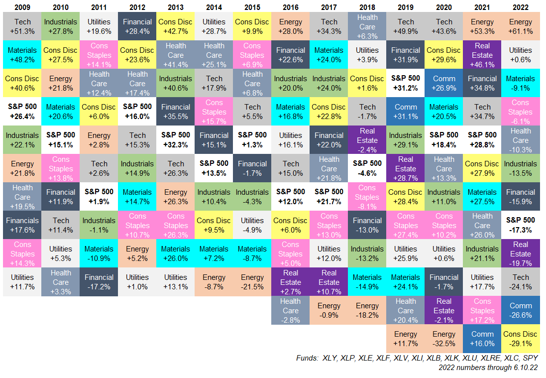

The S&P 500 Sector Quilt is the market’s most colorful reminder that leadership on Wall Street does not sit still for family photos. One year, energy walks in wearing the crown. The next year, technology grabs the microphone. Then utilities, financials, communication services, or consumer staples quietly remind everyone that “boring” can sometimes be a superpower.
At its core, a sector quilt is a year-by-year ranking chart that shows how the major sectors of the S&P 500 performed relative to one another. The best-performing sector usually appears at the top of each year’s column, while the worst-performing sector sinks to the bottom. Put several years side by side and the chart starts looking like a patchwork blanket sewn by a very caffeinated portfolio manager. But underneath the color blocks is a serious lesson: market leadership rotates, trends fade, and yesterday’s champion can become tomorrow’s awkward dinner guest.
For investors, analysts, financial writers, and curious market watchers, the S&P 500 sector quilt is more than a pretty chart. It is a visual history of sector rotation, business cycles, investor behavior, inflation scares, interest-rate shifts, commodity booms, technology manias, and defensive market positioning. It shows why diversification matters, why chasing last year’s winner can be dangerous, and why the stock market rarely rewards overconfidence for very long.
What Is an S&P 500 Sector Quilt?
An S&P 500 sector quilt is a visual table that ranks the annual performance of S&P 500 sectors. Each row or colored tile represents a sector, and each column represents a year. By arranging sectors from best to worst each year, the quilt quickly reveals which parts of the market led, lagged, recovered, or collapsed.
The chart gets its name because it resembles a quilt: bright blocks, repeated labels, and a pattern that looks organized only after you stop squinting. Unlike a simple line chart, a sector quilt makes leadership changes instantly visible. If technology dominates one year and falls near the bottom the next, the quilt shows it clearly. If energy moves from market basement to penthouse, the quilt practically waves a tiny flag.
The S&P 500 itself is a market-cap-weighted index of large U.S. companies. Its sectors are classified using the Global Industry Classification Standard, commonly called GICS. This system, developed by S&P Dow Jones Indices and MSCI, organizes companies into sectors, industry groups, industries, and sub-industries based mainly on their principal business activity. In plain English: companies get sorted by what they actually do for a living, not by what their marketing department wishes they did.
The 11 S&P 500 Sectors
The modern S&P 500 is divided into 11 primary sectors. These sectors give investors a clean way to understand the market’s internal structure:
1. Information Technology
This sector includes software, semiconductors, hardware, IT services, and other technology-driven businesses. It has become one of the largest and most influential areas of the S&P 500, especially as cloud computing, artificial intelligence, cybersecurity, and chip demand have reshaped corporate spending.
2. Health Care
Health care covers pharmaceuticals, biotechnology, medical devices, health insurers, and care providers. It can behave defensively because people still need medicine and treatment during slowdowns, but it can also act like a growth sector when innovation or drug pipelines excite investors.
3. Financials
Banks, insurers, asset managers, exchanges, and financial services companies live here. Financials are sensitive to interest rates, credit cycles, loan demand, capital markets activity, and the health of the broader economy.
4. Consumer Discretionary
This sector includes companies tied to non-essential spending: automobiles, restaurants, hotels, apparel, luxury goods, home improvement, e-commerce, and entertainment. When consumers feel wealthy, this sector may shine. When budgets tighten, it may start checking under couch cushions for spare change.
5. Communication Services
Communication services includes telecom firms, media companies, streaming platforms, entertainment businesses, and major digital advertising and social media companies. This sector was reshaped in 2018 when parts of technology and consumer discretionary were reclassified into a broader communication services category.
6. Industrials
Industrials include aerospace, defense, machinery, transportation, logistics, construction equipment, and professional services. This sector often reflects the strength of capital spending, infrastructure demand, manufacturing activity, and global trade.
7. Consumer Staples
Consumer staples companies sell essential goods such as food, beverages, household products, and personal care items. People may postpone buying a new car, but they generally do not postpone toothpaste. That makes staples a classic defensive sector.
8. Energy
Energy includes oil, gas, exploration, production, refining, and energy services companies. Its performance is heavily influenced by crude oil prices, natural gas prices, geopolitical events, supply discipline, and global demand.
9. Utilities
Utilities include electric, gas, water, and renewable power providers. The sector is often considered defensive because demand for electricity and water is steady. However, utilities can be sensitive to interest rates because many investors compare their dividends with bond yields.
10. Materials
Materials companies produce chemicals, metals, mining products, containers, packaging, construction materials, and other industrial inputs. This sector often responds to inflation, commodity prices, construction activity, and global manufacturing demand.
11. Real Estate
Real estate became its own GICS sector in 2016 after being separated from financials. It includes real estate investment trusts and real estate management companies. It can be influenced by interest rates, property values, rent trends, financing costs, and commercial real estate cycles.
Why the Sector Quilt Matters
The main lesson of the S&P 500 sector quilt is simple: leadership rotates. No sector wins forever. No sector loses forever. Even the most glamorous market darling eventually has to deal with valuation, competition, regulation, interest rates, or investors becoming allergic to hype.
For example, energy was a standout performer in 2022 as oil and gas prices surged while many growth stocks struggled under rising interest rates. Technology and communication services roared back strongly in 2023 as enthusiasm around artificial intelligence, cloud computing, and mega-cap platforms lifted growth-heavy parts of the index. In 2024, technology and communication-related names again played a major role in market leadership, while more traditional sectors delivered mixed results. By 2026, market commentary continued to focus on how technology’s huge weight could move the entire S&P 500 even when several other sectors were flat or falling.
That is exactly what a sector quilt teaches. The S&P 500 can rise because a few heavyweight sectors are doing the heavy lifting. It can also look healthy on the surface while several sectors are quietly wheezing in the background. The quilt gives investors a better view of what is happening beneath the headline index number.
Sector Rotation: The Engine Behind the Quilt
Sector rotation is the movement of market leadership from one sector to another. Investors rotate for many reasons: changes in the economy, earnings expectations, inflation, interest rates, commodity prices, fiscal policy, consumer confidence, and risk appetite.
During early economic recoveries, cyclical sectors such as consumer discretionary, financials, industrials, and materials may attract attention because investors expect stronger growth. During mid-cycle expansions, technology and industrials may benefit from business investment and productivity trends. Late in the cycle, energy and materials may do well if inflation and commodity demand are strong. During slowdowns or recessions, defensive sectors like utilities, consumer staples, and health care may hold up better because their revenues are less tied to optional spending.
This is not a law of physics. Markets love embarrassing anyone who treats a rule of thumb like a vending machine. Still, sector rotation gives investors a useful framework for understanding why different parts of the market respond differently to the same economic headline.
How to Read an S&P 500 Sector Quilt
Reading a sector quilt is easy, but reading it wisely takes discipline. Start by looking at the top row across multiple years. Which sectors appear most often? Then look at the bottom row. Which sectors repeatedly struggle? Next, scan for dramatic moves. Did a sector jump from last place to first? Did a long-time winner suddenly drop? These shifts often tell a story about macro conditions.
If energy sits near the top during a year of rising oil prices, the connection is obvious. If utilities outperform during a year of recession fears, investors may have been seeking stability and income. If technology dominates during a period of falling rates and rising earnings optimism, growth expectations may be leading the parade. The sector quilt turns these narratives into a visual scoreboard.
However, the quilt should not be used as a fortune-telling blanket. A sector’s past rank does not predict next year’s rank. Last year’s winner may still have strong momentum, or it may already be priced for perfection. Last year’s loser may be a bargain, or it may be cheap for a very good reason. The quilt is a starting point for analysis, not a crystal ball with a brokerage account.
Why Sector Weights Change Over Time
The S&P 500 is market-cap weighted, meaning larger companies have a bigger effect on index performance. When mega-cap technology and communication services companies rise sharply, their sectors gain weight. When energy, financials, or real estate lag, their influence can shrink.
This matters because an investor who owns an S&P 500 index fund is not equally invested across all 11 sectors. The portfolio naturally tilts toward the largest companies and sectors. In recent years, information technology and related mega-cap growth companies have represented a major share of the U.S. equity market. That concentration can boost returns when leaders keep winning, but it can also increase vulnerability if those leaders stumble.
A sector quilt helps reveal this concentration indirectly. If the largest sector is also the top performer, the S&P 500 may surge. If the largest sector falls, even strong performance from smaller sectors may not fully offset the damage. In other words, the quilt shows who is winning, while sector weights show how much that win matters.
Common Lessons From Sector Quilt History
Diversification Is Not Boring; It Is Survival Gear
Sector quilts repeatedly show that performance leadership is unpredictable. A portfolio concentrated in one sector may look brilliant for a while, then suddenly look like it forgot how stairs work. Diversification across sectors helps reduce the risk of relying too heavily on one market theme.
Chasing Performance Can Backfire
Investors often want to buy whatever performed best last year. Unfortunately, the quilt shows that top performers frequently cool off. Momentum can continue, but buying solely because a sector was recently hot is like choosing a restaurant because the parking lot was full during lunch three months ago.
Every Sector Has a Season
Defensive sectors may lag during roaring bull markets but shine when investors become cautious. Cyclical sectors may struggle during downturns but rebound quickly when growth improves. Technology may dominate during innovation cycles but suffer when valuations compress. The quilt shows that each sector responds to different economic weather.
Relative Performance Matters
A sector can post a positive return and still rank poorly if other sectors did much better. Likewise, a sector can lose money but still outperform during a terrible market. Sector quilts are about ranking, not just absolute gains or losses.
How Investors Use Sector Quilts
Investors use S&P 500 sector quilts for several purposes. Long-term investors use them to understand diversification and avoid overconfidence. Tactical investors use them to spot rotation patterns. Advisors use them to explain why a balanced portfolio may feel frustrating in one year and brilliant in the next. Financial writers use them because “market dispersion across GICS classifications” sounds less fun than “look at this chaotic rainbow of capitalism.”
Some investors pair sector quilts with other tools, such as valuation metrics, earnings revisions, relative strength charts, dividend yields, credit conditions, and macroeconomic indicators. For example, if financials are rising in the quilt while the yield curve is steepening and loan growth is improving, that may support a stronger sector story. If energy is leading while oil prices are falling, investors may need to look deeper at dividends, capital discipline, or geopolitical expectations.
Sector exchange-traded funds, including broad families from major asset managers, make it easier to track or tilt toward specific sectors. However, sector funds carry more concentrated risk than broad-market funds. A sector ETF may be diversified across many companies, but it is still tied to one slice of the economy. If that slice catches a cold, the whole fund may start sneezing.
Sector Quilt Example: A Simple Interpretation
Imagine a three-year mini quilt. In year one, energy ranks first because oil prices rise. Technology ranks near the bottom because interest rates jump. In year two, technology rebounds as rates stabilize and AI spending accelerates. Energy falls toward the middle as oil prices calm down. In year three, utilities climb because investors expect rate cuts and want income, while consumer discretionary lags because household spending slows.
That simple pattern tells a story. Investors moved from inflation protection to growth optimism to defensive income. No single sector was “best” in every environment. Each sector responded to changing economic expectations. That is the magic of the S&P 500 sector quilt: it makes market history easier to understand without forcing readers to digest a spreadsheet large enough to qualify as furniture.
What the Sector Quilt Does Not Tell You
A sector quilt is useful, but it has limits. It does not tell you whether a sector is undervalued or overvalued. It does not show earnings quality, balance sheet strength, dividend sustainability, or future cash flows. It does not explain whether performance came from many companies or just a few giants. It also does not account for your personal goals, time horizon, risk tolerance, or tax situation.
The quilt is best used as a visual summary, not a complete investment strategy. It can spark good questions: Why did this sector lead? What changed? Is the trend supported by earnings? Are valuations reasonable? Is performance broad or narrow? Those questions matter more than simply pointing at the top tile and saying, “I choose that one.”
Why the S&P 500 Sector Quilt Is Popular With Financial Educators
The sector quilt is popular because it makes a complex idea instantly understandable. Most people do not naturally think in terms of factor exposure, index concentration, or cross-sector dispersion. But show them a quilt where sectors jump around from year to year, and the lesson becomes obvious: markets rotate.
It is also a great antidote to hindsight bias. After a sector has a great year, it feels obvious that it was going to happen. The quilt reminds us that the past rarely looked obvious in real time. At the start of many years, investors face conflicting signals: inflation data, Federal Reserve policy, earnings forecasts, geopolitical risk, consumer spending, commodity prices, and valuation concerns. The quilt looks neat after the fact, but living through it can feel like trying to assemble IKEA furniture during an earthquake.
Experience-Based Insights: What Watching the S&P 500 Sector Quilt Teaches Over Time
One of the most valuable experiences related to the S&P 500 sector quilt is the humbling realization that confidence and accuracy are not the same thing. When you first study sector performance, it is tempting to believe that the pattern will become easy to predict. Technology is strong, so technology will stay strong. Energy is weak, so energy will stay weak. Consumer staples are boring, so they must underperform forever. Then the market flips the table, and suddenly the boring sector is wearing sunglasses indoors.
Watching sector quilts over multiple years teaches patience. It shows that strong portfolios are not built only around exciting stories. They are built around balance, discipline, and the willingness to admit that the future is messy. A sector that looks unattractive today may become valuable when conditions change. A sector that looks unstoppable may already carry expectations so high that even good news is not enough.
Another practical experience is learning to separate a good company from a good sector environment. A great company can struggle when its entire sector is out of favor. A mediocre company can rise when investors are rushing into its sector. The quilt helps explain why individual stock performance sometimes has more to do with sector winds than company-specific genius. It is not that fundamentals stop mattering; it is that the market often moves in groups before it gets picky.
The quilt also teaches emotional control. When your portfolio underperforms because your favored sector is lagging, the instinct is to change everything immediately. But sector rotation is normal. If every underperforming patch of a portfolio gets removed at the worst moment, investors may end up repeatedly selling low and buying high. The quilt’s chaotic pattern is a warning against overreacting to short-term rankings.
For writers and analysts, the S&P 500 sector quilt is especially useful because it turns market history into a story. Instead of saying “sector dispersion widened,” you can show that energy, utilities, technology, and financials took turns leading under different conditions. Instead of lecturing readers about diversification, you can let the quilt do the talking. It is visual proof that markets are dynamic, not static.
A final experience is learning that the quilt is most powerful when paired with context. The colors tell you what happened, but the story explains why. Energy leadership may reflect oil shocks, capital discipline, or inflation. Technology leadership may reflect earnings growth, lower discount rates, or AI investment. Utilities strength may reflect defensive positioning, falling yields, or electricity demand from data centers. The quilt opens the door; analysis walks through it.
Conclusion
The S&P 500 Sector Quilt is one of the clearest ways to understand market rotation. It shows that sector leadership changes frequently, that diversification has real value, and that chasing the latest winner can be risky. It also helps investors see the S&P 500 as a living market ecosystem rather than a single number flashing on a screen.
Whether you are a long-term investor, a financial blogger, a market researcher, or someone trying to understand why your portfolio behaved like a moody raccoon this year, the sector quilt offers a useful perspective. It reminds us that markets move in cycles, leadership shifts, and humility is not optional. In the colorful patchwork of S&P 500 sectors, the only permanent winner is the investor who keeps learning.
Note: This article is for educational and informational purposes only. It is not personalized investment advice, a recommendation to buy or sell securities, or a forecast of future returns.