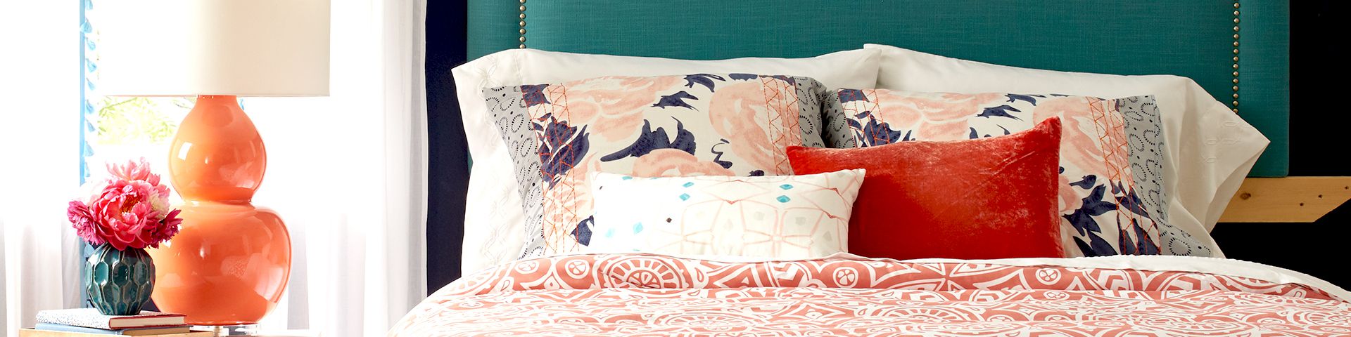

Your bedroom should not feel like a storage unit that accidentally learned how to hold a mattress. It should feel calm, personal, comfortable, and slightly smug about how good it looks. That is where the right bedroom color schemes come in. Paint, bedding, furniture, curtains, rugs, and accent decor all work together to create the mood of the room. A soft blue bedroom can feel like a deep breath. A warm beige bedroom can feel like a quiet Sunday morning. A moody green bedroom can feel like you sleep in a boutique hotel where everyone whispers and the towels are inexplicably perfect.
Choosing bedroom colors is not only about what looks pretty on a paint chip. It is about light, room size, undertones, furniture finishes, sleep habits, and the feeling you want when you walk in at night. Many interior designers and paint experts recommend softer blues, greens, warm whites, muted earth tones, creamy neutrals, gentle grays, taupes, and cozy browns for bedrooms because these shades tend to support rest, comfort, and visual harmony. But that does not mean your bedroom has to look like a bowl of oatmeal. With the right balance, even bold colors can feel sophisticated instead of chaotic.
This guide explores timeless and modern bedroom color palettes, explains how to choose the best bedroom paint colors, and gives practical examples you can use whether your style is minimalist, farmhouse, coastal, traditional, modern, romantic, or “I bought this nightstand at 1 a.m. and now we must design around it.”
Why Bedroom Color Schemes Matter
A bedroom color scheme affects how the room looks, but it also influences how the space feels. Bedrooms are different from kitchens, offices, and living rooms because their main job is rest. The best bedroom colors usually create a sense of calm, softness, warmth, or retreat. That does not mean every bedroom must be pale blue or white, but the palette should support relaxation rather than fight it with a tiny decorative sword.
Color also changes the way you perceive the room. Light colors can make a small bedroom feel more open and airy. Dark colors can make a large bedroom feel cozy and cocoon-like. Warm tones such as beige, camel, terracotta, cream, and muted blush can make a room feel welcoming. Cool colors such as sage green, misty blue, slate, and soft gray can make a room feel fresh and peaceful.
The best bedroom color schemes are layered. Instead of choosing one paint color and calling it a personality, think in terms of a complete palette: wall color, trim color, ceiling color, bedding, furniture, metals, wood tones, art, and textiles. A room becomes more polished when these elements speak the same design languageeven if they speak it with an accent.
How to Choose the Best Bedroom Color Scheme
Start With the Mood You Want
Before picking a color, decide what you want the bedroom to feel like. Do you want a calm retreat, a romantic escape, a cheerful guest room, a moody sanctuary, or a clean hotel-inspired space? Each goal points toward a different palette.
For a calm bedroom, try soft blue, sage green, creamy white, warm gray, or pale taupe. For a romantic bedroom, consider dusty rose, mauve, mushroom, champagne, plum-brown, or deep burgundy used carefully. For a cozy bedroom, use clay, chocolate brown, olive, camel, or greige. For a fresh and bright bedroom, choose white, ivory, pale yellow, sky blue, or soft green.
Consider Natural Light
Light changes everything. A paint color that looks elegant in a sunny room can look gloomy in a dark one. South-facing bedrooms often handle cooler shades well because the light is warmer and stronger. North-facing bedrooms may need warmer colors such as cream, beige, warm white, muted peach, or soft taupe to avoid feeling chilly.
If your bedroom gets little natural light, avoid choosing a color only because it looks good in a bright showroom. Test paint samples on multiple walls and look at them in the morning, afternoon, and evening. Paint chips are small, dramatic little liars; large samples tell the truth.
Work With Existing Furniture
Your bed frame, dresser, flooring, and nightstands matter. Dark walnut furniture pairs beautifully with warm whites, olive green, dusty blue, mushroom, and cream. Light oak works well with soft sage, pale gray-blue, white, beige, and terracotta accents. Black furniture looks striking with ivory, camel, warm gray, deep green, or moody blue. White furniture can support almost any palette, from coastal blue and white to blush and gold.
If your furniture has strong undertones, do not ignore them. Orange-toned wood may clash with cool gray walls. Red-toned wood often looks better with warm neutrals, soft greens, creamy whites, or muted blues. The goal is harmony, not a bedroom where every object appears to be arguing in separate group chats.
Timeless Bedroom Color Schemes
1. Soft Blue and Warm White
A blue and white bedroom is a classic for a reason. Blue often feels calm, clean, and restful, while warm white keeps the room from feeling cold. For a modern look, avoid stark white and choose ivory, cream, or soft stone instead. This creates a softer contrast that feels more relaxing.
Try pale blue walls with white linen bedding, natural wood nightstands, and brushed nickel or aged brass lamps. For a coastal bedroom, add woven baskets, striped pillows, and light oak furniture. For a more traditional bedroom, add navy accents, framed botanical prints, and crisp white trim.
2. Sage Green and Cream
Sage green is one of the most versatile bedroom colors because it feels connected to nature without shouting, “I have joined a forest.” It works well in modern, farmhouse, cottage, and transitional bedrooms. Pair sage walls with cream bedding, beige curtains, wood furniture, and black or brass accents.
This color scheme is especially strong for people who want a peaceful room that still has personality. Sage green also pairs beautifully with clay, blush, oatmeal, charcoal, and warm white. If you are nervous about green walls, start with sage bedding or curtains before painting the entire room.
3. Warm White, Taupe, and Natural Wood
Warm white and taupe create a bedroom that feels timeless, clean, and expensiveeven if the most expensive thing in the room is your mattress and your emotional attachment to it. This neutral bedroom color scheme works because it relies on texture rather than loud color.
Use warm white walls, taupe bedding, linen curtains, a wool rug, wood furniture, and ceramic lamps. To prevent the room from feeling flat, mix materials: matte paint, woven fabric, smooth wood, nubby throws, and soft pillows. Neutral bedrooms need texture the way coffee needs a mug.
4. Greige and Soft Black
Greigea blend of gray and beigeis a smart bedroom color for people who want a neutral that is warmer than gray but cooler than beige. Pair greige walls with soft black accents, cream bedding, and medium wood tones for a modern look.
This palette works well in small bedrooms because it feels polished without being too busy. Use black sparingly through curtain rods, picture frames, lamps, or a bench at the foot of the bed. The result is sophisticated, grounded, and calm.
5. Navy, Taupe, and Brass
Navy is dramatic, but it can still feel restful when balanced with warm neutrals. A navy and taupe bedroom feels more grown-up than basic blue and white, and brass accents add warmth. This color scheme is ideal for a primary bedroom, guest room, or anyone who wants hotel energy without the mini shampoo bottles.
Use navy on an accent wall, upholstered headboard, bedding, or all four walls if the room has enough light. Add taupe curtains, white sheets, brass sconces, and walnut furniture. The key is contrast: navy needs lighter elements so the room feels cozy, not cave-like.
Modern Bedroom Color Schemes for 2026 and Beyond
6. Earthy Brown and Ivory
Warm brown tones are becoming modern classics in bedroom design. Chocolate, mocha, camel, clay, and mushroom shades feel grounded and comforting. These colors work especially well for bedrooms because they create a wrapped-in-warmth effect.
Try ivory walls with a chocolate brown headboard, camel throw blanket, warm wood furniture, and cream curtains. For a bolder approach, paint the walls a soft brown and keep the bedding light. Brown is no longer the forgotten crayon in the box; it is now the sophisticated friend who knows how to order wine.
7. Dusty Mauve and Mushroom
Mauve has grown up. Today’s mauve bedroom color schemes are less childhood bedroom and more boutique retreat. When muted and earthy, mauve works almost like a neutral. Pair it with mushroom, cream, warm gray, walnut, or antique brass for a soft and elegant bedroom.
This palette is great for romantic bedrooms that do not feel overly sweet. Use dusty mauve on walls or bedding, then ground it with taupe furniture, linen textures, and simple artwork. Avoid pairing mauve with too many shiny or sugary accents unless you are intentionally chasing a candy-box look.
8. Blue-Green and Warm Neutral
Blue-green colorsthink smoky teal, eucalyptus, jade, sea glass, and muted aquaare popular because they balance calm and character. They feel cooler than sage but warmer than pure blue. This makes them useful for bedrooms that need serenity with a bit of depth.
Pair blue-green walls with warm white trim, oatmeal bedding, woven shades, and natural wood. For a moodier room, add charcoal, dark bronze, or forest green accents. Blue-green also looks excellent with vintage furniture and botanical prints.
9. Terracotta, Cream, and Olive
Terracotta brings warmth, but it should be used thoughtfully in bedrooms. A bright orange wall can feel too energetic for sleep, but muted clay or terracotta accents can be beautiful. Pair terracotta with cream and olive for a grounded, Mediterranean-inspired bedroom color scheme.
Use cream walls, olive bedding, terracotta pillows, natural wood furniture, and a jute rug. If you want more drama, paint one wall in a muted clay tone and keep the rest of the room calm. This palette feels sunny, earthy, and collected.
10. Burgundy and Soft Neutral
Burgundy can be luxurious in a bedroom when handled with restraint. Instead of painting every surface in a bright red, choose a muted wine, oxblood, or plum-brown shade. Pair it with beige, ivory, taupe, or warm gray to create a rich but restful space.
This scheme works well through velvet pillows, a burgundy throw, an upholstered headboard, or a painted accent wall. Add dark wood, antique brass, and cream bedding for balance. Burgundy is dramatic, yes, but in the right dose it is drama with good lighting and excellent manners.
Best Bedroom Color Schemes by Style
Coastal Bedroom Color Scheme
For a coastal bedroom, choose soft blue, sandy beige, warm white, driftwood gray, and sea-glass green. Keep the palette light and airy. Use linen bedding, woven shades, rattan furniture, and simple artwork. Avoid overdoing seashell decor unless you want your bedroom to feel like a souvenir shop with pillows.
Modern Bedroom Color Scheme
A modern bedroom works well with warm white, charcoal, greige, black, camel, and muted blue-green. Focus on clean lines, minimal clutter, and strong contrast. A modern palette does not have to be cold; warm neutrals and textured fabrics keep it comfortable.
Farmhouse Bedroom Color Scheme
Farmhouse bedrooms look best with creamy white, sage green, warm gray, beige, black accents, and natural wood. Add cotton bedding, vintage-style lamps, woven baskets, and simple patterns. The color scheme should feel relaxed and practical, not like a staged barn wedding.
Romantic Bedroom Color Scheme
For a romantic bedroom, try blush, mauve, champagne, cream, plum, soft gray, or burgundy accents. Choose warm lighting, layered curtains, plush bedding, and gentle contrast. Romantic does not have to mean frilly. A muted palette with beautiful texture often feels more elegant than a room covered in ruffles.
Minimalist Bedroom Color Scheme
Minimalist bedrooms benefit from warm white, ivory, oatmeal, pale gray, taupe, and light wood. The secret is keeping the palette simple while adding texture. Use linen sheets, a wool rug, a clean-lined bed frame, and one or two thoughtful pieces of art.
Bedroom Color Schemes for Small Rooms
Small bedrooms can handle both light and dark colors, but the strategy matters. Light colors such as warm white, pale blue, soft beige, and light gray-green can make the room feel open. Dark colors such as navy, charcoal, forest green, or chocolate brown can make the room feel cozy and intentional.
If you choose a light palette, add contrast through bedding, art, or furniture so the room does not look unfinished. If you choose a dark palette, consider painting the trim and ceiling in a similar shade for a color-drenched look. This can blur harsh lines and make the room feel more designed.
In small bedrooms, avoid using too many competing colors. Two main colors and one accent color are usually enough. For example, try ivory walls, sage bedding, and black accents. Or use navy walls, white bedding, and brass lighting. Simple palettes make small rooms feel calmer and more spacious.
Bedroom Colors to Use Carefully
Some colors are not forbidden, but they need careful handling. Bright red, neon orange, intense yellow, and highly saturated purple can feel stimulating in a bedroom. That does not mean you can never use them. It means they often work better as accents than as full-wall colors.
For example, instead of bright red walls, try a muted burgundy throw pillow. Instead of electric yellow walls, try pale buttery yellow or mustard accents. Instead of vivid orange, try terracotta or clay. The bedroom should help your brain slow down, not make it feel like it accidentally walked into a sports bar during overtime.
How to Build a Bedroom Palette Like a Designer
Use the 60-30-10 Rule
The 60-30-10 rule is a simple design guideline. Use one dominant color for about 60 percent of the room, a secondary color for 30 percent, and an accent color for 10 percent. In a bedroom, the dominant color is often the walls or bedding. The secondary color may appear in curtains, rugs, or furniture. The accent color shows up in pillows, lamps, art, or decor.
For example, in a sage green bedroom, sage might be 60 percent, cream might be 30 percent, and black or brass might be 10 percent. In a navy bedroom, navy might be 60 percent, taupe 30 percent, and brass 10 percent.
Layer Texture, Not Just Color
A good bedroom color scheme depends on texture. A cream bedroom with flat paint, plain sheets, and no contrast can look dull. But cream walls with linen curtains, a boucle pillow, wood furniture, a wool rug, and ceramic lamps can feel rich and calming.
Texture is especially important in neutral bedrooms. Mix smooth, rough, soft, matte, shiny, woven, and natural materials. This makes the room feel intentional and comfortable even when the color palette is quiet.
Test Before You Commit
Always test paint colors before painting the entire bedroom. Apply large swatches on different walls and observe them throughout the day. Check how they look with your bedding, flooring, and furniture. A color that looks perfect online may look completely different in your room because of lighting and undertones.
Also remember that paint usually looks more intense on a full wall than on a small sample. If you are choosing between two shades, the slightly softer one is often safer for a bedroom.
Real-Life Experience: What Bedroom Color Schemes Teach You Over Time
One of the most useful lessons about bedroom color schemes is that your first idea is not always your best idea. Many people begin by choosing a favorite color, then discover that loving a color on a sweater is very different from sleeping inside four walls of it. A deep emerald dress may look stunning. A deep emerald bedroom with poor lighting, black furniture, and heavy curtains may feel like a stylish cave where socks go to disappear.
In real homes, the best bedroom palettes often come from paying attention to how the room is actually used. A bedroom that doubles as a work area may need a slightly brighter, cleaner palette to feel productive during the day. A bedroom used only for sleep can go softer, darker, or more cocooning. A guest bedroom should feel welcoming to different tastes, which is why warm white, taupe, sage, blue-gray, and cream are dependable choices.
Another experience-based tip: bedding changes everything. People often repaint when they actually need new sheets, curtains, or a rug. A wall color can look wrong simply because the bedding is fighting it. For example, cool gray walls may look flat beside stark white bedding but become elegant with oatmeal linen, navy pillows, and warm wood. Sage green walls may look too rustic until you add crisp cream bedding and modern black lamps.
Lighting is another common surprise. A bedroom color scheme that looks beautiful in daylight can feel completely different at night under a cool LED bulb. Warm bulbs usually make bedrooms feel more relaxing and flattering. If your paint color seems harsh, try changing the bulb temperature before blaming the walls. Sometimes the wall is innocent; the light bulb is the villain.
Personal comfort matters more than trends. Earth tones, blue-greens, warm neutrals, and moody browns may be popular, but the best bedroom color is still the one that makes you exhale when you enter the room. If soft blue makes you feel peaceful, use it. If beige makes you feel bored, skip it. If dark green makes you feel calm and fancy, congratulationsyou may be one velvet pillow away from your dream bedroom.
A practical approach is to start with a base color you can live with for years, then use accents for trendier shades. Paint the walls warm white, taupe, sage, or blue-gray, then bring in burgundy, terracotta, mauve, or olive through pillows and throws. This makes the room easier to update without repainting every time design trends change their mind, which they do frequently and with great confidence.
Finally, the best bedroom color schemes feel collected rather than forced. They include colors from the rest of the home, repeat tones in small ways, and leave breathing room. A bedroom does not need twelve accent colors to have personality. It needs balance, comfort, good lighting, and enough restraint to avoid looking like a paint fan deck exploded near the bed.
Conclusion
The best bedroom color schemes combine beauty, comfort, and function. Soft blues, sage greens, warm whites, taupes, greiges, earthy browns, dusty mauves, and muted blue-greens are all excellent choices for creating a restful bedroom. Dark colors can feel cozy and elegant when balanced with lighter bedding and warm lighting. Bright colors can work as accents, but they are usually best used carefully in a room designed for rest.
Before choosing a bedroom palette, think about mood, natural light, furniture, flooring, and personal style. Test paint samples, layer textures, and use accent colors with intention. Whether you prefer a calm neutral bedroom, a romantic mauve retreat, a coastal blue and white space, or a moody navy sanctuary, the right color scheme can turn your bedroom into the most comforting room in the house. And really, any room that contains both good design and a bed deserves our deepest respect.
Note: This article was written in original American English and synthesized from current interior design, paint color, and sleep-environment guidance for web publication.