
September is the month when summer stops pretending it will last forever and our homes begin asking for a sweater. Not a literal sweater, of course, although if your sofa wants a wool throw and a moodier lamp, who are we to deny its emotional needs? This is the season of design recalibration: less beachy exhale, more collected glow. The best September interiors do not scream “fall decor” with a megaphone full of novelty pumpkins. They whisper it with richer color, better texture, smarter layering, and rooms that feel a little more alive at 7 p.m. than they did in July.
That is the real charm of September by design. It is not about swapping your entire personality for plaid. It is about shifting your home into a more grounded, expressive, and livable version of itself. Across current conversations in interior design trends, fall home decor ideas, and seasonal styling, one mood keeps rising to the top: homes should feel personal, tactile, warm, and slightly storied. In other words, less showroom, more soul.
The September Mood: Softer Light, Richer Rooms, Better Taste
Every season has its design personality, and September’s is quietly persuasive. It arrives with a different kind of light, one that flatters wood tones, deepens paint colors, and suddenly makes your iced coffee table book stack feel emotionally incomplete. It is the month when people start craving interiors with weight: deeper browns, olive greens, aubergine accents, smoky reds, creamy stone neutrals, and fabrics that do more than merely exist.
What makes this year’s September mood especially interesting is how far it has moved from the overly pale, overly sparse rooms that dominated the last wave of minimalism. Designers are leaning into warmth without making spaces feel heavy. The goal is not clutter. It is character. A room should feel edited, yes, but not sterilized. It should look like someone intelligent, charming, and possibly a little obsessed with lamp glow actually lives there.
This is why September design trends feel more emotional than algorithmic. They are about atmosphere as much as aesthetics. A caramel-toned sofa, a small framed sketch on a shelf, a brown tile detail in the kitchen, a cord-free lamp placed exactly where the room once felt awkwardthese are not giant gestures, but they completely change how a home feels.
Obsession No. 1: Warm Browns Are the New Neutral
If summer belonged to breezy whites and easy linen, September belongs to brown in all its delicious forms. Chocolate, walnut, espresso, bark, cinnamon, mushroom, camelcall it what you like, but brown has officially stopped being the color of dated dens and started acting like the confident backbone of stylish rooms. And honestly, it is about time.
Brown works because it has range. It can look tailored in leather, soft in velvet, organic in wood, dramatic in tile, and quietly luxurious in plaster or matte paint. It also plays beautifully with colors that often dominate fall interiors: forest green, muted blue, butter yellow, burgundy, ocher, and soft ivory. When used well, it makes a room feel grounded without becoming gloomy.
For homeowners, this is one of the easiest September updates to try. You do not need to repaint the entire house in espresso and start speaking in a mysterious whisper. Introduce brown through a bench, a lamp base, a side chair, a set of frames, a ceramic bowl, or a wool throw with a deeper undertone. Darker wood pieces are especially powerful because they add age and visual depth without demanding a major renovation. The effect is simple: your room suddenly looks more intentional, more expensive, and less like it was assembled from a panic scroll.
Obsession No. 2: Texture Is Doing the Heavy Lifting
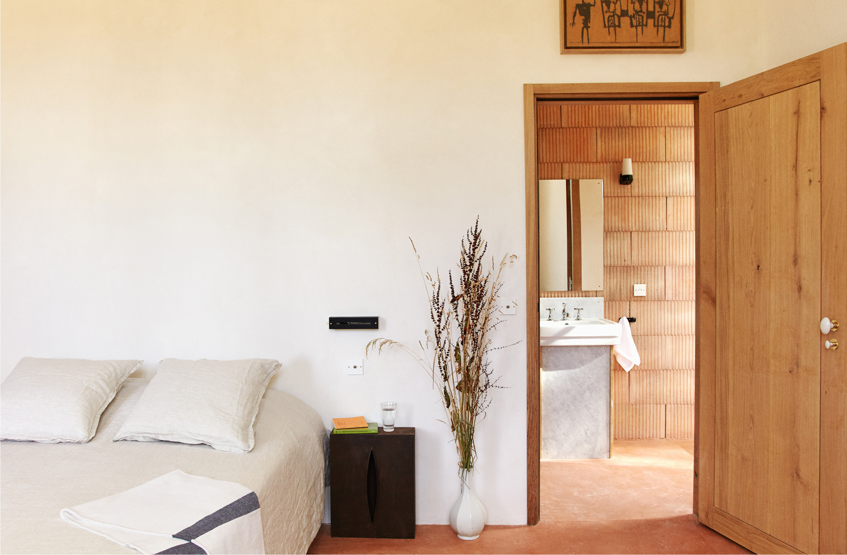
One of the biggest design shifts this September is the idea that texture can function like color. Instead of relying on loud contrast, many interiors are creating drama through materiality: grasscloth, boucle, plaster, wool, zellige tile, leather, linen, fluting, fringe, and hand-finished surfaces. Texture is the new neutral, and frankly, it is doing excellent work.
This matters because a beautifully designed room is rarely about one hero piece. It is about how materials talk to one another. A smooth marble side table becomes more interesting next to a nubby chair. A plaster wall feels richer when paired with polished metal. A structured plaid pillow makes more sense against a curvy sofa. Texture turns a flat room into a layered one, and layered rooms are what September does best.
The key is restraint with variation. You want contrast, but not a design audition where every fabric insists on a monologue. Pick three or four tactile notes and repeat them with purpose. Maybe that means a wool rug, linen drapes, a leather ottoman, and a glazed ceramic lamp. Maybe it means grasscloth wallpaper, a velvet banquette, and a stone tray on the coffee table. The combination should feel collected, not chaotic.
Obsession No. 3: Vintage Character Is Winning Over Generic Decor
September is not a month for rooms that look brand new in a suspicious way. Right now, the most appealing interiors have a little age, a little memory, and at least one object that seems to have better stories than everyone at dinner. That is why vintage accents, heirloom-inspired pieces, and antiques with patina are becoming central to the season’s look.
This does not mean your home needs to resemble a museum gift shop in a very emotional European village. It means mixing in elements that feel rooted: a weathered wood chest, a brass candlestick, a traditional print, a ceramic vase with irregular glaze, a skirted chair, an old mirror, or a botanical drawing in a slightly imperfect frame. These pieces add narrative, and narrative is what prevents seasonal decor from feeling disposable.
The smartest version of this trend pairs old and new. A vintage stool beside a streamlined bed. A traditional floral shade over a modern lamp base. Antique brass hardware in a crisp kitchen. Plaid wallpaper in a clean-lined hallway. The result is not nostalgic in a dusty way. It is nostalgic with posture.
Obsession No. 4: Pattern Is Back, but It Has Better Manners
For a while, pattern in mainstream interiors got reduced to safe stripes and the occasional timid checkerboard. September has other plans. Heritage florals, menswear plaids, Art Deco geometry, tapestry-inspired motifs, and botanical prints are stepping back into the room, but they are doing so with more nuance than chaos.
The trick is understanding pattern as punctuation. One plaid pillow can sharpen a neutral sofa. A floral lampshade can soften a hard-edged console. A Deco-inspired wallpaper can make a tiny powder room feel thrilling instead of forgettable. Pattern now is less about covering every surface and more about inserting rhythm, charm, and visual memory.
This is especially useful for fall styling because patterns can deliver seasonality without leaning on obvious symbols. A muted plaid throw says September without needing a single embroidered leaf. A botanical print in olive and rust carries autumnal energy without becoming a themed attraction. Your house can feel seasonal and still maintain its dignity.
Obsession No. 5: Lighting Has Become the Quiet Luxury Move
If color sets the mood and texture gives the room depth, lighting is what makes everything believable. One reason September interiors feel so seductive is that lighting becomes more layered, lower, and more atmospheric. Harsh overheads start losing the room. Lamps begin their annual reign.
Cordless lamps, shaded ceiling fixtures, sculptural sconces, and softer pools of light are all part of this shift. Good lighting makes a room feel finished. It also makes everyday life feel slightly more cinematic, which is a design benefit I fully support. There is something deeply satisfying about turning on a small lamp in a corner that used to feel ignored and watching the entire room become more hospitable.
To get the look, think in layers. Ambient light for overall warmth. Task light where you actually read, cook, or pretend to read while looking at your phone. Accent light for visual drama. September is the perfect time to replace one tired lamp, add a rechargeable one to a bookshelf or console, and finally admit that a single overhead fixture is not a lighting plan. It is a cry for help.
Obsession No. 6: Nature, But Make It Refined
September design always has a relationship with nature, but the most stylish homes are interpreting it in a more elevated way. Instead of obvious seasonal props, people are styling with branches, berries, pears, figs, mushrooms, stoneware, woven textures, and floral arrangements that feel slightly undone. The vibe is less “craft aisle exploded” and more “I casually arranged this while listening to jazz and slicing bread.”
Natural elements work best when they are integrated rather than announced. A bowl of late-season fruit on the kitchen island. Olive branches in a ceramic pitcher. Mossy green pillows mixed into an existing neutral palette. Burnished wood cutting boards leaned against a backsplash. These details connect a room to the season without making it temporary.
That is also why September styling often feels more sustainable and more personal. You can forage, thrift, repurpose, and rotate what you already own. A home that changes gracefully with the season tends to feel richer than one that gets completely redecorated every six weeks in an online shopping frenzy.
How to Bring “September by Design” Into Your Own Home
Start with one color shift.
Choose a deeper, earthier anchor shade and add it in two or three places. Brown, olive, aubergine, or muted red all work beautifully.
Upgrade one category of texture.
Swap a flat cotton throw for wool, add a velvet cushion, introduce a stone or ceramic object, or bring in a woven shade. One good texture can wake up an entire room.
Use vintage as seasoning, not a costume.
Add one or two storied pieces that create contrast. A brass tray, old frame, thrifted stool, or antique bowl can shift the tone fast.
Fix your lighting before you buy more decor.
A small lamp, a better bulb, or a shaded fixture often does more for a room than five trendy accessories ever will.
Keep the room recognizable.
The goal is not to become a new person because the calendar turned. The goal is to let your home evolve with the season while still looking like yours.
A September Design Diary: Living With the Obsession
There is a particular kind of evening that explains why September decorating feels so irresistible. It starts around six o’clock, when daylight begins to soften and the room suddenly reveals all its weaknesses. The too-bright bulb in the corner lamp feels aggressive. The coffee table looks a little bare. The summer pillow that seemed cheerful in July now looks like it wants to talk about beach parking. And you, standing there with a mug and a very real desire for your home to feel more composed, realize that September is less a season than a design intervention.
My favorite part of this month is that the changes never have to be dramatic to feel meaningful. A brown throw over the arm of a chair can make a room look like it finally understands itself. A tiny lamp on a bookshelf can create a glow so flattering it should probably have its own publicist. Even rearranging a tray with candles, matches, and a small ceramic bowl can turn a random surface into what designers love to call a “moment,” which is a slightly silly phrase until you create one and become emotionally attached to it.
September also encourages a more intimate relationship with objects. In summer, the house is often just a launchpad. You are leaving, returning, dropping your bag, chasing sunlight, and living in motion. But in September, you start noticing the rooms. You notice where you want to sit in the morning. You notice that the hallway could use art. You notice that your dining area feels more inviting when there is a branch arrangement on the table, even if no one is coming over except the people who already know where the forks are. Design becomes less about display and more about daily experience.
There is humor in this, too, because September can make otherwise rational adults suddenly obsessed with oddly specific details. A plaid lampshade becomes a quest. You begin caring deeply about the undertone of walnut. You say things like “this room needs more depth” with complete seriousness, as though you are directing an indie film instead of fluffing a pillow. But that is part of the joy. Thoughtful interiors are not frivolous. They shape mood, routine, comfort, and even attention. A well-lit corner gets used. A cozy chair invites reading. A layered room makes staying home feel like a reward rather than a compromise.
What I love most about Current Obsessions: September by Design is that it gives permission to refine rather than restart. You do not need a brand-new house, a giant budget, or a personality transplant into “moody European tastemaker.” You need observation. You need edit power. You need a willingness to swap what feels flat for what feels alive. Maybe that means adding berry-colored accents. Maybe it means bringing in a thrifted brass candlestick that somehow makes your kitchen feel wiser. Maybe it means retiring a bland beige pillow and replacing it with a textured brown one that looks like it reads poetry and knows how to host.
By the time late September rolls in, the best rooms are not just decorated for the season. They are tuned to it. They hold softer light, better contrast, more comfort, and more personality. They feel ready for longer dinners, darker mornings, and evenings that stretch gently around a lamp-lit living room. And that, ultimately, is the obsession: not trends for trend’s sake, but the pleasure of making a home feel just a little deeper, warmer, and more like yourself when the year starts turning inward.