
There is a special kind of bravery involved in admitting that your master bedroomthe room supposedly devoted to peace, comfort, and civilized adulthoodhas quietly become a warehouse with pillows. Ours had decent natural light and enough space to work. It also had mismatched nightstands, a ceiling fixture with the charm of a dentist’s waiting room, laundry performing a permanent residency on “the chair,” and walls painted a color best described as landlord oatmeal.
The goal of this surprise update was not to create a showroom guarded by a velvet rope. We wanted a relaxed, layered bedroom that felt finished, functioned better, and still looked like real people lived there. That meant keeping several existing pieces, correcting the layout, improving storage, softening the lighting, and adding personality without turning bedtime into a theme-park experience.
The Before: A Room Designed by Delay
Before the makeover, the bed sat on the longest wall because that was where it landed on moving day. Nobody had questioned the decision since. The rug floated several inches away from everything, making it look less like an anchor and more like a nervous bath mat. One lamp was too tall, the other was too dim, and the overhead fixture cast a dramatic shadow under every eye bag.
The room also suffered from visual static. Open baskets showed every cable, book, receipt, and mystery object we had postponed dealing with. The dresser held framed photos, skin-care bottles, loose coins, a tape measure, and one lonely sock waiting for legal representation.
Bedroom transformations featured by HGTV, The Spruce, and Apartment Therapy often begin with the same high-impact corrections: create a focal point, improve lighting, reduce visible clutter, and make storage deliberate rather than accidental.
What We Kept
A good bedroom update does not require a ceremonial bonfire for every existing possession. We kept the bed frame, dresser, two ceramic lamps, and a vintage bench. They were solid, appropriately scaled, and emotionally neutralwhich is decorator language for “nobody hated them.” Keeping those pieces protected the budget for paint, curtains, a larger rug, improved lighting, and closed storage.
The Surprise Plan: Quiet Drama and Better Function
The design direction became “quiet drama”: warm neutral walls, a muted blue-green accent, natural wood, aged brass, creamy textiles, and small amounts of black for definition. The palette was calm but not timid. Architectural Digest recommends deciding how a bedroom should feel before choosing its components, while Sherwin-Williams and Benjamin Moore emphasize selecting colors according to mood and the room’s conditions.
We tested large paint swatches near the windows, behind the bed, and beside the closet, then checked them in morning, afternoon, and lamplight. That step saved us from a gray that looked elegant at noon and vaguely seasick after sunset. Natural light can shift undertones throughout the day, so a color should be judged when the room is actually usednot only beneath store lighting.
A Layout Based on Measurements, Not Optimism
We measured the room, door swings, windows, walking paths, and furniture depths. HGTV recommends making a simple scaled plan before moving or buying major pieces. The advice is practical: a five-minute sketch is cheaper than discovering that a nightstand blocks a closet after you have dragged it across the floor and questioned every life choice that led to this moment.
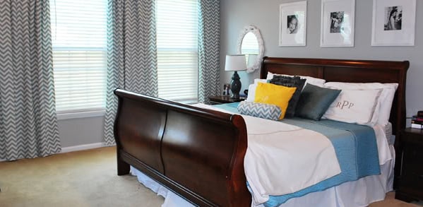
The bed moved between two windows, creating a balanced focal point. Matching curtains connected the windows visually, compact nightstands fit beneath them, and the dresser shifted opposite the bed. The bench moved to the foot of the mattress, where it could hold a throw instead of becoming a full-time clothing ecosystem.
The Biggest Visual Change: Paint and the Headboard Wall
The original beige made every object look tired. We replaced it with a warm off-white and used muted blue-green behind the bed. The contrast framed the sleeping area without expensive wallpaper or complicated millwork. Soft neutrals and restrained blues or greens can support a tranquil palette, while deeper tones add an enveloping quality when balanced with lighter fabrics and sufficient lighting.
Fresh satin trim sharpened the room’s edges and made the older furniture appear more intentional. New trim paint is the makeover equivalent of brushing your hair before a photo: technically optional, visually persuasive.
A DIY Headboard With Real Presence
Rather than replace the bed, we built an upholstered panel from plywood, foam, batting, and textured fabric. Oversized headboards are a reliable way to give an unfinished bedroom stronger scale, as seen in makeover examples from HGTV and Apartment Therapy.
The panel rose well above the existing frame, softened the accent wall, and made reading in bed comfortable. That last benefit is a genuine upgrade, not merely something people say while arranging decorative pillows.
Lighting: From Interrogation Room to Evening Retreat
The old lighting plan depended on one harsh ceiling fixture and two unrelated lamps. The update introduced three layers: a dimmable overhead light, bedside reading lights, and a small accent lamp on the dresser. Designers commonly combine overhead, task, and ambient light so bedrooms can shift from practical morning brightness to a softer evening mood.
Warm-toned bulbs made the textiles richer and the paint less flat. Wall-mounted bedside fixtures freed room for a book, water, and the phone we absolutely intended to stop checking before bed. Sleep guidance favors darkness during sleep and warmer, dimmer light before bedtime over cool, bright illumination, so blackout-lined curtains and adjustable fixtures improved function as well as appearance.
Storage That Does Not Announce Itself
The bedroom needed less visible stuff, not more decorative containers filled with visible stuff. Open baskets were replaced with drawers, a lidded charging box, and under-bed bins for seasonal bedding. Closed storage can reduce visual noise while preserving access, a strategy highlighted in bedroom guidance from Architectural Digest.
We also gave every surface a limit. Each nightstand received a light, one book, and a small tray. The dresser kept one framed photo, a low bowl, and a vase. Real Simple’s organizing guidance makes a useful point: bedrooms often feel calmer when excess chargers, unused equipment, bulky furniture, and surplus pillows stop competing for space.
The Chairdrobe Intervention
We removed the infamous clothes chair and installed hooks inside the closet for garments that were neither clean enough to fold nor dirty enough to wash. This category exists in every household, despite being ignored by science. Better Homes & Gardens describes the clutter-magnet chair as a common bedroom problem and recommends moving its function to a closet rod or similar solution.
Bedding, Curtains, and the Art of Looking Finished
The new bed used white cotton sheets, a textured quilt, sleeping pillows, two Euro shams, one lumbar pillow, and a washable throw. Variation came from texture rather than a pillow convention attended by seventeen identical cushions. Layered bedding adds softness and dimension, while natural materials such as cotton and linen suit the relaxed, tactile quality many designers seek in a bedroom.
Floor-length curtains made the windows look taller and softened the hard lines around the bed. Sheer panels filtered daytime glare, while blackout liners provided privacy and darkness. Window treatments are one of those changes that seem boring until installation; then the old room suddenly looks as though it had been wearing pants four inches too short.
The Rug Problem, Finally Solved
The original rug was attractive but undersized. We replaced it with one extending beyond both sides and the foot of the bed. That change connected the nightstands, bench, and mattress into a single visual zone while providing a soft landing in the morningdeeply appreciated before coffee and basic emotional stability.
Bedroom planning guidance warns against undersized rugs because they can make furniture feel disconnected. Proper scale mattered more here than buying the most elaborate pattern.
The After: A Better Room Without Replacing Everything
The finished master bedroom feels larger even though its dimensions are unchanged. The bed creates a clear focal point, the rug grounds the furniture, and the curtains add height. Closed storage reduces distractions. Layered lighting supports different activities, while the palette connects old and new pieces.
More importantly, the room no longer feels like the last unfinished space in the house. The vintage bench has a purpose. The dresser looks better against the new wall color. The handmade headboard adds scale and softness. A small landscape painting brings in color without yelling for applause.
The makeover proves that a dramatic master bedroom before and after does not depend on replacing everything. Editing, repositioning, repainting, and upgrading a few high-visibility elements can change the entire experience. The surprise was not a television descending from the ceiling or a secret espresso bar in the closet. It was discovering how much better the existing room could become once every choice supported the same idea.
Final Experience Notes: What Living With the Makeover Taught Us
Photographs captured the visual difference immediately, but living in the room revealed the more valuable changes. The first surprise was how much the new lighting altered our evenings. Before, we either used the bright overhead fixture or navigated by one dim lamp that made finding a dropped earring feel like an archaeological dig. Now we can fold laundry under clear light, read with focused bedside light, and wind down with only the dresser lamp glowing.
The second lesson was that storage works only when it matches real behavior. We originally imagined a beautiful basket for frequently worn clothes. In practice, it became a fabric-based witness protection program for everything we did not want to hang. Hooks worked better because they required one motion. Under-bed bins succeeded because they held only low-frequency items: extra blankets, off-season sheets, and travel pillows. Daily essentials stayed in easy-to-reach drawers.
Paint taught us patience. The blue-green wall looked cooler in the morning, clearer at noon, and moodier beneath warm lamps. Had we selected it from a digital photo alone, we might have chosen a shade that became too dark at night. Large samples were not exciting, but neither is repainting an entire wall while muttering about undertones.
We also learned that symmetry is helpful, not sacred. The windows and matching nightstands created order around the bed, but the rest of the room became more interesting when it relaxed. One side has a stack of books; the other has a ceramic dish. The dresser artwork is balanced by a vase rather than centered with mathematical intensity. The room feels composed without looking as though every object has been assigned a military coordinate.
The largest practical improvement was the rug. It softened footsteps, reduced the chopped-up appearance of the floor, and made the layout feel deliberate. The most satisfying feature was the headboard. It cost less than a new upholstered bed, reused the existing frame, and gave the room a custom element. It also survived the first accidental coffee splash, confirming that stain-resistant fabric was not pessimism; it was wisdom.
Not every decision worked on the first attempt. The curtain rod was mounted too low and had to be raised. One wall light initially sat at an awkward height because we measured while standing instead of sitting in bed. The first throw-pillow combination looked wonderful for six minutes and then migrated to the floor every night, so we reduced the total.
After several weeks, the best sign of success was not that the room remained photo-ready. It did not. Books accumulated, a glass appeared on a nightstand, and the throw occasionally resembled a surrendered flag. The difference was that resetting the room took only a few minutes because every item had a home and the furniture arrangement supported ordinary habits.
That is the lasting lesson from this master bedroom surprise update: design should make daily life easier before it makes a photograph prettier. The after view is calmer, warmer, and more polished, but it is also easier to clean, easier to use, and easier to enjoy. A bedroom does not need perfection to feel complete. It needs a clear purpose, a sensible layout, comfortable materials, flattering light, and fewer objects auditioning for permanent residence on the nearest chair.